Bruce Barnbaum - The Art of Photography - An Approach to Personal Expression
Здесь есть возможность читать онлайн «Bruce Barnbaum - The Art of Photography - An Approach to Personal Expression» весь текст электронной книги совершенно бесплатно (целиком полную версию без сокращений). В некоторых случаях можно слушать аудио, скачать через торрент в формате fb2 и присутствует краткое содержание. Жанр: Старинная литература, на английском языке. Описание произведения, (предисловие) а так же отзывы посетителей доступны на портале библиотеки ЛибКат.

- Название:The Art of Photography: An Approach to Personal Expression
- Автор:
- Жанр:
- Год:неизвестен
- ISBN:нет данных
- Рейтинг книги:5 / 5. Голосов: 1
-
Избранное:Добавить в избранное
- Отзывы:
-
Ваша оценка:
The Art of Photography: An Approach to Personal Expression: краткое содержание, описание и аннотация
Предлагаем к чтению аннотацию, описание, краткое содержание или предисловие (зависит от того, что написал сам автор книги «The Art of Photography: An Approach to Personal Expression»). Если вы не нашли необходимую информацию о книге — напишите в комментариях, мы постараемся отыскать её.
The Art of Photography: An Approach to Personal Expression — читать онлайн бесплатно полную книгу (весь текст) целиком
Ниже представлен текст книги, разбитый по страницам. Система сохранения места последней прочитанной страницы, позволяет с удобством читать онлайн бесплатно книгу «The Art of Photography: An Approach to Personal Expression», без необходимости каждый раз заново искать на чём Вы остановились. Поставьте закладку, и сможете в любой момент перейти на страницу, на которой закончили чтение.
Интервал:
Закладка:
The distant window is an extreme highlight. The upper left corner, lit from an unseen window, is a secondary highlight. Distant arches in the lower right are the deepest shadows (Figure 13-2). The contrast range exceeded 10 zones, and a 15-minute exposure increased the contrast. I exposed the highlights in the mid-teens, then drastically reduced contrast with compensating development to bring the negative into a printable range. During printing, I burned the left edge and the upper quarter (with special emphasis on the extreme upper left corner), then burned the distant window at much lower contrast to bring everything back into visibility (Figure 13-2). It requires some work, but it’s all there on the negative .
Figure 13-2. Central Arches, Wells Cathedral
Myth #2: There are 10 zones in the zone system
Photographic papers yield 10 zones, or doublings, of exposure from black to white. Negatives record far more than 10 zones, exceeding digital sensors in this respect (which is why digital photography may require multiple exposures to encompass the remarkable range of a single film exposure). Almost all panchromatic films cover 16–18 zones of brightness starting from threshold, i.e., the amount of light required to hit the negative material for it to be recorded.
Since enlarging papers yield only 10 zones of detail, most photographers think that exposing the negative beyond Zone 9 or 10 is useless. This is the heart of the myth. Since the negative accepts density increases for about 8 more zones above this false ceiling, higher zones can be brought into play whenever necessary. In fact, many people already use these zones without knowing it.
For example, suppose you have a photograph of a landscape with a big, billowing cumulous cloud. When you make a straight print, the cloud may appear as a featureless white blob. That’s because the density of the cloud on your negative is above Zone 9 or 10. So what do you do? You burn the sky and cloud, and soon the cloud begins to show good detail. You’re actually using the portion of the negative exposed above Zone 9 or 10. You’ve probably done this many times without giving any thought to it and without even being scared.
Furthermore, suppose the landscape has large areas that go completely black in your print but have detail on the negative. You can dodge those areas during the darkroom exposure, allowing you to see the detail in those dark portions of the image. Thus, by dodging the dark portions of the print (i.e., the thinner portions of the negative) and burning the bright portions of the print (i.e., the denser portions of the negative), you obtain visible detail from a negative that has a substantial number of zones.
Take another example: Suppose you walk into an old, abandoned mining shack with great wood textures and shapes inside. There’s a window that opens to a sunlit landscape. You expose the negative to get ample density for the interior, but the exterior is extremely dense. So you burn the hell out of the window, which gives you detail on the landscape beyond. Of course, you may get a black halo on the window frame if the burning overlaps it, or a white halo at the edge of the window if the burning doesn’t go right up to it. You can avoid this by reducing contrast in negative development. The point in this example is that by burning the window area, you add detail by using a portion of the negative with a density above Zone 9 or 10! And it didn’t even faze you!
So, negatives contain very useful information above Zone 9 or 10. You may need some burning to access it, but you can get it! If you can print negatives with densities above Zone 9 or 10, why shy away from purposely exposing negatives to those higher densities? I’ve been doing it for more than four decades.
In my photographs of the English cathedrals, I wanted to convey a feeling of their presence. I wanted you to see everything that I saw when I stood there. The range of brightness in many of those images exceeded 8 zones, sometimes up to 10 zones. Yet I wanted detail everywhere. I knew that if I exposed the negative at Zone 2½ or lower, I would be on the toe of the exposure/density curve—stuck with low density separations and a very flat print (tonally flat, and dimensionally flat, as well). So I generally exposed the low values at Zone 4 or Zone 5, knowing that I would reduce the contrast during negative development by giving the negative minus development. The exposed Zone 4 would develop to a lower density, perhaps Zone 3¾ or so. The exposed Zone 5 would also develop to a lower density, perhaps Zone 4½, dropping a bit more than the exposed Zone 4 during the shortened development time. But the high zones would drop dramatically in the minus development, dropping many zones below its exposed value.
So, if I exposed the darkest areas where I wanted detail in Zone 4, the brightest areas would be exposed in Zone 12, maybe even Zone 13 or Zone 14. But that’s OK. After all, the negative goes all the way up to about Zone 17. Minus development following exposure in the low teens can bring the developed density down to Zone 10 or so, making it easily accessible through burning in the final print.
I don’t want to expose important detail on the toe of the curve, which is generally below Zone 2½, or above the shoulder of the curve, which is above Zone 15 or 15½ (Chapter 9, Table 9-1). Those portions of the curve flatten out and yield very poor tonal separations in the final print. But between the toe and the shoulder, i.e., on the straight line portion of the curve, the negative still gives me 13 zones of excellent separations (Figure 13-2 and Figure 13-2).
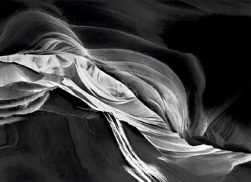
Since 1980, I’ve exposed hundreds of negatives in the slit canyons of Arizona and Utah. I regularly expose the highlights in the low teens (i.e., Zones 13, 14, or 15), enabling me to get the maximum amount of detail onto my negatives below those bright highlights. Of course I reduce the development severely, reducing the highest densities of the developed negative. This allows the negative to be printable—usually with extra burning, but printable nonetheless. It’s very difficult to print detail from negative densities that are up in the teens, but it’s perfectly fine to expose negatives that high on the scale, then reduce those placements to printable densities during development. I simply use minus development on negatives exposed that high on the scale, usually with the two-solution compensating development detailed in Chapter 9. Had I followed the misguided advice of some to expose highlights no higher than Zone 8, I could not have made many of my images in the cathedrals or the canyons (Figure 13-3).
The middle of the straight line portion of the exposure/density curve is Zone 8 or 9. Most photographers avoid these zones, yet the middle of the curve is where the separations are best! I regularly expose negatives above Zone 9 or Zone 10, but I generally give “minus development” to such negatives to avoid excessive negative densities and printing times under the enlarger.
Many instructors are unaware of the remarkable range of negatives and are afraid of exposing them into the double-digit zones. Most students are afraid of such exposures because they’ve been taught by people who are unaware of the negative’s true range. If you’re avoiding higher zones (i.e. above Zone 9), you’re throwing away opportunities to photograph in places that may yield exceptional images. Don’t be so narrow-minded. Break through the barrier of higher zones in your exposures. The negative has that range. Use it! When using high zones, reduce development to control them for later printing.
Интервал:
Закладка:
Похожие книги на «The Art of Photography: An Approach to Personal Expression»
Представляем Вашему вниманию похожие книги на «The Art of Photography: An Approach to Personal Expression» списком для выбора. Мы отобрали схожую по названию и смыслу литературу в надежде предоставить читателям больше вариантов отыскать новые, интересные, ещё непрочитанные произведения.


Обсуждение, отзывы о книге «The Art of Photography: An Approach to Personal Expression» и просто собственные мнения читателей. Оставьте ваши комментарии, напишите, что Вы думаете о произведении, его смысле или главных героях. Укажите что конкретно понравилось, а что нет, и почему Вы так считаете.