Bruce Barnbaum - The Art of Photography - An Approach to Personal Expression
Здесь есть возможность читать онлайн «Bruce Barnbaum - The Art of Photography - An Approach to Personal Expression» весь текст электронной книги совершенно бесплатно (целиком полную версию без сокращений). В некоторых случаях можно слушать аудио, скачать через торрент в формате fb2 и присутствует краткое содержание. Жанр: Старинная литература, на английском языке. Описание произведения, (предисловие) а так же отзывы посетителей доступны на портале библиотеки ЛибКат.

- Название:The Art of Photography: An Approach to Personal Expression
- Автор:
- Жанр:
- Год:неизвестен
- ISBN:нет данных
- Рейтинг книги:5 / 5. Голосов: 1
-
Избранное:Добавить в избранное
- Отзывы:
-
Ваша оценка:
The Art of Photography: An Approach to Personal Expression: краткое содержание, описание и аннотация
Предлагаем к чтению аннотацию, описание, краткое содержание или предисловие (зависит от того, что написал сам автор книги «The Art of Photography: An Approach to Personal Expression»). Если вы не нашли необходимую информацию о книге — напишите в комментариях, мы постараемся отыскать её.
The Art of Photography: An Approach to Personal Expression — читать онлайн бесплатно полную книгу (весь текст) целиком
Ниже представлен текст книги, разбитый по страницам. Система сохранения места последней прочитанной страницы, позволяет с удобством читать онлайн бесплатно книгу «The Art of Photography: An Approach to Personal Expression», без необходимости каждый раз заново искать на чём Вы остановились. Поставьте закладку, и сможете в любой момент перейти на страницу, на которой закончили чтение.
Интервал:
Закладка:
You may object that the shadow is then too light in tone. Of course it is, but you solve that problem by printing it darker—down to your desired Zone 3—when you enlarge it. When you do that, you’ll get a print with far richer tonal separations, one that exhibits far greater spatial depth. In other words, you expose and develop the negative so that the shadow densities are in the Zone 4 range, but you print it down to the Zone 3 range under the enlarger. It’s that simple.
David Vestal, in an article in Photo Techniques (January/February 1999) said, “For detailed black stuff, I expose only one stop less than indicated.” Thus, he found that he got better results when he placed shadow details in Zone 4 rather than Zone 3. Vestal also mentioned that Ansel Adams recommended Zone 3, but he himself found that “the resulting negatives are too thin”. Vestal is worth reading; he has a lot of worthwhile things to say.
You may inquire, why are we always taught to place the shadows in Zone 3? Because most teachers and most magazine writers are sensitometrists, not photographers. They spend too much time testing materials and graphing them and too little time making photographs. When they look at Zone 3, they look at an exact Zone 3 tonality, not at a textured range that averages out to Zone 3. There is an immense difference between studying an exact Zone 3 tonality (lacking texture), and a Zone 3 made up of texture. The photographer’s world is made of textures; the sensitometrist’s world is made of tonalities. The difference is like day and night.
Sensitometrists pull out their trusty densitometers and get the perfect Zone 3 by exposing a gray card at that zone. All appears to be well and good. But when they expose a real scene with real tonal variations and real texture, their exposed Zone 3 yields closer tonal separations because the textures are made up of tones both above and below Zone 3. Some of the tones below Zone 3 dip into the toe of the curve. With a Zone 4 exposure, nothing dips into the toe of the curve, so the separations are greater. When you take a negative with Zone 4 texture and print it darker (back down to Zone 3 tonalities), you retain greater tonal separations in your print. Look again at Figure 7-2 and specifically at the hill and rock area in the center, directly below the snow-covered mountain. That area was placed just above Zone 4 during negative exposure to retain maximum separations in those shadow areas, but printed significantly darker than Zone 4 to give the photograph the snap I sought. Had I placed those areas at Zone 3, I could not have maintained either the richness of tone or the feeling of depth that the image conveys.
Sensitometrists who work with step wedges and exact tones are like people who study a single musical note. Melodies, however, are made up of many notes creating a musical texture. You can’t get the feel of a melody by examining a single note. Similarly, you can’t get the feel of texture in a photograph by examining a single visual tonality. Sensitometrists are like piano tuners who make sure that each individual key sounds exactly right. You need them to keep the piano tuned, but you need a composer to write music and a pianist to play it. Photographers are both composers and pianists. It’s wise not to learn how to play the piano from a piano tuner. It’s equally wise not to learn about zone placements from a sensitometrist. I see too many sensitometric curves in photography magazines.
Photographs are not step wedges; they can be real art. They are meant to be personally expressive. They are meant to be seen by others and to move others emotionally. They are meant to communicate a thought, a mood, an experience, a moment in time, a fantasy, or any of dozens of other ideas from the artist to the viewer. They should be imbued with light and life. Exact curves and exact enlarging times won’t get you there. You’ve got to deviate from the densitometer readings and use different approaches from one print to the next if you want to say something.
I don’t own a densitometer—never have, never will. It gives me no useful information. All I need to do is expose and develop a few negatives to tell me everything I need to know about how a film responds to light and how a developer works with that film. I know that however little or much I develop a negative—minus development, normal development, or plus development—the lowest zones look just about the same because they develop quickly and hardly get any denser after the first couple of minutes of development. The low zones tell me the speed of the film and also whether I exposed it properly. Then I look at the high zones to see how much density they have, which tells me whether I developed the negative properly. If I’m off by a little, I adjust my development procedure. Any such readjustment won’t materially affect the low zones because they develop so quickly and so fully. Looking and adjusting is far better than testing.
In order to assure that I’m solidly above Zone 3 when exposing my negatives (i.e., above the toe of the curve), I generally set my film ASA considerably lower than the recommended value. For example, I shoot Kodak Tri-X rated at ASA 320, but for my purposes I rate it at 160 (a full stop lower than Kodak’s recommendation). When I shoot Ilford HP5+ rated at ASA 400, I shoot it at ASA 300, a half stop lower than Ilford recommends. I do roughly the same for other films I use as well.
Even after lowering the ASA of the film, I still place my shadows in Zone 4. This makes my shadow placement closer to Ilford’s or Kodak’s (or your) Zone 4½ or Zone 5. It gives me a denser negative, but it still gives me 10 zones of good negative separations above that level before I run into the shoulder of the density curve. So I’m not losing any options. Of course, if I run into a scene with high contrast, I’ll give the negative plenty of minus development to make the highlight densities printable.
In the article mentioned above, Vestal also pointed out that he often places highlights in Zone 9 (“I expose four stops more than the meter says for the bright tone.”) That’s perfectly fine, but it’s also fine to place highlights even higher—way higher if necessary! I’ve done it for years with excellent, printable results.
My negatives have good, solid densities. They may require longer exposures or a more open aperture for enlargement, but when I place my shadows sufficiently high and develop appropriately for the highlights, I get all the separations and snap I want in the shadows. My prints are neither tonally nor spatially flat. The extra time under the enlarger does not materially shorten my life. It’s not a problem.
Students should not be taught to keep their negatives thin. Negatives should be stout in order to yield good tonal separations from the blacks to the whites. It may be easier to focus a thinner negative, and thin negatives show lower grain—but what’s more important, a negative with lower grain that is a bit easier to focus, or a print that’s alive?
It turns out that Ansel Adams did photography an immense service by creating the zone system and an immense disservice by saddling people with the dictum, “Place your shadows in Zone 3.” It’s wrong. I doubt that he followed his own dictum. I place my shadows in Zone 4 or a bit higher. So does David Vestal, and I recommend that you do the same. You’ll get better results. (And the sensitometrist’s exposure/density curve explains exactly why ... when you shoot in the real, textured world!)
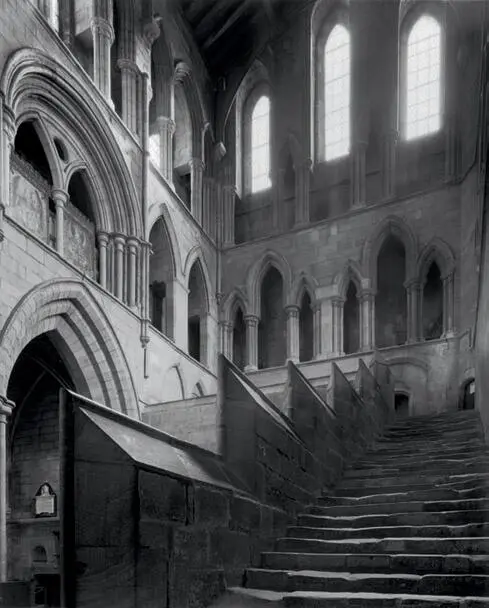
The south transept, with its remarkable stairway, is the only intact portion of this awesome northern England structure. The rest was demolished numerous times in the English/Scottish wars. It’s a wonderful scene with exceptionally high contrast, from the windows at the top of the stairs (with the noonday sun just outside the rightmost window) to the distant alcove at the bottom. Placing the window at nearly Zone 15, and then compacting the contrast range with compensating development of the negative, I retained more than a 10-zone range of the scene on the negative in printable fashion. The print exhibits rich detail and tonal separations everywhere .
Читать дальшеИнтервал:
Закладка:
Похожие книги на «The Art of Photography: An Approach to Personal Expression»
Представляем Вашему вниманию похожие книги на «The Art of Photography: An Approach to Personal Expression» списком для выбора. Мы отобрали схожую по названию и смыслу литературу в надежде предоставить читателям больше вариантов отыскать новые, интересные, ещё непрочитанные произведения.


Обсуждение, отзывы о книге «The Art of Photography: An Approach to Personal Expression» и просто собственные мнения читателей. Оставьте ваши комментарии, напишите, что Вы думаете о произведении, его смысле или главных героях. Укажите что конкретно понравилось, а что нет, и почему Вы так считаете.