Bruce Barnbaum - The Art of Photography - An Approach to Personal Expression
Здесь есть возможность читать онлайн «Bruce Barnbaum - The Art of Photography - An Approach to Personal Expression» весь текст электронной книги совершенно бесплатно (целиком полную версию без сокращений). В некоторых случаях можно слушать аудио, скачать через торрент в формате fb2 и присутствует краткое содержание. Жанр: Старинная литература, на английском языке. Описание произведения, (предисловие) а так же отзывы посетителей доступны на портале библиотеки ЛибКат.

- Название:The Art of Photography: An Approach to Personal Expression
- Автор:
- Жанр:
- Год:неизвестен
- ISBN:нет данных
- Рейтинг книги:5 / 5. Голосов: 1
-
Избранное:Добавить в избранное
- Отзывы:
-
Ваша оценка:
The Art of Photography: An Approach to Personal Expression: краткое содержание, описание и аннотация
Предлагаем к чтению аннотацию, описание, краткое содержание или предисловие (зависит от того, что написал сам автор книги «The Art of Photography: An Approach to Personal Expression»). Если вы не нашли необходимую информацию о книге — напишите в комментариях, мы постараемся отыскать её.
The Art of Photography: An Approach to Personal Expression — читать онлайн бесплатно полную книгу (весь текст) целиком
Ниже представлен текст книги, разбитый по страницам. Система сохранения места последней прочитанной страницы, позволяет с удобством читать онлайн бесплатно книгу «The Art of Photography: An Approach to Personal Expression», без необходимости каждый раз заново искать на чём Вы остановились. Поставьте закладку, и сможете в любой момент перейти на страницу, на которой закончили чтение.
Интервал:
Закладка:
Figure 13-5. Stairway, Hexham Abbey
Myth #4: Negative densities should be within a fixed density range, and negatives that don’t fit into that range are useless
The first three myths directly involve the zone system. This one begins to move away from it, but not by much. It may seem like I’m fixated on the zone system, but I don’t really think about it much in my own work because it’s part of me. Just as you drive without thinking about driving, you can afford the luxury of not thinking about the zone system once you learn it. To use it properly, you’ve got to understand it so thoroughly that it’s instinctive.
I’ve already pointed out that I use the full range of the negative. I don’t expect all of my negatives to have the same density range, and they don’t! Some people would say, “They’re all over the board!” That’s absolutely correct. Let’s clarify this with a few examples.
Examples #1 and #2
Suppose I enter an old growth forest on a typically cloudy day in the Pacific Northwest, somewhere near my home. I can do an average reading on the forest and give it normal development, getting a range of tonalities from Zone 4 to Zone 8. (Remember, we’re going higher on the scale for better shadow separations than the usual Zone 3–7 spread.) Let’s forget about exposing this negative from Zone 3 to Zone 7, even if those are the tones desired in the final print (Myth #3). So, this negative now has a standard density range of Zone 4 to Zone 8. We’ll call this example #1.
Suppose I have a different idea for this scene: I want it to look light, ethereal, and very dreamlike. The contrast range is the same, so suppose I expose this negative with a spread from Zone 8 to Zone 12. Then I give that negative extreme minus development, or even compensating development, to radically reduce the high densities. The exposed Zone 12 drops down to about Zone 8½ or 9, while the darkest part of the scene drops from Zone 8 to about Zone 5½ or 6. (I’m not being exact here, but just using educated guesses. But then, I’m never exact! I fully expect to manipulate the print by dodging, burning, bleaching, etc., in the darkroom anyway, so exactness doesn’t matter.)
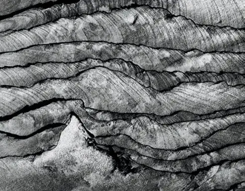
This flat sandstone formation in Phipps Wash, Utah struck me as a highly stylized, snow-covered mountain summit with rows of rolling hills trailing off behind it. Contrast was low, less than a zone from the brightest to the darkest portion. I increased contrast to the maximum extent in negative development, then printed at the highest possible contrast level (170 units of magenta filtration) followed by minor amounts of bleaching .
Figure 13-6. Summit and Rolling Hills
Now I have a contrast spread of a little less than three zones, from about Zones 6–9 instead of Zones 8–12. If I print those values just a half zone lower, I’ll end up with a high key, dreamy scene where the tones range from something lighter than a gray card all the way up to near-whites. Can you envision this hypothetical print? The negative that produces it is vastly different from the Zone 4–8 spread of the previous example. We’ll call this example #2.
Example #1 is pure realism. Example #2 is pure fantasy. Both are legitimate. Both express a feeling about the place, but example #2 almost creates a new world out of the one I encountered. Its negative densities are all quite high, starting from an initial exposure that is substantially higher.
Example #3
I’m photographing in one of the English cathedrals. A distant stained glass window is eight zones brighter than a dark alcove off to the side. The rest of the cathedral is much darker than the window but brighter than the alcove. The distant window, along with others, is the source of the interior light. My goal is to render everything visible, with detail from the stained glass window to the dark alcove. If I place the alcove at Zone 4½, the window falls at Zone 12½. The rest of the interior architecture lies between Zones 5½ and 7½. Because the cathedral is rather dark, and I’ve closed my aperture for maximum depth of field, I need a long exposure. Then reciprocity failure forces even higher contrast (see Chapter 9).
The highlight is so sensitized to light during the exposure that I give the negative compensating development (Figure 13-7). This brings the window down in density from the exposed Zone 14 to perhaps Zone 10 in the developed negative. The alcove, too, drops in value to Zone 3½ or so, while the rest of the interior ends up around Zone 4 to Zone 6. This negative is moderately thin to average, except for the very dense window area.
Example #4
I find a flat rock with fascinating patterns that speak volumes to me. Contrast is very low—perhaps just one zone of difference between the darkest and brightest portion of the rock—so I want to increase the inherent contrast as much as possible (Figure 13-6). If I underexpose and overdevelop, I can’t increase contrast much because the low zones don’t expand during extended development. So I expose normally and then overdevelop, an approach that I find far more effective than underexposing before overdeveloping.
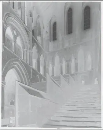
Note the high density of the three windows at the south transept and the relative thinness of the rest of the negative. However, detail with density separations is there throughout, as can be seen in Figure 13-5 .
Figure 13-7. Negative of Stairway, Hexham Abbey
If I place the average tones of the image around Zone 5 and give the negative maximum development to increase contrast, the average zone will end up around Zone 7 or 7½ with highlights near or above Zone 9. There may be a spread of 2–3 zones from the densest to the thinnest portions of the negative. This means that the negative may have values of roughly Zone 6 to Zone 9. This negative (Figure 13-8) is considerably denser on average than that of Stairway, Hexham Abbey (Figure 13-7), yet its greatest density is about as dense as the windows in that negative (compare Figure 13-7 and Figure 13-8).
These two negatives have very different average densities and ranges. I can print example #3 by exposing the negative under the enlarger for the interior architecture and then burning the window, which otherwise would be blank white. For example #4, I’d print the average tonalities farther down on the tonal scale but use the highest contrast enlarging filter to further increase the contrast on the rock—contrast that I already partially expanded via extended negative development. Ultimately, the two prints will each have light and life throughout.
All four of these examples are good negatives, and all vary greatly from one another in density. Each one is designed to express my point of view about the world I’ve seen or the world I’m creating. Creating something different from reality is not only perfectly valid, but also wonderfully desirable. I couldn’t make the photographs I want to make if all of my negatives had to be within a standard range.
Negative densities should be whatever they have to be. They should allow you to say what you want to say. Obviously, if you want to do a realistic version of a wintry snow scene in bright sunlight, you’ll end up with a denser negative than if you want a realistic version of an open pit coal mine on a cloudy day. Those two perfectly realistic photographs will have to come from negatives that are quite different in average density. So, even within the realm of pure realism, there is no reason to expect all negatives to land within a fixed range of densities.
Читать дальшеИнтервал:
Закладка:
Похожие книги на «The Art of Photography: An Approach to Personal Expression»
Представляем Вашему вниманию похожие книги на «The Art of Photography: An Approach to Personal Expression» списком для выбора. Мы отобрали схожую по названию и смыслу литературу в надежде предоставить читателям больше вариантов отыскать новые, интересные, ещё непрочитанные произведения.


Обсуждение, отзывы о книге «The Art of Photography: An Approach to Personal Expression» и просто собственные мнения читателей. Оставьте ваши комментарии, напишите, что Вы думаете о произведении, его смысле или главных героях. Укажите что конкретно понравилось, а что нет, и почему Вы так считаете.