Bruce Barnbaum - The Art of Photography - An Approach to Personal Expression
Здесь есть возможность читать онлайн «Bruce Barnbaum - The Art of Photography - An Approach to Personal Expression» весь текст электронной книги совершенно бесплатно (целиком полную версию без сокращений). В некоторых случаях можно слушать аудио, скачать через торрент в формате fb2 и присутствует краткое содержание. Жанр: Старинная литература, на английском языке. Описание произведения, (предисловие) а так же отзывы посетителей доступны на портале библиотеки ЛибКат.

- Название:The Art of Photography: An Approach to Personal Expression
- Автор:
- Жанр:
- Год:неизвестен
- ISBN:нет данных
- Рейтинг книги:5 / 5. Голосов: 1
-
Избранное:Добавить в избранное
- Отзывы:
-
Ваша оценка:
The Art of Photography: An Approach to Personal Expression: краткое содержание, описание и аннотация
Предлагаем к чтению аннотацию, описание, краткое содержание или предисловие (зависит от того, что написал сам автор книги «The Art of Photography: An Approach to Personal Expression»). Если вы не нашли необходимую информацию о книге — напишите в комментариях, мы постараемся отыскать её.
The Art of Photography: An Approach to Personal Expression — читать онлайн бесплатно полную книгу (весь текст) целиком
Ниже представлен текст книги, разбитый по страницам. Система сохранения места последней прочитанной страницы, позволяет с удобством читать онлайн бесплатно книгу «The Art of Photography: An Approach to Personal Expression», без необходимости каждый раз заново искать на чём Вы остановились. Поставьте закладку, и сможете в любой момент перейти на страницу, на которой закончили чтение.
Интервал:
Закладка:
Many of my slit canyon images contain areas of non-textural black, but this one retains detail throughout because the lines and forms in the dark areas work so well with the fabulous forms in the central bright strip. My initial contact proof, made at low contrast, failed to show shadow detail, although the negative has good densities and separations throughout. Although I exposed the negative in 1984, I avoided printing it because I repeatedly looked at the contact proof, not the negative. But a look at it in 2002 told me that all the detail was there, so I finally printed it 18 years later .
Figure 13-3. Oscillations, Antelope Canyon
Why does the negative have such a long range when the paper doesn’t? Interestingly, it turns out that the paper emulsion has virtually the same range! The difference is simply how you view the two items. You view a negative by transmitted light. You place a negative on a light box, and light comes through the emulsion so you can see it. When you look at a print, however, the light source is in front of it (and generally, behind you). It goes through the emulsion once on its way to the paper backing, then reflects off the backing and goes through the emulsion a second time before coming to your eye.
Instead of looking at a print with reflected light, try holding it up to a powerful light from behind the print (e.g., a 500-watt floodlight). You’ll see detail in the deepest blacks that will astound you. Now you’re seeing the paper emulsion via transmitted light, the same way you view a negative. In fact, next time you’re printing in the darkroom, inspect your print under white light after you get it into the fixing tray. Look at the deep rich blacks in the print, then hold the wet print up to a bright light (with the light shining through the back of the print from behind). You’ll be amazed at the range of detail within areas you thought were solid black. The paper emulsion equals the range of the negative emulsion (or, at least, comes impressively close to it); but because you see a print with reflected light rather than transmitted light, its range is severely reduced. Therefore, you must develop your negative to a low contrast range to encompass the paper’s limitations.
This is a challenge, but it’s not a problem. When the image is printed well, it looks extremely brilliant with deep blacks, glowing whites, and rich gray tones in between. You can get just what you want in a silver print from a properly exposed and developed negative. And you can do it in an extremely wide range of situations if you initially take advantage of the extraordinary range of contrast that a negative is able to handle. Don’t hesitate to expose negatives into the double-digit zones.
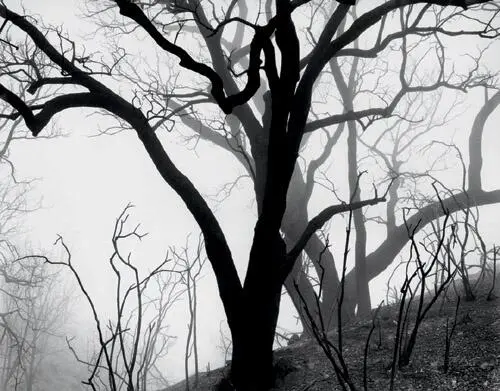
Photographed in thick fog just weeks after the massive 1978 Agoura-Malibu fire, the singed trees take on a cutout character with no detail on the bark. This creates a fascinating design unencumbered by textural detail .
Figure 13-4. Burnt Oak Silhouettes
Most photographers proceed with the certainty that if they expose negatives above Zone 7, they’re getting into rough waters, and if they go above Zone 8, well, lord help them! Above Zone 9, forget it—everything is lost! This is patently absurd. Much of the effort I put into explaining the zone system involves getting students to unlearn the myths that are locked into their thinking. As baseball legend Satchel Paige said, “It ain’t the things you don’t know that hurt you; it’s the things you know that just ain’t so!”
There have been (and still are) well-known teachers who tell students never to expose above Zone 8. Further, they tell people only to develop “normally”. They say that minus development leads to flat prints. They’re wrong. Theirs is a perfectly good approach in open, relatively even lighting situations. But it fails miserably when you get into unusual situations, such as those with extremely high or low contrast. It’s an approach that limits your options. Virtually all of my photographs in the cathedrals or the canyons were exposed with highlights well into the double-digit zones, and nearly all were given minus development ... often compensating development! The prints aren’t flat. They have a rich tonal palette. I’ve also made prints in low contrast situations, such as in fog, that also have a rich tonal palette (Figure 13-4).
My approach is to expand options, not limit them. Using the full range of the negative expands options. Placing unnecessary limits on the range of the negative restricts the locations and/or lighting situations in which you can photograph.
As a final important aside, some people have the strange notion that if there are 10 zones, there must be 10 gray values. Not true. Going from one zone to the next higher zone involves a doubling of exposure (i.e., a full stop of additional exposure). But you can open up a half stop, a third of a stop, a quarter of a stop, etc., to increase exposure only slightly. Each of these choices represents a slightly different gray value. In fact, there are an infinite number of gray values, some so minutely different from the next that the eye cannot differentiate them. That’s why black and-white prints can be so rich. The tonal scale is a smooth continuum, not a set of quantum jumps.
Myth #3: Shadows should be placed at Zone 3 in the zone system
This is an idea about using the zone system that comes from the creator of the zone system himself. Ansel Adams urged photographers to place shadows in Zone 3, but I doubt that he used Zone 3 placement himself. His prints exhibit too much brilliance and illusion of spatial depth to have been given such low placement of shadows in his own negatives.
Let’s look closely at the exposure/density curve (Figure 9-5) to see why Zone 3 placement is too low and why Zone 4 placement turns out to be much better. The toe of the curve is the initial, lower portion of the curve that is rather flat. This part of the curve yields very low density separations on the negative and consequently very low tonal variations on the print. So you don’t want anything important on that part of the curve. (Note the emphasis on “important”.)
The major part of the curve, the so-called “straight line” portion, is not flat. It rises at a steeper angle, indicating that for equal increases in exposure of the negative you get greater density separations in the developed negative than you get in the toe of the curve. Let’s keep that in mind and consider what it means for a print.
Texture in any photograph is made up of small tonal variations in immediately adjacent tones. When you talk about Zone 3 texture or Zone 4 texture, you’re not just talking about a Zone 3 tonality or a Zone 4 tonality; you’re talking about small variations in tonality around that zone that comprise texture.
If you expose a shadow area at Zone 3, some of the densities on your negative are lower than Zone 3 and some are higher, yielding texture. They average to Zone 3. But if some of that texture is at Zone 2½ or less, it’s on the toe of the curve where density separations are lower. Therefore tonal separations in the print are lowered, and the print begins to look flat. The word “flat” perfectly describes the unsatisfactory print you get. The print has the following two main flaws:
It is tonally flat, lacking in the good tonal separations that give it snap.
It is dimensionally or spatially flat because nearly identical tonalities yield prints that lack the appearance of spatial depth.
To avoid the unsatisfactory look and feel of flatness, expose the negative higher on the scale at Zone 4. With higher placement, those portions of the negative higher and lower than Zone 4 are still on the straight line portion of the curve, yielding far better tonal separations in the print.
Читать дальшеИнтервал:
Закладка:
Похожие книги на «The Art of Photography: An Approach to Personal Expression»
Представляем Вашему вниманию похожие книги на «The Art of Photography: An Approach to Personal Expression» списком для выбора. Мы отобрали схожую по названию и смыслу литературу в надежде предоставить читателям больше вариантов отыскать новые, интересные, ещё непрочитанные произведения.


Обсуждение, отзывы о книге «The Art of Photography: An Approach to Personal Expression» и просто собственные мнения читателей. Оставьте ваши комментарии, напишите, что Вы думаете о произведении, его смысле или главных героях. Укажите что конкретно понравилось, а что нет, и почему Вы так считаете.