Bruce Barnbaum - The Art of Photography - An Approach to Personal Expression
Здесь есть возможность читать онлайн «Bruce Barnbaum - The Art of Photography - An Approach to Personal Expression» весь текст электронной книги совершенно бесплатно (целиком полную версию без сокращений). В некоторых случаях можно слушать аудио, скачать через торрент в формате fb2 и присутствует краткое содержание. Жанр: Старинная литература, на английском языке. Описание произведения, (предисловие) а так же отзывы посетителей доступны на портале библиотеки ЛибКат.

- Название:The Art of Photography: An Approach to Personal Expression
- Автор:
- Жанр:
- Год:неизвестен
- ISBN:нет данных
- Рейтинг книги:5 / 5. Голосов: 1
-
Избранное:Добавить в избранное
- Отзывы:
-
Ваша оценка:
The Art of Photography: An Approach to Personal Expression: краткое содержание, описание и аннотация
Предлагаем к чтению аннотацию, описание, краткое содержание или предисловие (зависит от того, что написал сам автор книги «The Art of Photography: An Approach to Personal Expression»). Если вы не нашли необходимую информацию о книге — напишите в комментариях, мы постараемся отыскать её.
The Art of Photography: An Approach to Personal Expression — читать онлайн бесплатно полную книгу (весь текст) целиком
Ниже представлен текст книги, разбитый по страницам. Система сохранения места последней прочитанной страницы, позволяет с удобством читать онлайн бесплатно книгу «The Art of Photography: An Approach to Personal Expression», без необходимости каждый раз заново искать на чём Вы остановились. Поставьте закладку, и сможете в любой момент перейти на страницу, на которой закончили чтение.
Интервал:
Закладка:
Another tip I’d like to offer is that for small white lines or small spots (usually caused by dust or hairs on either the negative or the enlarging paper), a standard #2 or #3 pencil can be very useful for spotting. Sharpen the pencil, and then rub its graphite edge on a piece of scrap paper until the point is a truly very sharp. Then use the pencil for spotting—not with the sharp tip, but with the edge of the graphite tip gently touching the print surface. If you press too hard or use the sharp point, you can indent the print surface. Then gently rub the pencil marks with either a cotton swab or the tip of your finger (make sure it’s a clean swab or finger!) to smooth out the tonality. This method works amazingly well, and I use it often, especially in very light gray areas that require spotting.
Etching is used when a black dot or line mars the image. This is most often caused by a pinhole or a particle of dust or grit that was on the negative at the time of exposure, resulting in a clear area that prints as black. I use an X-ACTO knife to gently— very gently— scrape at the surface of the print and wear away the emulsion (and the silver embedded in it) until the black line is reduced in density to mesh with the surroundings. I apply no pressure to the X-ACTO knife, letting its own weight be the only pressure, but simply guide the blade in a series of short, gentle scrapes. Avoid trying to dig out the black mark and gouging the print in the process.
If the black mark is excessively large, I may attempt to retouch the negative with Kodak’s Opaque—a claylike substance that can be diluted with water and painted directly onto the clear area of the negative emulsion, rendering it opaque. When the negative is printed, the opaque area will print as a white spot that can be retouched with spotting dye without damaging the emulsion. What makes Opaque so attractive is that if you fail to put it on satisfactorily, you can wipe it off completely with a water-moistened Q-tip, allow the negative to dry, and try it again. You can do it incorrectly 150 times and lose nothing but time, and if you do it well the 151st time, you’re done!
Print Finishing
Once the print—black-and-white or color—is spotted, etched, or hand colored, it only needs your signature. Put it on: it’s your print! You should show it and be proud of it. But use restraint. Sign it lightly, not heavily so that it becomes a distraction. I use a No. 6 pencil, which is very hard. I recommend against using a No. 2 or No. 3 pencil, both of which leave a heavy signature that becomes a distracting graphic element.
I prefer signing a print on the mount board, just below the print on the right edge. Generally I place the date of the image below the print on the left edge. There are variations to this basic approach. Some photographers place the name and date together. Some just sign the print, ignoring the date as irrelevant. Few photographers sign the image on the print itself. If the print is not dry mounted, but hinge mounted at the corners and overmatted, it is best to sign the back of the print.
You may want to overmat and frame the print for viewing. Framed prints should be overmatted so that the emulsion of the print is separated from the glass. This is necessary, for alternating periods of humidity and dryness can cause the emulsion to stick to the glass and destroy the print. Glass offers protection from dust and grit damage; though reflections can be a nuisance, well placed lighting can overcome this problem to a great extent.
Please do not use non-glare glass. It places a slight fog across the entire image and slightly blurs sharpness, an effect that becomes pronounced if the print is separated from the glass. Plexiglas is a fine material to use instead of glass. It is lighter in weight and virtually impervious to breakage should the frame fall.
Framing, like mounting, is best if kept simple. It strikes me that this is a consequence of photography’s inherently direct approach. Exceptions exist, of course, such as Marie Cosindas’ color prints that are tastefully presented in ornate frames. But for the most part, such presentations of photography are out of character. For black-and-white photographs, metal sectional frames in brushed or polished aluminum work well; and for color photographs, finishes such as bronze are quite attractive. Plastic or plexiglass frames with thin, black borders are equally attractive. The array of possibilities abound. Just keep it simple and clean—let the photographs do the talking.
Presentation of photographs is a highly subjective matter. Don’t feel compelled to follow my dictates as gospel. Nobody has a corner on the aesthetic market. There are innumerable variations of successful, tasteful presentations. Use the method that suits you best. My only caution is to avoid “arty” presentations that may garner attention, but are devoid of sophistication and are basically silly.
Chapter 13. Exploding Photographic Myths
DESPITE ALL THE PHOTOGRAPHY INSTRUCTION OUT THERE—and too often because of it—a number of patently incorrect ideas persist. These photographic myths must be laid to rest. They push photographers in the wrong direction. Let’s reveal the invalidity of these commonly held beliefs.
Some myths have already been dealt with in this book. By approaching them in a somewhat different manner, and perhaps by imparting a different emphasis to them, this chapter may serve as worthwhile reinforcement. Several of the myth-breakers I will discuss are primarily geared toward traditional black-and-white photography, yet many of the concepts are extremely valuable to both traditional and digital photographers.
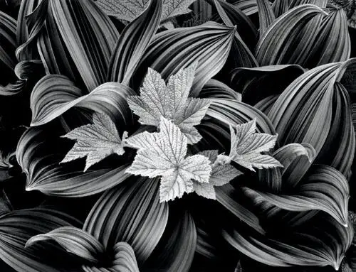
The fascinating relationships between the wild raspberry leaves amidst the surrounding corn lily leaves caught my eye on the Iceberg Lake trail in Glacier National Park. Using my 4 × 5 camera with a 210mm lens, I aimed almost straight down, placing the raspberry leaves directly in the center of the image, making sure the edges were clean, with nothing distracting jutting in or leading the eye out. Does center placement break a well-known rule about composition? You bet it does! This chapter deals with several well-known photographic rules that deserve to be avoided, or better yet, discarded entirely .
Figure 13-1. Raspberry and Corn Lily
Myth #1: The zone system gives you a negative that yields a straight print of exactly what you saw in the field, with no burning or dodging required
This simply isn’t true, but it’s the most widespread misconception about the zone system. It’s wrong because of the following fact: what you see and what the camera sees is quite different.
As you look at a scene, your eyes scan it randomly, jumping from important area to important area, seeing only small bits of the scene sharply at any moment. As your eyes jump from dark areas to bright areas, the irises open to let in more light when you look the dark areas or close down to prevent the full dose when you look at brighter areas. The brain, working in concert with the eyes, further opens up things in dark areas and closes down things in bright areas. In other words, you view every scene at multiple apertures. Without these automatic mechanisms, it could be very painful indeed to look at a bright spot after looking at a dark spot. Think of what it’s like to come out of a darkened restaurant or afternoon movie into the bright sun!
The camera sees the entire scene at one aperture, the aperture you’ve chosen for the image. It cannot change the aperture to accommodate different parts of a scene. Thus, the camera does not allow the film or sensor to see what you see when you look at a scene. A camera is a mechanical/electronic device lacking the automatic features that allow your eyes to open up or close down. No matter how many remarkable features your camera may have, it still can’t do this!
Читать дальшеИнтервал:
Закладка:
Похожие книги на «The Art of Photography: An Approach to Personal Expression»
Представляем Вашему вниманию похожие книги на «The Art of Photography: An Approach to Personal Expression» списком для выбора. Мы отобрали схожую по названию и смыслу литературу в надежде предоставить читателям больше вариантов отыскать новые, интересные, ещё непрочитанные произведения.


Обсуждение, отзывы о книге «The Art of Photography: An Approach to Personal Expression» и просто собственные мнения читателей. Оставьте ваши комментарии, напишите, что Вы думаете о произведении, его смысле или главных героях. Укажите что конкретно понравилось, а что нет, и почему Вы так считаете.