Bruce Barnbaum - The Art of Photography - An Approach to Personal Expression
Здесь есть возможность читать онлайн «Bruce Barnbaum - The Art of Photography - An Approach to Personal Expression» весь текст электронной книги совершенно бесплатно (целиком полную версию без сокращений). В некоторых случаях можно слушать аудио, скачать через торрент в формате fb2 и присутствует краткое содержание. Жанр: Старинная литература, на английском языке. Описание произведения, (предисловие) а так же отзывы посетителей доступны на портале библиотеки ЛибКат.

- Название:The Art of Photography: An Approach to Personal Expression
- Автор:
- Жанр:
- Год:неизвестен
- ISBN:нет данных
- Рейтинг книги:5 / 5. Голосов: 1
-
Избранное:Добавить в избранное
- Отзывы:
-
Ваша оценка:
The Art of Photography: An Approach to Personal Expression: краткое содержание, описание и аннотация
Предлагаем к чтению аннотацию, описание, краткое содержание или предисловие (зависит от того, что написал сам автор книги «The Art of Photography: An Approach to Personal Expression»). Если вы не нашли необходимую информацию о книге — напишите в комментариях, мы постараемся отыскать её.
The Art of Photography: An Approach to Personal Expression — читать онлайн бесплатно полную книгу (весь текст) целиком
Ниже представлен текст книги, разбитый по страницам. Система сохранения места последней прочитанной страницы, позволяет с удобством читать онлайн бесплатно книгу «The Art of Photography: An Approach to Personal Expression», без необходимости каждый раз заново искать на чём Вы остановились. Поставьте закладку, и сможете в любой момент перейти на страницу, на которой закончили чтение.
Интервал:
Закладка:
Let me close this chapter by suggesting an idea that can be of value to black-and-white digital printers. It’s the idea of making a 9-zone step tablet. I don’t use anything like this for my classical printing because I’ve refined my inspection and evaluation of prints in the darkroom (see Chapter 10), but you may find this to be of value at the computer to help correlate the image as it appears on the computer display with the tonalities of the black-and-white print.
To make the step tablet in Photoshop, open a new file (from the File Menu select New), size appropriately (say 4″ × 8″), use the Rectangular Marquee Tool (m) to draw the boundaries of the tablet, select the Gradient Tool (g or Shift+g), set the colors to default (d), and draw a gradient from black to white. Then posterize the image: from the Image Menu select Adjustments and choose Posterize with levels set at 9. You can augment the step tablet by typing the ink percentage on each step using the sampling tool to determine the ink density for each step.
Print the step tablet on the same paper you use for your prints and have it available for reference as you refine your images. You can also paste the tablet onto the edge of an image you are editing for ready reference as you work. Use the sampling tool to compare values in the image to a known density in the step tablet. Note that I have intentionally avoided making recommendations for the placement of values. Objects in grayscale imagery are amenable to an almost unlimited variety of tonal renderings. Regardless of whether the process is traditional or digital, you should feel free to place values as you deem appropriate. The step tablet simply gives the digital photographer tonal references to help visualize the final image.
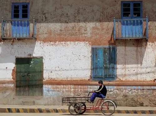
In the town square, just north of Lake Titicaca, I saw the Mondrianesque geometry and colors of the buildings, with the boy on the vendor’s tricycle adding the extra touch to make the photograph sing. I quickly made the digital capture before anything changed .
Figure 11-25. Boy on Tricycle, Moho, Peru
Chapter 12. Presentation
A FINE PHOTOGRAPH deserves an appropriate presentation. The presentation should enhance the photograph without overwhelming or detracting from it. The frame or method of displaying the photograph should not draw attention to itself. The best presentation is understated, simple, and conservative. Showy presentations detract from the image and are needed only if the photograph is inherently weak. I feel that a fine photograph looks best when dry mounted. A dry mounted print has the structural support of the mount board, it lies perfectly flat, and it appears to have been given greater care than an unmounted print.
Corner mounted, overmatted prints have always enjoyed a degree of popularity, but I am somewhat ambivalent to them. Such prints can be made to lay reasonably flat with only a small bow or ripple; and if the mount board is damaged, the print can be easily removed and remounted on a new board. This has obvious advantages, yet I still prefer the look of a smooth, dry mounted print.
Research by the Center for Creative Photography at the University of Arizona shows that all dry mount tissue ever produced in the United States, and all dry mount tissue ever produced anywhere (with the exception of one produced for about 18 months in the 1920s in Czechoslovakia), has a neutral Ph, meaning that none of these can harm the life of the print. Furthermore, the research determined that dry mount tissue forms an impervious barrier between the mount board and the print, which means that dry mounting actually improves the life of any print mounted on a board that is not of archival quality. The hinge mounted or corner mounted print would be in direct contact with the inferior board, placing it in jeopardy of degeneration.
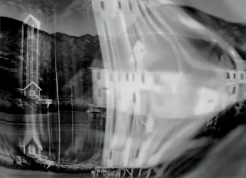
It may be difficult—perhaps impossible—to determine what you’re viewing in this image. That is intentional. Rather than thinking, “What am I looking at?” a more important question to ask yourself is, “Does the image interest or intrigue me?” If the subject is obvious, does it strike you as compelling, exciting, well-conceived? If it’s not obvious, is it sufficiently interesting to hold your attention long enough for you to figure it out, or to just enjoy its mystery without seeking an answer? For any image to attract the viewer, it must be well exposed, well composed, well printed, and well presented. Previous chapters dealt with the first three issues; this chapter discusses the fourth .
Figure 12-1. Dream Distortions, Skrova
On the other hand, suppose a print is dry mounted and stored under somewhat humid conditions, allowing mold to grow on the board. Then you’re stuck! The board is irreparably damaged, and the print is permanently dry mounted to it. Some dry mount tissue claims to be removable when reinserted into the press at a high temperature. I’m skeptical about such claims on two grounds. First, I’ve never met anyone who has successfully dismounted and remounted a print; second, I wonder if the print emulsion would be damaged if the temperature were too high (though I’ve never found studies indicating that this is a problem).
Many digital papers lie quite flat and can be corner mounted and overmatted successfully, especially with computer-driven mat cutters (very expensive, but programmable to within one millimeter). Digital matte papers tend to lie flatter than gloss or semigloss papers, making them the prime candiates for this type of overmatting. I suggest that you research the various options before deciding which way to go with your own work, recognizing that you don’t have to employ the same approach for every photograph. I still dry mount all of my work, for I feel that it finishes the photograph in the best way possible. I discuss my methods fully in the next few pages, but you may settle on a different approach.
To avoid contamination problems, it makes sense to use the finest quality museum mount boards made to archivally permanent standards, and to store them under conditions that won’t allow mold to grow. Most mount boards of this quality are made of cotton fiber (so-called “rag board”) and are manufactured by processes that do not utilize acids. Several manufacturers produce mount board of archival permanence from wood pulp, which is available in white and a multitude of colors. Often the stark white border of archival rag board is incompatible with the color tint of a warm-toned black-and-white photograph, or may be too harsh for a color photograph. Wood pulp products may help alleviate these problems.
For color photographs, matching the color of the mount board to a specific color in the print is virtually impossible, as well as undesirable. It’s preferable to choose a color that is compatible, though not necessarily identical, to colors in the photograph. In general, the mount board’s color should be somewhat muted so as to support, but not dominate, the image. There are exceptions to this rule (as there always are!), but they must be employed with a keen sense of overall design and visual impact. I prefer off-white, such as antique white, as the color for the mount or overmat of my color images. The softer white does not call attention to itself, and it’s more compatible with the softer white of the color print papers (which are invariably softer than those of black-and-white papers).
For black-and-white photographs, white mount boards are universally accepted for fine art prints by galleries, museums, and collectors—virtually to the exclusion of any other color. This is a carryover from historical precedence in which the only archival mount board was the cotton fiber in pure white. Today, however, colored boards—particularly neutral gray—can be especially attractive because the brightest white of the print will not compete with the white of the mount board. The biggest stumbling block I have encountered with colored boards is lack of acceptance by galleries, museums, and collectors who are reluctant to break with tradition. I think this is shortsighted and unfortunate, because some images simply look better on colored mounts. In any case, I continue to mount on traditional white board because I would rather have viewers look at my images rather than question my choice of board. Perhaps greater flexibility will gain acceptance in time.
Читать дальшеИнтервал:
Закладка:
Похожие книги на «The Art of Photography: An Approach to Personal Expression»
Представляем Вашему вниманию похожие книги на «The Art of Photography: An Approach to Personal Expression» списком для выбора. Мы отобрали схожую по названию и смыслу литературу в надежде предоставить читателям больше вариантов отыскать новые, интересные, ещё непрочитанные произведения.


Обсуждение, отзывы о книге «The Art of Photography: An Approach to Personal Expression» и просто собственные мнения читателей. Оставьте ваши комментарии, напишите, что Вы думаете о произведении, его смысле или главных героях. Укажите что конкретно понравилось, а что нет, и почему Вы так считаете.