Mark Middlebrook - AutoCAD 2005 for Dummies
Здесь есть возможность читать онлайн «Mark Middlebrook - AutoCAD 2005 for Dummies» — ознакомительный отрывок электронной книги совершенно бесплатно, а после прочтения отрывка купить полную версию. В некоторых случаях можно слушать аудио, скачать через торрент в формате fb2 и присутствует краткое содержание. Город: Indianapolis, Год выпуска: 2004, ISBN: 2004, Издательство: Wiley Publishing, Inc, Жанр: Программы, на английском языке. Описание произведения, (предисловие) а так же отзывы посетителей доступны на портале библиотеки ЛибКат.
- Название:AutoCAD 2005 for Dummies
- Автор:
- Издательство:Wiley Publishing, Inc
- Жанр:
- Год:2004
- Город:Indianapolis
- ISBN:0-7645-7138-9
- Рейтинг книги:5 / 5. Голосов: 1
-
Избранное:Добавить в избранное
- Отзывы:
-
Ваша оценка:
AutoCAD 2005 for Dummies: краткое содержание, описание и аннотация
Предлагаем к чтению аннотацию, описание, краткое содержание или предисловие (зависит от того, что написал сам автор книги «AutoCAD 2005 for Dummies»). Если вы не нашли необходимую информацию о книге — напишите в комментариях, мы постараемся отыскать её.
AutoCAD is more than just another application program, it’s a complete environment for drafting and design. So if you’re new to AutoCAD, you need to know several things to get off to a good start — especially how to use the command line area and set up your drawing properly. These key techniques are described in this part of the book.
If you’ve used earlier versions of AutoCAD, you’ll be most interested in the high points of the new release, including some newer interface components. The lowdown on what’s new is here, too.
AutoCAD 2005 for Dummies — читать онлайн ознакомительный отрывок
Ниже представлен текст книги, разбитый по страницам. Система сохранения места последней прочитанной страницы, позволяет с удобством читать онлайн бесплатно книгу «AutoCAD 2005 for Dummies», без необходимости каждый раз заново искать на чём Вы остановились. Поставьте закладку, и сможете в любой момент перейти на страницу, на которой закончили чтение.
Интервал:
Закладка:
It’s okay to use a TrueType font sparingly for something like a title block logo, but in general, you should stick with standard AutoCAD SHX fonts whenever possible.
 The most popular AutoCAD font is ROMANS.SHX (Roman Simplex). (You may also run into SIMPLEX.SHX, an older version of Roman Simplex.) ROMANS.SHX is a good, general-purpose font for drafting in AutoCAD. Avoid complicated, thick fonts. They can slow down AutoCAD, and they’re usually more difficult to read than the simpler fonts. Remember, you’re doing CAD here — not fancy graphic design or reproduction of medieval manuscripts!
 Whenever possible, avoid custom fonts, which are font files that don’t come with AutoCAD or AutoCAD LT (both programs come with the same fonts). AutoCAD installs its standard SHX fonts into the C:\Program Files\AutoCAD 2005\Fonts folder — as long as you haven’t added any custom fonts to that folder, you can refer to it for a list of standard fonts. If you use a custom font, exchanging your drawings with other people will be more complicated. If you’re compelled to use a custom font, make a note of it and remember either to send it whenever you send the DWG file (assuming that the font isn’t copyrighted, which many custom fonts are) or to warn the recipients that the text will appear different on their systems. It’s far less hassle to eschew custom fonts altogether. See Chapter 16 for additional information about how to deal with fonts when you send and receive drawings.
The following steps describe how to select an existing text style or create a new one before you enter text into a drawing. (If you want to experiment with an existing drawing that contains a variety of text styles, you can use \Program Files\AutoCAD 2005\Sample\Hummer Elevation.dwg.)
1. Choose Format→ Text Style.
The Text Style dialog box appears, as shown in Figure 9-1.
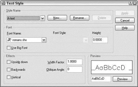
Figure 9-1:Text with style.
2. In the Style Name drop-down list, select each style in turn to see what text styles have been created in this drawing.
Note the font name and look at the Preview panel to get a feel for what the different fonts look like.
3. If you find a suitable text style, select it in the Style Name drop-down list and then skip to Step 9.
What constitutes a suitable text style depends on industry practices, office standards, and personal preferences about how the text should look. The information in preceding sections may help you decide. If not, ask an experienced drafter in your office or look at some printed drawings and try to match the text on those.
The selected text style name becomes the current style.
4. If you don’t find a suitable text style, or if you prefer to create your own text style, click New.
The New Text Style dialog box appears, with an edit box for you to type a name.
5. Type a name for your new text style and then click OK.
Your new text style is added to the Style Name list and becomes the current style.
6. Choose a font from the Font Name list.
ROMANS.SHX is the best all-purpose font for most drafting work. If you’d like to use a different font, review the font suggestions and warnings in the previous section.
The font that you choose becomes the font that’s assigned to your new text style.
7. Set the remaining text style settings as shown in Figure 9-1: Height=0.0, Width Factor=1.0, Oblique Angle=0.0, and all four check boxes unchecked.
A text style height of 0.0 makes the style variable height, which means that you can specify the height separately for each single-line text object. Assigning a fixed (that is, nonzero) height to a text style forces all singleline text using the style to be the same height. Variable height styles are more flexible, but fixed height styles usually make it easier to draw text of consistent height. The decision to use variable height versus fixed height styles is another aspect of text that depends on office practice, so if you work with other AutoCAD users, ask around.
8. Click Apply.
9. Click Close.
The Text Style dialog box closes, and the text style that you selected or created is now the current style for new text objects.
In Chapter 3, I describe the importance of choosing an appropriate drawing scale when you set up a drawing. I warn you that you need to know the drawing scale factor for tasks described in other chapters of this book. This is one of those chapters, and I’m about to explain one of those tasks!
 Drawing scale is the traditional way of describing a scale with an equal sign or colon — for example ¼”=1’–0”, 1:20, or 2:1. The drawing scale factor represents the same relationship with a single number such as 48, 20, or 0.5. The drawing scale factor is the multiplier that converts the first number in the drawing scale into the second number.
One of the things that distinguishes knowledgeable CAD users is that they always know the drawing scale factor of any drawing they’re working on. Make it a point to determine the drawing scale factor of a drawing before you add text to it.
“Why do I need to know the drawing scale factor in order to draw text?,” you may ask — especially if you’ve spent time “on the boards,” as we grizzled old-timers like to call manual drafting. You need to know the drawing scale factor because you handle scaling of objects and text in CAD opposite from the way you do in manual drafting.
In manual drafting, you squeeze real-world objects (the building, widget, or whatever) down by a specific scale factor, like 10 or 48, so that they fit nicely on a sheet of paper. Naturally, you always draw text the size that you want it to appear on the paper (for example, ⅛ inch or 3 mm high), regardless of the scale of the drawing.
In CAD drafting, you draw objects as if they were at their actual size. Then, when you plot, you shrink — or, if you make drawings of tiny things such as microprocessor circuitry, expand — the entire drawing by that same scale factor (for example, 10 or 48) to fit on the paper. When you shrink the whole drawing to fit on the paper, text shrinks, too. To avoid indecipherably small text, or incredibly large text, you must create text at a size that’s scaled appropriately by the drawing scale factor. (If you’re an architect, imagine that your text is neon lettering on the side of the building. If you’re a mechanical designer, think of a brand name stamped on the side of a screw.)
For example, assume that someone has drawn a widget at a scale of 1:20 (corresponding to a drawing scale factor of 20), and you want your notes to appear 3 mm high when the drawing is plotted to scale. You need to create text that’s 20 times 3 mm, or 60 mm, high. In a building plan drawn at a scale of ¼”=1’–0” (drawing scale factor equals 48), text that will appear ⅛ inch when plotted needs to be ⅛ inch times 48, or 6 inches, high.
Читать дальшеИнтервал:
Закладка:
Похожие книги на «AutoCAD 2005 for Dummies»
Представляем Вашему вниманию похожие книги на «AutoCAD 2005 for Dummies» списком для выбора. Мы отобрали схожую по названию и смыслу литературу в надежде предоставить читателям больше вариантов отыскать новые, интересные, ещё непрочитанные произведения.


Обсуждение, отзывы о книге «AutoCAD 2005 for Dummies» и просто собственные мнения читателей. Оставьте ваши комментарии, напишите, что Вы думаете о произведении, его смысле или главных героях. Укажите что конкретно понравилось, а что нет, и почему Вы так считаете.