Won Y. Yang - Applied Numerical Methods Using MATLAB
Здесь есть возможность читать онлайн «Won Y. Yang - Applied Numerical Methods Using MATLAB» — ознакомительный отрывок электронной книги совершенно бесплатно, а после прочтения отрывка купить полную версию. В некоторых случаях можно слушать аудио, скачать через торрент в формате fb2 и присутствует краткое содержание. Жанр: unrecognised, на английском языке. Описание произведения, (предисловие) а так же отзывы посетителей доступны на портале библиотеки ЛибКат.
- Название:Applied Numerical Methods Using MATLAB
- Автор:
- Жанр:
- Год:неизвестен
- ISBN:нет данных
- Рейтинг книги:5 / 5. Голосов: 1
-
Избранное:Добавить в избранное
- Отзывы:
-
Ваша оценка:
Applied Numerical Methods Using MATLAB: краткое содержание, описание и аннотация
Предлагаем к чтению аннотацию, описание, краткое содержание или предисловие (зависит от того, что написал сам автор книги «Applied Numerical Methods Using MATLAB»). Если вы не нашли необходимую информацию о книге — напишите в комментариях, мы постараемся отыскать её.
Applied Numerical Methods Using MATLAB®, Second Edition Provides examples and problems of solving electronic circuits and neural networks Includes new sections on adaptive filters, recursive least-squares estimation, Bairstow's method for a polynomial equation, and more Explains Mixed Integer Linear Programing (MILP) and DOA (Direction of Arrival) estimation with eigenvectors Aimed at students who do not like and/or do not have time to derive and prove mathematical results
is an excellent text for students who wish to develop their problem-solving capability without being involved in details about the MATLAB codes. It will also be useful to those who want to delve deeper into understanding underlying algorithms and equations.
Applied Numerical Methods Using MATLAB — читать онлайн ознакомительный отрывок
Ниже представлен текст книги, разбитый по страницам. Система сохранения места последней прочитанной страницы, позволяет с удобством читать онлайн бесплатно книгу «Applied Numerical Methods Using MATLAB», без необходимости каждый раз заново искать на чём Вы остановились. Поставьте закладку, и сможете в любой момент перейти на страницу, на которой закончили чтение.
Интервал:
Закладка:
The graph is constructed by connecting the data points with the straight lines and is piecewise‐linear (PWL), while it looks like a curve as the data points are densely collected. Note that the graph can be plotted as points in various forms according to the optional input argument described in Table 1.2.
1 (Q1) Suppose the data in the array named ‘temp’ are the highest/lowest temperatures measured on the 11th, 12th, 14th, 16th, and 17th days, respectively. How should we modify the above script to have the actual days shown on the horizontal axis?
2 (A1) Just make the day vector [11 12 14 16 17] and use it as the first input argument of the ‘ plot()’ command.>days=[11 12 14 16 17]; plot(days,temp)Running these statements yields the graph in Figure 1.1b.
3 (Q2) How do we change the ranges of the horizontal/vertical axes into 10–20 and 0–30, respectively, and draw the grid on the graph?
4 (A2)>axis([10 20 0 30]), grid on
5 (Q3) How can we change the range of just the horizontal or vertical axis, separately?
6 (A3)>xlim([11 17]); ylim([0 30])
7 (Q4) How do we make the scales of the horizontal/vertical axes equal so that a circle appears round, not like an ellipse?
8 (A4)>axis('equal')
9 (Q5) How do we fix the tick values and their labels of the horizontal/vertical axes?
10 (A5)>set(gca,'xtick',[11:3:17],'xticklabel',{'11','14','17'}) >set(gca,'ytick',[5:5:15],'yticklabel',{'5','15','25'})where gca is the current (figure) axis and gcf is the current figure handle.
11 (Q6) How do we have another graph overlapped onto an existing graph?
12 (A6) If you run the ‘ hold on’ command after plotting the first graph, any following graphs in the same section will be overlapped onto the existing one(s) rather than plotted newly. For example:>hold on, plot(days,temp(:,1),'b*', days,temp(:,2),'ro') This will be good until you issue the command ‘ hold off’ or clear all the graphs in the graphic window by using the ‘ clf’ command.
Table 1.2Graphic line specifications used in the ‘ plot()’ command.
| Line type | Point type (marker symbol) | Color | |||||||||
‐ |
Solid line | · | Dot | + | Plus | * | Asterisk | r: |
Red | m: |
Magenta |
: |
Dotted line | ̂: |
Δ | >: |
> | o |
Circle | g: |
Green | y: |
Yellow |
‐‐ |
Dashed line | p: |
* | v: |
∇ | x: |
x‐Mark | b: |
Blue | c: |
Cyan (sky blue) |
‐. |
Dash‐dot | d: |
⋄ | <: |
< | s:□ |
Square | k: |
Black |
Sometimes we need to see the inter‐relationship between two variables. Suppose we want to plot the lowest/highest temperature, respectively, along the horizontal/vertical axis in order to grasp the relationship between them. Let us try using the following command:
>plot(temp(:,1),temp(:,2),'kx') % temp(:,2) vs. temp(:,1) in black 'x'
This will produce a point‐wise graph like Figure 1.2a, which is fine. But if you replace the third input argument by 'b‐'or just omit it to draw a PWL graph connecting the data points like Figure 1.2b, the graphic result looks clumsy, because the data on the horizontal axis are not arranged in ascending or descending order. The graph will look better if you sort the data on the horizontal axis and also the data on the vertical axis accordingly and then plot the relationship in the PWL style by running the following MATLAB statements:
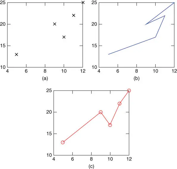
Figure 1.2Examples of graphs obtained using the ‘ plot()’ command. (a) Data not arranged – pointwise, (b) data not arranged – interpolated linearly, and (c) data arranged along the horizontal axis.
>[temp1,I]=sort(temp(:,1)); temp2=temp(I,2); >plot(temp1,temp2)
This will yield the graph like Figure 1.2c, which looks more informative than Figure 1.2b.
We can also use the ‘ plot()’ command to draw a circle.
>r=1; th=[0:0.01:2]*pi; % [0:0.01:2] makes [0 0.01 0.02 .. 2] >plot(r*cos(th),r*sin(th)) >plot(r*exp(j*th)) % Alternatively,
Note that the ‘ plot()’ command with a sequence of complex numbers as its first input argument plots the real/imaginary parts along the horizontal/vertical axis.
The ‘ polar()’ command plots the phase (in radians) and magnitude given as its first and second input arguments, respectively (see Figure 1.3a).
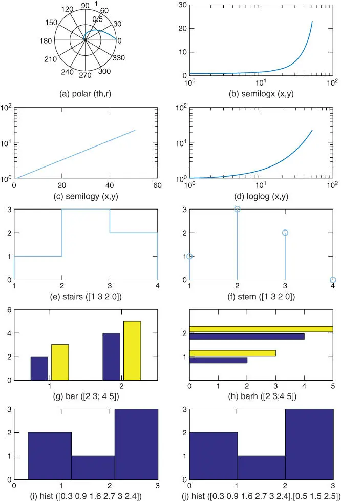
Figure 1.3Graphs drawn by using various graphic commands.
>polar(th,exp(-th)) % polar plot of a spiral
Several other plotting commands, such as ‘ semilogx()’ (with a base 10 logarithmic scale for the x ‐axis), ‘ semilogy()’ (with a base 10 logarithmic scale for the y ‐axis), ‘ loglog()’ (with a base 10 logarithmic scale for both the x ‐axis and the y ‐axis), ‘ stairs()’ (stairstep graph), ‘ stem()’ (discrete graph), ‘ bar()’ /‘ barh()’ (vertical/horizontal bar graph), and ‘ hist()’ (histogram), may be used to draw various graphs (shown in Figure 1.3). Readers may use the ‘ help’ command to get the detailed usage of each one and try running the following MATLAB script “nm01f03.m” to draw various types of graphs.
%nm01f03.m: plot several types of graph th=[0:0.02:1]*pi; subplot(521), polar(th,exp(-th)) % polar graph subplot(522), semilogx(exp(th)) % with a base 10 logarithmic scale for x-axis subplot(523), semilogy(exp(th)) % with a base 10 logarithmic scale for y-axis subplot(524), loglog(exp(th)) % with a logarithmic scale for x-/y-axis subplot(525), stairs([1 3 2 0]) % stairstep graph subplot(526), stem([1 3 2 0]) % discrete graph subplot(527), bar([2 3; 4 5]) % vertical bar graph subplot(528), barh([2 3; 4 5]) % horizontal bar graph y=[0.3 0.9 1.6 2.7 3 2.4]; subplot(529), hist(y,3) % histogram subplot(5,2,10), hist(y,0.5+[0 1 2])
Moreover, the commands ‘ sprintf()’, ‘ text()’, and ‘ gtext()’ are used for combining supplementary statements with the value(s) of one or more variables to construct a string and printing it at a certain location on the existing graph. For instance, let us run the following statements:
>f=1./[1:10]; plot(f) >n=3; [s,errmsg]=sprintf('f(%1d)=%5.2f',n,f(n)) >text(3,f(3),s) %writes the text string at the point (3,f(3)) >gtext('f(x)=1/x') %writes the input string at point clicked by mouse
The command ‘ ginput()’ allows you to obtain the coordinates of a point by clicking the mouse button on the existent graph. Let us try the following commands:
>[x,y,butkey]=ginput %get the x,y coordinates & # of the mouse button or ascii code of the key pressed till pressing the ENTER key >[x,y,butkey]=ginput(n) %repeat the same job for up to n points clicked
Читать дальшеИнтервал:
Закладка:
Похожие книги на «Applied Numerical Methods Using MATLAB»
Представляем Вашему вниманию похожие книги на «Applied Numerical Methods Using MATLAB» списком для выбора. Мы отобрали схожую по названию и смыслу литературу в надежде предоставить читателям больше вариантов отыскать новые, интересные, ещё непрочитанные произведения.


Обсуждение, отзывы о книге «Applied Numerical Methods Using MATLAB» и просто собственные мнения читателей. Оставьте ваши комментарии, напишите, что Вы думаете о произведении, его смысле или главных героях. Укажите что конкретно понравилось, а что нет, и почему Вы так считаете.