A. Gouveia Oliveira - Biostatistics Decoded
Здесь есть возможность читать онлайн «A. Gouveia Oliveira - Biostatistics Decoded» — ознакомительный отрывок электронной книги совершенно бесплатно, а после прочтения отрывка купить полную версию. В некоторых случаях можно слушать аудио, скачать через торрент в формате fb2 и присутствует краткое содержание. Жанр: unrecognised, на английском языке. Описание произведения, (предисловие) а так же отзывы посетителей доступны на портале библиотеки ЛибКат.

- Название:Biostatistics Decoded
- Автор:
- Жанр:
- Год:неизвестен
- ISBN:нет данных
- Рейтинг книги:3 / 5. Голосов: 1
-
Избранное:Добавить в избранное
- Отзывы:
-
Ваша оценка:
Biostatistics Decoded: краткое содержание, описание и аннотация
Предлагаем к чтению аннотацию, описание, краткое содержание или предисловие (зависит от того, что написал сам автор книги «Biostatistics Decoded»). Если вы не нашли необходимую информацию о книге — напишите в комментариях, мы постараемся отыскать её.
Extensive coverage of the design and analysis of experiments for basic science research Experimental designs are presented together with the statistical methods The rationale of all forms of ANOVA is explained with simple mathematics A comprehensive presentation of statistical tests for multiple comparisons Calculations for all statistical methods are illustrated with examples and explained step-by-step. This book presents biostatistical concepts and methods in a way that is accessible to anyone, regardless of his or her knowledge of mathematics. The topics selected for this book cover will meet the needs of clinical professionals to readers in basic science research.
Biostatistics Decoded — читать онлайн ознакомительный отрывок
Ниже представлен текст книги, разбитый по страницам. Система сохранения места последней прочитанной страницы, позволяет с удобством читать онлайн бесплатно книгу «Biostatistics Decoded», без необходимости каждый раз заново искать на чём Вы остановились. Поставьте закладку, и сможете в любой момент перейти на страницу, на которой закончили чтение.
Интервал:
Закладка:
When observations from two independent random variables are added or subtracted, the mean of the resulting variable will be the sum or the subtraction, respectively, of the means of the two variables. In both cases, however, the variance of the new variable will be the sum of the variances of the two variables. The right graph in Figure 1.16shows the result of adding variables A and B . The first result is easy to understand, but the second is not that evident, so we will try to show it by an example.
Suppose we have two sets of strips of paper of varying length. We take one strip from each set and glue them at their ends. When we have glued together all the pairs of strips, we will end up with strips that have lengths that are more variable. This is because, in some cases, we added long strips to long strips, making them much longer than average, and added short strips to short strips, making them much smaller than average. Therefore, the variation of strip length increased. Now, if instead of adding the two strips of paper we cut a variable amount from each strip, we will eventually make large cuts in short strips and small cuts in large strips, again increasing variation.
Note that this result will not hold if the variables are not independent, that is, if they are correlated. Taking the example above, if we decided to always make large cuts in long strips and small cuts in short strips, we would end up with a smaller variance. If we did it the other way around, the final variance would be much larger than the sum of the two variances.
Figure 1.17summarizes the properties of means and variances just described. Means and variances are represented by the letters μ and σ 2of the Greek alphabet.
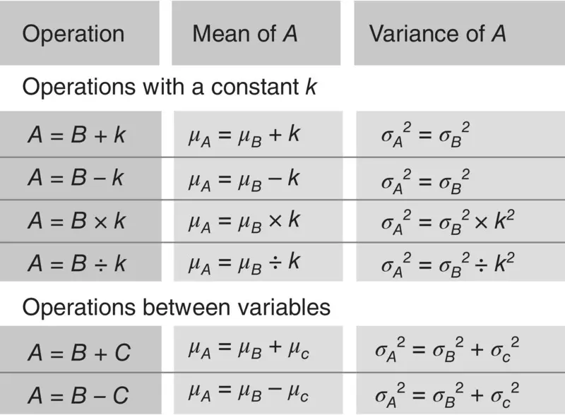
Figure 1.17 Table of mean and variance properties.
1.12 Descriptive Statistics
The central tendency, location, and dispersion measures may be used to describe a collection of data. Those measures are called descriptive statisticsand are used to summarize observations on ordinal and interval attributes. Binary attributes are described by the mean but, as the variance of a binary attribute is determined by the mean, it is not customary to present variances of binary attributes and the usual practice is to present counts.
Descriptive statistics are used to abstract the observations on a sample of the population and they must not be used to infer quantities in populations. From what was said, it is clear that the first thing that must be done when evaluating the results of a research study is, therefore, to abstract the data. To do that, we must first identify the scale of measurement used with each attribute in the dataset, and then we must decide which one is the best method for summarizing the data.
One simple method is the tabulationof the data whereby, for each study variable, we make a list of all the different values found in the dataset and, in front of each one, we write down the number of times it occurred. This is called the absolute frequencyof each value. In order to improve readability, it is customary to also write down the number of occurrences of each value as a percentage of the total number of values, the relative frequency.
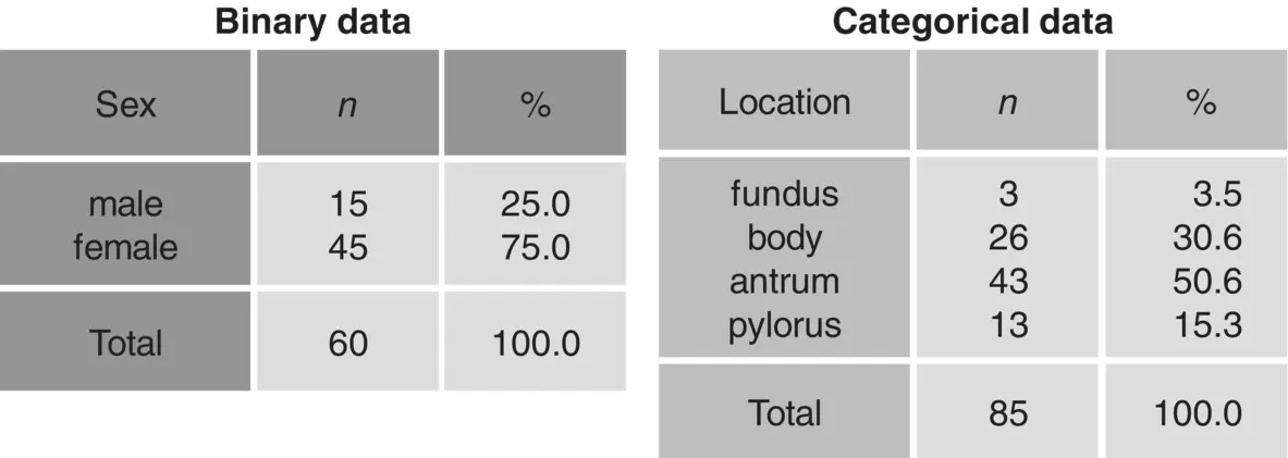
Figure 1.18 Tabulation of nominal data.
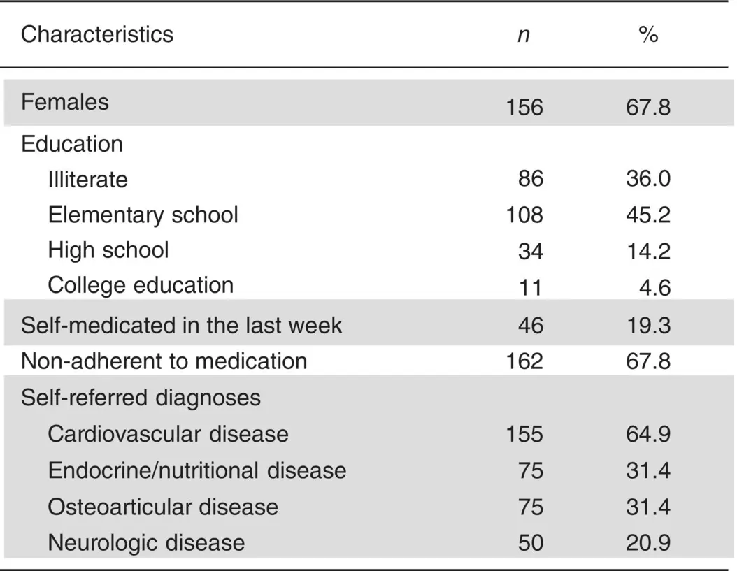
Figure 1.19 Typical presentation of several nominal attributes in a single table.
When we look at a table, such as the ones shown in Figure 1.18, we are evaluating how the individual values are distributed in our sample. Such a display of data is called a frequency distribution.
Tabulations of data with absolute and relative frequencies are the best way of presenting binary and categorical data. Tables are a very compact means of data presentation, and tabulation does not involve any significant loss of information. In the presentation of the results of a research, the usual practice is to present all nominal variables in a single table, as illustrated in Figure 1.19.
In the table, females and self‐medicated are binary attributes. It is convenient in binary variables to present the absolute and relative frequency of just one of the attribute values, because presenting frequencies for the two values would be a redundancy. Education is a categorical variable, but may also be considered an ordinal variable. We know it is categorical because the percentages total 100.0%. Self‐referred diagnosis is a multi‐valued attribute and cardiovascular, endocrine, osteoarticular, and neurologic disease are four binary variables. We know that because the percentages do not sum to 100%, meaning that each subject may have more than one disease.
We can use tables for ordinal and interval data as well, provided the number of different values is not too large. In those tables, we present the values in ascending sort order and write down the absolute and relative frequencies, as we did with binary and categorical data. For each value we can also add the cumulative frequency, or the percentage of observations in the dataset that are equal to or smaller than that value. If the number of values is large, then it is probably better to group the values into larger intervals, as in Figure 1.20, but this will lead to some loss of information. A more convenient way of abstracting interval attributes and ordinal attributes that have many different values is by using descriptive statistics.
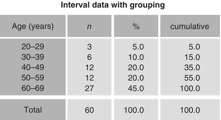
Figure 1.20 Tabulation of ordinal and interval data.
The following are some general rules to guide the description of study samples:
Keep in mind that the idea of using summary statistics is to display the data in an easy‐to‐grasp format while losing as little information as possible.
Begin by understanding what scale of measurement was used with each attribute.
If the scale is binary or categorical, the appropriate method is tabulation, and both the absolute and relative frequencies should always be displayed.
If the scale is ordinal, the mean and standard deviation should not be presented, which would be wrong because arithmetic operations are not allowed with ordinal scales; instead, present the median and one or more of the other measures of dispersion, either the limits, range, or interquartile range.
If the scale is interval, the mean and the standard deviation should be presented unless the distribution is very asymmetrical about the mean. In this case, the median and the limits may provide a better description of the data.
Figure 1.21shows a typical presentation of a table describing the information obtained from a sample of patients with benign prostate hyperplasia. For some attributes, the values are presented separated with a ± sign. This is a usual way of displaying the mean and the standard deviation, but a footnote should state what those values represent. The attributes age, PV, PSA, Q max, and PVR are interval variables, while IPSS, QoL, and IIEF are ordinal variables. We know that because the former have units and the latter do not. We know that AUR is a binary variable because it is displayed as a single value. Adverse events is a multi‐valued attribute and its values are binary variables, and we know that because the percentages do not sum to 100%.
Читать дальшеИнтервал:
Закладка:
Похожие книги на «Biostatistics Decoded»
Представляем Вашему вниманию похожие книги на «Biostatistics Decoded» списком для выбора. Мы отобрали схожую по названию и смыслу литературу в надежде предоставить читателям больше вариантов отыскать новые, интересные, ещё непрочитанные произведения.


Обсуждение, отзывы о книге «Biostatistics Decoded» и просто собственные мнения читателей. Оставьте ваши комментарии, напишите, что Вы думаете о произведении, его смысле или главных героях. Укажите что конкретно понравилось, а что нет, и почему Вы так считаете.