Thomas N. Bulkowski - Encyclopedia of Chart Patterns
Здесь есть возможность читать онлайн «Thomas N. Bulkowski - Encyclopedia of Chart Patterns» — ознакомительный отрывок электронной книги совершенно бесплатно, а после прочтения отрывка купить полную версию. В некоторых случаях можно слушать аудио, скачать через торрент в формате fb2 и присутствует краткое содержание. Жанр: unrecognised, на английском языке. Описание произведения, (предисловие) а так же отзывы посетителей доступны на портале библиотеки ЛибКат.

- Название:Encyclopedia of Chart Patterns
- Автор:
- Жанр:
- Год:неизвестен
- ISBN:нет данных
- Рейтинг книги:3 / 5. Голосов: 1
-
Избранное:Добавить в избранное
- Отзывы:
-
Ваша оценка:
Encyclopedia of Chart Patterns: краткое содержание, описание и аннотация
Предлагаем к чтению аннотацию, описание, краткое содержание или предисловие (зависит от того, что написал сам автор книги «Encyclopedia of Chart Patterns»). Если вы не нашли необходимую информацию о книге — напишите в комментариях, мы постараемся отыскать её.
, Third Edition expands upon Bulkowski's immensely popular Second Edition with fully revised and updated material on chart patterns. Whether you’re new to the stock market or an experienced professional trader, use this book as a reference guide to give you an edge.
Within the pages of this book, you’ll learn how to identify chart patterns, supported by easy-to-understand performance statistics describing how well a pattern works, what the failure rate is, and what special quirks suggest better future performance. You’ll discover how often a stop loss order will trigger at various locations within a chart pattern, how the chart pattern’s performance has evolved over the past three decades, and how to profit from failure by trading busted patterns.
This broadened and revised
offers investors the most comprehensive, up-to-date guide to this popular method of market analysis. Written by a leading expert on chart patterns, Tom Bulkowski, this edition includes revised statistics on 75 chart patterns including 23 new ones, with pictures and performance statistics, packaged within easy-to-read text.
Gain essential knowledge of chart patterns and how they are used to predict price movements in bull and bear markets New tables include how often stops are hit, busted pattern performance, performance over the decades, and special pattern features Joining Tour, Identification Guidelines, Focus on Failures, Statistics, Trading Tactics and Sample Trade is Experience. It puts you in the passenger’s seat so you can share lessons learned from Bulkowski's trades This edition reports on statistics from nearly four times the number of samples used in the Second Edition and ten times the number in the , Third Edition further solidifies the reputation of this book as the leading reference on chart patterns, setting it far above the competition.
Encyclopedia of Chart Patterns — читать онлайн ознакомительный отрывок
Ниже представлен текст книги, разбитый по страницам. Система сохранения места последней прочитанной страницы, позволяет с удобством читать онлайн бесплатно книгу «Encyclopedia of Chart Patterns», без необходимости каждый раз заново искать на чём Вы остановились. Поставьте закладку, и сможете в любой момент перейти на страницу, на которой закончили чтение.
Интервал:
Закладка:
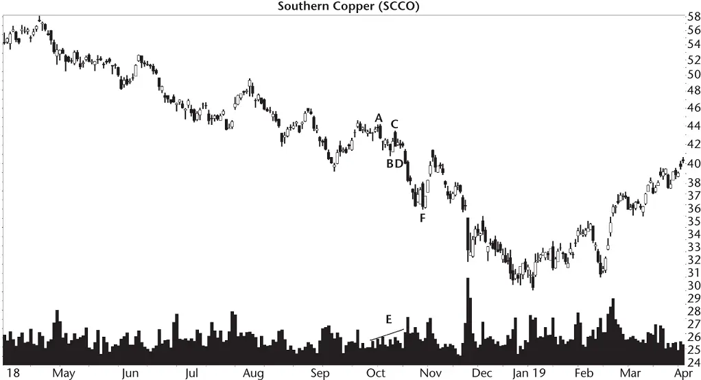
Figure 3.3 This bullish AB=CD has price falling through the predicted turning at D.
Point D is where the stock is supposed to bottom and turn upward, but it doesn't. It's obvious that the height of CF is much taller than AB, but the height can vary depending on the Fibonacci numbers used in construction of the pattern. The turn at D should be at 40.05, and yet the stock continues lower.
This type of failure happens often, 62% of the time in bull markets and 67% of the time in bear markets. Let me also say that this high failure rate may be due to the model I used. Your software may find patterns that perform better than the ones I found.
Another way the pattern fails is if the stock doesn't make it down to D. It turns before the predicted target, leaving you waiting to buy the stock with a fist full of money. Fortunately, this type of failure is exceedingly rare.
Finally, the pattern can also fail if it does make it down to D and it does turn at D, but the rise isn't high enough to make money. These types of failures are what I call 5% failures and describe them in Table 3.2as the breakeven failure rate. Let's check the statistics to see what we can learn about this pattern.
Statistics
Table 3.2shows the first batch of statistics for the bullish AB=CD.
Number found.I found over 2,300 patterns, sorted by market condition, in 1,069 stocks from July 1991 to February 2020. I told my program to limit the number found so it didn't overload my spreadsheet. Not all stocks covered the entire period, and some no longer trade.
Breakeven failure rate.The failure rate (a measure of how many patterns failed to see price climb more than 5%) is quite good, averaging between 3% and 12% of those patterns that reached D and reversed there. To put it another way, if you were to trade a lot of these patterns perfectly, you'd have an 88% chance of seeing price rise more than 5% above the low at D. That's terrific.
Average rise after D.I measured the average rise from the low at D for those patterns reaching D and turning upward. The average rise is disappointing. Non‐Fibonacci‐based patterns in bull markets perform better, averaging 42.4%. However, bear markets beat non‐Fib patterns with the rise averaging 30.5% compared to 28.1%, respectively.
Table 3.2General Statistics
| Description | Bull Market | Bear Market |
|---|---|---|
| Number found | 1,741 | 565 |
| Breakeven failure rate | 11.6% | 3.7% |
| Average rise after D | 38.4% | 30.5% |
| Volume trend | 53% Upward | 57% Upward |
| Performance Up/Down volume | 40%U, 37%D | 33%U, 27%D |
Volume trend, performance.Volume trends upward slightly more often than downward, as the table shows. You can improve performance by looking at the volume trend. I used linear regression to determine if volume was trending upward or downward from the start to end of the pattern (A to D). Often you can just look at volume to see the trend.
Both markets see an improvement in performance if volume trends higher. To put it another way, a downward volume trend hurts performance.
Trading Tactics
Imagine if you found a pattern that could predict when the stock is going to turn. That's what I had hoped for this pattern. Once you know that the stock had bottomed, you could buy and ride it higher.
Does the stock really turn when it's supposed to and how high does the stock rise? Let's find out. Table 3.3shows statistics regarding the behavior of price after the pattern ends.
How often does price reach or exceed D?If you use the pattern to predict turn D, then price will hit the target nearly all of the time. The 100% hit rate in bull markets is a round‐off thing. I found three patterns out of 1,741 where the stock failed to drop down to the calculated D. So it does fail to reach D, but it's very rare. That's the good news (it reaches D).
Table 3.3 Price Move after Pattern End
| Description | Bull Market | Bear Market |
|---|---|---|
| How often does price reach or exceed D? | 100% | 99% |
| How often does price turn at D? | 38% | 33% |
| How often does D appear within a week of calculated time? | 50% | 47% |
| How many rise to point A? | 40% | 22% |
| How many rise to point B? | 83% | 80% |
| How many rise to point C? | 47% | 33% |
How often does price turn at D?Here's where the pattern stumbles. For those stocks dropping to D, only about a third will turn when they are supposed to. Figure 3.3shows an example of this when price ignores D and continues lower to bottom at F.
How often does D appear within a week of calculated time?Using the first three turns to predict the time when turn D will appear works about half the time. It could be better, but sometimes having a clue when something will happen can improve your trading. Use this idea just like I explain with price in the Identification Guidelines. That is, find the ratio between the time to move from B to C compared to the time to move from A to B. Point D should appear following the formula, (C – B)/Ratio + C, where ratio is the number you just found.
I'll discuss an example of this in the Sample Trade.
How many rise to…?For those patterns seeing price drop to D and turn upward, how far does price rise? The answer to that question is vital for swing traders.
I used the pattern's turns to gauge success. Point B is closest to turn D, and we see price climb that far 83% of the time in bull markets. That's very good.
Use A, which is at the top of the pattern, and we see that price makes it up that far less than half the time (40%).
Hopefully you can use the information in these tables to help improve trading results using Fibonacci‐based patterns.
Sample Trade
Figure 3.4shows a trade George made. His computer program found the AB=CD pattern on the way down to D. Let's go through his buy decision.
The pattern appears at turns ABCD on the chart. The high at point A is 6.65, the low at B is 5.81, for a height of 84 cents. Subtracting the height from the high at C (6.55) gives a calculated turn D of 5.71. The high–low range at D is 5.94–5.59. It's the first point where the stock drops below the target, and it accurately marks the turn. So that becomes point D.
Let's see if we can predict when the stock will reach D. Point A is 9 November 2009, B is at 8 December, and C turns at 16 December. The ratio of CB/BA is 8/29 or .28. That's the ratio between the two legs.
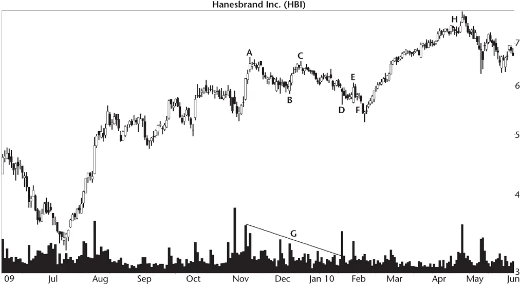
Figure 3.4 George took a loss buying this AB=CD.
For point D, we use the formula D = (C – B)/Ratio + C or (8)/.28 + (16 December 2009). Turn D is predicted to appear on 14 January 2010. In this example, turn D appeared on 20 January, and that's within a week of the predicted time. I consider that a good prediction.
Volume sloped downward as line G shows. Even though volume slopes upward most of the time in an AB=CD pattern, the direction is nearly random (53%). He made this trade in a bull market (the bear market ended in early 2009), and Table 3.2says a falling volume trend penalizes performance, but only by about a percentage point (dropping from 38.4% to 37%).
Читать дальшеИнтервал:
Закладка:
Похожие книги на «Encyclopedia of Chart Patterns»
Представляем Вашему вниманию похожие книги на «Encyclopedia of Chart Patterns» списком для выбора. Мы отобрали схожую по названию и смыслу литературу в надежде предоставить читателям больше вариантов отыскать новые, интересные, ещё непрочитанные произведения.


Обсуждение, отзывы о книге «Encyclopedia of Chart Patterns» и просто собственные мнения читателей. Оставьте ваши комментарии, напишите, что Вы думаете о произведении, его смысле или главных героях. Укажите что конкретно понравилось, а что нет, и почему Вы так считаете.