Thomas N. Bulkowski - Encyclopedia of Chart Patterns
Здесь есть возможность читать онлайн «Thomas N. Bulkowski - Encyclopedia of Chart Patterns» — ознакомительный отрывок электронной книги совершенно бесплатно, а после прочтения отрывка купить полную версию. В некоторых случаях можно слушать аудио, скачать через торрент в формате fb2 и присутствует краткое содержание. Жанр: unrecognised, на английском языке. Описание произведения, (предисловие) а так же отзывы посетителей доступны на портале библиотеки ЛибКат.

- Название:Encyclopedia of Chart Patterns
- Автор:
- Жанр:
- Год:неизвестен
- ISBN:нет данных
- Рейтинг книги:3 / 5. Голосов: 1
-
Избранное:Добавить в избранное
- Отзывы:
-
Ваша оценка:
Encyclopedia of Chart Patterns: краткое содержание, описание и аннотация
Предлагаем к чтению аннотацию, описание, краткое содержание или предисловие (зависит от того, что написал сам автор книги «Encyclopedia of Chart Patterns»). Если вы не нашли необходимую информацию о книге — напишите в комментариях, мы постараемся отыскать её.
, Third Edition expands upon Bulkowski's immensely popular Second Edition with fully revised and updated material on chart patterns. Whether you’re new to the stock market or an experienced professional trader, use this book as a reference guide to give you an edge.
Within the pages of this book, you’ll learn how to identify chart patterns, supported by easy-to-understand performance statistics describing how well a pattern works, what the failure rate is, and what special quirks suggest better future performance. You’ll discover how often a stop loss order will trigger at various locations within a chart pattern, how the chart pattern’s performance has evolved over the past three decades, and how to profit from failure by trading busted patterns.
This broadened and revised
offers investors the most comprehensive, up-to-date guide to this popular method of market analysis. Written by a leading expert on chart patterns, Tom Bulkowski, this edition includes revised statistics on 75 chart patterns including 23 new ones, with pictures and performance statistics, packaged within easy-to-read text.
Gain essential knowledge of chart patterns and how they are used to predict price movements in bull and bear markets New tables include how often stops are hit, busted pattern performance, performance over the decades, and special pattern features Joining Tour, Identification Guidelines, Focus on Failures, Statistics, Trading Tactics and Sample Trade is Experience. It puts you in the passenger’s seat so you can share lessons learned from Bulkowski's trades This edition reports on statistics from nearly four times the number of samples used in the Second Edition and ten times the number in the , Third Edition further solidifies the reputation of this book as the leading reference on chart patterns, setting it far above the competition.
Encyclopedia of Chart Patterns — читать онлайн ознакомительный отрывок
Ниже представлен текст книги, разбитый по страницам. Система сохранения места последней прочитанной страницы, позволяет с удобством читать онлайн бесплатно книгу «Encyclopedia of Chart Patterns», без необходимости каждый раз заново искать на чём Вы остановились. Поставьте закладку, и сможете в любой момент перейти на страницу, на которой закончили чтение.
Интервал:
Закладка:
He used the traditional measure rule for chart patterns to estimate how far price would climb if the pattern broke out upward. The height of the pattern is A – D (6.65 – 5.59) or 1.06, so the target would be 1.06 + 6.65 or 7.71, which is the height added to the high at point A. A downward breakout would be D – 1.06 or 4.53 (or 19% lower).
“When the stock made a strong push upward at E,” he told me, “I bought at the open the next day and received a fill at 6.02. And I just ate breakfast, too.” He grinned.
I scratched my head.
“The stock filled…ate breakfast. Get it?”
I exhaled, rolled my eyes, but said nothing. With a calculated rise to 7.71, he was looking at a potential gain of 18%. “That sounds reasonable,” he said.
For grins, he calculated a new target based on half the height (1.06/2 or .53 added to the high at A) or 7.18. If he sold at the closer target, he'd make 9%.
“Let's look at the historical chart.” He punched keys on his computer and pulled up a chart from 2007. “Overhead resistance here,” he pointed and swept his finger across the screen. Price moved horizontally for a year. “Looks like a cloudbank pattern,” before the bear market started and sucked the stock down. If the stock worked as he hoped, it would have to traverse through that resistance to reach the full height target. “Am I asking too much for price to rise that far?”
A check of Table 3.3didn't set well with him. With just 38% of patterns showing a reversal at D, he decided to place a tight stop a penny below the low at D (5.59 – .01 or 5.58).
“The trade went bad right from the start. The day I bought, the stock closed lower, almost reversing the move up at price bar E. Four days later,” he pointed to F, “the stock hit my stop and cashed me out at 5.58 for a loss of 7%. That's one day before it bottomed.”
The day after he was stopped out, the stock began a rebound that carried the stock up to the full‐height target, 7.71, shown on the chart as point H.
Looking back at the trade, the AB=CD pattern found point D accurately and on time (within a week of the prediction), but the stock broke out downward (at F), not upward. It busted the downward breakout when it closed above the top of the pattern (above A) and continued higher to reach the full‐height target (H).
4 Bat ®, Bearish
RESULTS SNAPSHOT
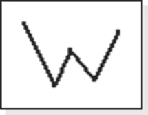
Appearance: Looks like a big W with turns located by Fibonacci ratios.
Downward Moves
| Bull Market | Bear Market | |
| Performance rank | 1 (best) out of 5 | 4 out of 5 |
| Breakeven failure rate | 17.7% | 4.5% |
| Average drop | –14.3% | –20.2% |
| Volume trend | Downward | Downward |
| Point D reversal rate | 86% | 86% |
| See also | Big W, bearish crab, bearish butterfly, double bottoms (all types), and bearish Gartley |
Every time I see a bearish bat pattern, my first thought is it's a Big W chart pattern. It's as if the Big W was computerized and the developer used Fibonacci ratios to determine the turning points. The bat pattern joins other Fibonacci‐based patterns: AB=CD, butterfly, crab, and Gartley.
I measured performance of Fibonacci‐based patterns differently than I do other chart pattern types. That's because we're looking for a reversal at the end of the pattern and not an upward or downward breakout. Therefore, the layout of this chapter is different from most other chapters in this book.
The above Results Snapshot gauges the downward move after the pattern ends. The stocks I looked at saw price turn lower 86% of the time after reaching point D. That percentage is not good but great!
The average decline in bull markets is a hair over 14%. The breakeven failure rate isn't too bad, at 17.7%. That means an average of almost 18% of the bearish bats will fail to see price drop more than 5% below the high at D (end of the pattern).
All of this may be confusing unless you can see what a typical bat pattern looks like. So let's take a quick tour.
Tour
Figure 4.1shows an example of a bearish bat. The pattern begins at X, which is any significant turn. The locations of points A and B follow, but their placement is determined by one of two Fibonacci numbers. Once points XAB are found, the search for C can begin using one of six Fibonacci numbers. Following that, if you're lucky, D will appear close to one of four Fibonacci numbers. One last number, .886, helps validate the pattern. All of that gibberish means this pattern is complicated, and that makes it rare.
If you're handy with a slide rule (remember those?), then you'll be wasting your time searching for a bat. Even using a fancy electronic calculator will take too much time to find a bat. Use a computer with pattern‐finding software. I have a free one on my website called Patternz which will find this pattern and dozens of others. Try using it if you're serious about finding bats.
Even for a bearish bat, this example looks weird because of the uneven bottoms (A and C). Volume trends upward (E) when Table 4.2says the average pattern shows a downward trend. As bad as this bat looks, it performs exceedingly well, with price dropping to F. This bearish bat is indeed bearish.
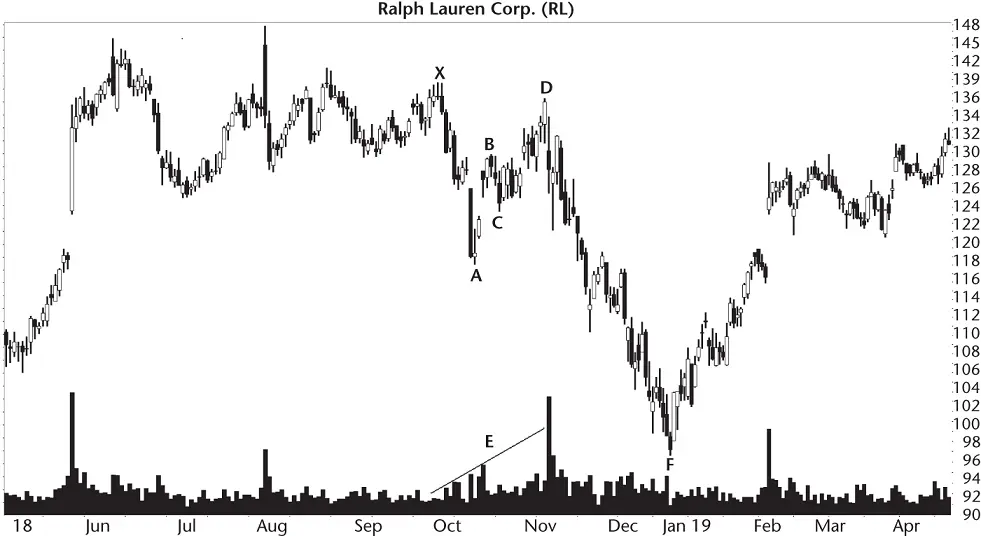
Figure 4.1 The five turns, X, A, B, C, and D, complete the bearish bat.
A swing trader taking a position just after D forms and watching the stock go all the way down to F might start dreaming about bats. Maybe even build some bat houses and hang them on his (or her) property. Here's a hint: a nearby pond is a plus. Let's return to trading bats. First, we have to find them.
Identification Guidelines
Table 4.1shows identification guidelines. The guidelines are similar to other Fibonacci‐based patterns except the turns may use different numbers.
Figure 4.2shows another example of a bearish bat.
Table 4.1 Identification Guidelines
| Characteristic | Discussion |
|---|---|
| Appearance | Looks like a big W with turns located by Fibonacci ratios. |
| BA/XA retrace | The ratio of BA/XA is either .382 or .5 |
| BC/BA retrace | The ratio of BC/BA is one of .382, .5, .618, .707, .786, or .886 |
| DC/BC extension | The extension of leg DC to BC is one of the Fibonacci numbers: 1.618, 2, 2.24, or 2.618. |
| DA/XA retrace | The ratio of DA to XA is .886. |
| Volume | Volume is downward the majority of the time, but this is an observation, not a requirement. |
| Duration | I limited patterns to 6 months, but this is an arbitrary limit I use for most chart patterns. |
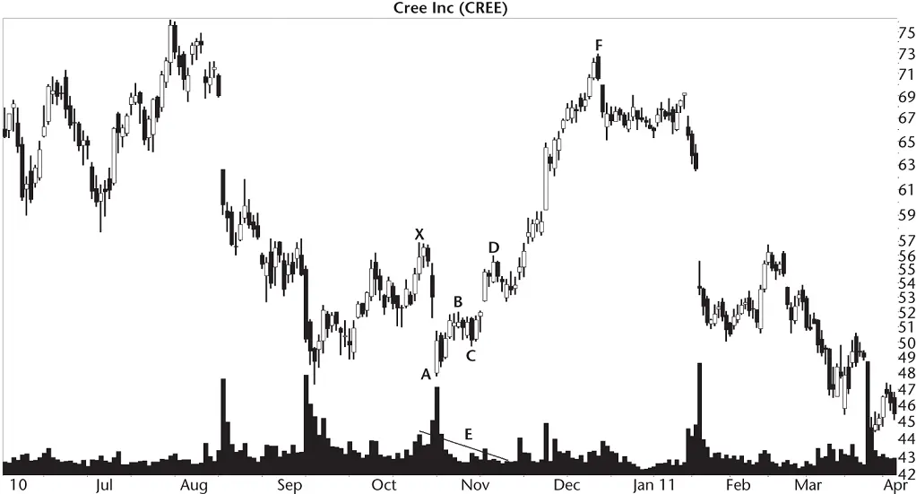
Figure 4.2 This bearish bat sees price dip after D but still breaks out upward.
Appearance.My guess is that the name comes from the picture which forms when you connect turns XABCD with lines, but also includes lines connecting XB and BD. The pattern looks like two wings. When trying to visualize this, consumption of alcohol may be a plus.
Читать дальшеИнтервал:
Закладка:
Похожие книги на «Encyclopedia of Chart Patterns»
Представляем Вашему вниманию похожие книги на «Encyclopedia of Chart Patterns» списком для выбора. Мы отобрали схожую по названию и смыслу литературу в надежде предоставить читателям больше вариантов отыскать новые, интересные, ещё непрочитанные произведения.


Обсуждение, отзывы о книге «Encyclopedia of Chart Patterns» и просто собственные мнения читателей. Оставьте ваши комментарии, напишите, что Вы думаете о произведении, его смысле или главных героях. Укажите что конкретно понравилось, а что нет, и почему Вы так считаете.