Thomas N. Bulkowski - Encyclopedia of Chart Patterns
Здесь есть возможность читать онлайн «Thomas N. Bulkowski - Encyclopedia of Chart Patterns» — ознакомительный отрывок электронной книги совершенно бесплатно, а после прочтения отрывка купить полную версию. В некоторых случаях можно слушать аудио, скачать через торрент в формате fb2 и присутствует краткое содержание. Жанр: unrecognised, на английском языке. Описание произведения, (предисловие) а так же отзывы посетителей доступны на портале библиотеки ЛибКат.

- Название:Encyclopedia of Chart Patterns
- Автор:
- Жанр:
- Год:неизвестен
- ISBN:нет данных
- Рейтинг книги:3 / 5. Голосов: 1
-
Избранное:Добавить в избранное
- Отзывы:
-
Ваша оценка:
Encyclopedia of Chart Patterns: краткое содержание, описание и аннотация
Предлагаем к чтению аннотацию, описание, краткое содержание или предисловие (зависит от того, что написал сам автор книги «Encyclopedia of Chart Patterns»). Если вы не нашли необходимую информацию о книге — напишите в комментариях, мы постараемся отыскать её.
, Third Edition expands upon Bulkowski's immensely popular Second Edition with fully revised and updated material on chart patterns. Whether you’re new to the stock market or an experienced professional trader, use this book as a reference guide to give you an edge.
Within the pages of this book, you’ll learn how to identify chart patterns, supported by easy-to-understand performance statistics describing how well a pattern works, what the failure rate is, and what special quirks suggest better future performance. You’ll discover how often a stop loss order will trigger at various locations within a chart pattern, how the chart pattern’s performance has evolved over the past three decades, and how to profit from failure by trading busted patterns.
This broadened and revised
offers investors the most comprehensive, up-to-date guide to this popular method of market analysis. Written by a leading expert on chart patterns, Tom Bulkowski, this edition includes revised statistics on 75 chart patterns including 23 new ones, with pictures and performance statistics, packaged within easy-to-read text.
Gain essential knowledge of chart patterns and how they are used to predict price movements in bull and bear markets New tables include how often stops are hit, busted pattern performance, performance over the decades, and special pattern features Joining Tour, Identification Guidelines, Focus on Failures, Statistics, Trading Tactics and Sample Trade is Experience. It puts you in the passenger’s seat so you can share lessons learned from Bulkowski's trades This edition reports on statistics from nearly four times the number of samples used in the Second Edition and ten times the number in the , Third Edition further solidifies the reputation of this book as the leading reference on chart patterns, setting it far above the competition.
Encyclopedia of Chart Patterns — читать онлайн ознакомительный отрывок
Ниже представлен текст книги, разбитый по страницам. Система сохранения места последней прочитанной страницы, позволяет с удобством читать онлайн бесплатно книгу «Encyclopedia of Chart Patterns», без необходимости каждый раз заново искать на чём Вы остановились. Поставьте закладку, и сможете в любой момент перейти на страницу, на которой закончили чтение.
Интервал:
Закладка:
If you owned the stock (long) and sold at D thinking price would drop, you'd be happy that the stock dropped to E, but your joy would turn to sadness when the stock continued climbing up to F and beyond. It would say you'd made a mistake.
Of course I chose Figure 2.3to highlight the failure of this pattern to perform as expected. That's what the Focus on Failures section is supposed to do. In the next section, we'll see what the numbers say about how this pattern behaves.
Statistics
Table 2.2shows general statistics for the bearish AB=CD and tailored to the Fibonacci pattern. That means you won't find explanations for the table entries in the Glossary. Most are self‐explanatory.
Number found.If you can program your computer to find them, you'll discover that they come out like worms after a heavy downpour. They were so plentiful that I limited the number catalogued per stock.
I found the first pattern in February 1990 and the most recent in February 2020, finding them in 884 stocks. Not all stocks covered the entire period, and some stocks no longer trade.
Table 2.2 General Statistics
| Description | Bull Market | Bear Market |
|---|---|---|
| Number found | 2,649 | 696 |
| Breakeven failure rate | 26.3% | 10.2% |
| Average decline after D | –12.7% | –21.6% |
| Volume trend | 54% Downward | 58% Downward |
| Performance Up/Down volume | –13%U, –13%D | –19%U, –24%D |
Breakeven failure rate.For those patterns that see price make it up to D and reverse there, this is a measure of how often price fails to drop more 5% (below the high at D). The bull market value is high (ranking fourth out of five, where one has the lowest failure rate), but the bear market rate, at 10.2%, is the worst of the five bearish Fibonacci patterns I looked at.
Average decline after D.This is a measure of the drop after point D, for those patterns seeing price make it up to point D and reverse there. As one would expect, the drop in bear markets is larger than in bull markets. If you were to trade the bearish AB=CD pattern perfectly and frequently, this is how much you could make on average. Commissions were not included.
Volume trend.I used linear regression from the start to end of the pattern and found it trends downward most of the time, but it's near random.
Performance Up/Down volume.I checked performance when volume was trending up or down. This applies only to those patterns that turned down at D. The bull market shows no performance difference, but in bear markets, the performance difference is wider and substantial. Patterns with downward‐sloping volume see price drop an average of 24% compared to a 19% decline for those with up‐sloping volume.
Trading Tactics
The AB=CD pattern can be a wonderful tool to help predict when price will turn and then make a substantial decline. Once you know the first three turns, you can determine when and at what price the fourth turn will appear. And when turn D appears, the stock will drop. Does it really work like that? Let's find out.
Table 2.3shows how price behaves after point D.
How often does price reach or exceed D?I checked how often price climbed far enough to reach the calculated price of D. The table shows that nearly all of the patterns reached the target turn.
Table 2.3 Price Move after Pattern End
| Description | Bull Market | Bear Market |
|---|---|---|
| How often does price reach or exceed D? | 95% | 98% |
| How often does price turn at D? | 32% | 38% |
| How often does D appear within a week of calculated time? | 43% | 45% |
| How many drop to point A? | 24% | 36% |
| How many drop to point B? | 76% | 87% |
| How many drop to point C? | 35% | 46% |
That's terrific! Swing traders can use this to predict how far price will rise. They can even trade it by buying at the low at C and riding price higher, to D.
How often does price turn at D?I checked each pattern to see if a minor high formed at the calculated point D. I found that only about a third of the time will you see price turn lower at the calculated price of D. Because we know price rises to D nearly all of the time, we can assume that price continues beyond D instead of turning lower when it should.
This finding is not a deal breaker. Now that we know price will likely continue rising, we can just stay in our trade (when we bought after turn C) and ride the stock upward until it does turn.
How often does D appear within a week of calculated time?The pattern can work as a predictor of when point D will occur (as well as the price of the turn). I found the dates of the ABC turns and found the ratio of CB to BA. Then point D followed the equation: D = (C – B)/Ratio + C using dates instead of price.
I found that between 43% and 45% of the time point D appeared within (plus or minus a 2‐week window) a week of when it was supposed to. Because the numbers fall well short of the expected time, I don't think this measure is helpful.
How many drop to…?If price reaches D and turns down, we know that the average decline measures between 12% and 22% from Table 2.2. Let's measure how far price drops in terms of turns A, B, and C.
Point B is closest to turn D, so we would expect the stock to drop that far most often. Indeed, the table shows that price reaches turn B between 76% and 87% of the time. Price will drop to C less often (35% to 46% of the time) and reach the bottom of the pattern (point A) even less often.
Using these values, we can get a sense of how far price might decline. It could be less or more, depending on the situation, of course. But at least we have a roadmap.
Sample Trade
Figure 2.4shows a sample trade using the AB=CD pattern.
Jacob poked me in the ribs, then pointed to the screen to discuss his trade. “See that? It's a double bottom.”
His fingers traced the twin bottoms at EA with a nice peak (F) between them. “I can make money trading that.”
He placed a buy stop a penny above F. That order triggered at G, putting him into the stock near the breakout price. Immediately, he placed a stop a penny below the lower of the two bottoms, which in this case, was A, at 37.12. If the trade went bad, he'd lose about 10%.
“That's bigger than the 8% I like to see, but you have to be flexible,” he told me.
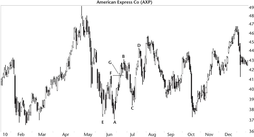
Figure 2.4 Jacob used the bearish AB=CD pattern to exit a trade.
For about a week, the stock cooperated and climbed to B before starting to retrace.
“The throwback and drop to C made me nervous. I started sweating bullets because I thought I'd be stopped out. Don't believe me? The sweat started pouring off me, and the furniture started floating. I'm not kidding. You can see the watermark.” He pointed to a smudge on the wall. His wide grin made the Grand Canyon look like a small ditch by comparison.
“I thought of selling, but I invariably sell a week or two before the stock bottoms. It's annoying. What helped me this time was when I noticed the bearish AB=CD pattern.”
His software helped by providing the location for him. Let's run through the numbers. The low at point A was 37.13, the high at B was 43.14, and the low of price bar C was 38.42. Crunching the numbers said that the ratio of BC to BA was (43.14 – 38.42)/(43.14 – 37.13) or 78.5%. That was close to the 78.6% Fibonacci number, so the turn matched the identification guidelines ( Table 2.1).
Читать дальшеИнтервал:
Закладка:
Похожие книги на «Encyclopedia of Chart Patterns»
Представляем Вашему вниманию похожие книги на «Encyclopedia of Chart Patterns» списком для выбора. Мы отобрали схожую по названию и смыслу литературу в надежде предоставить читателям больше вариантов отыскать новые, интересные, ещё непрочитанные произведения.


Обсуждение, отзывы о книге «Encyclopedia of Chart Patterns» и просто собственные мнения читателей. Оставьте ваши комментарии, напишите, что Вы думаете о произведении, его смысле или главных героях. Укажите что конкретно понравилось, а что нет, и почему Вы так считаете.