Joseph Schmuller - Statistical Analysis with Excel For Dummies
Здесь есть возможность читать онлайн «Joseph Schmuller - Statistical Analysis with Excel For Dummies» — ознакомительный отрывок электронной книги совершенно бесплатно, а после прочтения отрывка купить полную версию. В некоторых случаях можно слушать аудио, скачать через торрент в формате fb2 и присутствует краткое содержание. Жанр: unrecognised, на английском языке. Описание произведения, (предисловие) а так же отзывы посетителей доступны на портале библиотеки ЛибКат.
- Название:Statistical Analysis with Excel For Dummies
- Автор:
- Жанр:
- Год:неизвестен
- ISBN:нет данных
- Рейтинг книги:4 / 5. Голосов: 1
-
Избранное:Добавить в избранное
- Отзывы:
-
Ваша оценка:
Statistical Analysis with Excel For Dummies: краткое содержание, описание и аннотация
Предлагаем к чтению аннотацию, описание, краткое содержание или предисловие (зависит от того, что написал сам автор книги «Statistical Analysis with Excel For Dummies»). Если вы не нашли необходимую информацию о книге — напишите в комментариях, мы постараемся отыскать её.
fully updated for the 2021 version of Excel, you’ll hit the ground running with straightforward techniques and practical guidance to unlock the power of statistics in Excel.
Bypass unnecessary jargon and skip right to mastering formulas, functions, charts, probabilities, distributions, and correlations. Written for professionals and students without a background in statistics or math, you’ll learn to create, interpret, and translate statistics—and have fun doing it!
In this book you’ll find out how to:
Understand, describe, and summarize any kind of data, from sports stats to sales figures Confidently draw conclusions from your analyses, make accurate predictions, and calculate correlations Model the probabilities of future outcomes based on past data Perform statistical analysis on any platform: Windows, Mac, or iPad Access additional resources and practice templates through Dummies.com For anyone who’s ever wanted to unleash the full potential of statistical analysis in Excel—and impress your colleagues or classmates along the way—
walks you through the foundational concepts of analyzing statistics and the step-by-step methods you use to apply them.
Statistical Analysis with Excel For Dummies — читать онлайн ознакомительный отрывок
Ниже представлен текст книги, разбитый по страницам. Система сохранения места последней прочитанной страницы, позволяет с удобством читать онлайн бесплатно книгу «Statistical Analysis with Excel For Dummies», без необходимости каждый раз заново искать на чём Вы остановились. Поставьте закладку, и сможете в любой момент перейти на страницу, на которой закончили чтение.
Интервал:
Закладка:

FIGURE 3-15:The Select Data Source dialog box.
FIGURE 3-16:The Axis Labels dialog box.
Adding a Spark
The brainchild of Edward Tufte (also known as “the da Vinci of data”), a sparkline is a tiny chart you can integrate into text or a table to quickly illustrate a trend. It’s designed to be the size of a word. In fact, Tufte refers to sparklines as datawords.
Three types of sparklines are available: One is a line chart; another is a column chart. The third is a special type of column chart that sports fans will enjoy: It shows wins and losses.
To show you what these sparklines look like, I apply the first two to the Table 3-1data. First, I insert two columns between Column A and Column B. Then, in the new (blank) Column B, I select cell B2. Then I choose Insert | Sparklines ⇒ Line from the main menu to open the Create Sparklines dialog box. (See Figure 3-17.)
In the Data Range box, I enter D2:H2 and click OK. Then I autofill the column. I repeat these steps for column C, except this time I choose Sparklines | Column instead of Sparklines | Line. Figure 3-18 shows the results.
If you absolutely must show a table in a presentation, sparklines are a welcome addition. If I were presenting this table, I would include the column sparklines.
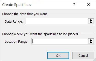
FIGURE 3-17:The Create Sparklines dialog box.
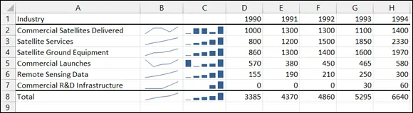
FIGURE 3-18:Line sparklines and column sparklines for the data in Table 3-1.
How else would you use a sparkline? Figure 3-19 shows two column sparklines integrated into a Word document. It takes a little maneuvering to copy and paste properly, and you have to paste the sparkline as a picture. I think you’ll agree that the results are worth the effort.
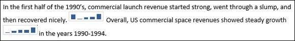
FIGURE 3-19:Sparklines in a Word document.
The Win/Loss sparkline nicely summarizes a sports team’s progress throughout a season. Created with the Win/Loss button in the Sparklines area, the sparklines in Figure 3-20 represent the monthly records of the teams in the National Basketball Association’s Atlantic Division for the 2020–2021 season.
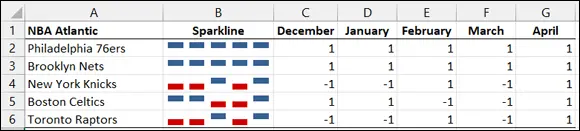
FIGURE 3-20:Win/Loss sparklines for the 2020–2021 NBA Atlantic Division, featuring the magnificent Brooklyn Nets.
In the data, 1 represents a winning record for the month (more wins than losses), –1 represents a losing record, and 0 (not in this dataset) means the team won as many games as they lost. In the sparkline, a winning month appears as a marker above the middle of the Sparkline cell, a losing month appears as a marker below the middle of the Sparkline cell, and a break-even month (again, not in this data set) is a blank.
The magnificent Brooklyn Nets, you’ll note, was one of only two teams in the Division to have a winning record in each of the five months. (Yes, I know they went on to lose in the semifinals to the ultimate NBA champs. Don’t go there. Seriously.)
 To delete a sparkline, skip the usual method. Instead, right-click it and choose Sparklines from the pop-up menu. You see a choice that allows you to clear the sparkline.
Passing the Bar
Excel's bar chart is a column chart laid on its side. This is the one that reverses the horizontal-vertical convention. Here, the vertical axis holds the independent variable, and it's referred to as the x- axis. The horizontal axis is the y- axis, and it tracks the dependent variable.
When would you use a bar chart? This type of chart fits the bill when you want to make a point about reaching a goal, or about the inequities in attaining one.
Table 3-2shows the data on home Internet usage. The data, from the US Census Bureau (via the US Statistical Abstract ), are for the year 2013. Percent means the percentage of people in each income group.
TABLE 3-2Use of the Internet at Home (2013)
| Household Income | Percent |
|---|---|
| Less than $25,000 | 48.4 |
| $25,000 to $49,999 | 69.0 |
| $50,000 to $99,999 | 84.9 |
| $100,000 to $149,999 | 92.7 |
| $150,000 and more | 94.9 |
Data from U.S. Census Bureau
The numbers in the table show a clear trend. Casting them into a bar chart shows the trend even more clearly, as you can see in Figure 3-21.
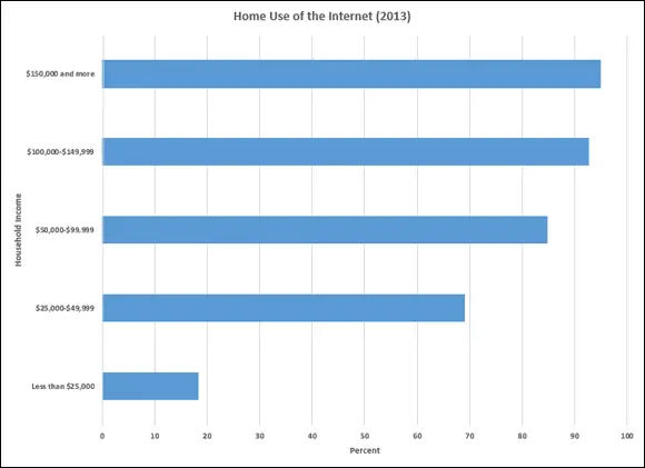
FIGURE 3-21:A bar chart of the data in Table 3-2.
To create this graph, follow these steps:
1 Enter your data into a worksheet.Figure 3-22 shows the data entered into a worksheet.
2 Select the data that go into the chart.For this example, the data are cells A1 through B8.
3 Choose Insert | Recommended Charts from the main menu and then choose the chart you like from the list on the left side of the screen.I selected the first option: Clustered Bar. Figure 3-23 shows the result.
4 Modify the chart.The first modification is to change the chart title. One way to do this is to click the current title and type the new title. Next, I add the axis titles. To do this, I click the Chart Elements button, that button labeled with a plus sign (+). Selecting the Axis Labels check box on the menu that appears adds generic axis titles, which I then change. Finally, I bold the font on the axis titles as well as the axis numbers. The easiest way to do that is to select an element and press Ctrl+B.
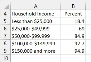
FIGURE 3-22: Table 3-2data in a worksheet.
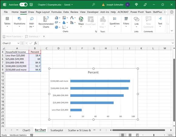
FIGURE 3-23:The initial Excel bar chart.
The Plot Thickens
You use an important statistical technique called linear regression to determine the relationship between one variable, x, and another variable, y. For more information on linear regression, see Chapter 14.
The basis of the technique is a graph that shows individuals measured on both x and y. The graph represents each individual as a point. Because the points seem to scatter around the graph, the graph is called a scatterplot.
Читать дальшеИнтервал:
Закладка:
Похожие книги на «Statistical Analysis with Excel For Dummies»
Представляем Вашему вниманию похожие книги на «Statistical Analysis with Excel For Dummies» списком для выбора. Мы отобрали схожую по названию и смыслу литературу в надежде предоставить читателям больше вариантов отыскать новые, интересные, ещё непрочитанные произведения.


Обсуждение, отзывы о книге «Statistical Analysis with Excel For Dummies» и просто собственные мнения читателей. Оставьте ваши комментарии, напишите, что Вы думаете о произведении, его смысле или главных героях. Укажите что конкретно понравилось, а что нет, и почему Вы так считаете.