Joseph Schmuller - Statistical Analysis with Excel For Dummies
Здесь есть возможность читать онлайн «Joseph Schmuller - Statistical Analysis with Excel For Dummies» — ознакомительный отрывок электронной книги совершенно бесплатно, а после прочтения отрывка купить полную версию. В некоторых случаях можно слушать аудио, скачать через торрент в формате fb2 и присутствует краткое содержание. Жанр: unrecognised, на английском языке. Описание произведения, (предисловие) а так же отзывы посетителей доступны на портале библиотеки ЛибКат.
- Название:Statistical Analysis with Excel For Dummies
- Автор:
- Жанр:
- Год:неизвестен
- ISBN:нет данных
- Рейтинг книги:4 / 5. Голосов: 1
-
Избранное:Добавить в избранное
- Отзывы:
-
Ваша оценка:
Statistical Analysis with Excel For Dummies: краткое содержание, описание и аннотация
Предлагаем к чтению аннотацию, описание, краткое содержание или предисловие (зависит от того, что написал сам автор книги «Statistical Analysis with Excel For Dummies»). Если вы не нашли необходимую информацию о книге — напишите в комментариях, мы постараемся отыскать её.
fully updated for the 2021 version of Excel, you’ll hit the ground running with straightforward techniques and practical guidance to unlock the power of statistics in Excel.
Bypass unnecessary jargon and skip right to mastering formulas, functions, charts, probabilities, distributions, and correlations. Written for professionals and students without a background in statistics or math, you’ll learn to create, interpret, and translate statistics—and have fun doing it!
In this book you’ll find out how to:
Understand, describe, and summarize any kind of data, from sports stats to sales figures Confidently draw conclusions from your analyses, make accurate predictions, and calculate correlations Model the probabilities of future outcomes based on past data Perform statistical analysis on any platform: Windows, Mac, or iPad Access additional resources and practice templates through Dummies.com For anyone who’s ever wanted to unleash the full potential of statistical analysis in Excel—and impress your colleagues or classmates along the way—
walks you through the foundational concepts of analyzing statistics and the step-by-step methods you use to apply them.
Statistical Analysis with Excel For Dummies — читать онлайн ознакомительный отрывок
Ниже представлен текст книги, разбитый по страницам. Система сохранения места последней прочитанной страницы, позволяет с удобством читать онлайн бесплатно книгу «Statistical Analysis with Excel For Dummies», без необходимости каждый раз заново искать на чём Вы остановились. Поставьте закладку, и сможете в любой момент перейти на страницу, на которой закончили чтение.
Интервал:
Закладка:
Stacking the Columns
If I had selected Excel’s seventh recommended chart, I would have created a set of columns that presents the same information in a slightly different way. This type of chart is called Stacked Columns. Each column represents the total of all the data series at a point on the x-axis. Each column is divided into segments and each segment’s size is proportional to how much it contributes to the total. Figure 3-8 shows this.
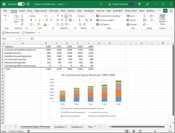
FIGURE 3-8:A stacked column chart of the data in Table 3-1.
I inserted each graph into the worksheet. Excel also allows you to move a graph to a separate sheet in the workbook. Click on the chart to make the Chart Design tab visible. Then choose Chart Design | Move Chart (it’s on the extreme right side of the Chart Design tab) to open the Move Chart dialog box. Click the New Sheet radio button to add a sheet and move the chart there. Figure 3-9 shows how the chart looks in its own chart sheet. As you can see in Figure 3-9, I relocated the legend from Figure 3-8.
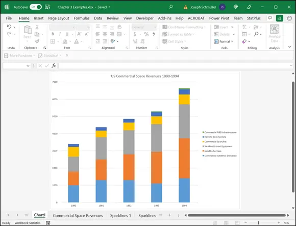
FIGURE 3-9:The Stacked Column chart, in its own chart sheet.
This is a nice way of showing percentage changes over the course of time. If you just want to focus on percentages in one year, the next type of graph is more effective.
Slicing the Pie
On to the next chart type. To show the percentages that make up one total, a pie chart gets the job done effectively.
Suppose you want to focus on US commercial space revenues for 1994 — the last column of data in Table 3-1. You catch people’s attention when you present the data in the form of a pie chart, like the one in Figure 3-10.
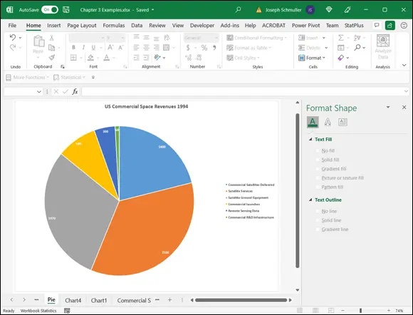
FIGURE 3-10:A pie chart of the last column of data in Table 3-1.
Here’s how to create this chart:
1 Enter your data into a worksheet.It’s pretty easy. I’ve already done this.
2 Select the data that go into the chart.I want the names in column A and the data in column F. The trick is to select column A (cells A2 through A7) in the usual way and then press and hold the Ctrl key. While holding this key, drag the cursor from F2 through F7. Voilà — two non-adjoining columns are selected.
3 Choose Insert | Recommended Charts from the main menu and pick Pie Chart from the list on the left side of the screen.
4 Modify the chart.Figure 3-11 shows the initial pie chart (after I added the title) on its own sheet. To get it to look like Figure 3-10, I had to do a lot of modifying. First, I formatted the legend as in the preceding example.The numbers inside the slices are called data labels. To add them, I select the chart (not just one slice) and then click the Chart Elements button. I then check the box next to Data Labels.To change the font color of the labels, click one of the data labels and select Text Options in the Format Data Labels pane that appears. Click the Solid Fill radio button and change the color from black to white. Press Ctrl+B to make the font bold.
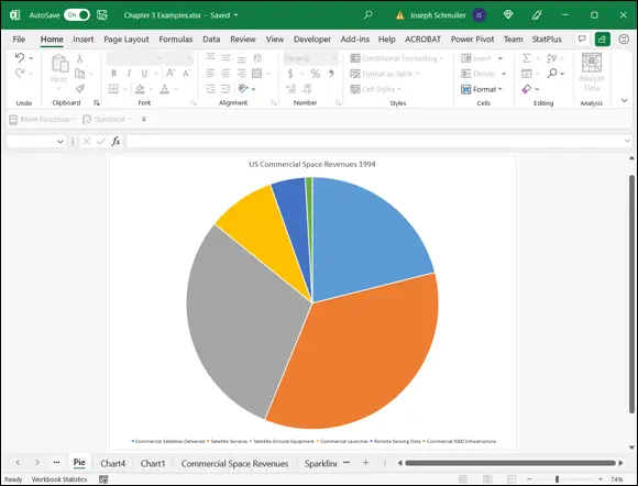
FIGURE 3-11:The initial pie chart, on its own sheet.
Whenever you set up a pie chart, always keep the following in mind… .
A word from the wise
The late, great social commentator, raconteur, and former baseball player Yogi Berra once went to a restaurant and ordered a whole pizza.
“How many slices should I cut,” asked the waitress, “four or eight?”
“Better make it four,” said Yogi. “I'm not hungry enough to eat eight.”
Yogi’s insightful analysis leads to a useful guideline about pie charts: They’re more digestible if they have fewer slices. If you cut a pie chart too fine, you’re likely to leave your audience with information overload.
 When you create a chart for a presentation (as in PowerPoint), include the data labels. They often clarify important points and trends for your audience.
(That Yogi anecdote appears in the previous four editions of this book. Did it really happen? We can’t be sure. As Mr. Berra once famously said: “Half the lies they tell about me aren’t true.”)
Drawing the Line
In the preceding example, I focus on one column of data from Table 3-1. In this example, I focus on one row. The idea is to trace the progress of one space related industry across the years 1990–94. In this example, I graph the revenues from Satellite Services. The final product, shown on its own sheet, is shown in Figure 3-12.
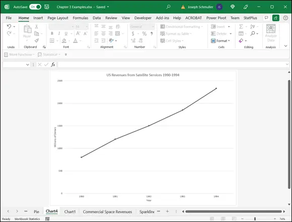
FIGURE 3-12:A line chart of the second row of data in Table 3-1.
A line chart is a good way to show change over time, when you aren't dealing with many data series. If you try to graph all six industries on one line chart, it begins to look like spaghetti.
How do you create a chart like Figure 3-12? Follow along:
1 Enter your data into a worksheet.Once again, it’s already done.
2 Select the data that go into the chart.For this example, that’s cells A3 through F3. Yes, I include the label.Whoa! Did I forget something? What about that little trick I showed you earlier, where you hold down the Ctrl key and select additional cells? Couldn’t I do that and select the top row of years for the x- axis?Nope. Not this time. If I do that, Excel thinks 1990, 1991, 1992, 1993, and 1994 are just another series of data points to plot on the graph. I show you another way to put those years on the x- axis.
3 Choose Insert | Recommended Charts from the main menu and select a chart type.This time, I select the All Charts tab, pick Line in the left column, and choose Line with Markers from the options. Figure 3-13 shows the result.
4 Modify the chart.The line on the chart might be a little hard to see. Clicking the line and then choosing Chart Design | Change Colors from the menu that appears gives a set of colors for the line. I chose black.Next, I added the titles for the chart and for the axes. The easiest way to change the title (which starts out as the label I selected along with the data) is to click the title and type the change.To add the axis titles, I clicked the Chart Elements button (labeled with a plus sign) and selected the check box next to Axis Titles on the pop-up menu. (Refer to Figure 3-7.) I then clicked an axis title, highlighted the text, and typed the new title.I still have to put the years on the x- axis. To do this, I right-clicked inside the chart to open the pop-up menu shown in Figure 3-14. FIGURE 3-13:The result of choosing Line with Markers from the All Charts tab. FIGURE 3-14:Right-clicking inside the chart opens this menu.Choosing Select Data from this menu opens the Select Data Source dialog box. (See Figure 3-15.) In the box labeled Horizontal (Category) Axis Labels, clicking the Edit button opens the Axis Labels dialog box. (See Figure 3-16.) A blinking cursor in the Axis Label Range box shows it’s ready for business. Selecting cells B1 through F1 and clicking OK sets the range and closes this dialog box. Clicking OK closes the Select Data Source dialog box and puts the years on the x- axis.
Читать дальшеИнтервал:
Закладка:
Похожие книги на «Statistical Analysis with Excel For Dummies»
Представляем Вашему вниманию похожие книги на «Statistical Analysis with Excel For Dummies» списком для выбора. Мы отобрали схожую по названию и смыслу литературу в надежде предоставить читателям больше вариантов отыскать новые, интересные, ещё непрочитанные произведения.


Обсуждение, отзывы о книге «Statistical Analysis with Excel For Dummies» и просто собственные мнения читателей. Оставьте ваши комментарии, напишите, что Вы думаете о произведении, его смысле или главных героях. Укажите что конкретно понравилось, а что нет, и почему Вы так считаете.