Joseph Schmuller - Statistical Analysis with Excel For Dummies
Здесь есть возможность читать онлайн «Joseph Schmuller - Statistical Analysis with Excel For Dummies» — ознакомительный отрывок электронной книги совершенно бесплатно, а после прочтения отрывка купить полную версию. В некоторых случаях можно слушать аудио, скачать через торрент в формате fb2 и присутствует краткое содержание. Жанр: unrecognised, на английском языке. Описание произведения, (предисловие) а так же отзывы посетителей доступны на портале библиотеки ЛибКат.
- Название:Statistical Analysis with Excel For Dummies
- Автор:
- Жанр:
- Год:неизвестен
- ISBN:нет данных
- Рейтинг книги:4 / 5. Голосов: 1
-
Избранное:Добавить в избранное
- Отзывы:
-
Ваша оценка:
Statistical Analysis with Excel For Dummies: краткое содержание, описание и аннотация
Предлагаем к чтению аннотацию, описание, краткое содержание или предисловие (зависит от того, что написал сам автор книги «Statistical Analysis with Excel For Dummies»). Если вы не нашли необходимую информацию о книге — напишите в комментариях, мы постараемся отыскать её.
fully updated for the 2021 version of Excel, you’ll hit the ground running with straightforward techniques and practical guidance to unlock the power of statistics in Excel.
Bypass unnecessary jargon and skip right to mastering formulas, functions, charts, probabilities, distributions, and correlations. Written for professionals and students without a background in statistics or math, you’ll learn to create, interpret, and translate statistics—and have fun doing it!
In this book you’ll find out how to:
Understand, describe, and summarize any kind of data, from sports stats to sales figures Confidently draw conclusions from your analyses, make accurate predictions, and calculate correlations Model the probabilities of future outcomes based on past data Perform statistical analysis on any platform: Windows, Mac, or iPad Access additional resources and practice templates through Dummies.com For anyone who’s ever wanted to unleash the full potential of statistical analysis in Excel—and impress your colleagues or classmates along the way—
walks you through the foundational concepts of analyzing statistics and the step-by-step methods you use to apply them.
Statistical Analysis with Excel For Dummies — читать онлайн ознакомительный отрывок
Ниже представлен текст книги, разбитый по страницам. Система сохранения места последней прочитанной страницы, позволяет с удобством читать онлайн бесплатно книгу «Statistical Analysis with Excel For Dummies», без необходимости каждый раз заново искать на чём Вы остановились. Поставьте закладку, и сможете в любой момент перейти на страницу, на которой закончили чтение.
Интервал:
Закладка:
When you create a chart, you insert it into a spreadsheet. This immediately clues you in that all chart creation tools are in the Charts area of the Insert tab. (See Figure 3-2.)

FIGURE 3-2:The Charts area of the Insert tab.
To insert a chart, follow these steps:
1 Enter your data into a worksheet.
2 Select the data that go into the chart.
3 In the Charts area of the Insert tab, select Recommended Charts.The Insert Chart dialog box opens. This dialog box presents Excel’s best guesses for the kind of chart that captures your data. Choose one, and Excel creates a chart in the worksheet.
4 Modify the chart.Click on the chart, and Excel adds a Chart Design contextual tab and a Format contextual tab to the Ribbon. These tabs allow you to make all kinds of changes to the chart. You can also double-click on a chart element (like an axis or a data point) to open a task pane on the right side of the screen. The task pane enables you to modify the element. If you keep the task pane open and click on another element, the task pane changes to accommodate the newly clicked element and the possible modifications you can make.
It’s that simple. (Charts seem to get easier with each new version of Excel.) The next section shows what I mean.
 By the way, here’s one more important concept about Excel graphics. In Excel, a chart is dynamic: After you create a chart, changing its worksheet data results in an immediate change in the chart.
In this example, and in all the ones to follow, Step 3 is always
Insert | Recommended Charts
You can, however, directly access a chart type without Excel’s recommendations. The Charts group on the Insert tab provides a button for each chart type. You can also access each chart from the All Charts tab in the Recommended Charts dialog box.
Becoming a Columnist
In this section, I show you how to create the spiffy graph shown earlier, in Figure 3-1. Follow these steps:
1 Enter your data into a worksheet.Figure 3-3 shows the data from Table 3-1entered into a worksheet. FIGURE 3-3: Table 3-1data, entered into a worksheet.
2 Select the data that go into the chart.I selected A1:F7. The selection includes the labels for the axes but doesn’t include row 8, which holds the column totals.
3 In the Charts area of the Insert tab, select Recommended Charts.Choosing Insert | Charts | Recommended Charts opens the Insert Chart dialog box, shown in Figure 3-4. I scrolled down the recommended charts in the left column and selected Excel’s fifth recommendation. (Apparently, Excel’s tastes are a bit different from mine — even in this edition! Perhaps in a future version, Excel and I will see eye to eye.) This type of chart is called Clustered Column. I click OK to put the chart in the worksheet. FIGURE 3-4:The Insert Chart dialog box.
4 Modify the chart.Figure 3-5 shows the resulting chart as well as the Chart Design tab and the Format tab. These tabs combine to form Chart Tools. As you can see, I have to do some modifying. Why? Excel has guessed wrong about how I want to design the chart. It looks okay, but it will look better (to my eye) if I relocate the legend (the part below the x- axis that shows what all the colors mean). As Figure 3-1 shows, I prefer the legend on the right side of the chart.To make the modification, I double-click on the legend. This action opens the Format Legend pane. (See Figure 3-5.) I click the Top Right radio button to reposition the legend.
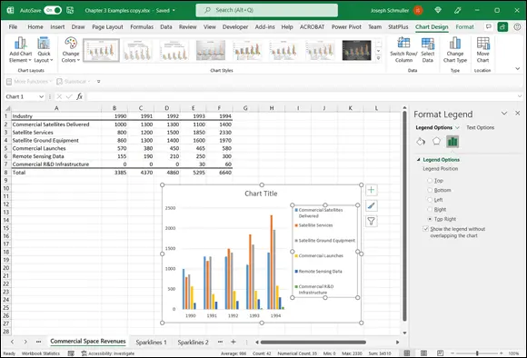
FIGURE 3-5:The Format Legend pane.
Some work remains. For some reason, Excel creates the chart without a line for the y- axis, and with a light gray line for the x- axis. Also, the axes aren’t labeled yet, and the graph has no title.
I start by formatting the axes. When I click on the y- axis, the Format Axis pane replaces the Format Legend pane. Figure 3-6 shows this pane after choosing Axis Options and then Line. I worked with the Color button to change the color of the y- axis. In the same way, I can select the x- axis and then repeat the same steps to change the color of the x- axis.
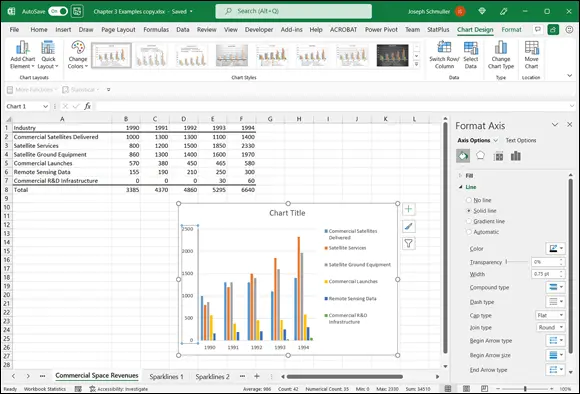
FIGURE 3-6:The Format Axis pane, with Axis Options and Line selected.
Next, I add the axis titles and the chart title. To do this, I move the cursor inside the chart and click. A set of buttons appears to the right of the chart. One of them, labeled with a plus sign (+), is called the Chart Elements button. Click this button and, on the pop-up menu that appears, select the check box next to Axis Titles. Figure 3-7 shows the Chart Elements button and the Axis Titles check box selected. Choosing an axis from the pop-up menu adds a text box with placeholder text to that axis.
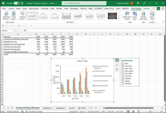
FIGURE 3-7:The Chart Elements button, with Axis Titles selected.
Use the title text boxes to add the titles and finish off the chart to make it look like the chart in Figure 3-1.
To add elements to a chart, you can also use the Add Chart Elements button on the extreme left side of the Chart Design tab.
For a quick way to add the chart title, just click the title in the chart and type a new title.
When you add a title (whether axis or chart), you can either select the title and start typing or highlight the title before you start typing. If you type without highlighting, the new title appears on the Formula bar and then in the title area after you press Enter. If you highlight before you type, the title appears in the title area as you type.
You can preview a chart in a couple of ways. In the Insert Chart dialog box, clicking each recommended chart previews how your data looks in each type of chart. Each preview appears in the dialog box. After you create your chart, mousing over alternatives on the Chart Design tab previews different looks for your chart. Each preview temporarily changes your chart.
That set of buttons headed by the plus sign provides many useful shortcuts. The Paintbrush button presents a variety of color schemes and styles for your chart. The filter button allows you to delete selected elements from the chart and gives a shortcut for opening the Select Data Source dialog box (which I use in the later section “ Drawing the Line.”)
Интервал:
Закладка:
Похожие книги на «Statistical Analysis with Excel For Dummies»
Представляем Вашему вниманию похожие книги на «Statistical Analysis with Excel For Dummies» списком для выбора. Мы отобрали схожую по названию и смыслу литературу в надежде предоставить читателям больше вариантов отыскать новые, интересные, ещё непрочитанные произведения.


Обсуждение, отзывы о книге «Statistical Analysis with Excel For Dummies» и просто собственные мнения читателей. Оставьте ваши комментарии, напишите, что Вы думаете о произведении, его смысле или главных героях. Укажите что конкретно понравилось, а что нет, и почему Вы так считаете.