Bruce Barnbaum - The Art of Photography - An Approach to Personal Expression
Здесь есть возможность читать онлайн «Bruce Barnbaum - The Art of Photography - An Approach to Personal Expression» весь текст электронной книги совершенно бесплатно (целиком полную версию без сокращений). В некоторых случаях можно слушать аудио, скачать через торрент в формате fb2 и присутствует краткое содержание. Жанр: Старинная литература, на английском языке. Описание произведения, (предисловие) а так же отзывы посетителей доступны на портале библиотеки ЛибКат.

- Название:The Art of Photography: An Approach to Personal Expression
- Автор:
- Жанр:
- Год:неизвестен
- ISBN:нет данных
- Рейтинг книги:5 / 5. Голосов: 1
-
Избранное:Добавить в избранное
- Отзывы:
-
Ваша оценка:
The Art of Photography: An Approach to Personal Expression: краткое содержание, описание и аннотация
Предлагаем к чтению аннотацию, описание, краткое содержание или предисловие (зависит от того, что написал сам автор книги «The Art of Photography: An Approach to Personal Expression»). Если вы не нашли необходимую информацию о книге — напишите в комментариях, мы постараемся отыскать её.
The Art of Photography: An Approach to Personal Expression — читать онлайн бесплатно полную книгу (весь текст) целиком
Ниже представлен текст книги, разбитый по страницам. Система сохранения места последней прочитанной страницы, позволяет с удобством читать онлайн бесплатно книгу «The Art of Photography: An Approach to Personal Expression», без необходимости каждый раз заново искать на чём Вы остановились. Поставьте закладку, и сможете в любой момент перейти на страницу, на которой закончили чтение.
Интервал:
Закладка:
The Exposure/Density Curve and Zone 4 Shadow Placement
The most important reason to avoid thin negatives is based on the separation of tonalities in the developed negative. Zone 1 is very thin with easily perceptible density above Zone 0. Yet translated to the print, both zones appear black with no real separation of tone between them. Zone 2 shows separation from Zone 1 in the print; in fact, on the negative there is a greater density spread between Zone 2 and Zone 1 than there is between Zone 1 and Zone 0. Higher zones show even greater separation of density. Figure 9-5 shows a common graph known as the Exposure/Density Curve, which depicts how it all works. (For the mathematically inclined, this curve is the first half of a sine wave.)
In Figure 9-5, the X-axis (the horizontal axis) represents equal increases in exposure; the Y-axis (the vertical axis) represents increases in negative density with development. The continuous line represents normal development of a typical negative. The dotted line to its left represents the curve if development time is increased; the dotted line to the right represents the curve if development time is decreased. As the curve starts from Zone 0 it rises very slowly to Zone 1, being nearly horizontal in that area. Its height above the X-axis at Zone 1 represents its very slight density. It then begins to curve upward between Zones 1 and 2, representing the greater density spread between those zones. It curves even more steeply upward between Zones 2 and 3, again representing more density spread between those two zones.
From Zone 3 upward to the mid-teens, the curve is relatively straight, indicating nearly equal separations in density between zones. Above Zone 15, the curve flattens out again, representing decreasing separations in density between zones in the densest portion of the negative. The lower portion of the curve, where separations are minimal (Zones 0 to 2½) is called the “toe” of the curve. The upper portion of the curve, where separations are again minimal, is known as the “shoulder” of the curve. The large middle portion, where separations are greatest, is the “straight line portion” of the curve. The straight line portion is the best part of the curve—the part where you want your densities to be—because it’s where you get the most visible separations of tonalities in the print.
I strongly urge you to keep all of your exposures within the straight line portion of the curve in order to maximize tonal separations as I do . You can do this by “overexposing” your black-and-white negatives one full stop. In this way, your Zone 1 is actually Zone 2. More importantly, your Zone 3 is now Zone 4. Good, dark shadow detail and texture are often printed at Zone 3 tonalities, but Zone 3 placement puts a portion of that texture on the toe of the curve, whereas Zone 4 placement puts it all on the straight line portion of the curve, maintaining better separations. (Later, when printing the negative, give it extra exposure to bring the tone back to Zone 3.) You won’t lose anything with this approach, because the valuable part of the curve for virtually all black-and-white films ranges all the way up to Zone 15 before starting to flatten out again. I don’t consider this to be “overexposure,” but proper exposure for the best possible negatives. At the upper end of the scale, it’s wise to avoid exposures above Zone 15, where highlight detail may lose separation.
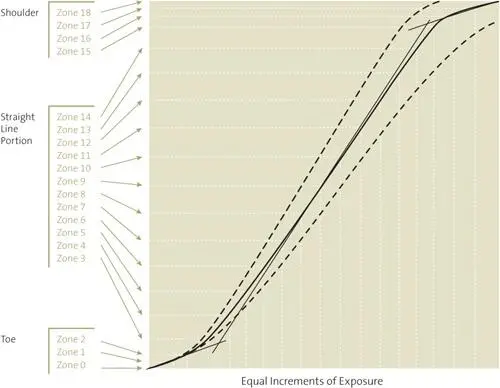
Figure 9-5. The exposure/density curve
If you follow this approach, your negatives will tend to be a bit denser and require a bit more exposure time under the enlarger, but they will give your prints visible separations down to the deepest tones. There will be no muddying of dark tonalities above pure black.
My method of proper exposure is simple: cut the film’s recommended ASA (the rated film speed—the faster the film, the higher the number) approximately in half, which is the equivalent of opening up one stop, then do everything else as discussed above. If you use the DIN number instead of the ASA, drop the number by one. With Tri-X sheet film listed as ASA 320, I use ASA 160; with HP5+ sheet film listed as ASA 400, I use ASA 300 (which obviously is not half the recommended ASA, but which has proven to give me ample density with that film). Some films, such as Kodak T-Max 100 or Ilford Delta 100, can be exposed at, or closer to, the manufacturer’s recommended ASA. But most benefit from additional exposure.
Differences Between Photography and Sensitometry: Texture vs. Tone and Zone 4 Shadow Placement
There is a solid reason behind my recommendation of higher zone placements. Zone 1 is a critical zone for testing film because it starts the process of successively doubling exposures that creates all the other zones. But while Zone 1 is critical for testing film (i.e., important for sensitometric purposes), it’s not terribly important for photographic purposes because it hardly separates from Zone 0 in printing. Because your goal is to create fine photographs, not fine tests, take the route that leads to better photographs, which is to cut the manufacturer’s recommended ASA in half when using most films.
In testing film, sensitometrists use step wedges. They measure small bits of featureless film density. They expose the film to varying amounts of light and develop them to see how they respond to light when developed in different developers, at different temperatures, with different agitation procedures, etc. Unfortunately, they do not look at textures, but only tones .
This is a pivotal difference. In the real world, we deal with textures, not tones . For example, when we talk about a Zone 4 exposure on the bark of a tree, we know that the Zone 4 is the average of the lighter and darker parts of the bark, which we see as texture . A Zone 4 tonality in the real world has parts that are lighter than Zone 4 and parts that are darker. In other words, there is a spread of brightness. Not so with a tone, which is a featureless Zone 4.
This difference becomes critical where the toe of the curve meets the straight line portion of the curve, generally about Zone 2½. If you place your shadow (the bark) in Zone 3, as sensitometrists recommend, the lower part of the textural spread is on the toe of the curve, where densities are crunched together with less separation. When you print that negative, the print tonalities are also crunched together. If you want deep, rich blacks, everything goes too black and you lose detail; if you want separations to show, you can’t get a good, rich black.
Instead, if you place your shadows in Zone 4, or even higher, the entire spread is on the straight line portion of the curve. Your negative is denser than it would be if you placed the shadows in Zone 3, but everything separates beautifully. Then, when you print the negative, simply give it additional exposure time under the enlarger, printing it down to the average Zone 3 that you want. By placing your most important dark shadows at least in Zone 4—not the darkest things in the scene, but the darkest things that you want to see as good, dark, visible textures in the final print—you’ll get a richer print every time. That’s a guarantee!
Cutting the manufacturer’s recommended film speed in half, or placing shadows one zone higher than normally recommended (or both!) is my simple—but overwhelmingly important—modification of the zone system for practical usage. All of my recommended methods are geared toward getting the optimum quality from your negatives and the highest quality from your prints. So, rather than placing key shadows in Zone 3, place them in Zone 4 or higher to assure that you’re on the straight line portion of the curve, where density separations are greatest. (And don’t worry about getting squeezed at the top because the black-and-white film response goes so high.) The idea of placing important shadows in Zone 3 is simply wrong.
Читать дальшеИнтервал:
Закладка:
Похожие книги на «The Art of Photography: An Approach to Personal Expression»
Представляем Вашему вниманию похожие книги на «The Art of Photography: An Approach to Personal Expression» списком для выбора. Мы отобрали схожую по названию и смыслу литературу в надежде предоставить читателям больше вариантов отыскать новые, интересные, ещё непрочитанные произведения.


Обсуждение, отзывы о книге «The Art of Photography: An Approach to Personal Expression» и просто собственные мнения читателей. Оставьте ваши комментарии, напишите, что Вы думаете о произведении, его смысле или главных героях. Укажите что конкретно понравилось, а что нет, и почему Вы так считаете.