Iain Pardoe - Applied Regression Modeling
Здесь есть возможность читать онлайн «Iain Pardoe - Applied Regression Modeling» — ознакомительный отрывок электронной книги совершенно бесплатно, а после прочтения отрывка купить полную версию. В некоторых случаях можно слушать аудио, скачать через торрент в формате fb2 и присутствует краткое содержание. Жанр: unrecognised, на английском языке. Описание произведения, (предисловие) а так же отзывы посетителей доступны на портале библиотеки ЛибКат.
- Название:Applied Regression Modeling
- Автор:
- Жанр:
- Год:неизвестен
- ISBN:нет данных
- Рейтинг книги:5 / 5. Голосов: 1
-
Избранное:Добавить в избранное
- Отзывы:
-
Ваша оценка:
Applied Regression Modeling: краткое содержание, описание и аннотация
Предлагаем к чтению аннотацию, описание, краткое содержание или предисловие (зависит от того, что написал сам автор книги «Applied Regression Modeling»). Если вы не нашли необходимую информацию о книге — напишите в комментариях, мы постараемся отыскать её.
delivers a concise but comprehensive treatment of the application of statistical regression analysis for those with little or no background in calculus. Accomplished instructor and author Dr. Iain Pardoe has reworked many of the more challenging topics, included learning outcomes and additional end-of-chapter exercises, and added coverage of several brand-new topics including multiple linear regression using matrices.
The methods described in the text are clearly illustrated with multi-format datasets available on the book's supplementary website. In addition to a fulsome explanation of foundational regression techniques, the book introduces modeling extensions that illustrate advanced regression strategies, including model building, logistic regression, Poisson regression, discrete choice models, multilevel models, Bayesian modeling, and time series forecasting. Illustrations, graphs, and computer software output appear throughout the book to assist readers in understanding and retaining the more complex content.
covers a wide variety of topics, like:
Simple linear regression models, including the least squares criterion, how to evaluate model fit, and estimation/prediction Multiple linear regression, including testing regression parameters, checking model assumptions graphically, and testing model assumptions numerically Regression model building, including predictor and response variable transformations, qualitative predictors, and regression pitfalls Three fully described case studies, including one each on home prices, vehicle fuel efficiency, and pharmaceutical patches Perfect for students of any undergraduate statistics course in which regression analysis is a main focus,
also belongs on the bookshelves of non-statistics graduate students, including MBAs, and for students of vocational, professional, and applied courses like data science and machine learning.
Applied Regression Modeling — читать онлайн ознакомительный отрывок
Ниже представлен текст книги, разбитый по страницам. Система сохранения места последней прочитанной страницы, позволяет с удобством читать онлайн бесплатно книгу «Applied Regression Modeling», без необходимости каждый раз заново искать на чём Вы остановились. Поставьте закладку, и сможете в любой момент перейти на страницу, на которой закончили чтение.
Интервал:
Закладка:
We saw in Figure 1.2how a density curve can be thought of as a histogram with a very large sample size. So one way to assess whether our population follows a normal distribution model is to construct a histogram from our sample data and visually determine whether it “looks normal,” that is, approximately symmetric and bell‐shaped. This is a somewhat subjective decision, but with experience you should find that it becomes easier to discern clearly nonnormal histograms from those that are reasonably normal. For example, while the histogram in Figure 1.2clearly looks like a normal density curve, the normality of the histogram of 30 sample sale prices in Figure 1.1is less certain. A reasonable conclusion in this case would be that while this sample histogram is not perfectly symmetric and bell‐shaped, it is close enough that the corresponding (hypothetical) population histogram could well be normal.
An alternative way to assess normality is to construct a QQ‐plot (quantile–quantile plot), also known as a normal probability plot , as shown in Figure 1.4(see computer help #22 in the software information files available from the book website). If the points in the QQ‐plot lie close to the diagonal line, then the corresponding population values could well be normal. If the points generally lie far from the line, then normality is in question. Again, this is a somewhat subjective decision that becomes easier to make with experience. In this case, given the fairly small sample size, the points are probably close enough to the line that it is reasonable to conclude that the population values could be normal.
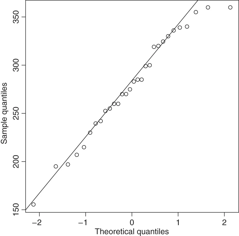
Figure 1.4QQ‐plot for the home prices example.
There are also a variety of quantitative methods for assessing normality—brief details and references are provided in Section 3.4.2.
Optional—technical details of QQ‐plots
For the purposes of this book, the technical details of QQ‐plots are not too important. For those that are curious, however, a brief description follows. First, calculate a set of  equally spaced percentiles (quantiles) from a standard normal distribution. For example, if the sample size,
  , is 9, then the calculated percentiles would be the 10th, 20th,
  , 90th. Then construct a scatterplot with the
  observed data values ordered from low to high on the vertical axis and the calculated percentiles on the horizontal axis. If the two sets of values are similar (i.e., if the sample values closely follow a normal distribution), then the points will lie roughly along a straight line. To facilitate this assessment, a diagonal line that passes through the first and third quartiles is often added to the plot. The exact details of how a QQ‐plot is drawn can differ depending on the statistical software used (e.g., sometimes the axes are switched or the diagonal line is constructed differently).
1.3 Selecting Individuals at Random—Probability
Having assessed the normality of our population of sale prices by looking at the histogram and QQ‐plot of sample sale prices, we now return to the task of making probability statements about the population. The crucial question at this point is whether the sample data are representative of the population for which we wish to make statistical inferences. One way to increase the chance of this being true is to select the sample values from the population at random—we discussed this in the context of our home prices example in Section 1.1. We can then make reliable statistical inferences about the population by considering properties of a model fit to the sample data—provided the model fits reasonably well.
We saw in Section 1.2that a normal distribution model fits the home prices example reasonably well. However, we can see from Figure 1.1that a standard normal distribution is inappropriate here, because a standard normal distribution has a mean of 0 and a standard deviation of 1, whereas our sample data have a mean of 278.6033 and a standard deviation of 53.8656. We therefore need to consider more general normal distributions with a mean that can take any value and a standard deviation that can take any positive value (standard deviations cannot be negative).
Let  represent the population values (sale prices in our example) and suppose that
  is normally distributed with mean (or expected value ),
  , and standard deviation,
  . This textbook uses this notation with familiar Roman letters in place of the traditional Greek letters,
  (mu) and
  (sigma), which, in the author's experience, are unfamiliar and awkward for many students. We can abbreviate this normal distribution as
 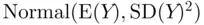 , where the first number is the mean and the second number is the square of the standard deviation (also known as the variance ). Then the population standardized
  ‐value ,
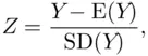
has a standard normal distribution with mean 0 and standard deviation 1. In symbols,

We are now ready to make a probability statement for the home prices example. Suppose that we would consider a home as being too expensive to buy if its sale price is higher than  . What is the probability of finding such an expensive home in our housing market? In other words, if we were to randomly select one home from the population of all homes, what is the probability that it has a sale price higher than
  ? To answer this question, we need to make a number of assumptions. We have already decided that it is probably safe to assume that the population of sale prices (
  ) could be normal, but we do not know the mean,
  , or the standard deviation,
  , of the population of home prices. For now, let us assume that
 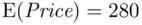 and
and  (fairly close to the sample mean of 278.6033 and sample standard deviation of 53.8656). (We will be able to relax these assumptions later in this chapter.) From the theoretical result above,
  has a standard normal distribution with mean 0 and standard deviation 1.
Интервал:
Закладка:
Похожие книги на «Applied Regression Modeling»
Представляем Вашему вниманию похожие книги на «Applied Regression Modeling» списком для выбора. Мы отобрали схожую по названию и смыслу литературу в надежде предоставить читателям больше вариантов отыскать новые, интересные, ещё непрочитанные произведения.


Обсуждение, отзывы о книге «Applied Regression Modeling» и просто собственные мнения читателей. Оставьте ваши комментарии, напишите, что Вы думаете о произведении, его смысле или главных героях. Укажите что конкретно понравилось, а что нет, и почему Вы так считаете.