Bruce Barnbaum - The Art of Photography - An Approach to Personal Expression
Здесь есть возможность читать онлайн «Bruce Barnbaum - The Art of Photography - An Approach to Personal Expression» весь текст электронной книги совершенно бесплатно (целиком полную версию без сокращений). В некоторых случаях можно слушать аудио, скачать через торрент в формате fb2 и присутствует краткое содержание. Жанр: Старинная литература, на английском языке. Описание произведения, (предисловие) а так же отзывы посетителей доступны на портале библиотеки ЛибКат.

- Название:The Art of Photography: An Approach to Personal Expression
- Автор:
- Жанр:
- Год:неизвестен
- ISBN:нет данных
- Рейтинг книги:5 / 5. Голосов: 1
-
Избранное:Добавить в избранное
- Отзывы:
-
Ваша оценка:
The Art of Photography: An Approach to Personal Expression: краткое содержание, описание и аннотация
Предлагаем к чтению аннотацию, описание, краткое содержание или предисловие (зависит от того, что написал сам автор книги «The Art of Photography: An Approach to Personal Expression»). Если вы не нашли необходимую информацию о книге — напишите в комментариях, мы постараемся отыскать её.
The Art of Photography: An Approach to Personal Expression — читать онлайн бесплатно полную книгу (весь текст) целиком
Ниже представлен текст книги, разбитый по страницам. Система сохранения места последней прочитанной страницы, позволяет с удобством читать онлайн бесплатно книгу «The Art of Photography: An Approach to Personal Expression», без необходимости каждый раз заново искать на чём Вы остановились. Поставьте закладку, и сможете в любой момент перейти на страницу, на которой закончили чтение.
Интервал:
Закладка:

Using indoor color transparency film (Kodak Ektachrome 64T), I was able to encompass the wide range of brightness in the scene, from detail in the brightly lit clouds and distant mountains to the foreground rocks and water.
Figure 8-3. Lofoten Islands, Norway
If one of the two objects were of greater importance, I would be sure to place it at the most appropriate zone placement, letting the other one end up where it may. If the brighter object were rendered as a middle tonality (Zone 5), high contrast film could be a problem for it would render the dark object at Zone 2, devoid of color and barely hinting at tonality above pure black. A transparency film of moderate contrast, on the other hand, would render the darker object at Zone 3, exhibiting both deep color and tonality.
These considerations are paramount in color exposures. Without knowledge of the film’s characteristics, and without exact meter readings and careful placements of exposures, you will produce many exposures that are just enough “off” as to be useless.
With negatives, the contrast is slightly lower than with indoor transparencies. If the negative is slightly overexposed, it gains excess density that can be corrected in printing. Thus it offers two degrees of flexibility over outdoor transparency film (greater flexibility, but not necessarily greater or lesser quality). It holds contrast better and offers greater leeway of exposure. A print made from a color negative, therefore, has a very different look than one made from transparency film. Every serious color photographer should carefully consider the merits of color negative photography in comparison with the merits of transparency film, for it may prove to be more suitable for many applications.
A number of years ago, when I first started shooting 35mm color slides, I was in Yosemite Valley one afternoon while the sun was shining brilliantly on El Capitan, the enormous granite cliff near the valley entrance. I stood in the shaded forest below the awesome rock, amidst the oaks and pines. I was excited by the contrast between the brilliant granite and the dark trees, so I photographed the scene.
The slides were complete disasters! The trees were dead black; the cliff, blank white. There was no detail anywhere, and I was baffled because I followed the light meter perfectly (that was before I determined it was a gray meter!). Several years later, after learning the zone system, I was again in Yosemite Valley under similar circumstances and quickly learned the reason for the earlier failure.
The sunlit cliff was fully six stops brighter than the shaded trees. I took an average reading, which placed the cliff three stops higher than Zone 5, and the trees three stops lower. Because of the high contrast of the Kodachrome II film I was using at the time, the three stops in either direction translated into nearly five zones! El Capitan was nearly at Zone 10, while the trees were barely above Zone 0. The slides were obviously doomed to failure, or so it seemed.
Actually, something could have been done had I known both the zone system and the characteristics of the film. With the tones so far apart, I could have concentrated on the cliff, disregarding the trees entirely and allowing them to be black silhouettes (as they ultimately turned out, anyway). Had I taken a gray meter reading on the cliff alone, I then could have opened up a bit more than one stop, which would have translated into nearly two zones with the high contrast film I was using, placing the cliff just below Zone 7. Then the cliff would have been rendered in light tonalities possessing clearly visible color and texture—as it appeared to the eye—and the black trees would have appeared as silhouetted design elements in the foreground. It could have been an effective photograph. In this case, full knowledge of the zone system and effective use of the gray meter would have overcome the film’s inability to accept the full tonal range of the scene.
The Zone System and the Inverse Square Law
At the end of Chapter 5, I pointed out that the inverse square law presents major problems for zone placements indoors. If objects are placed one foot, two feet, and three feet from a light source, the second object receives ¼ the amount of light of the closest one, and the third object receives only  the light of the first. The same ratios hold if the objects are placed two feet, four feet, and six feet from the light source. (The closest object receives
 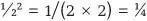 unit of light; the second receives
 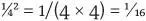 unit of light; the third receives
 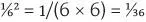 unit of light. Thus the ratios remain the same.)
Suppose those objects were people, and you wanted to do a portrait of the three people sitting side by side on a couch with a lamp lighting the scene from the far right edge. As we know, successive zones represent doublings or halvings of light levels. Therefore, if the middle person receives only ¼ the light of the person on the right, he or she will be two zones lower on the scale. (One zone difference is half the light; two zones is a quarter the light, and so on.) The person on the left will be more than three zones darker. (One eighth of the light would be exactly three zones.)
As a result, if the person nearest the lamp is placed in Zone 7 (which would be an extremely light rendition of any skin tone), the one in the center will be Zone 5, and the one on the left below Zone 4! (This assumes the skin tones are the same in equal lighting.) This is a major problem for all indoor photography, and it explains the necessity for so much extra lighting in most studio photography just to balance light levels. It is also the prime reason for lower contrast of indoor transparency film.
The eye/brain combination tends to smooth over these large discrepancies in light levels, so gray meter readings are essential indoors for determining the light levels that the film will encounter. If the light source is a window in the daylight hours, the distance from the windowpane (which is, effectively, the light source) also answers to the inverse square law. This explains the difficulty of photographing with natural light indoors. The problem is increased by the fact that every part of the room does not receive direct light from the window. Some parts, such as the walls immediately around the window, receive no direct light whatsoever but only reflected light within the room. Therefore, those walls may be many zones lower than an object in front of—and very near—the window.
Methods of dealing with surprising situations like this, as well as other situations with excessively high or low contrast, are the prime focus of the next chapter.
In Summary
Knowledge of the zone system of exposure, coupled with knowledge of your film’s characteristics, is the most effective means of obtaining excellent negatives or transparencies. These tools can be combined either for literal renditions of reality or for departures from reality. The important thing is that they will bring precision to your interpretation. For this reason, they are indispensable tools for creativity.
Читать дальшеИнтервал:
Закладка:
Похожие книги на «The Art of Photography: An Approach to Personal Expression»
Представляем Вашему вниманию похожие книги на «The Art of Photography: An Approach to Personal Expression» списком для выбора. Мы отобрали схожую по названию и смыслу литературу в надежде предоставить читателям больше вариантов отыскать новые, интересные, ещё непрочитанные произведения.


Обсуждение, отзывы о книге «The Art of Photography: An Approach to Personal Expression» и просто собственные мнения читателей. Оставьте ваши комментарии, напишите, что Вы думаете о произведении, его смысле или главных героях. Укажите что конкретно понравилось, а что нет, и почему Вы так считаете.