Cecilia Martinez - Improving Health Care Quality
Здесь есть возможность читать онлайн «Cecilia Martinez - Improving Health Care Quality» — ознакомительный отрывок электронной книги совершенно бесплатно, а после прочтения отрывка купить полную версию. В некоторых случаях можно слушать аудио, скачать через торрент в формате fb2 и присутствует краткое содержание. Жанр: unrecognised, на английском языке. Описание произведения, (предисловие) а так же отзывы посетителей доступны на портале библиотеки ЛибКат.

- Название:Improving Health Care Quality
- Автор:
- Жанр:
- Год:неизвестен
- ISBN:нет данных
- Рейтинг книги:3 / 5. Голосов: 1
-
Избранное:Добавить в избранное
- Отзывы:
-
Ваша оценка:
Improving Health Care Quality: краткое содержание, описание и аннотация
Предлагаем к чтению аннотацию, описание, краткое содержание или предисловие (зависит от того, что написал сам автор книги «Improving Health Care Quality»). Если вы не нашли необходимую информацию о книге — напишите в комментариях, мы постараемся отыскать её.
®
® Improving Health Care Quality: Case Studies with JMP
Improving Health Care Quality — читать онлайн ознакомительный отрывок
Ниже представлен текст книги, разбитый по страницам. Система сохранения места последней прочитанной страницы, позволяет с удобством читать онлайн бесплатно книгу «Improving Health Care Quality», без необходимости каждый раз заново искать на чём Вы остановились. Поставьте закладку, и сможете в любой момент перейти на страницу, на которой закончили чтение.
Интервал:
Закладка:
The use of data and measurement is key to the quality improvement philosophy. Therefore, data collection and analysis tools play an important role in improvement initiatives. The process of applying statistical tools to a quality improvement initiative begins with collecting data that will address the question posed. Generating pertinent and reliable data forms the basis for analysis that guides process changes. The application of formal methodologies in study, experiment, and survey design help assure that the data collected meets the needs of a quality initiative. Once data has been acquired, a variety of data cleaning techniques, such as subsetting, recoding, or formatting may be needed prior to analysis. An important part of data preparation is making sure variable definitions are clearly understood. Data dictionaries accompany many databases and should be consulted for such definitions. Once the data is ready for analysis, the next step is to become familiar with the data through the use of descriptive statistics and visualizations. These initial data summaries are invaluable to help the analyst identify data anomalies, missing data patterns, outliers, time trends, and patterns of variation. They also assist the analyst in identifying additional statistical analyses that may prove useful in better understanding process performance. Figure 1.3shows the data analysis process in relation to the DMAIC and PDCA frameworks.
In each of these analysis steps, there are a number of statistical and data management tools that can be applied. For example, hypothesis testing may be needed to ascertain if there are significant differences between average wait times of two different urgent care facilities within the same healthcare network. Data visualization is an integral part of the statistical analysis process. The statistical tools presented in this casebook are those most commonly applied in quality improvement. Additional detail on these tools and other statistical analysis techniques can be found in Babbie (2015), Hoerl and Snee (2012), Polit (2010), and Rosner (2015).
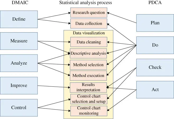
Figure 1.3Statistical analysis process in QI framework.
1.5.1 Data Visualization
Data visualization plays an important role in quality improvement, as can be seen in Figure 1.3. Once data has been collected, visualizations are useful in the data cleaning process, for assessing variation, in understanding relationships between variables, and for monitoring key process indicators.
Univariate graphs such as histograms and box plots aid in identifying data anomalies, such as transcription errors or misspellings in character fields. These graphs also familiarize the analyst with the distribution of the observations. Outliers are easily seen in histograms and box plots. Outliers may be legitimate, but unusual values of a process or they may be errors that require either correction or removal from the data set. Careful study of outliers may lead to insights that benefit the quality initiative. A control chart, which will be described in more detail later, is another type of univariate graph used to monitor process performance over time.
Bivariate plots, such as scatterplots and run charts allow analysts to detect patterns of variation and time trends. They are also helpful to the analyst in choosing an appropriate form for a statistical model to quantify the relationship between two variables. Multivariate graphs such as bubble plots and scatterplot matrices are effective for displaying three or more variables. Maps are another valuable way to visualize geographic data. JMP®'s Graph Builder offers many options for creating multivariate graphs and implements the data visualization technique of “small multiples” (Tufte 2001). This method displays multiple variables using similar graphs with the same axis scales sequenced over one or two other variables. Small multiples allow the observer to focus on changes in the data rather than changes in the graphical elements.
Data visualizations are easily understood by participants in quality improvement projects and facilitate evaluation of process performance. They are also powerful tools for communicating with management, stakeholders, and the general public. There are a number of principles and best practices to create effective visualizations. The reader is referred to the works of Cleveland (1994), Tufte (2001), Few (2012), and Knaflic (2015) for more guidance on creating compelling data visualizations. The cases presented here illustrate how visualizations are applied in various phases of the DMAIC process and provide step‐by‐step instructions for how to create a variety of different types of graphs.
1.5.2 Subgrouping Data
Examining data in subgroups, also known as “slicing” the data, or stratification can help project teams discover opportunities for process change. For example, analyzing the time required for nurses to respond to a patient call by shift may identify needed changes to staffing levels to improve patient satisfaction. JMP provides many features that facilitate data slicing, such as the Data Filter, Graph Builder, and Tabulate. Data subgrouping was crucial in the preoperative TJR process improvement effort. Even though the main steps of the preoperative TJR process are the same regardless of the type of implant, the improvement team discovered that there were some extra steps for a particular kind of knee implant. This stratification led the team to analyze these processes separately. Indeed, this data slicing allowed the improvement team to run comparative studies that facilitated the identification of the root cause of the problem as discussed in Chapters 13and 14.
1.5.3 Control Charts
In practice, process changes are most effective right after they are implemented when awareness is high, but over time, these changes may not be sustained. Control charts are a key tool for monitoring quality improvements to be sure that the desired effect is maintained over time. They track key process variables and alert the user when something has changed in the process performance.
An important feature of control charts is that they display the region corresponding to the expected variability (common cause variation) of a process indicator when it is operating normally (i.e. in control). Observations lying outside of this region alert the user that the process has changed and action should be taken to understand what has changed and deploy any needed corrective actions. There are different types of control charts that depend on the measurement level of the process variable. “Variables” charts are for those variables measured on a continuous scale. “Attribute” charts apply to count measurements, such as number of errors per insurance claim. Figure 1.4shows some of the commonly applied attribute and variables charts.
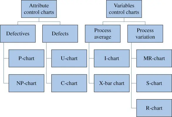
Figure 1.4Types of control charts.
Attributes are counts, classified as either defectives or defects. A defective is an item that does not meet the requirements, while defects are the number of nonconformances per item. For example, consider the process of hospital bills being audited periodically. If a bill contains an error, it would be considered defective, and the count of all defective bills during the audit period would be appropriately monitored by P‐ or NP‐charts, depending on whether the number of bills audited in each period is variable or fixed, respectively. In contrast, if the auditors count the number of errors on each bill, then U‐ and C‐charts are applicable, again depending on whether the number of bills audited in each period is variable or fixed, respectively.
Читать дальшеИнтервал:
Закладка:
Похожие книги на «Improving Health Care Quality»
Представляем Вашему вниманию похожие книги на «Improving Health Care Quality» списком для выбора. Мы отобрали схожую по названию и смыслу литературу в надежде предоставить читателям больше вариантов отыскать новые, интересные, ещё непрочитанные произведения.


Обсуждение, отзывы о книге «Improving Health Care Quality» и просто собственные мнения читателей. Оставьте ваши комментарии, напишите, что Вы думаете о произведении, его смысле или главных героях. Укажите что конкретно понравилось, а что нет, и почему Вы так считаете.