Zachary Jarvinen - Enterprise AI For Dummies
Здесь есть возможность читать онлайн «Zachary Jarvinen - Enterprise AI For Dummies» — ознакомительный отрывок электронной книги совершенно бесплатно, а после прочтения отрывка купить полную версию. В некоторых случаях можно слушать аудио, скачать через торрент в формате fb2 и присутствует краткое содержание. Жанр: unrecognised, на английском языке. Описание произведения, (предисловие) а так же отзывы посетителей доступны на портале библиотеки ЛибКат.
- Название:Enterprise AI For Dummies
- Автор:
- Жанр:
- Год:неизвестен
- ISBN:нет данных
- Рейтинг книги:5 / 5. Голосов: 1
-
Избранное:Добавить в избранное
- Отзывы:
-
Ваша оценка:
Enterprise AI For Dummies: краткое содержание, описание и аннотация
Предлагаем к чтению аннотацию, описание, краткое содержание или предисловие (зависит от того, что написал сам автор книги «Enterprise AI For Dummies»). Если вы не нашли необходимую информацию о книге — напишите в комментариях, мы постараемся отыскать её.
, author Zachary Jarvinen simplifies and explains to readers the complicated world of artificial intelligence for business. Using practical examples, concrete applications, and straightforward prose, the author breaks down the fundamental and advanced topics that form the core of business AI.
Written for executives, managers, employees, consultants, and students with an interest in the business applications of artificial intelligence,
demystifies the sometimes confusing topic of artificial intelligence. No longer will you lag behind your colleagues and friends when discussing the benefits of AI and business.
The book includes discussions of AI applications, including :
· Streamlining business operations
· Improving decision making
· Increasing automation
· Maximizing revenue
The
series makes topics understandable, and as such, this book is written in an easily understood style that’s perfect for anyone who seeks an introduction to a usually unforgiving topic.
Enterprise AI For Dummies — читать онлайн ознакомительный отрывок
Ниже представлен текст книги, разбитый по страницам. Система сохранения места последней прочитанной страницы, позволяет с удобством читать онлайн бесплатно книгу «Enterprise AI For Dummies», без необходимости каждый раз заново искать на чём Вы остановились. Поставьте закладку, и сможете в любой момент перейти на страницу, на которой закончили чтение.
Интервал:
Закладка:
 Focusing on the power of visualization
Embracing data as the new currency
Defining use cases
Considering the value that AI can bring to an organization, it’s no wonder that the world is experiencing an AI renaissance. Gartner reported that the adoption rate for AI in the enterprise increased 270 percent between 2015 and 2019, and that trend shows no signs of slowing.
A 2018 Deloitte report found that the primary focus of enterprise AI deployments has been to optimize internal and external operations, make better decisions, and free workers to be more creative.
However, launching an AI initiative is not as simple as setting up powerful processors and massive storage and then throwing a bunch of data at it. It’s a powerful beast and must be approached with all due caution.
Before you obsess on technology, you should take a deep breath and focus on a benefit. Identify specific use cases that are compatible with an AI solution. Next, evaluate the business case for each use case and solution, specifically for a near-future benefit. Then you can do a gap assessment to identify the next steps for moving forward.
Democratizing AI
For decades, artificial intelligence was the province of academics, scientists, and technicians with a highly specialized skill set. In the 1980s, some data scientists took the step from academe to commerce, applying AI to real-world problems and the development of expert systems. In the 1990s, commercial applications for AI expanded along with the Internet and the wealth of data it generated.
Even so, any business wanting to capitalize on the power of artificial intelligence had to commit a serious amount of capital, not only for rare and expensive data scientists, but also for major-league processing power and data storage.
More recently, full-powered AI solutions with simplified interfaces allow users to create and train models and produce reports and data visualization, reducing the need for a full team of dedicated data scientists.
In fact, Gartner predicted that workers using self-service analytics would output more analysis than professional data scientists. That’s good news for enterprises. And don’t worry about putting data scientists out of business. They are still in high demand. For the last three years, data scientist was the #1 ranked job in the U.S. on the career website Glassdoor.
Visualizing Results
The key to actionable insight is the ability to quickly recognize what the data is telling you. Any AI solution you use must have a rich, robust, and easy-to-use data visualization engine.
Good data visualization transcends barriers of language and culture to instantly communicate the important data points and trends. It also has the virtue of being easy to share and to engage with. Table 3-1shows four visualization types categorized by use.
Comparison
When you want to compare a selection of things, you line them up on the table to see them all at once. That’s how a comparison visualization works.
TABLE 3-1Types of Visualizations and Uses
| Type | Use |
| Comparison | Compare two or more values on an XY axis. Examples: timeline, trend, ranking Types: line, column, bar, timeline |
| Composition | Show how the parts relate to the whole. Examples: revenue of product mix over time, breakdown of demographic data across the range of a variable Types: stacked bars/columns, pie/donut, stacked area, waterfall, polar |
| Distribution | Show the value of one variable tracked across a set of categories. Examples: sales across regions or stores, age ranges in demographic Types: histogram, line, area, scatter plot, map |
| Relationship | Show the connection between two or more variables. Examples: track revenue versus cost across regions or stores, show traffic or accident incidents by weather or time of day Types: scatter, bubble, line |
One way to do that is a bar chart, either vertical or horizontal. One axis displays the collection of categories or ranges and the other the quantity, rank, or another metric.
Another way is to have the X axis represent one variable and the Y axis represent a different variable, and then plot the data points. The data points can even use bubble size to represent a third variable, packing information into a simple visualization that conveys lots of information in a glance. Figure 3-1 shows the number of page visits on the X axis, the duration of the visit on the Y axis, and income band by the size of the bubble.
Composition
A composition visualization drills down into the information that comprises a single number.
For example, you may know the total number of employees across industries, but there is more information buried in the data.
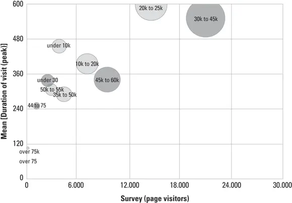
FIGURE 3-1:Comparison: Total page visits by mean duration of visit.
The top part of Figure 3-2 shows a bar chart with the various categories of employees on one axis and the number of employees on the other axis to help you understand the composition of the workforce across industries. The bottom part of Figure 3-2 shows a donut chart breaking down the percentage of revenue per market segment.
Distribution
A distribution visualization conveys how the data points fall across categories or locations and such. For example, you can show a table of counties in alphabetical order and the number of startups for each county, but it is hard to get a sense of how they relate geographically. Figure 3-3 uses a heat map to represent values through colors, often with gradations shades or tints indicating the values of adjacent numbers.
Relationship
A relationship visualization reveals how two or more variables affect each other. You can show relationships through a variety of methods.
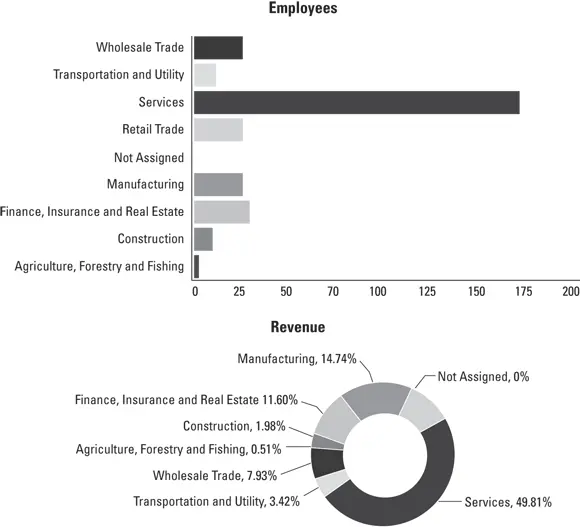
FIGURE 3-2:Composition: Employee per industry (top), revenue per market segment (bottom).
The simplest is a line graph showing how one variable rises or falls along the Y axis as it moves through degrees of another variable on the X axis. A scatter plot is useful when the data is not linear, such as representing the height and weight of a population, where there are multiple instances of weight for each height. A bubble chart is a scatter plot using the size of the bubble to represent a third variable.
You can also indicate relationship by graphing two variables on one axis across a third variable on the other axis. Figure 3-4 graphs call center wait times and customer satisfaction scores across time.
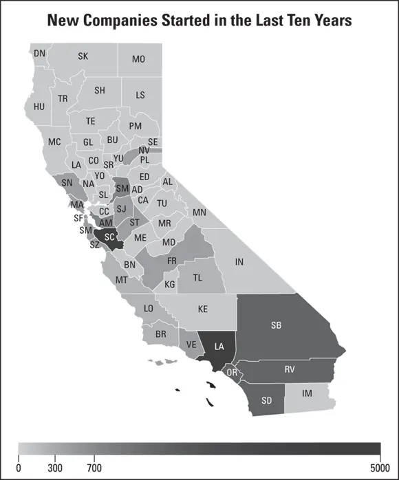
FIGURE 3-3:Distribution: Startups per county.
Читать дальшеИнтервал:
Закладка:
Похожие книги на «Enterprise AI For Dummies»
Представляем Вашему вниманию похожие книги на «Enterprise AI For Dummies» списком для выбора. Мы отобрали схожую по названию и смыслу литературу в надежде предоставить читателям больше вариантов отыскать новые, интересные, ещё непрочитанные произведения.


Обсуждение, отзывы о книге «Enterprise AI For Dummies» и просто собственные мнения читателей. Оставьте ваши комментарии, напишите, что Вы думаете о произведении, его смысле или главных героях. Укажите что конкретно понравилось, а что нет, и почему Вы так считаете.