Michael Begon - Ecology
Здесь есть возможность читать онлайн «Michael Begon - Ecology» — ознакомительный отрывок электронной книги совершенно бесплатно, а после прочтения отрывка купить полную версию. В некоторых случаях можно слушать аудио, скачать через торрент в формате fb2 и присутствует краткое содержание. Жанр: unrecognised, на английском языке. Описание произведения, (предисловие) а так же отзывы посетителей доступны на портале библиотеки ЛибКат.
- Название:Ecology
- Автор:
- Жанр:
- Год:неизвестен
- ISBN:нет данных
- Рейтинг книги:5 / 5. Голосов: 1
-
Избранное:Добавить в избранное
- Отзывы:
-
Ваша оценка:
Ecology: краткое содержание, описание и аннотация
Предлагаем к чтению аннотацию, описание, краткое содержание или предисловие (зависит от того, что написал сам автор книги «Ecology»). Если вы не нашли необходимую информацию о книге — напишите в комментариях, мы постараемся отыскать её.
– now in full colour – offers students and practitioners a review of the ecological sciences.
The previous editions of this book earned the authors the prestigious ‘Exceptional Life-time Achievement Award’ of the British Ecological Society – the aim for the fifth edition is not only to maintain standards but indeed to enhance its coverage of Ecology.
In the first edition, 34 years ago, it seemed acceptable for ecologists to hold a comfortable, objective, not to say aloof position, from which the ecological communities around us were simply material for which we sought a scientific understanding. Now, we must accept the immediacy of the many environmental problems that threaten us and the responsibility of ecologists to play their full part in addressing these problems. This fifth edition addresses this challenge, with several chapters devoted entirely to applied topics, and examples of how ecological principles have been applied to problems facing us highlighted throughout the remaining nineteen chapters.
Nonetheless, the authors remain wedded to the belief that environmental action can only ever be as sound as the ecological principles on which it is based. Hence, while trying harder than ever to help improve preparedness for addressing the environmental problems of the years ahead, the book remains, in its essence, an exposition of the
of ecology. This new edition incorporates the results from more than a thousand recent studies into a fully up-to-date text.
Written for students of ecology, researchers and practitioners, the fifth edition of
is anessential reference to all aspects of ecology and addresses environmental problems of the future.
Ecology — читать онлайн ознакомительный отрывок
Ниже представлен текст книги, разбитый по страницам. Система сохранения места последней прочитанной страницы, позволяет с удобством читать онлайн бесплатно книгу «Ecology», без необходимости каждый раз заново искать на чём Вы остановились. Поставьте закладку, и сможете в любой момент перейти на страницу, на которой закончили чтение.
Интервал:
Закладка:
k values
The advantages are combined, however, in the next column of the life table, which contains k xvalues (Haldane, 1949 ; Varley & Gradwell, 1970). k xis defined simply as the difference between successive values of log 10 a xor successive values of log 10 l x(they amount to the same thing), and is sometimes referred to as a ‘killing power’. Like q xvalues, k xvalues reflect the intensity or rate of mortality (as Tables 4.1and 4.2show); but unlike summing the q xvalues, summing k xvalues is a legitimate procedure. Thus, the killing power or k value for the first four years in the marmot example is 0.26 + 0.31 + 0.18 + 0.12 = 0.87, which is also the difference between log 10 a 0and log 10 a 4(allowing for rounding errors). Note too that like l xvalues, k xvalues are standardised, and are therefore appropriate for comparing quite separate studies. In this and later chapters, k xvalues will be used repeatedly.
fecundity schedules
Tables 4.1and 4.2also include fecundity schedules for Gilia and for the marmots (the final three columns). The first of these in each case shows F x, the total number of the youngest age class produced by each subsequent age class. This youngest class is seeds for Gilia , produced only by the flowering plants. For the marmots, these are independent juveniles, fending for themselves outside their burrows, produced when adults were between 2 and 10 years old. The next column is then said to contain m xvalues, which is fecundity: the mean number of the youngest age class produced per surviving individual of each subsequent class. For the marmots, fecundity was highest for eight‐year‐old females: 1.68, that is, 37 young produced by 22 surviving females. We get a good idea of the range of fecundity schedules in Figure 4.2: some with constant fecundity throughout most of an individual’s life, some in which there is a steady increase with age, some with an early peak followed by an extended postreproductive phase. We try to account for some of this variation in the next chapter.
… combined to give the basic reproductive rate
In the final column of a life table, the l xand m xcolumns are brought together to express the overall extent to which a population increases or decreases over time – reflecting the dependence of this on both the survival of individuals (the l xcolumn) and the reproduction of those survivors (the m xcolumn). That is, an age class contributes most to the next generation when a large proportion of individuals have survived and they are highly fecund. The sum of all the l x m xvalues, ∑ l x m x, where the symbol ∑ means ‘the sum of’, is therefore a measure of the overall extent by which this population has increased or decreased in a generation. We call this the basic reproductive rate and denote it by R 0(‘ R ‐nought’). That is:
(4.2) 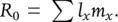
We can also calculate R 0by dividing the total number of offspring produced during one generation (∑ F x, meaning the sum of the values in the F xcolumn) by the original number of individuals. That is:
(4.3) 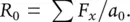
For Gilia ( Table 4.1), R 0is calculated very simply (no summation required) since only the flowering class produces seed. Its value is 38.27 for the inland subspecies and 11.47 for the coastal subspecies: a clear indication that the inland subspecies thrived, comparatively, at this inland site. (Though the annual rate of reproduction would not have been this high, since, no doubt, a proportion of these would have died before the start of the 1994 cohort. In other words, another class of individuals, ‘winter seeds’, was ignored in this study.)
For the marmots, R 0= 0.67: the population was declining, each generation, to around two‐thirds its former size. However, whereas for Gilia the length of a generation is obvious, since there is one generation each year, for the marmots the generation length must itself be calculated. We address the question of how to do this in Section 4.7, but for now we can note that its value, 4.5 years, matches what we can observe ourselves in the life table: that a ‘typical’ period from an individual’s birth to giving birth itself (i.e. a generation) is around four and a half years. Thus, Table 4.2indicates that each generation, every four and a half years, this particular marmot population was declining to around two‐thirds its former size.
4.6.2 Survivorship curves
It is also possible to study the detailed pattern of decline in a cohort. Figure 4.10a, for example, shows the numbers of marmots surviving relative to the original population – the l xvalues – plotted against the age of the cohort. However, this can be misleading. If the original population is 1000 individuals, and it decreases by half to 500 in one time interval, then this decrease looks more dramatic on a graph like Figure 4.9a than a decrease from 50 to 25 individuals later in the season. Yet the risk of death to individuals is the same on both occasions. If, however, l xvalues are replaced by log( l x) values, that is, the logarithms of the values, as in Figure 4.10b (or, effectively the same thing, if l xvalues are plotted on a log scale), then it is a characteristic of logs that the reduction of a population to half its original size will always look the same. Survivorship curves are, therefore, conventionally plots of log( l x) values against cohort age. Figure 4.10b shows that for the marmots, there was a steady, more or less constant rate of decline until around the eighth year of life, then three further years at a slightly higher rate (until breeding ceased), followed by a brief period with effectively no mortality, after which the few remaining survivors died.
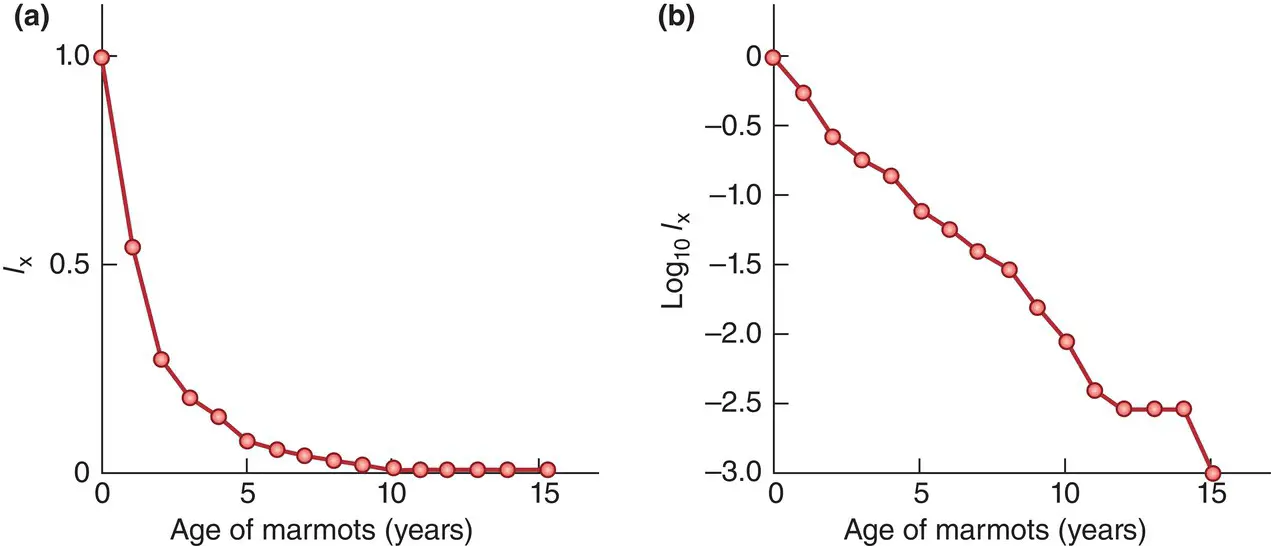
Figure 4.10 Representations of the survival of a cohort of the yellow‐bellied marmot( Table 4.2). (a) When l xis plotted against cohort age, it is clear that most individuals are lost relatively early in the life of the cohort, but there is no clear impression of the risk of mortality at different ages. (b) By contrast, a survivorship curve plotting log( l x) against age shows a virtually constant mortality risk until around age eight, followed by a brief period of slightly higher risk, and then another brief period of low risk after which the remaining survivors died.
a classification of survivorship curves
Life tables provide a great deal of data on specific organisms. But ecologists search for generalities – patterns of life and death that we can see repeated in the lives of many species – conventionally dividing survivorship curves into three types in a scheme that goes back to 1928, generalising what we know about the way in which the risks of death are distributed through the lives of different organisms ( Figure 4.11).
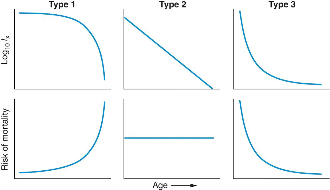
Figure 4.11 Classification of survivorship curvesplotting log( l x) against age, above, with corresponding plots of the changing risk of mortality with age, below. The three types are discussed in the text.
Читать дальшеИнтервал:
Закладка:
Похожие книги на «Ecology»
Представляем Вашему вниманию похожие книги на «Ecology» списком для выбора. Мы отобрали схожую по названию и смыслу литературу в надежде предоставить читателям больше вариантов отыскать новые, интересные, ещё непрочитанные произведения.


Обсуждение, отзывы о книге «Ecology» и просто собственные мнения читателей. Оставьте ваши комментарии, напишите, что Вы думаете о произведении, его смысле или главных героях. Укажите что конкретно понравилось, а что нет, и почему Вы так считаете.