David Machin - Medical Statistics
Здесь есть возможность читать онлайн «David Machin - Medical Statistics» — ознакомительный отрывок электронной книги совершенно бесплатно, а после прочтения отрывка купить полную версию. В некоторых случаях можно слушать аудио, скачать через торрент в формате fb2 и присутствует краткое содержание. Жанр: unrecognised, на английском языке. Описание произведения, (предисловие) а так же отзывы посетителей доступны на портале библиотеки ЛибКат.
- Название:Medical Statistics
- Автор:
- Жанр:
- Год:неизвестен
- ISBN:нет данных
- Рейтинг книги:3 / 5. Голосов: 1
-
Избранное:Добавить в избранное
- Отзывы:
-
Ваша оценка:
Medical Statistics: краткое содержание, описание и аннотация
Предлагаем к чтению аннотацию, описание, краткое содержание или предисловие (зависит от того, что написал сам автор книги «Medical Statistics»). Если вы не нашли необходимую информацию о книге — напишите в комментариях, мы постараемся отыскать её.
Helpful multi-choice exercises are included at the end of each chapter, with answers provided at the end of the book. Each analysis technique is carefully explained and the mathematics kept to minimum. Written in a style suitable for statisticians and clinicians alike, this edition features many real and original examples, taken from the authors' combined many years' experience of designing and analysing clinical trials and teaching statistics.
Students of the health sciences, such as medicine, nursing, dentistry, physiotherapy, occupational therapy, and radiography should find the book useful, with examples relevant to their disciplines. The aim of training courses in medical statistics pertinent to these areas is not to turn the students into medical statisticians but rather to help them interpret the published scientific literature and appreciate how to design studies and analyse data arising from their own projects. However, the reader who is about to design their own study and collect, analyse and report on their own data will benefit from a clearly written book on the subject which provides practical guidance to such issues.
The practical guidance provided by this book will be of use to professionals working in and/or managing clinical trials, in academic, public health, government and industry settings, particularly medical statisticians, clinicians, trial co-ordinators. Its practical approach will appeal to applied statisticians and biomedical researchers, in particular those in the biopharmaceutical industry, medical and public health organisations.
Medical Statistics — читать онлайн ознакомительный отрывок
Ниже представлен текст книги, разбитый по страницам. Система сохранения места последней прочитанной страницы, позволяет с удобством читать онлайн бесплатно книгу «Medical Statistics», без необходимости каждый раз заново искать на чём Вы остановились. Поставьте закладку, и сможете в любой момент перейти на страницу, на которой закончили чтение.
Интервал:
Закладка:
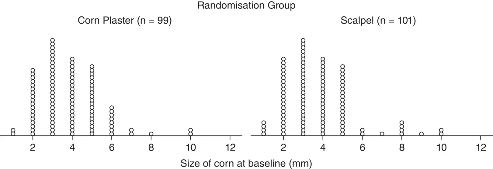
Figure 2.5 Dot plot showing corn size (in mm) by randomised treatment group for 200 patients with corns.
( Source: data from Farndon et al. 2013).
Histograms
The patterns may be revealed in large data set of a numerically continuous variable by forming a histogram with them. This is constructed by first dividing up the range of variable into several non‐overlapping and equal intervals, classes, or bins, then counting the number of observations in each. A histogram for all the baseline corn sizes in the Farndon et al. (2013) trial data is shown in Figure 2.6. In this histogram the intervals corresponded to a width of 1 mm. The area of each histogram block is proportional to the number of subjects in the particular corn size category concentration group. Thus, the total area in the histogram blocks represents the total number of patients. Relative frequency histograms allow comparison between histograms made up of different numbers of observations which may be useful when studies are compared.
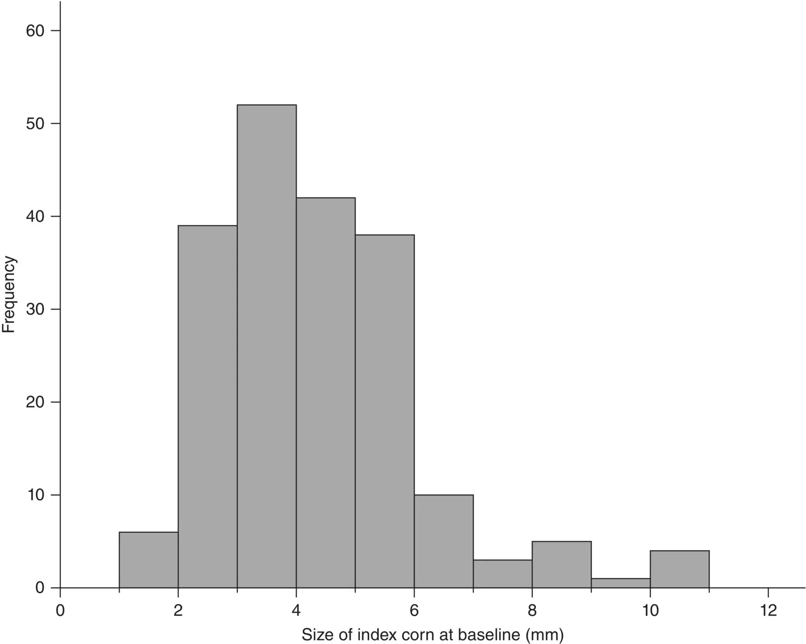
Figure 2.6 Histogram of baseline index corn size (in mm) for 200 patients with corns.
( Source: data from Farndon et al. 2013).
The choice of the number and width of intervals or bins is important. Too few intervals and much important information may be smoothed out; too many intervals and the underlying shape will be obscured by a mass of confusing detail. As a rule of thumb, it is usual to choose between 5 and 15 intervals, but the correct choice will be based partly on a subjective impression of the resulting histogram. In the corn plaster trial the baseline corn size was measured in integers to the nearest mm. In Figure 2.6we have 10 intervals or bins of width 1 mm which fits our rule of thumb. In this example an interval of 1–1.99 mm covers bin 1, 2–2.99 mm covers bin 2, etc. Histograms with bins of unequal interval length can be constructed but they are usually best avoided.
Box and Whisker Plot
A box and whisker plot contains five pieces of summary information about the data: the median; upper quartile; lower quartile; maximum and minimum values. If the number of points is large, a dot‐plot can be replaced by a box and whisker plot and which is more compact than the corresponding histogram.
Illustrative Example – Box and Whisker Plot – Birthweight by Type of Delivery
A box and whisker plot is illustrated in Figure 2.7for the corn size and treatment group from Farndon et al. (2013). The ‘whiskers’ in the diagram indicate the minimum and maximum values of the variable under consideration. The median value is indicated by the central horizontal line whilst the lower and upper quartiles by the corresponding horizontal ends of the box. The shaded box itself represents the interquartile range. The box and whisker plot as used here therefore displays the median and two measures of spread, namely the range and interquartile range. In Figure 2.7, for the scalpel group the median and lower quartile for the baseline corn size coincide and is 3 mm.
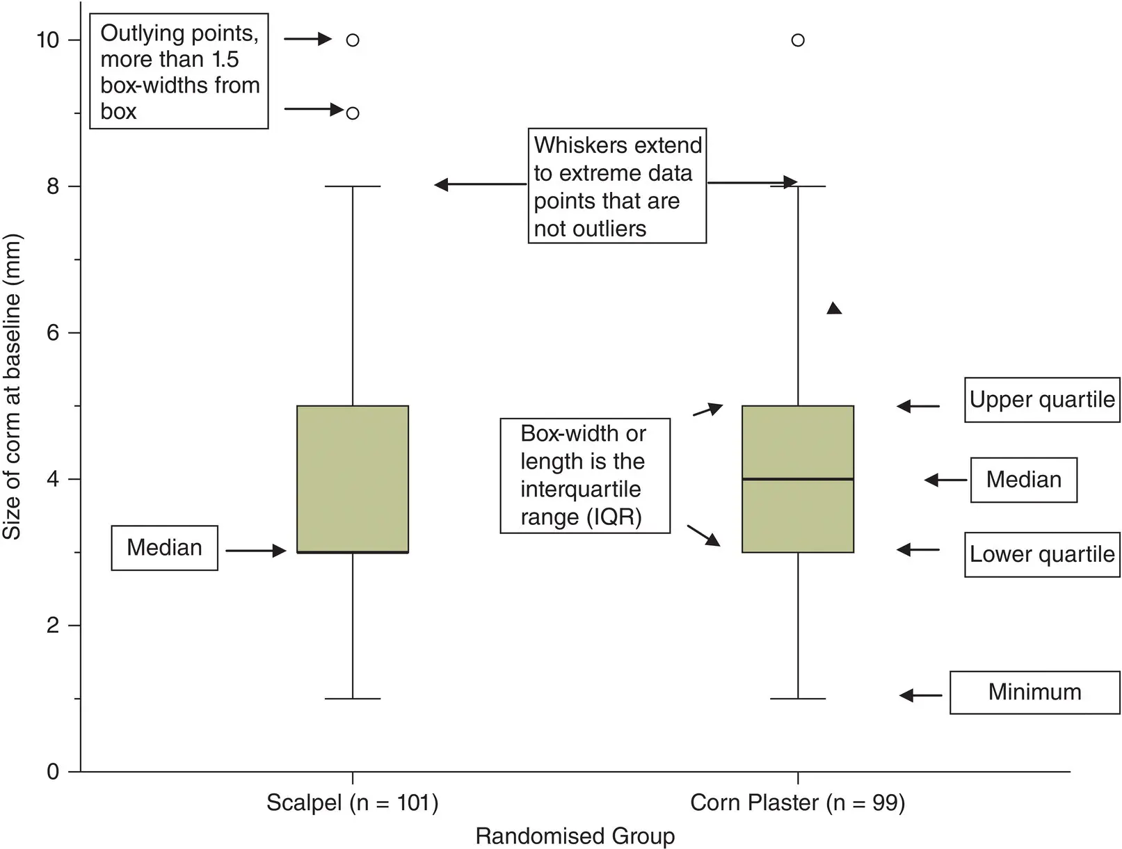
Figure 2.7 Box and whisker plot of size of corn at baseline (in mm) by randomised group for 200 patients with corns.
( Source: data from Farndon et al. 2013).
Scatter Plots
When one wishes to illustrate a relationship between two continuous variables, a scatter plot of one against the other may be informative.
Illustrative Example – Scatter Plot – Baseline Corn Size by Corn Size at a Three month Follow‐up
A scatter plot is illustrated in Figure 2.8for the baseline corn size against the three‐month follow‐up corn size for 181 patients with corns on their feet. There appears to be some association between baseline and three‐month corn size in this sample with larger baseline corn sizes associated with larger three‐month corn sizes and vice versa. There are numerous overlapping data points in this scatterplot with several patients having the same combination of baseline and three‐month corn sizes. Overlapping or overplotting can occur when a continuous measurement, in this example corn size, is rounded to some convenient unit (e.g. the nearest mm). To prevent overlapping data points in Figure 2.8, we have added a small random noise to the data called jittering. Jittering is the act of adding random noise to data in order to prevent overplotting in statistical graphs.
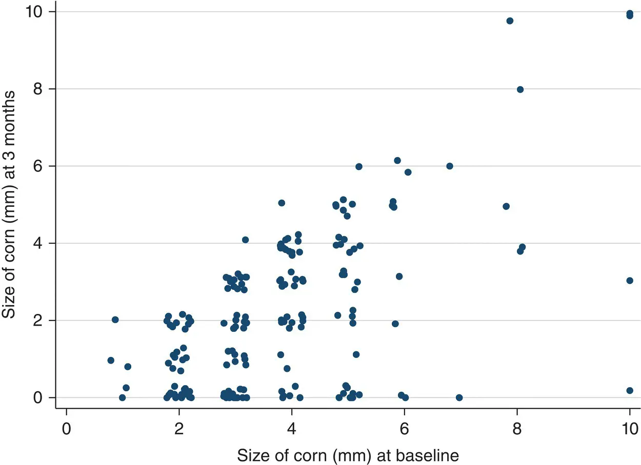
Figure 2.8 Scatter plot of baseline corn size by corn size at a three month follow‐up for 181 patients with corns.
( Source: data from Farndon et al. 2013).
It is likely that baseline corn size will have an influence on corn size at three months, but vice versa cannot be the case. In this case, if one variable, x , (baseline corn size) could cause the other, y , (three‐month corn size) then it is usual to plot the x variable on the horizontal axis and the y variable on the vertical axis.
In contrast, if we were interested in the relationship between baseline corn size and height of the patient then either variable could cause or influence the other. In this example it would be immaterial which variable (corn size or height) is plotted on which axis.
Measures of Symmetry
One important reason for producing dot plots and histograms is to get some idea of the shape of the distribution of the data. In Figure 2.6there is a (slight) suggestion that the distribution of corn size is not symmetric; that is if the distribution were folded over some central point, the two halves of the distribution would not coincide. When this is the case, the distribution is termed skewed . A distribution is right (left) skewed if the longer tail is to the right (left), see Figure 2.9. If the distribution is symmetric then the median and mean will be close. If the distribution is skewed then the median and interquartile range are in general more appropriate summary measures than the mean and standard deviation, since the latter are sensitive to the skewness.
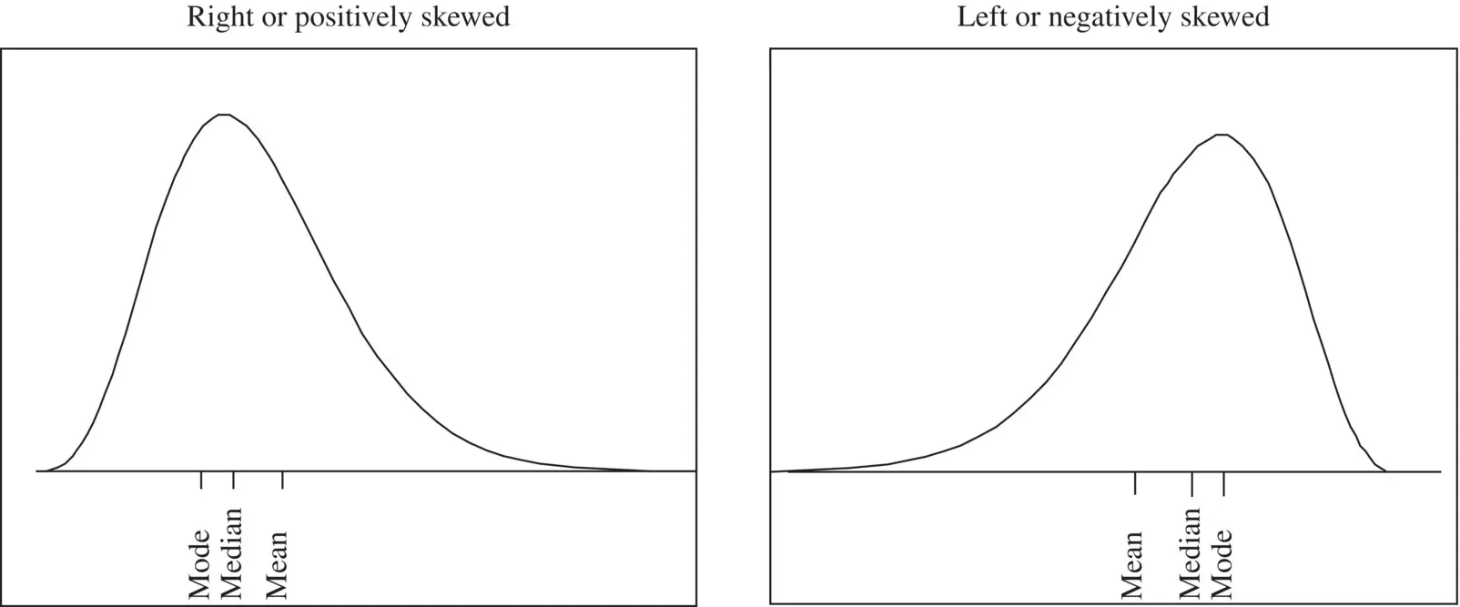
Figure 2.9 Examples of two skewed distributions.
For the corn size data, the mean from the 200 patients is 3.8 mm and the median is 4 mm so we conclude the data are reasonably symmetric. One is more likely to see skewness when the variables are constrained at one end or the other. For example, waiting time or time in hospital cannot be negative, but can be very large for some patients but relatively short for the majority and so it likely to be right or positively skewed.
A common skewed distribution is annual income, where a few high earners pull up the mean, but not the median. In the UK about 68% of the population earn less than the average wage, that is, the mean value of annual pay is equivalent to the 68th percentile on the income distribution. Thus, many people who earn more than the earnings of 50% (the median) of the population will still feel under paid!
Читать дальшеИнтервал:
Закладка:
Похожие книги на «Medical Statistics»
Представляем Вашему вниманию похожие книги на «Medical Statistics» списком для выбора. Мы отобрали схожую по названию и смыслу литературу в надежде предоставить читателям больше вариантов отыскать новые, интересные, ещё непрочитанные произведения.


Обсуждение, отзывы о книге «Medical Statistics» и просто собственные мнения читателей. Оставьте ваши комментарии, напишите, что Вы думаете о произведении, его смысле или главных героях. Укажите что конкретно понравилось, а что нет, и почему Вы так считаете.