David Machin - Medical Statistics
Здесь есть возможность читать онлайн «David Machin - Medical Statistics» — ознакомительный отрывок электронной книги совершенно бесплатно, а после прочтения отрывка купить полную версию. В некоторых случаях можно слушать аудио, скачать через торрент в формате fb2 и присутствует краткое содержание. Жанр: unrecognised, на английском языке. Описание произведения, (предисловие) а так же отзывы посетителей доступны на портале библиотеки ЛибКат.
- Название:Medical Statistics
- Автор:
- Жанр:
- Год:неизвестен
- ISBN:нет данных
- Рейтинг книги:3 / 5. Голосов: 1
-
Избранное:Добавить в избранное
- Отзывы:
-
Ваша оценка:
Medical Statistics: краткое содержание, описание и аннотация
Предлагаем к чтению аннотацию, описание, краткое содержание или предисловие (зависит от того, что написал сам автор книги «Medical Statistics»). Если вы не нашли необходимую информацию о книге — напишите в комментариях, мы постараемся отыскать её.
Helpful multi-choice exercises are included at the end of each chapter, with answers provided at the end of the book. Each analysis technique is carefully explained and the mathematics kept to minimum. Written in a style suitable for statisticians and clinicians alike, this edition features many real and original examples, taken from the authors' combined many years' experience of designing and analysing clinical trials and teaching statistics.
Students of the health sciences, such as medicine, nursing, dentistry, physiotherapy, occupational therapy, and radiography should find the book useful, with examples relevant to their disciplines. The aim of training courses in medical statistics pertinent to these areas is not to turn the students into medical statisticians but rather to help them interpret the published scientific literature and appreciate how to design studies and analyse data arising from their own projects. However, the reader who is about to design their own study and collect, analyse and report on their own data will benefit from a clearly written book on the subject which provides practical guidance to such issues.
The practical guidance provided by this book will be of use to professionals working in and/or managing clinical trials, in academic, public health, government and industry settings, particularly medical statisticians, clinicians, trial co-ordinators. Its practical approach will appeal to applied statisticians and biomedical researchers, in particular those in the biopharmaceutical industry, medical and public health organisations.
Medical Statistics — читать онлайн ознакомительный отрывок
Ниже представлен текст книги, разбитый по страницам. Система сохранения места последней прочитанной страницы, позволяет с удобством читать онлайн бесплатно книгу «Medical Statistics», без необходимости каждый раз заново искать на чём Вы остановились. Поставьте закладку, и сможете в любой момент перейти на страницу, на которой закончили чтение.
Интервал:
Закладка:
( Source: data from Farndon et al. 2013).
| Treatment centre | Frequency | Percentage |
|---|---|---|
| Central | 110 | 54.5% |
| Manor | 33 | 16.3% |
| Jordanthorpe | 24 | 11.9% |
| Limbrick | 9 | 4.5% |
| Firth Park | 11 | 5.4% |
| Huddersfield | 9 | 4.5% |
| Darnall | 6 | 3.0% |
| Total | 202 | 100.0 |
In addition to tabulating each variable separately, we might be interested in whether the distribution of patients across each centre is the same for each randomised group. Table 2.3shows the distribution of the number of patients treated at centre by randomised group; in this case it can be said that treatment centre has been cross‐tabulated with randomised group. Table 2.3is an example of a contingency table with seven rows (representing treatment centre) and two columns (randomised group). Note that we are interested in the distribution of patients across the seven centres in each randomised group (to see whether or not we have similar numbers of patients randomised to each treatment within each centre), and so the percentages add to 100 down each column, rather than across the rows. In this example since we have 101 and 101 patients in each randomised group the percentages are almost the same as the raw counts. However, for most studies you are unlikely to have exactly 100 participants in each group!
Table 2.3 Cross‐tabulation of treatment centre by randomised group for 202 patients with corns who were recruited to a randomised control trial of the effectiveness of salicylic acid plasters compared with ‘usual’ scalpel debridement for the treatment of corns
( Source: data from Farndon et al. 2013).
| Randomised group | |||
|---|---|---|---|
| Corn plaster | Scalpel | All | |
| n (%) | n (%) | n (%) | |
| Central | 58 (57) | 52 (52) | 110 (54.5) |
| Manor | 13 (13) | 20 (20) | 33 (16.3) |
| Jordanthorpe | 10 (10) | 14 (14) | 24 (11.9) |
| Limbrick | 3 (3) | 6 (6) | 9 (4.5) |
| Firth Park | 7 (7) | 4 (4) | 11 (5.4) |
| Huddersfield | 5 (5) | 4 (4) | 9 (4.5) |
| Darnall | 5 (5) | 1 (1) | 6 (3.0) |
| Total | 101 (100) | 101 (100) | 202 (100) |
Labelling Binary Outcomes
For binary data it is common to call the outcome ‘an event’ or ‘a non‐event’. For example, having your corn healed and resolved after three months of treatment may be an ‘event’. We often score an ‘event’ as 1 and a ‘non‐event’ as 0. These may also be referred to as a ‘positive’ or ‘negative’ outcome or ‘success’ and ‘failure’. It is important to realise that these terms are merely labels and the main outcome of interest might be a success in one context and a failure in another. Thus, in a study of a potentially lethal disease the outcome might be death, whereas in a disease that can be cured it might be being alive.
2.3 Displaying Categorical Data
Two methods of displaying categorical data are a bar chart or a pie chart . Figure 2.2shows in a bar chart the recruiting centres of 202 patients with foot corns treated in the trial of Farndon et al. (2013). Along the horizontal axis are the different treatment centre categories whilst on the vertical axis is the percentage. Each bar represents the percentage of the total patient population in that category. For example, it can be seen that the percentage of participants who were treated in the Central centre was about 55%.
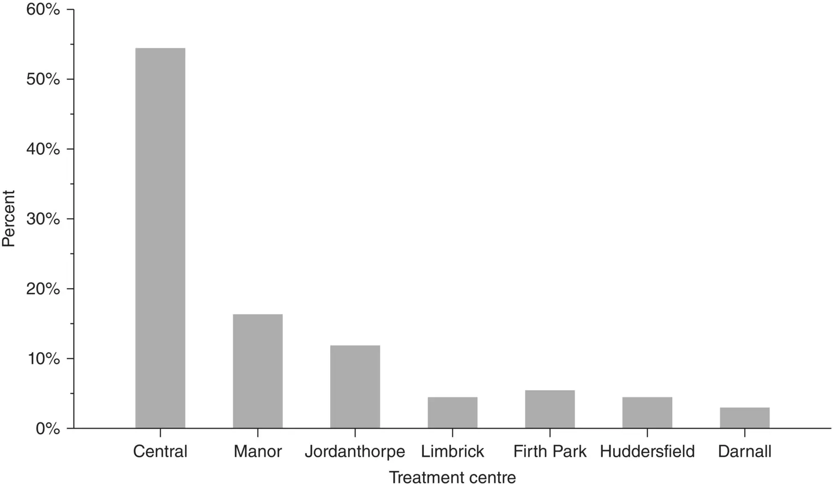
Figure 2.2 Bar chart showing where 202 patients with corns were treated
( Source: Farndon et al. 2013).
Figure 2.3a shows the same data displayed as a pie chart. One often sees pie charts in the literature. However, generally they are to be avoided as they can be difficult to interpret, particularly when the number of categories becomes greater than five. In addition, unless the percentages in the individual categories are displayed (as here) it can be much more difficult to estimate them from a pie chart than from a bar chart. For both chart types it is important to include the number of observations on which it is based, particularly when comparing more than one chart. Neither of these charts should be displayed in three dimensions (see Figure 2.3b for a three‐dimensional pie chart). Three‐dimensional charts feature in many spreadsheet packages, but are not recommended since they distort the information presented. They make it very difficult to extract the correct information from the figure, and, for example in Figure 2.3b the sectors that appear nearer the reader are over emphasised.
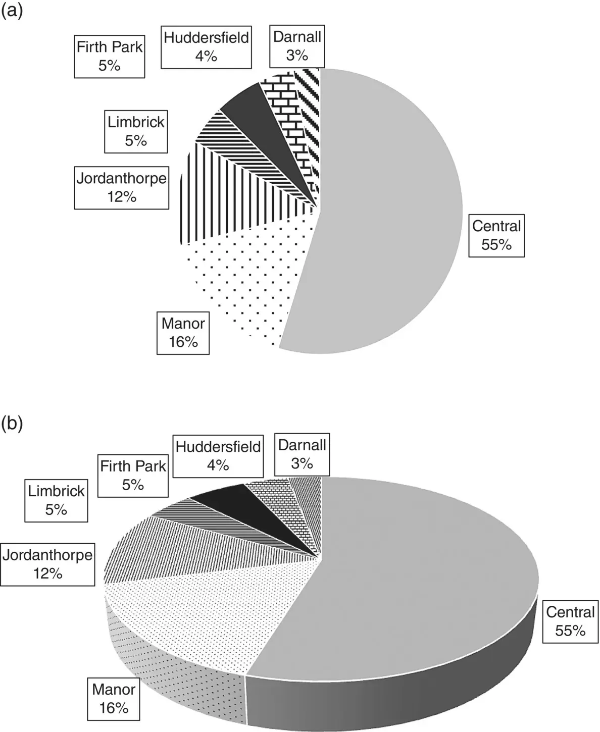
Figure 2.3 Pie chart showing where 202 patients with foot corns were treated
( Source: Farndon et al. 2013).
If the sample is further classified into whether the patient was treated with corn plasters or scalpel then it becomes impossible to present the data as a single pie or bar chart. We could present the data as two separate pie‐charts or bar charts side by side but it is preferably to present the data in one graph with the same scales and axes to make the visual comparisons easier.
In this case we could present the data as a clustered bar chart, as shown in Figure 2.4. This clearly shows that the distribution of the frequency of patients at each treatment centre by randomised treatment group is broadly similar. It is preferable to use the relative frequency scale on the vertical axis rather than the actual counts, particularly when the two groups are of different sizes, although in this example where the groups are of similar size this will not make much difference here.
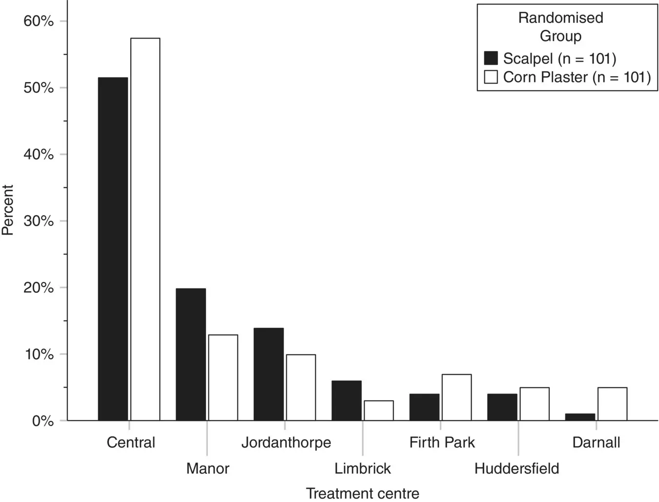
Figure 2.4 Clustered bar chart showing where 202 patients with foot corns were treated by randomised group
( Source: Farndon et al. 2013).
If you do use the relative frequency scale as we have, then it is recommended good practice to report the actual total sample sizes for each group in the legend. In this way, given the total sample size and relative frequency (from the height of the bars) we can work out the actual numbers treated in each centre.
2.4 Summarising Continuous Data
A quantitative measurement contains more information than a categorical one, and so summarising these data is more complex. One chooses summary statistics to condense a large amount of information into a few intelligible numbers, the sort that could be communicated verbally. The two most important pieces of information about a quantitative measurement are ‘what is the average value?’ and ‘what is the spread of the data?’ These are categorised as measures of location (sometimes ‘central tendency’) and measures of spread or variability. A measure of location (average) and variability (spread) provides an informative but brief summary of a set of observations.
Читать дальшеИнтервал:
Закладка:
Похожие книги на «Medical Statistics»
Представляем Вашему вниманию похожие книги на «Medical Statistics» списком для выбора. Мы отобрали схожую по названию и смыслу литературу в надежде предоставить читателям больше вариантов отыскать новые, интересные, ещё непрочитанные произведения.


Обсуждение, отзывы о книге «Medical Statistics» и просто собственные мнения читателей. Оставьте ваши комментарии, напишите, что Вы думаете о произведении, его смысле или главных героях. Укажите что конкретно понравилось, а что нет, и почему Вы так считаете.