Denis Mercier - Spatial Impacts of Climate Change
Здесь есть возможность читать онлайн «Denis Mercier - Spatial Impacts of Climate Change» — ознакомительный отрывок электронной книги совершенно бесплатно, а после прочтения отрывка купить полную версию. В некоторых случаях можно слушать аудио, скачать через торрент в формате fb2 и присутствует краткое содержание. Жанр: unrecognised, на английском языке. Описание произведения, (предисловие) а так же отзывы посетителей доступны на портале библиотеки ЛибКат.
- Название:Spatial Impacts of Climate Change
- Автор:
- Жанр:
- Год:неизвестен
- ISBN:нет данных
- Рейтинг книги:5 / 5. Голосов: 1
-
Избранное:Добавить в избранное
- Отзывы:
-
Ваша оценка:
Spatial Impacts of Climate Change: краткое содержание, описание и аннотация
Предлагаем к чтению аннотацию, описание, краткое содержание или предисловие (зависит от того, что написал сам автор книги «Spatial Impacts of Climate Change»). Если вы не нашли необходимую информацию о книге — напишите в комментариях, мы постараемся отыскать её.
Spatial Impacts of Climate Change — читать онлайн ознакомительный отрывок
Ниже представлен текст книги, разбитый по страницам. Система сохранения места последней прочитанной страницы, позволяет с удобством читать онлайн бесплатно книгу «Spatial Impacts of Climate Change», без необходимости каждый раз заново искать на чём Вы остановились. Поставьте закладку, и сможете в любой момент перейти на страницу, на которой закончили чтение.
Интервал:
Закладка:
This increase in global ocean surface temperatures leads, through thermal expansion, to a rise in sea level, as an increase in air temperature contributes to the melting of the Earth's cryosphere and thus to the increase in the amount of water in the global ocean (see Chapter 2on melting of the cryosphere). Similarly, rising ocean temperatures reduce dissolved oxygen in the ocean and significantly affect marine life, especially corals and other organisms sensitive to temperature and water chemistry (IPCC 2019; see Chapter 4on coasts). Increasing ocean surface water temperature promotes evaporation over the oceans and moisture in the atmosphere, which logically can promote heavy rainfall, and can be associated with more frequent and/or more intense cyclones, and can, depending on the case, lead to flooding (IPCC 2019). The consequence of this change in ocean temperatures is prolonged contemporary warming simply because of the thermal inertia of these gigantic ocean masses.
1.2. Contemporary Arctic-wide climate change
Global warming is not always visible to some, but it is most easily illustrated in the Arctic, particularly with the melting of the cryosphere (see Chapter 2). Indeed, the high latitudes of the boreal regions have recorded an increase in temperature of around 2.5°C since the beginning of the 20th Century, with temperature sequences comparable to those recorded on a global scale. Globally, this temperature increase is mainly due to the last few decades. Seasonally, the winter months (November to April) recorded the greatest temperature increases (see Figure 1.5), although the warmer months also experienced higher temperatures.
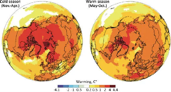
Figure 1.5. Spatial distribution of Arctic warming for the period 1961-2014 for the cold season (November to April) and the warm season (May to October)
(source: AMAP 2017). For a color version of this figure, see www.iste.co.uk/mercier/climate.zip
In the Arctic Basin, the Svalbard Archipelago is located in the area with the greatest warming. The curves in Figure 1.6, showing the evolution of temperature since the end of the 19th Century, illustrate both this climate warming on all time scales (annual and seasonal, especially winter) and the increase in annual precipitation. The average temperature in Longyearbyen, (Svalbard archipelago) has increased by 4 to 5°C since the beginning of the 20th Century. Like all the meteorological stations of this archipelago, Longyearbyen, being in a coastal position, is all the more sensitive to the spatial retraction of the winter sea ice in recent years, which explains the more significant increase in winter temperatures in recent decades in particular. Temperature trends are not linear, and cycles of different lengths and amplitudes have been obtained by statistical analyses (Fourier and wavelet, see Humlum et al. 2011). The similarities between the thermal evolutions at the Longyearbyen station and the North Atlantic Multidecadal Oscillations (AMO) underline the importance of the influence of ocean temperatures on that of the lower layers of the atmosphere (Humlum et al . 2011).
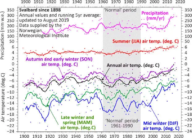
Figure 1.6. Temporal distribution of air temperature warming at Longyearbyen , 78° 25' N, 15° 47' E, capital of the Svalbard archipelago, for the period 1898-2019 at different time scales, annual in black, summer (June, July, August) in red, autumn (September, October, November) in purple, winter (December, January, February) in blue, spring (March, April, May) in green. For a color version of this figure, see www.iste.co.uk/mercier/climate.zip
COMMENT ON FIGURE 1.6.- The baseline average is calculated for the period 1961-1990. Change in mean annual precipitation with a five-year sliding average (in pink) (source: based on data from the Norwegian Meteorological Institute3) .
For the Ny-Alesund station, located on the northwestern coast of the Svalbard archipelago (78° 55' N, 11° 55' E), Figure 1.7 shows an increase in mean annual temperatures of 4°C from 1969 to 2016 and the increase in predominantly rainy precipitation from 356 mm per year in 1969 to 546 mm per year in 2016. The increase in temperatures largely explains the increase in precipitation due to an increase in the hygrometric capacity of the air, by the increase in the frequency of oceanic disturbances caused by the North Atlantic drift; in winter, in connection with periods when the North Atlantic Oscillation (NAO) index is positive, and in relation to the reduction of the ice pack in the Arctic basin, which allows open sea water to release heat into the lower layers of the atmosphere (see Chapter 2).
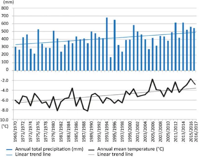
Figure 1.7. Annual mean precipitation and annual mean temperatures from 1969 to 2016 at the Ny-Alesund weather station (northwestern Spitsbergen, Svalbard)
(source: Bourriquen et al. 2018, based on data from the Norwegian Meteorological Institute). For a color version of this figure, see www.iste.co.uk/mercier/climate.zip
Thus, whatever the spatial scales used here, contemporary climate change is illustrated by an increase in temperatures and an associated increase in precipitation.
1.3. Future global climate change
At the current rate of atmospheric warming (0.2°C per decade), a warming of 1.5°C is expected by 2050 (IPCC 2014). Under the worst-case scenario and an increase of 8.5 watts per square meter, the temperature could rise by 4°C. The rise in sea level would be between 50 cm and 1 m by 2100 according to the latest IPCC report on cryosphere and oceans (IPCC 2019 and Chapters 2and 3).
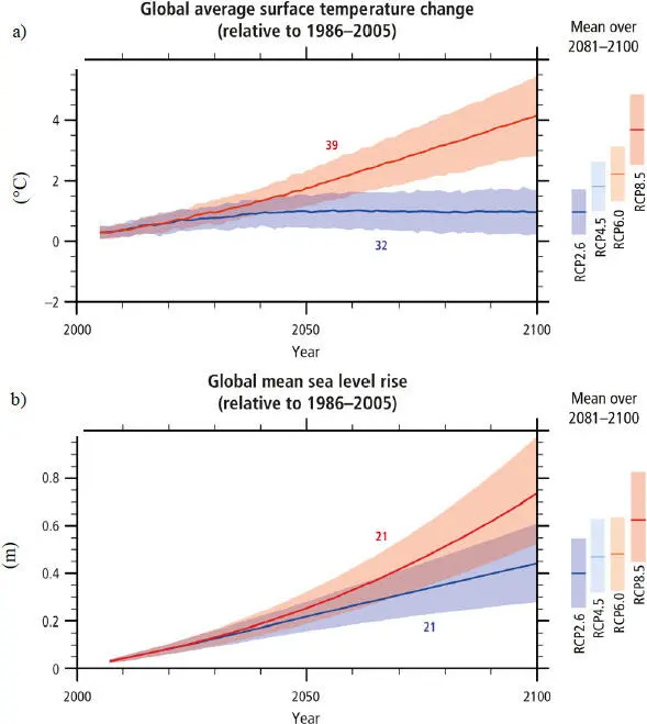
Figure 1.8. (a) Mean change in surface temperature. (b) Mean sea-level rise from 2006 to 2100 (as determined by multi-model simulations). For a color version of this figure, see www.iste.co.uk/mercier/climate.zip
COMMENT ON Figure 1.8.- All changes relate to 1986-2005. Time series of projections and a measure of uncertainty (shading) are presented for the RCP2.6 (blue) and RCP8.5 (red) scenarios 4. The average and associated uncertainties averaged over 2081-2100 are given for all RCP scenarios as colored vertical bars on the right side of each panel. The number of models from Phase 5 of the Coupled Model Intercomparison Project (CMIP5) used to calculate the multi-model mean is given (source: IPCC 2014).
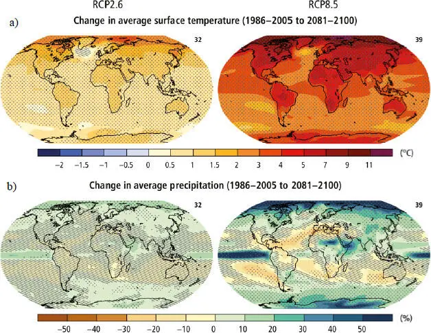
Figure 1.9. (a) Change in mean surface temperature. (b) Change in mean precipitation based on the multi-model mean projections for 2081-2100 compared to 1986-2005 in the RCP2.6 (left) and RCP8.5 (right) scenarios. For a color version of this figure, see www.iste.co.uk/mercier/climate.zip
COMMENT ON FIGURE 1.9.- The number of models used to calculate the multi-model average is shown in the upper right corner of each panel. The dotted lines show
regions where the projected change is large relative to the natural internal variability, and where at least 90% of the models agree on the sign of the change. Hatching shows regions where the projected change is less than one standard deviation of the natural internal variability (source: IPCC 2014) .
Читать дальшеИнтервал:
Закладка:
Похожие книги на «Spatial Impacts of Climate Change»
Представляем Вашему вниманию похожие книги на «Spatial Impacts of Climate Change» списком для выбора. Мы отобрали схожую по названию и смыслу литературу в надежде предоставить читателям больше вариантов отыскать новые, интересные, ещё непрочитанные произведения.


Обсуждение, отзывы о книге «Spatial Impacts of Climate Change» и просто собственные мнения читателей. Оставьте ваши комментарии, напишите, что Вы думаете о произведении, его смысле или главных героях. Укажите что конкретно понравилось, а что нет, и почему Вы так считаете.