Thomas N. Bulkowski - Encyclopedia of Chart Patterns
Здесь есть возможность читать онлайн «Thomas N. Bulkowski - Encyclopedia of Chart Patterns» — ознакомительный отрывок электронной книги совершенно бесплатно, а после прочтения отрывка купить полную версию. В некоторых случаях можно слушать аудио, скачать через торрент в формате fb2 и присутствует краткое содержание. Жанр: unrecognised, на английском языке. Описание произведения, (предисловие) а так же отзывы посетителей доступны на портале библиотеки ЛибКат.

- Название:Encyclopedia of Chart Patterns
- Автор:
- Жанр:
- Год:неизвестен
- ISBN:нет данных
- Рейтинг книги:3 / 5. Голосов: 1
-
Избранное:Добавить в избранное
- Отзывы:
-
Ваша оценка:
Encyclopedia of Chart Patterns: краткое содержание, описание и аннотация
Предлагаем к чтению аннотацию, описание, краткое содержание или предисловие (зависит от того, что написал сам автор книги «Encyclopedia of Chart Patterns»). Если вы не нашли необходимую информацию о книге — напишите в комментариях, мы постараемся отыскать её.
, Third Edition expands upon Bulkowski's immensely popular Second Edition with fully revised and updated material on chart patterns. Whether you’re new to the stock market or an experienced professional trader, use this book as a reference guide to give you an edge.
Within the pages of this book, you’ll learn how to identify chart patterns, supported by easy-to-understand performance statistics describing how well a pattern works, what the failure rate is, and what special quirks suggest better future performance. You’ll discover how often a stop loss order will trigger at various locations within a chart pattern, how the chart pattern’s performance has evolved over the past three decades, and how to profit from failure by trading busted patterns.
This broadened and revised
offers investors the most comprehensive, up-to-date guide to this popular method of market analysis. Written by a leading expert on chart patterns, Tom Bulkowski, this edition includes revised statistics on 75 chart patterns including 23 new ones, with pictures and performance statistics, packaged within easy-to-read text.
Gain essential knowledge of chart patterns and how they are used to predict price movements in bull and bear markets New tables include how often stops are hit, busted pattern performance, performance over the decades, and special pattern features Joining Tour, Identification Guidelines, Focus on Failures, Statistics, Trading Tactics and Sample Trade is Experience. It puts you in the passenger’s seat so you can share lessons learned from Bulkowski's trades This edition reports on statistics from nearly four times the number of samples used in the Second Edition and ten times the number in the , Third Edition further solidifies the reputation of this book as the leading reference on chart patterns, setting it far above the competition.
Encyclopedia of Chart Patterns — читать онлайн ознакомительный отрывок
Ниже представлен текст книги, разбитый по страницам. Система сохранения места последней прочитанной страницы, позволяет с удобством читать онлайн бесплатно книгу «Encyclopedia of Chart Patterns», без необходимости каждый раз заново искать на чём Вы остановились. Поставьте закладку, и сможете в любой момент перейти на страницу, на которой закончили чтение.
Интервал:
Закладка:
“After a few days, I saw the symmetrical triangle form and got worried. Those things are unpredictable.” When the stock moved below the lower triangle trendline, Ralph sold the stock and closed out his trade at 46.50.
He cleared the image on the screen and looked at a chart without any lines or indicators. Just price.
Ralph smiled. “I made the right decision to sell because a partial rise,” such as where the triangle formed, “can predict an immediate downward breakout.”
Sure enough, the following day price dropped even further, tagging the broadening formation trendline again.
“Then the blasted thing bounced on me. Caught me by surprise. I wasn't in the stock then, but I like to think I made the right decision to sell. The thing went all the way back up to A, right where I hoped it would go during my trade. But nooo!”
Ralph took a small loss after factoring in commissions.
“I sold at the right time. The stock broke out downward from the triangle and could have continued a lot lower. In hindsight, though, I could have waited to see if the stock found support at the lower trendline. It was close enough that I could have tolerated the potential loss. In this case, all I had to do was wait no more than 3 days before price started climbing to A.”
11 Broadening Tops
RESULTS SNAPSHOT
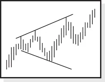
Appearance: Price trends upward leading to the chart patterns. The pattern has a megaphone appearance with higher highs and lower lows that widen over time.
Upward Breakouts
| Bull Market | Bear Market | |
| Reversal or continuation | Long‐term bullish continuation | Intermediate‐term bullish continuation |
| Performance rank | 22 out of 39 | 14 out of 20 |
| Breakeven failure rate | 18% | 18% |
| Average rise | 42% | 25% |
| Volume trend | Upward | Upward |
| Throwbacks | 67% | 64% |
| Percentage meeting price target | 66% | 52% |
| Synonyms | Expanding triangle, broadening triangle, orthodox broadening top, and five‐point reversal | |
| See also | Broadening bottom |
Downward Breakouts
| Bull Market | Bear Market | |
| Reversal or continuation | Short‐term bearish reversal | Short‐term bearish reversal |
| Performance rank | 28 out of 36 | 14 out of 19 |
| Breakeven failure rate | 27% | 9% |
| Average drop | 13% | 22% |
| Volume trend | Upward | Upward |
| Pullbacks | 67% | 67% |
| Percentage meeting price target | 42% | 46% |
Broadening tops, not surprisingly, look a lot like broadening bottoms. What separates a top from a bottom is the price trend leading to the chart pattern. For tops, the inbound price trend is upward; for broadening bottoms, it is downward. This is an arbitrary distinction I made just to see if the two chart patterns act differently. In answer to the question you have probably posed right now: Yes, the two formations have slightly different performance (but both are yucky).
A brief review of the Results Snapshot shows the performance rank is midrange. The rank is based on how far price moves after the breakout compared to other chart pattern types.
The breakeven failure rate for downward breakouts in bear markets is terrific, just 9%, but that ranks the pattern at 11 out of 19 (not shown). As small as the failure rate seems compared to the others shown in the table, it's still a mid‐list performer.
The average rise varies from 25% in bear markets, where the general market is trying to drown price, and 42% in bull markets, where the market trend tugs on the stock like a helium balloon. The average decline is 13% in bull markets, which compares to a 22% drop in bear markets. This time, bear markets are pulling price downward, hence the larger average drop than in bull markets.
Tour
Broadening patterns come in a variety of styles and names. There are the broadening tops and bottoms, right‐angled ascending and descending, expanding triangle, orthodox broadening top, and five‐point reversal. The last three—expanding triangle, orthodox broadening top, and five‐point reversal—are synonyms for the broadening top, with the last two being based on five turning points.
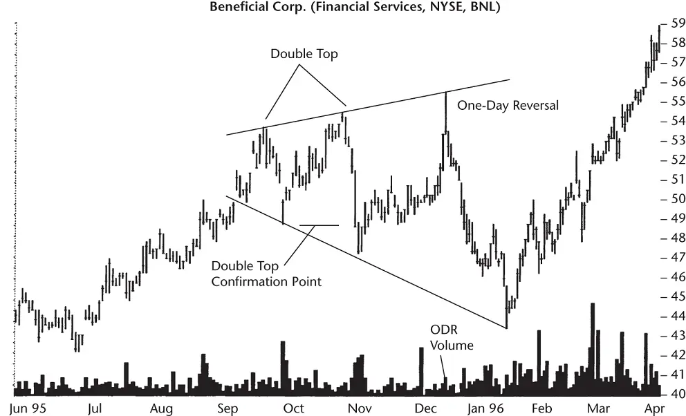
Figure 11.1 A potential triple top changed into a broadening formation. The one‐day reversal appeared as the third peak after an unsustainably quick price rise. The broadening top formation marked a struggle between eager buyers and reluctant sellers at the lows and the quick‐to‐take‐profit momentum players at the peaks.
For a tour of the chart pattern, look at Figure 11.1. The stock began an uphill run in December 1994 and continued climbing to reach a high in mid‐September at 53.75. Holders of the stock, enjoying the long run, decided to sell their shares and retire in Florida. The stock headed lower. On 25 September 1995, volume spiked upward and halted the decline. Investors, seeing a 40% retrace of their gains from the June peak, apparently thought the decline overdone and purchased the stock, sending price back up.
Price peaked at a higher level, 54.50, on 19 October. Astute traders, who suspected a double top was forming, promptly sold their holdings to maximize their gains, sending price tumbling. Price confirmed the double top when it fell below the confirmation price (below the lowest low between the two peaks), at 48.75.
Volume picked up, and the struggle between supply and demand reasserted itself. The decline stalled as traders willing to buy the stock overwhelmed reluctant sellers. The stock turned around and headed higher. By this time, chart followers could draw the two trendlines—one across the twin peaks and another below the two valleys—giving birth to the broadening top pattern. Traders jumped on the bandwagon at this point and purchased the stock. They wanted to play the anticipated rise as the formation broadened out. The stock cooperated and moved higher, reaching the top trendline once again at a new high of 55.50.
The steepness of the ascent in the latter stages was unsustainable. The peak looked like a one‐day reversal, with a close near the low of the day and a tall daily price swing. However, volume was unconvincing. It was higher that day than during the prior week, but it certainly was not of the caliber of the late November spike.
In any case, the stock tumbled and soon reached a new low of 43.50, stopping right at the bottom trendline. Once the stock began moving higher, the momentum players jumped on board and volume increased along with price. Buying enthusiasm and rising momentum pushed the stock higher, climbing through the top trendline. An upward breakout occurred.
Throughout the various peaks and troughs as this chart pattern unfolded, there was a struggle between buyers and sellers. Near the lows, the buyers believed the stock was oversold, and they eagerly bought it. At the top, they and others sold their shares and pocketed handsome profits. This selling pressure, of course, sent the stock back down.
Читать дальшеИнтервал:
Закладка:
Похожие книги на «Encyclopedia of Chart Patterns»
Представляем Вашему вниманию похожие книги на «Encyclopedia of Chart Patterns» списком для выбора. Мы отобрали схожую по названию и смыслу литературу в надежде предоставить читателям больше вариантов отыскать новые, интересные, ещё непрочитанные произведения.


Обсуждение, отзывы о книге «Encyclopedia of Chart Patterns» и просто собственные мнения читателей. Оставьте ваши комментарии, напишите, что Вы думаете о произведении, его смысле или главных героях. Укажите что конкретно понравилось, а что нет, и почему Вы так считаете.