Thomas N. Bulkowski - Encyclopedia of Chart Patterns
Здесь есть возможность читать онлайн «Thomas N. Bulkowski - Encyclopedia of Chart Patterns» — ознакомительный отрывок электронной книги совершенно бесплатно, а после прочтения отрывка купить полную версию. В некоторых случаях можно слушать аудио, скачать через торрент в формате fb2 и присутствует краткое содержание. Жанр: unrecognised, на английском языке. Описание произведения, (предисловие) а так же отзывы посетителей доступны на портале библиотеки ЛибКат.

- Название:Encyclopedia of Chart Patterns
- Автор:
- Жанр:
- Год:неизвестен
- ISBN:нет данных
- Рейтинг книги:3 / 5. Голосов: 1
-
Избранное:Добавить в избранное
- Отзывы:
-
Ваша оценка:
Encyclopedia of Chart Patterns: краткое содержание, описание и аннотация
Предлагаем к чтению аннотацию, описание, краткое содержание или предисловие (зависит от того, что написал сам автор книги «Encyclopedia of Chart Patterns»). Если вы не нашли необходимую информацию о книге — напишите в комментариях, мы постараемся отыскать её.
, Third Edition expands upon Bulkowski's immensely popular Second Edition with fully revised and updated material on chart patterns. Whether you’re new to the stock market or an experienced professional trader, use this book as a reference guide to give you an edge.
Within the pages of this book, you’ll learn how to identify chart patterns, supported by easy-to-understand performance statistics describing how well a pattern works, what the failure rate is, and what special quirks suggest better future performance. You’ll discover how often a stop loss order will trigger at various locations within a chart pattern, how the chart pattern’s performance has evolved over the past three decades, and how to profit from failure by trading busted patterns.
This broadened and revised
offers investors the most comprehensive, up-to-date guide to this popular method of market analysis. Written by a leading expert on chart patterns, Tom Bulkowski, this edition includes revised statistics on 75 chart patterns including 23 new ones, with pictures and performance statistics, packaged within easy-to-read text.
Gain essential knowledge of chart patterns and how they are used to predict price movements in bull and bear markets New tables include how often stops are hit, busted pattern performance, performance over the decades, and special pattern features Joining Tour, Identification Guidelines, Focus on Failures, Statistics, Trading Tactics and Sample Trade is Experience. It puts you in the passenger’s seat so you can share lessons learned from Bulkowski's trades This edition reports on statistics from nearly four times the number of samples used in the Second Edition and ten times the number in the , Third Edition further solidifies the reputation of this book as the leading reference on chart patterns, setting it far above the competition.
Encyclopedia of Chart Patterns — читать онлайн ознакомительный отрывок
Ниже представлен текст книги, разбитый по страницам. Система сохранения места последней прочитанной страницы, позволяет с удобством читать онлайн бесплатно книгу «Encyclopedia of Chart Patterns», без необходимости каждый раз заново искать на чём Вы остановились. Поставьте закладку, и сможете в любой момент перейти на страницу, на которой закончили чтение.
Интервал:
Закладка:
When I have cash I want to put to work in the stock market, I'll flip through 600 charts on my computer, looking for anything that interests me (that takes less than an hour unless I find something interesting). Figure 1.1shows a weekly chart that caught my attention. Why?
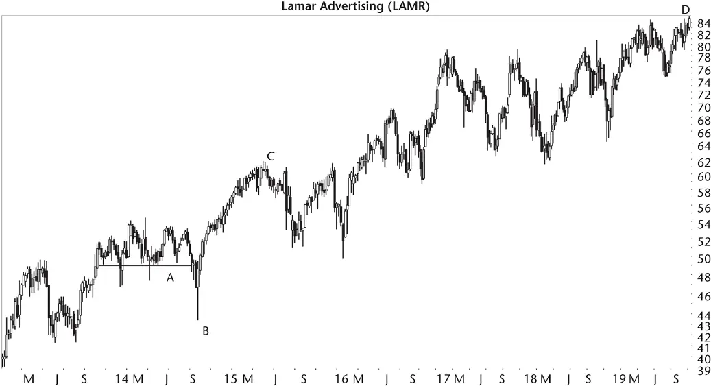
Figure 1.1 The pattern at A and B leads to a strong move higher.
Before I answer that, let me say that I prefer to bottom fish for stocks. That is, I prefer to buy low and sell high. I'm more successful at bottom fishing than momentum trading (buy high, sell higher).
Ideally, a bottom fishing expedition will yield an investment that turns into a momentum play when the stock soars and continues well into the stratosphere.
Some will claim that bottom fishing is a risky play, and they are right. But I argue that momentum trading is even riskier. Only you can decide which practice is best suited for your trading style. I use both, but I prefer fishing because as my portfolio has grown in size, I don't need to trade as much. I can devote my time to living instead of playing video games watching candlesticks form on the 5‐minute scale.
Returning to the figure, the stock started out low on the left of the chart and climbed to the right, doubling in value. If you were to ride this chart like a rollercoaster, you might exit the ride and stumble around, feeling queasy.
When I looked at Figure 1.1, I wasn't thinking of buying the dip, but that's what I saw. Price moved horizontally at A (if you ignore the few downward price spikes, the bottom of the portion is reasonably flat) followed by a strong and quick plunge to B. After B, the stock recovered quickly to C and bobbled up and down, eventually rising into the clouds at D.
I put the chart aside and flipped to the next stock that caught my attention. Figure 1.2shows what I found (weekly chart, again). My software (which I wrote) groups charts by industry so I can get a sense of how the industry is behaving. I had moved from advertising ( Figure 1.1) to airline stocks ( Figure 1.2).
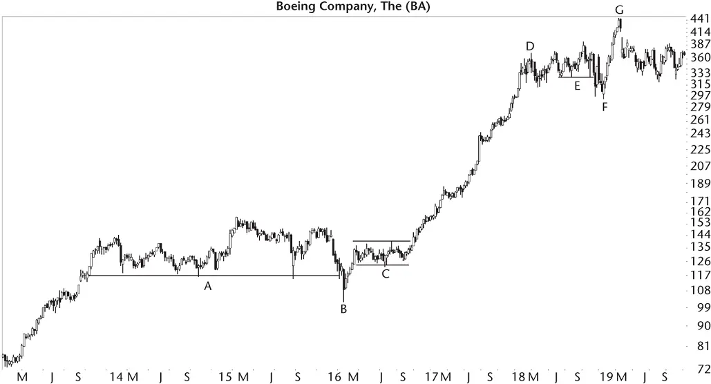
Figure 1.2 A diving board on the weekly scale leads to the stock climbing strongly.
There's the same pattern shown on this chart!
Point A is a flat base, lasting a long time (over 2 years). A plunge follows, taking the stock down fast to B, and then it recovers. This time, the stock zipped up (B to C) but went sideways in 2016 for about 6 months (C) before taking off and flying to D in a nice straight‐line run that saw the stock triple in price.
The stock moved sideways again at E (another flat base, but shorter), dropped to F (not a fast drop), and soared to G. The EFG move is a pattern similar to the prior two (this chart and the prior figure), but not as clean looking nor as successful.
The pattern in Figure 1.1happened in 2013–2014. Pattern AB ( Figure 1.2) happened in 2013–2016, and pattern EF occurred in 2018. In other words, I'm finding the same pattern in different years, which is a good thing (potentially different market conditions). Flat base, sudden drop, and fast move higher: Could this be a winning setup that's worked for years?
After finding a number of these patterns, I hunted for those that failed to perform as expected. Figure 1.3shows an example of a failure (weekly chart). Notice that the flat base at A started in late 2014, the same as the other two charts. Price moved horizontally at A, dropped swiftly to B, and recovered but only to C before it tumbled to make a lower low at D. After D, though, the stock did take flight and delivered (a pun on the package delivery service, in case you missed it), which was reassuring if you buy and hold but terrifying for a swing or position trader who bought before C.
I looked for other examples and eventually catalogued my results. The research led to a pattern I call a diving board. I hunt for it on the weekly scale, but I've noticed variations of this pattern on the daily charts, too.

Figure 1.3 This diving board fails to act as expected.
As you look at the three charts, there are differences and there are similarities between them. What's important to performance? Is it the length of the pattern, how far price drops after the flat base, the industry the stock is a member of, or the time of year (seasonality or even bull/bear market)? By looking at a number of charts (and with the help of this book), you can answer those questions and become a more successful trader.
Daily Chart Setup
Figure 1.4shows the same pattern in the advertising industry (which is suspicious because it's the same industry as Figure 1.1) but a different period (2018). The large breakaway gap up in early November (A) was because of third quarter results, which the market liked (hence the bullish gap). After that, price moved horizontally at B and made a strong push lower to C, followed by a headline‐fetching rise up to G.
Along the way, earnings came out and helped momentum push the stock up (D and E). Near the top, earnings at F sent the stock lower, but only for a day. Perhaps the weak quarter was a warning of a coming trend change. At H, the market disliked earnings and seemed to confirm an end to the upward move, at least for a time.
I visited the company's website and found a headline for I (near the diving board), titled, “UBS Global Media and Communications Conference” webcast. I didn't listen to the broadcast, but the stock turned sharply lower a few days later, making a straight‐line run down to C. I don't know if the webcast was the cause of the decline or what happened to send the stock skittering to C. If you owned this stock at the time, it would have been wonderful if you knew the cause of the drop (from I to C).
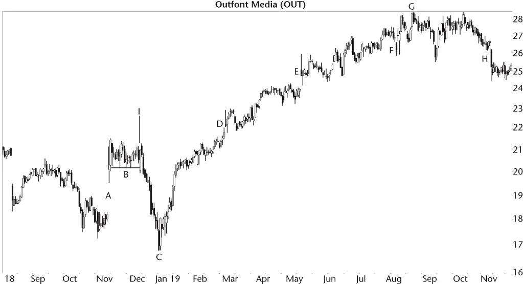
Figure 1.4 This diving board is on the daily chart.
This chart, on the daily scale, is similar to Figures 1.1and 1.2. You can use these historical charts to formulate how to trade the pattern. If you can time your entry near C, then you can ride price back up to the base of the diving board (B).
You can wait for price to close above the highest peak at B and ride price upward to G. Below the bottom of the diving board (B) provides a good stop location, too.
The ride upward to G may not be as smooth as shown on this chart or in Figure 1.2as price climbs from C to D. It might be as treacherous as the climb to D in Figure 1.1. When I look at this chart, though, I see dollar signs in the form of profit. All you have to do is find this pattern and have the courage to trade it.
Another Setup
Figure 1.5shows another setup but one you should avoid (at least from the bullish side). The setup begins with price making a strong push higher, often in a straight‐line run (but be flexible as in this example). I show that upward move at A and then B. The uptrend lasts several months and takes price from about 9 to 13 (which means, a good rise).
Price moves horizontally at C as if trying to catch its breath (ignore the downward February spike at C). The horizontal move should be proportional to the AB move. If AB shows a breathtaking rise, then expect C to be a long horizontal move while the bulls and bears regroup. In this example, AB is about 4 months long and C is 6 months long.
Читать дальшеИнтервал:
Закладка:
Похожие книги на «Encyclopedia of Chart Patterns»
Представляем Вашему вниманию похожие книги на «Encyclopedia of Chart Patterns» списком для выбора. Мы отобрали схожую по названию и смыслу литературу в надежде предоставить читателям больше вариантов отыскать новые, интересные, ещё непрочитанные произведения.


Обсуждение, отзывы о книге «Encyclopedia of Chart Patterns» и просто собственные мнения читателей. Оставьте ваши комментарии, напишите, что Вы думаете о произведении, его смысле или главных героях. Укажите что конкретно понравилось, а что нет, и почему Вы так считаете.