Yong Chen - Industrial Data Analytics for Diagnosis and Prognosis
Здесь есть возможность читать онлайн «Yong Chen - Industrial Data Analytics for Diagnosis and Prognosis» — ознакомительный отрывок электронной книги совершенно бесплатно, а после прочтения отрывка купить полную версию. В некоторых случаях можно слушать аудио, скачать через торрент в формате fb2 и присутствует краткое содержание. Жанр: unrecognised, на английском языке. Описание произведения, (предисловие) а так же отзывы посетителей доступны на портале библиотеки ЛибКат.
- Название:Industrial Data Analytics for Diagnosis and Prognosis
- Автор:
- Жанр:
- Год:неизвестен
- ISBN:нет данных
- Рейтинг книги:5 / 5. Голосов: 1
-
Избранное:Добавить в избранное
- Отзывы:
-
Ваша оценка:
Industrial Data Analytics for Diagnosis and Prognosis: краткое содержание, описание и аннотация
Предлагаем к чтению аннотацию, описание, краткое содержание или предисловие (зависит от того, что написал сам автор книги «Industrial Data Analytics for Diagnosis and Prognosis»). Если вы не нашли необходимую информацию о книге — напишите в комментариях, мы постараемся отыскать её.
In
, distinguished engineers Shiyu Zhou and Yong Chen deliver a rigorous and practical introduction to the random effects modeling approach for industrial system diagnosis and prognosis. In the book’s two parts, general statistical concepts and useful theory are described and explained, as are industrial diagnosis and prognosis methods. The accomplished authors describe and model fixed effects, random effects, and variation in univariate and multivariate datasets and cover the application of the random effects approach to diagnosis of variation sources in industrial processes. They offer a detailed performance comparison of different diagnosis methods before moving on to the application of the random effects approach to failure prognosis in industrial processes and systems.
In addition to presenting the joint prognosis model, which integrates the survival regression model with the mixed effects regression model, the book also offers readers:
A thorough introduction to describing variation of industrial data, including univariate and multivariate random variables and probability distributions Rigorous treatments of the diagnosis of variation sources using PCA pattern matching and the random effects model An exploration of extended mixed effects model, including mixture prior and Kalman filtering approach, for real time prognosis A detailed presentation of Gaussian process model as a flexible approach for the prediction of temporal degradation signals Ideal for senior year undergraduate students and postgraduate students in industrial, manufacturing, mechanical, and electrical engineering,
is also an indispensable guide for researchers and engineers interested in data analytics methods for system diagnosis and prognosis.
Industrial Data Analytics for Diagnosis and Prognosis — читать онлайн ознакомительный отрывок
Ниже представлен текст книги, разбитый по страницам. Система сохранения места последней прочитанной страницы, позволяет с удобством читать онлайн бесплатно книгу «Industrial Data Analytics for Diagnosis and Prognosis», без необходимости каждый раз заново искать на чём Вы остановились. Поставьте закладку, и сможете в любой момент перейти на страницу, на которой закончили чтение.
Интервал:
Закладка:
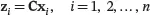
In general, if we have q linear combinations of x 1, x 2,…, xp defined by:
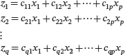
or in matrix notation,
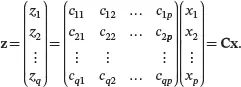
The sample mean vector and sample covariance matrix of
are given by
 (2.9)
(2.9)
 (2.10)
Obviously, ( 2.9) and ( 2.10) are generalizations of ( 2.7) and ( 2.8), respectively.
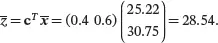
Example 2.5For the auto.specdata set, using the mean()function of Rthe sample means of the variables city.mpgand highway.mpgcan be found as 25.22 and 30.75, respectively. If we are interested in the overall MPG of a car, denoted by z , as the following weighted average of x 1= city.mpgand x 2= highway.mpg:
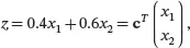
where c= (0.4 0.6) T . Then by ( 2.7) the sample mean of the overall MPG in the data set is
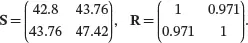
To find the sample variance of z , first we obtain the sample covariance matrix for city.mpgand highway.mpgusing the cov()function of R:
cov(auto.spec.df[, c("city.mpg", "highway.mpg")]) cor(auto.spec.df[, c("city.mpg", "highway.mpg")])
The function cor()calculates the sample correlation matrix. Based on the output from the above Rcodes, we have
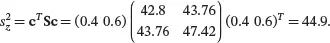
By ( 2.8), the sample variance of z is
Bibliographic Notes
Data visualization methods are discussed in books in the data mining area, for example, Shmueli et al. [2017] and Williams [2011]. In this chapter, we mostly use the graphics functions from base R. A popular dedicated graphics package in Ris the ggplot2package by Wickham [2016]. The ggplot2package provides more flexible and powerful graphics capability that can create presentation-quality visualization. However, it also comes with a significant learning curve to get familiar with the special technical language used in ggplot2. For those who use data visualizations on a regular basis, it is worth the time and effort to learn ggplot2.
Sample statistics such as sample mean vector and sample covariance matrix for multivariate observations are discussed in detail in many multivariate statistics books, for example, Johnson et al. [2002] and Rencher [2003].
Exercises
1 Consider the data in the following table with two numerical variables x1 and x2 and two categorical variables x3 and x4.
| x 1 | x 2 | x 3 | x 4 |
| 9 | 1 | Yes | On |
| 5 | 3 | No | Off |
| 1 | 2 | Yes | Off |
| 3 | 4 | Yes | On |
| 6 | −1 | No | On |
| 3 | 3 | Yes | On |
1 Manually sketch the scatter plot for x1 and x2.Manually sketch the mosaic plot for x3 and x4.
1 Consider the data set in Exercise 1. Manually calculate the sample mean vector, the sample covariance matrix, and the sample correlation matrix of x = (x1 x2)T.
2 Consider the data in the following table with two numerical variables x1 and x2 and two categorical variables x3 and x4.
| x 1 | x 2 | x 3 | x 4 |
| 1 | 0 | Yes | Working |
| 4 | 6 | No | Fail |
| 2 | 2 | Yes | Fail |
| 0 | 3 | No | Fail |
| 3 | 4 | No | Working |
| 5 | 7 | Yes | Working |
1 Manually sketch the scatter plot for x1 and x2.Manually sketch the mosaic plot for x3 and x4.
1 Consider the data set in Exercise 3. Manually calculate the sample mean vector, the sample covariance matrix, and the sample correlation matrix of x = (x1 x2)T.
2 Consider the auto_spec data set in the file auto_spec.csv. Use R to draw appropriate plots to display the following information and comment on any patterns that can be found from the plots.Distribution of the variables fuel.type and aspiration.Distribution of each of the following three variables: width, height, and highway.mpg. Use two types of plots for each variable.How does the horsepower affect the city.mpg?The relationship between horsepower and body.style.The relationship between body.style and fuel.type.
3 For the auto_spec data, use R to create a new variable named cat.mpg, which is equal to “high” if highway.mpg is at least 30, and “low” otherwise.Using R, create a scatter plot of horsepower versus curb.weight, color-coded by the variable cat.mpg. Format the plot with appropriate labels and legend.Use R to find the sample mean vector, the sample covariance matrix, and the sample correlation matrix of highway.mpg and city.mpg.Assume that 75% of the mileage of a car is on a highway and 25% is on local roads, using the results from part (b), manually calculate the sample mean and sample variance of the overall average MPG of the cars in this data set.Use R to calculate the overall average MPG of each car in the data set based on the assumption in part (c). Then use R to find the sample mean and sample variance of the overall average MPG. Compare with the results in part (c).
4 Hot rolling is among the key steel-making processes that convert cast or semi-finished steel into finished products. A typical hot rolling process usually includes a melting division and a rolling division. The melting division is a continuous casting process that melts scrapped metals and solidifies the molten steel into semi-finished steel billet; the rolling division will further squeeze the steel billet by a sequence of stands. Each stand is composed of several rolls. The final long thin steel billet is coiled for transportation convenience and thus is often called a coil. Due to the recent development of computer and sensor technology, the whole hot rolling process is highly automated and monitored by a large number of sensors. Various types of sensors (optical sensor, temperature sensor, force sensor, etc.) are installed in the hot rolling process. The last rolling stands are equipped with some infrared sensors. These sensors take photos of the steel billets, and then the photos are processed to see if any defects are produced. We focus on two types of defect: checkings and seams.The file hotrolling_defects.csv contains the numbers of checkings and seams of 754 billets. Use R to generate two new variables corresponding to whether a billet has at least one checking defect and whether it has at least one seams defect, respectively. Use appropriate plots to visualize the distribution of each of these two new variables and the relationship between them.The file stand_5_side_temp.csv contains side temperature measurements when a steel billet is passing stand 5 of the rolling division. The side temperature is measured at 79 evenly spaced locations along the stand. Use R to draw a scatter plot matrix for the side temperature measurements at the first five locations of stand 5. Comment on noticeable patterns in relationship among the first five temperature variables.Use R to find the sample mean vector, the sample covariance matrix, and sample correlation matrix of the side temperature measurements at the first five locations of stand 5.Use R to draw a heatmap for the correlation of the side temperature measurements at the first 20 locations of stand 5. Which locations have the highest correlation in side temperature measurements?
Читать дальшеИнтервал:
Закладка:
Похожие книги на «Industrial Data Analytics for Diagnosis and Prognosis»
Представляем Вашему вниманию похожие книги на «Industrial Data Analytics for Diagnosis and Prognosis» списком для выбора. Мы отобрали схожую по названию и смыслу литературу в надежде предоставить читателям больше вариантов отыскать новые, интересные, ещё непрочитанные произведения.


Обсуждение, отзывы о книге «Industrial Data Analytics for Diagnosis and Prognosis» и просто собственные мнения читателей. Оставьте ваши комментарии, напишите, что Вы думаете о произведении, его смысле или главных героях. Укажите что конкретно понравилось, а что нет, и почему Вы так считаете.