Yong Chen - Industrial Data Analytics for Diagnosis and Prognosis
Здесь есть возможность читать онлайн «Yong Chen - Industrial Data Analytics for Diagnosis and Prognosis» — ознакомительный отрывок электронной книги совершенно бесплатно, а после прочтения отрывка купить полную версию. В некоторых случаях можно слушать аудио, скачать через торрент в формате fb2 и присутствует краткое содержание. Жанр: unrecognised, на английском языке. Описание произведения, (предисловие) а так же отзывы посетителей доступны на портале библиотеки ЛибКат.
- Название:Industrial Data Analytics for Diagnosis and Prognosis
- Автор:
- Жанр:
- Год:неизвестен
- ISBN:нет данных
- Рейтинг книги:5 / 5. Голосов: 1
-
Избранное:Добавить в избранное
- Отзывы:
-
Ваша оценка:
Industrial Data Analytics for Diagnosis and Prognosis: краткое содержание, описание и аннотация
Предлагаем к чтению аннотацию, описание, краткое содержание или предисловие (зависит от того, что написал сам автор книги «Industrial Data Analytics for Diagnosis and Prognosis»). Если вы не нашли необходимую информацию о книге — напишите в комментариях, мы постараемся отыскать её.
In
, distinguished engineers Shiyu Zhou and Yong Chen deliver a rigorous and practical introduction to the random effects modeling approach for industrial system diagnosis and prognosis. In the book’s two parts, general statistical concepts and useful theory are described and explained, as are industrial diagnosis and prognosis methods. The accomplished authors describe and model fixed effects, random effects, and variation in univariate and multivariate datasets and cover the application of the random effects approach to diagnosis of variation sources in industrial processes. They offer a detailed performance comparison of different diagnosis methods before moving on to the application of the random effects approach to failure prognosis in industrial processes and systems.
In addition to presenting the joint prognosis model, which integrates the survival regression model with the mixed effects regression model, the book also offers readers:
A thorough introduction to describing variation of industrial data, including univariate and multivariate random variables and probability distributions Rigorous treatments of the diagnosis of variation sources using PCA pattern matching and the random effects model An exploration of extended mixed effects model, including mixture prior and Kalman filtering approach, for real time prognosis A detailed presentation of Gaussian process model as a flexible approach for the prediction of temporal degradation signals Ideal for senior year undergraduate students and postgraduate students in industrial, manufacturing, mechanical, and electrical engineering,
is also an indispensable guide for researchers and engineers interested in data analytics methods for system diagnosis and prognosis.
Industrial Data Analytics for Diagnosis and Prognosis — читать онлайн ознакомительный отрывок
Ниже представлен текст книги, разбитый по страницам. Система сохранения места последней прочитанной страницы, позволяет с удобством читать онлайн бесплатно книгу «Industrial Data Analytics for Diagnosis and Prognosis», без необходимости каждый раз заново искать на чём Вы остановились. Поставьте закладку, и сможете в любой момент перейти на страницу, на которой закончили чтение.
Интервал:
Закладка:
Relationship Between Two Categorical Variables – Mosaic Plot
We can use a mosaic plot to see how values of two categorical variables are related to each other. Figure 2.6 shows a mosaic plot for fuel.typeand aspirationof the auto_specdata set, which is drawn by the following Rcodes.
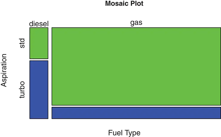
Figure 2.6 Mosaic plot for fuel type and aspiration.
mosaicplot(fuel.type ~ aspiration, data = auto.spec.df,
xlab = "Fuel Type", ylab = "Aspiration",
color = c("green", "blue"),
main = "Mosaic Plot")
In a mosaic plot, the height of a bar represents the percentage for each value of the variable in the vertical axis given a fixed value of the variable in the horizontal axis. For example, in Figure 2.6 the height of the bar corresponding to turbo aspiration is much higher when the fuel type is diesel than when it is gas, which means a higher percentage of diesel cars use turbo aspiration, while a lower percentage of gasoline cars use turbo aspiration. The width of a bar in a mosaic plot corresponds to the frequency , or the number of observations, for each value of the variable in the horizontal axis. For example, from Figure 2.6, the bars for gas fuel type is much wider than those for diesel fuel type, indicating that a much larger number of cars are gasoline cars in the data set.
2.1.3 Plots for More than Two Variables
It is very difficult to plot more than two variables in a two dimensional plot. This section introduces commonly used plots that show some aspects of how multiple variables are related to each other. In Chapter 4, we will study another technique called principal component analysis, which can also serve as a useful tool to visualize high dimensional data in a low dimensional space.
Color Coded Scatter Plot
We have seen that a scatter plot can effectively show the relationship between two numerical variables. By adding color coding to the points on a scatter plot of two numerical variables, we are able to study their relationship with a third variable. Typically, the third variable is a categorical variable, with each category represented by a different color. The color coded scatter plot is very useful in visualizing how some numerical variables can be used to predict a categorical variable. For the auto_specdata, we can use a color coded scatter plot to show how fuel.typeis related to two of the numerical variables horsepowerand peak.rpm. The color coded scatter plot is shown in Figure 2.7, which is created by the following Rcodes.
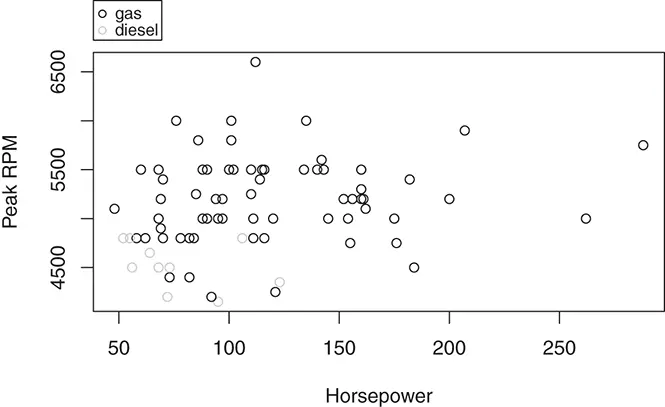
Figure 2.7 Scatter plot color coded by fuel type.
oldpar <- par(xpd = TRUE) plot(auto.spec.df$peak.rpm ~ auto.spec.df$horsepower,
xlab = "Horsepower", ylab = "Peak RPM",
col = ifelse(auto.spec.df$fuel.type == "gas",
"black", "gray")) legend("topleft", inset = c(0, -0.2),
legend = c("gas", "diesel"),
col = c(“black”, "gray"), pch = 1, cex = 0.8) par(oldpar)
Although there is no clear relationship between the peak RPM and horsepower of a car from the scatter plot in Figure 2.7, it is obvious from the color coded plot that diesel cars tend to have low peak RPM and low horsepower.
Scatter Plot Matrix and Heatmap
The pairwise relationship of multiple numerical variables can be visualized simultaneously by using a matrix of scatter plots. The following Rcodes plot the scatter plot matrix for five of the numerical variables in the auto_specdata set: wheel.base, height, curb.weight, city.mpg, and highway.mpg. The column indices of the five variables are 8, 11, 12, 22, and 23, respectively.
var.idx <- c(8, 11, 12, 22, 23) plot(auto.spec.df[, var.idx])
From the scatter plot matrix shown in Figure 2.8, there are different types of relationship among the variables. For example, there is a strong linear relationship between city.mpgand highway.mpg. Besides these two variables, wheel.base, height, and curb.weightare positively related to each other. And the curb.weightis negatively related to both city.mpgand highway.mpg.
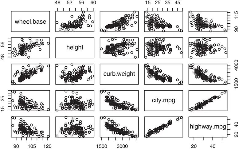
Figure 2.8 Scatter plot matrix for five numerical variables.
For a large number of numerical variables, it is difficult to visualize all pairwise scatter plots as in the scatter plot matrix. In this case, we can use a heatmap for pairwise correlations of the variables to quickly show the strength of the relationship. The heatmap uses different shades of colors to represent the values of the correlations so that the spots or regions of strong positive or negative relationship can be quickly detected. Detailed discussion of correlation is provided in Section 2.2. We draw the heatmap of correlations for all numerical variables in the auto_specdata set using the following Rcodes.
library(gplots) var.idx <-c(8:12, 15, 17:23) data.nomiss <- na.omit(auto.spec.df[, var.idx]) heatmap.2(cor(data.nomiss), Rowv = FALSE, Colv = FALSE, dendrogram = “none”, cellnote = round(cor(data.nomiss),2), notecol = “black”, key = FALSE, trace = ’none’, margins=c(10,10))
In the above Rcodes, we use the heatmap.2()function from the gplotspackage to draw the heatmap. We first remove the observations with missing values using the na.omit()function. Then the heatmap is drawn for the pairwise correlations calculated by cor(). In the heatmap of all numerical variables, as shown in Figure 2.9, a lighter color indicates a strong positive (linear) relationship between the variables and a darker color indicates a strong negative (linear) relationship. The correlation values are shown within each cell of the heatmap table. The diagonal cells have the lightest color because any variable has the strongest relationship to itself. From the heatmap in Figure 2.9, we can also see that the two MPG variables ( city.mpgand highway.mpg) have strong negative relationships with many of the other numerical variables in the data set.
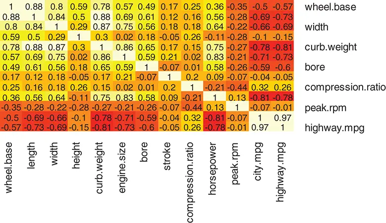
Figure 2.9 Heatmap of correlation for all numerical variables.
2.2 Summary Statistics
Data visualization is an effective and intuitive representation of the qualitative features of the data. Key characteristics of data can also be quantitatively summarized by numerical statistics. This section introduces common summary statistics for univariate and multivariate data.
2.2.1 Sample Mean, Variance, and Covariance
Sample Mean – Measure of Location
A sample mean or sample average provides a measure of location, or central tendency, of a variable in a data set. Consider a univariate data set, which is a data set with a single variable, that consists of a random sample of n observations x 1, x 2,…, xn . The sample mean is simply the ordinary arithmetic average
Читать дальшеИнтервал:
Закладка:
Похожие книги на «Industrial Data Analytics for Diagnosis and Prognosis»
Представляем Вашему вниманию похожие книги на «Industrial Data Analytics for Diagnosis and Prognosis» списком для выбора. Мы отобрали схожую по названию и смыслу литературу в надежде предоставить читателям больше вариантов отыскать новые, интересные, ещё непрочитанные произведения.


Обсуждение, отзывы о книге «Industrial Data Analytics for Diagnosis and Prognosis» и просто собственные мнения читателей. Оставьте ваши комментарии, напишите, что Вы думаете о произведении, его смысле или главных героях. Укажите что конкретно понравилось, а что нет, и почему Вы так считаете.