Yong Chen - Industrial Data Analytics for Diagnosis and Prognosis
Здесь есть возможность читать онлайн «Yong Chen - Industrial Data Analytics for Diagnosis and Prognosis» — ознакомительный отрывок электронной книги совершенно бесплатно, а после прочтения отрывка купить полную версию. В некоторых случаях можно слушать аудио, скачать через торрент в формате fb2 и присутствует краткое содержание. Жанр: unrecognised, на английском языке. Описание произведения, (предисловие) а так же отзывы посетителей доступны на портале библиотеки ЛибКат.
- Название:Industrial Data Analytics for Diagnosis and Prognosis
- Автор:
- Жанр:
- Год:неизвестен
- ISBN:нет данных
- Рейтинг книги:5 / 5. Голосов: 1
-
Избранное:Добавить в избранное
- Отзывы:
-
Ваша оценка:
Industrial Data Analytics for Diagnosis and Prognosis: краткое содержание, описание и аннотация
Предлагаем к чтению аннотацию, описание, краткое содержание или предисловие (зависит от того, что написал сам автор книги «Industrial Data Analytics for Diagnosis and Prognosis»). Если вы не нашли необходимую информацию о книге — напишите в комментариях, мы постараемся отыскать её.
In
, distinguished engineers Shiyu Zhou and Yong Chen deliver a rigorous and practical introduction to the random effects modeling approach for industrial system diagnosis and prognosis. In the book’s two parts, general statistical concepts and useful theory are described and explained, as are industrial diagnosis and prognosis methods. The accomplished authors describe and model fixed effects, random effects, and variation in univariate and multivariate datasets and cover the application of the random effects approach to diagnosis of variation sources in industrial processes. They offer a detailed performance comparison of different diagnosis methods before moving on to the application of the random effects approach to failure prognosis in industrial processes and systems.
In addition to presenting the joint prognosis model, which integrates the survival regression model with the mixed effects regression model, the book also offers readers:
A thorough introduction to describing variation of industrial data, including univariate and multivariate random variables and probability distributions Rigorous treatments of the diagnosis of variation sources using PCA pattern matching and the random effects model An exploration of extended mixed effects model, including mixture prior and Kalman filtering approach, for real time prognosis A detailed presentation of Gaussian process model as a flexible approach for the prediction of temporal degradation signals Ideal for senior year undergraduate students and postgraduate students in industrial, manufacturing, mechanical, and electrical engineering,
is also an indispensable guide for researchers and engineers interested in data analytics methods for system diagnosis and prognosis.
Industrial Data Analytics for Diagnosis and Prognosis — читать онлайн ознакомительный отрывок
Ниже представлен текст книги, разбитый по страницам. Система сохранения места последней прочитанной страницы, позволяет с удобством читать онлайн бесплатно книгу «Industrial Data Analytics for Diagnosis and Prognosis», без необходимости каждый раз заново искать на чём Вы остановились. Поставьте закладку, и сможете в любой момент перейти на страницу, на которой закончили чтение.
Интервал:
Закладка:
bodystyle.freq <- table(auto.spec.df$body.style)
barplot(bodystyle.freq, xlab = "Body Style",
ylim = c(0, 100))
The plotted bar chart is shown in Figure 2.1. From the bar chart, it is clear that most of the cars in the data are either sedans or hatchbacks.
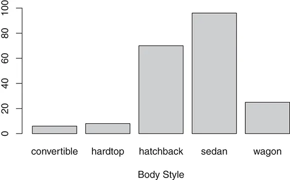
Figure 2.1 Bar chart of car body style.
Distribution of Numerical Variables – Histogram and Box Plot
A histogram can be used to approximately represent the distribution of a numerical variable with continuous values. A histogram can be considered as a bar chart extended to continuous numerical variables. To draw a histogram, the entire range of the variable in the data set is divided into a number of consecutive equal sized intervals. Then a “bar” is shown for each interval to represent the number of observations in the interval.
Another commonly used plot that can represent distribution of a numerical variable is the box plot. We illustrate the basic elements of a box plot in Figure 2.2, which shows the box plot of the numerical variable widthof the auto_specdata set. The bold line within the rectangle box represents the median value of the variable in the data set. The lower and upper bound of the box are corresponding to the first quartile (25th percentile) and the third quartile (75th percentile), respectively. The height of the box is the interquartile range (IQR), which is the distance between the first and the third quartile. The short horizontal lines above and below the box are called the whiskers , which represent the maximum and minimum of the values in the data set, excluding the “outliers”. In box plots, an outlier is typically defined as a data point that is either above the third quartile with a distance greater than 1.5 times of the IQR or below the first quartile with a distance greater than 1.5 times of IQR. The individual outliers are shown by the open circles in the box plot in Figure 2.2.
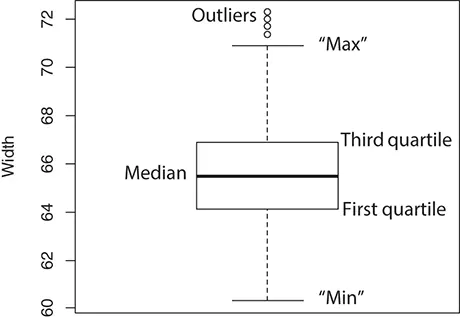
Figure 2.2 Elements of a box plot.
The Rfunctions hist()and boxplot()can be used to plot the histogram and box plot, respectively. The following Rcodes plot, as shown in Figure 2.3, the histograms and box plots for three numerical variables, the length, horsepower, and compression.ratio, in the auto_specdata set.
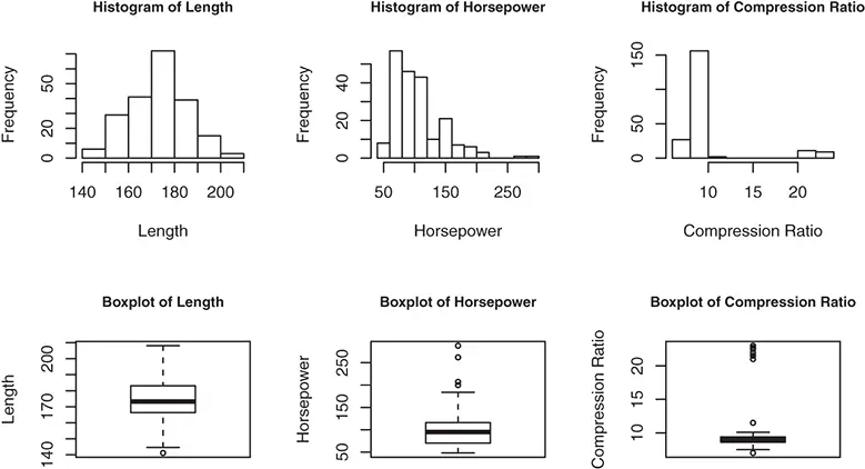
Figure 2.3 Histograms and box plots of three numerical variables.
oldpar <- par(mfrow=c(2,3)) # split the plot into panels hist(auto.spec.df$length, xlab = "Length",
main = "Histogram of Length") hist(auto.spec.df$horsepower, xlab = "Horsepower", main = "Histogram of Horsepower") hist(auto.spec.df$compression.ratio, xlab = "Compression Ratio", main = "Histogram of Compression Ratio") boxplot(auto.spec.df$length, ylab = "Length", main = "Boxplot of Length") boxplot(auto.spec.df$horsepower, ylab = "Horsepower", main = "Boxplot of Horsepower") boxplot(auto.spec.df$compression.ratio, ylab = " Compression Ratio", main = "Boxplot of Compression Ratio") par(oldpar)
From the histogram and box plot of the variable length, it can be seen that the distribution of the car lengths in the data set has a fairly symmetric shape. In contrast, the distribution of horsepower is more skewed with a long (right) tail. The histogram of the compression ratios shows the existence of two groups or clusters of data, which is also indicated by the separate cluster of outliers with high compression ratios that can be seen in the box plot.
2.1.2 Plots for Relationship Between Two Variables
The relationship between variables is one of the most useful patterns in industrial data analytics applications. For example, we are often interested in predicting a particular variable of interest, which is referred to as the response variable , based on available input information represented by a number of variables that are referred to as the predictor variables . In this situation, the relationship between the response variable and the predictor variables can help identify the most important predictors. Plotting of two variables can also be used to detect redundant variables and outliers in a data set. Depending on the types of variables being compared, different plots can be used to study the relationship between the variables.
Relationship Between Two Numerical Variables – Scatter Plot
In a scatter plot, each observation is represented by a point whose coordinates are the values for the two variables of this observation. The following Rcodes draw the scatter plot for two numerical variables, horsepowerand highway.mpg, of the auto_specdata set.
plot(auto.spec.df$highway.mpg ~ auto.spec.df$horsepower,
xlab = "Horsepower", ylab = "Highway MPG")
The obtained scatter plot is shown in Figure 2.4. It can be seen from the scatter plot that a general trend exists in the relationship between the highway MPG and the horsepower, where a car with higher horsepower is more likely to have a lower highway MPG.
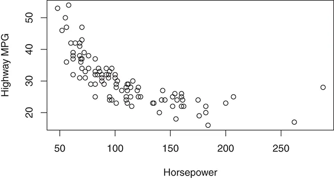
Figure 2.4 Scatter plot of highway MPG versus horsepower.
Relationship Between A Numerical Variable and A Categorical Variable – Side-by-Side Box Plot
Side-by-side box plots can be used to show how the distribution of a numerical variable changes over different values of a categorical variable. The idea is to use a box plot to represent the distribution of the numerical variable at each value of the categorical variable. In Figure 2.5, we draw two side-by-side box plots for the auto_specdata set using the following Rcodes:
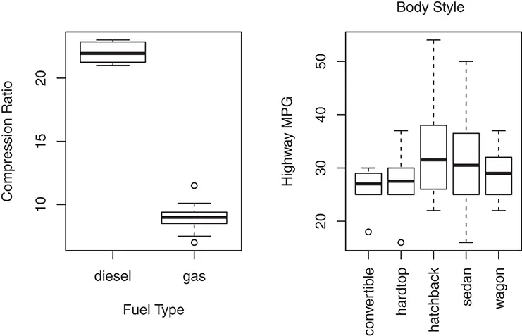
Figure 2.5 Side-by-side box plots.
oldpar <- par(mfrow = c(1, 2)) boxplot(auto.spec.df$compression.ratio ~ auto.spec.df$ fuel.type, xlab = "Fuel Type", ylab = "Compression Ratio") boxplot(auto.spec.df$highway.mpg ~ auto.spec.df$body. style, las = 2, xlab = "", ylab = "Highway MPG") mtext("Body Style", side = 3, line = 1) par(oldpar)
The left panel of Figure 2.5 shows how the numerical variable compression.ratiois related to the two values ( dieseland gas) of fuel.type. It is clear from the side-by-side box plot that a car with diesel fuel has a much higher compression ratio than a car with gas fuel. This also explains the separate cluster of outliers in the histogram and box plot of compression.ratiothat is observed in Figure 2.3. The right panel of Figure 2.5 shows how highway.mpgis related to the five values of body.style. It can be seen that a hatchback car is more likely to have higher highway MPG while a convertible tends to have lower highway MPG.
Интервал:
Закладка:
Похожие книги на «Industrial Data Analytics for Diagnosis and Prognosis»
Представляем Вашему вниманию похожие книги на «Industrial Data Analytics for Diagnosis and Prognosis» списком для выбора. Мы отобрали схожую по названию и смыслу литературу в надежде предоставить читателям больше вариантов отыскать новые, интересные, ещё непрочитанные произведения.


Обсуждение, отзывы о книге «Industrial Data Analytics for Diagnosis and Prognosis» и просто собственные мнения читателей. Оставьте ваши комментарии, напишите, что Вы думаете о произведении, его смысле или главных героях. Укажите что конкретно понравилось, а что нет, и почему Вы так считаете.