Mark Murphy - Beginning Android
Здесь есть возможность читать онлайн «Mark Murphy - Beginning Android» весь текст электронной книги совершенно бесплатно (целиком полную версию без сокращений). В некоторых случаях можно слушать аудио, скачать через торрент в формате fb2 и присутствует краткое содержание. Город: New York, Год выпуска: 2009, ISBN: 2009, Издательство: Apress, Жанр: Программирование, на английском языке. Описание произведения, (предисловие) а так же отзывы посетителей доступны на портале библиотеки ЛибКат.
- Название:Beginning Android
- Автор:
- Издательство:Apress
- Жанр:
- Год:2009
- Город:New York
- ISBN:978-1-4302-2420-4
- Рейтинг книги:3 / 5. Голосов: 1
-
Избранное:Добавить в избранное
- Отзывы:
-
Ваша оценка:
Beginning Android: краткое содержание, описание и аннотация
Предлагаем к чтению аннотацию, описание, краткое содержание или предисловие (зависит от того, что написал сам автор книги «Beginning Android»). Если вы не нашли необходимую информацию о книге — напишите в комментариях, мы постараемся отыскать её.
Dear Reader,
First, welcome to the world of Android! We’re entering a new era of mobile application development, one marked by open platforms and open source, to take ‘walled gardens’ and make them green houses for any and all to participate in. Android is relatively easy for developers, and I believe that this innovation will help generate a large ecosystem of developers and consumers within a very short time. This means that budding developers such as yourself will have many opportunities to design and build your own applications and you’ll have a huge and hungry customer base.
Second, welcome to the book! Its purpose is to start you on your way with building Android applications, and to help you master the learning curve. Android is already a rich framework, comparable in many ways to the richness Android of desktop Java environments. This means that there is a lot of cool stuff for you to pick up along your journey in order to create the slickest, most useful apps Android you can imagine.
The source code for the code samples in this book is all available from the Apress site, so you can stay as hands-on and practical as you like while I introduce you to the core of Android, and invite you to experiment with the various classes and APIs we’ll be looking at. By the time you’ve finished this book, you’ll be creating your own Android applications and asking yourself what your next great application will be…!
Enjoy! Mark Murphy
Beginning Android — читать онлайн бесплатно полную книгу (весь текст) целиком
Ниже представлен текст книги, разбитый по страницам. Система сохранения места последней прочитанной страницы, позволяет с удобством читать онлайн бесплатно книгу «Beginning Android», без необходимости каждый раз заново искать на чём Вы остановились. Поставьте закладку, и сможете в любой момент перейти на страницу, на которой закончили чтение.
Интервал:
Закладка:
Thinking Linearly
As noted already, LinearLayoutis a box model — widgets or child containers are lined up in a column or row, one after the next. This works similarly to FlowLayoutin Java Swing, vboxand hboxin Flex and XUL, etc.
Flex and XUL use the box as their primary unit of layout. If you want, you can use LinearLayoutin much the same way, eschewing some of the other containers. Getting the visual representation you want is mostly a matter of identifying where boxes should nest and what properties those boxes should have, such as alignment vis-à-vis other boxes.
Concepts and Properties
To configure a LinearLayout, you have five main areas of control besides the container’s contents: the orientation, the fill model, the weight, the gravity, and the padding.
Orientationindicates whether the LinearLayoutrepresents a row or a column. Just add the android:orientationproperty to your LinearLayoutelement in your XML layout, setting the value to be horizontalfor a row or verticalfor a column.
The orientation can be modified at runtime by invoking setOrientation()on the LinearLayout, supplying it with either HORIZONTALor VERTICAL.
Let’s imagine a row of widgets, such as a pair of radio buttons. These widgets have a “natural” size based on their text. Their combined sizes probably do not exactly match the width of the Android device’s screen — particularly since screens come in various sizes. We then have the issue of what to do with the remaining space.
All widgets inside a LinearLayoutmust supply android:layout_widthand android:layout_heightproperties to help address this issue. These properties’ values have three flavors:
• You can provide a specific dimension, such as 125px, to indicate the widget should take up exactly 125 pixels.
• You can provide wrap_content, which means the widget should fill up its natural space unless that is too big, in which case Android can use word wrap as needed to make it fit.
• You can provide fill_parent, which means the widget should fill up all available space in its enclosing container after all other widgets are taken care of.
The latter two flavors are the most common, as they are independent of screen size, allowing Android to adjust your view to fit the available space.
What happens if we have two widgets that should split the available free space? For example, suppose we have two multi-line fields in a column, and we want them to take up the remaining space in the column after all other widgets have been allocated their space.
To make this work, in addition to setting android:layout_width(for rows) or android:layout_height(for columns) to fill_parent, you must also set android:layout_weight. This property indicates what proportion of the free space should go to that widget. If you set android:layout_weightto be the same value for a pair of widgets (e.g., 1), the free space will be split evenly between them. If you set it to be 1 for one widget and 2 for another widget, the second widget will use up twice the free space that the first widget does, and so on.
By default, everything is left-and top-aligned. So if you create a row of widgets via a horizontal LinearLayout, the row will start flush on the left side of the screen.
If that is not what you want, you need to specify a gravity. Using android:layout_gravity on a widget (or calling setGravity()at runtime on the widget’s Java object), you can tell the widget and its container how to align it vis-à-vis the screen.
For a column of widgets, common gravity values are left, center_horizontal, and rightfor left-aligned, centered, and right-aligned widgets, respectively.
For a row of widgets, the default is for them to be aligned so their text is aligned on the baseline (the invisible line that letters seem to “sit on”), though you may wish to specify a gravity of center_verticalto center the widgets along the row’s vertical midpoint.
By default, widgets are tightly packed next to each other. If you want to increase the whitespace between widgets, you will want to use the android:paddingproperty (or call setPadding()at runtime on the widget’s Java object).
The padding specifies how much space there is between the boundaries of the widget’s “cell” and the actual widget contents. Padding is analogous to the margins on a word-processing document — the page size might be 8.5”×11”, but 1” margins would leave the actual text to reside within a 6.5”×9” area.
The android:paddingproperty allows you to set the same padding on all four sides of the widget, with the widget’s contents centered within that padded-out area. If you want the padding to differ on different sides, use android:paddingLeft, android:paddingRight, android:paddingTop, and android:paddingBottom(see Figure 7-1).
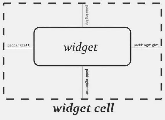
Figure 7-1. The relationship between a widget, its cell, and the padding values
The value of the padding is a dimension, such as 5pxfor 5 pixels’ worth of padding.
LinearLayout Example
Let’s look at an example ( Containers/Linear) that shows LinearLayout properties set both in the XML layout file and at runtime.
xmlns:android="http://schemas.android.com/apk/res/android"
android:orientation="vertical"
android:layout_width="fill_parent"
android:layout_height="fill_parent">
android:orientation="horizontal"
android:layout_width="wrap_content"
android:layout_height="wrap_content"
android:padding="5px">
android:id="@+id/horizontal"
android:text="horizontal" />
android:id="@+id/vertical"
android:text="vertical" />
android:orientation="vertical"
android:layout_width="fill_parent"
android:layout_height="wrap_content"
android:padding="5px">
android:id="@+id/left"
android:text="left" />
android:id="@+id/center"
android:text="center />
android:id="@+id/right"
android:text="right" />
Note that we have a LinearLayoutwrapping two RadioGroupsets. RadioGroupis a subclass of LinearLayout, so our example demonstrates nested boxes as if they were all LinearLayoutcontainers.
The top RadioGroupsets up a row ( android:orientation="horizontal") of RadioButtonwidgets. The RadioGrouphas 5pxof padding on all sides, separating it from the other RadioGroup. The width and height are both set to wrap_content, so the radio buttons will take up only the space that they need.
Интервал:
Закладка:
Похожие книги на «Beginning Android»
Представляем Вашему вниманию похожие книги на «Beginning Android» списком для выбора. Мы отобрали схожую по названию и смыслу литературу в надежде предоставить читателям больше вариантов отыскать новые, интересные, ещё непрочитанные произведения.


Обсуждение, отзывы о книге «Beginning Android» и просто собственные мнения читателей. Оставьте ваши комментарии, напишите, что Вы думаете о произведении, его смысле или главных героях. Укажите что конкретно понравилось, а что нет, и почему Вы так считаете.