Mark Murphy - Beginning Android
Здесь есть возможность читать онлайн «Mark Murphy - Beginning Android» весь текст электронной книги совершенно бесплатно (целиком полную версию без сокращений). В некоторых случаях можно слушать аудио, скачать через торрент в формате fb2 и присутствует краткое содержание. Город: New York, Год выпуска: 2009, ISBN: 2009, Издательство: Apress, Жанр: Программирование, на английском языке. Описание произведения, (предисловие) а так же отзывы посетителей доступны на портале библиотеки ЛибКат.
- Название:Beginning Android
- Автор:
- Издательство:Apress
- Жанр:
- Год:2009
- Город:New York
- ISBN:978-1-4302-2420-4
- Рейтинг книги:3 / 5. Голосов: 1
-
Избранное:Добавить в избранное
- Отзывы:
-
Ваша оценка:
Beginning Android: краткое содержание, описание и аннотация
Предлагаем к чтению аннотацию, описание, краткое содержание или предисловие (зависит от того, что написал сам автор книги «Beginning Android»). Если вы не нашли необходимую информацию о книге — напишите в комментариях, мы постараемся отыскать её.
Dear Reader,
First, welcome to the world of Android! We’re entering a new era of mobile application development, one marked by open platforms and open source, to take ‘walled gardens’ and make them green houses for any and all to participate in. Android is relatively easy for developers, and I believe that this innovation will help generate a large ecosystem of developers and consumers within a very short time. This means that budding developers such as yourself will have many opportunities to design and build your own applications and you’ll have a huge and hungry customer base.
Second, welcome to the book! Its purpose is to start you on your way with building Android applications, and to help you master the learning curve. Android is already a rich framework, comparable in many ways to the richness Android of desktop Java environments. This means that there is a lot of cool stuff for you to pick up along your journey in order to create the slickest, most useful apps Android you can imagine.
The source code for the code samples in this book is all available from the Apress site, so you can stay as hands-on and practical as you like while I introduce you to the core of Android, and invite you to experiment with the various classes and APIs we’ll be looking at. By the time you’ve finished this book, you’ll be creating your own Android applications and asking yourself what your next great application will be…!
Enjoy! Mark Murphy
Beginning Android — читать онлайн бесплатно полную книгу (весь текст) целиком
Ниже представлен текст книги, разбитый по страницам. Система сохранения места последней прочитанной страницы, позволяет с удобством читать онлайн бесплатно книгу «Beginning Android», без необходимости каждый раз заново искать на чём Вы остановились. Поставьте закладку, и сможете в любой момент перейти на страницу, на которой закончили чтение.
Интервал:
Закладка:
If you like HTML tables, spreadsheet grids, and the like, you will like Android’s TableLayout— it allows you to position your widgets in a grid to your specifications. You control the number of rows and columns, which columns might shrink or stretch to accommodate their contents, and so on.
TableLayoutworks in conjunction with TableRow. TableLayoutcontrols the overall behavior of the container, with the widgets themselves poured into one or more TableRowcontainers, one per row in the grid.
Concepts and Properties
For all this to work, we need to know how widgets work with rows and columns, plus how to handle widgets that live outside of rows.
Rows are declared by you, the developer, by putting widgets as children of a TableRowinside the overall TableLayout. You, therefore, control directly how many rows appear in the table.
The number of columns is determined by Android; you control the number of columns in an indirect fashion.
There will be at least one column per widget in your longest row. So if you have three rows — one with two widgets, one with three widgets, and one with four widgets — there will be at least four columns.
However, a widget can take up more than one column if you include the android:layout_spanproperty, indicating the number of columns the widget spans. This is akin to the colspanattribute one finds in table cells in HTML:
android:id="@+id/entry"
android:layout_span="3"/>
In this XML layout fragment, the field spans three columns.
Ordinarily, widgets are put into the first available column. In the preceding fragment, the label would go in the first column (column 0, as columns are counted starting from 0), and the field would go into a spanned set of three columns (columns 1 through 3). However, you can put a widget into a different column via the android:layout_columnproperty, specifying the 0-based column the widget belongs to:
android:id="@+id/cancel"
android:layout_column="2"
android:text="Cancel" />
In this XML layout fragment, the Cancel button goes in the third column (column 2). The OK button then goes into the next available column, which is the fourth column.
Normally, TableLayoutcontains only TableRowelements as immediate children. However, it is possible to put other widgets in between rows. For those widgets, TableLayoutbehaves a bit like LinearLayoutwith vertical orientation. The widgets automatically have their width set to fill_parent, so they will fill the same space that the longest row does.
One pattern for this is to use a plain View as a divider (e.g., as a two-pixel-high blue bar across the width of the table).
By default, each column will be sized according to the “natural” size of the widest widget in that column (taking spanned columns into account). Sometimes, though, that does not work out very well, and you need more control over column behavior.
You can place an android:stretchColumnsproperty on the TableLayout. The value should be a single column number (again, 0-based) or a comma-delimited list of column numbers. Those columns will be stretched to take up any available space on the row. This helps if your content is narrower than the available space.
Conversely, you can place an android:shrinkColumnsproperty on the TableLayout. Again, this should be a single column number or a comma-delimited list of column numbers. The columns listed in this property will try to word-wrap their contents to reduce the effective width of the column; by default, widgets are not word-wrapped. This helps if you have columns with potentially wordy content that might cause some columns to be pushed off the right side of the screen.
You can also leverage an android:collapseColumnsproperty on the TableLayout, again with a column number or a comma-delimited list of column numbers. These columns will start out “collapsed,” meaning they will be part of the table information but will be invisible. Programmatically, you can collapse and un-collapse columns by calling setColumnCollapsed()on the TableLayout. You might use this to allow users to control which columns are of importance to them and should be shown, versus which ones are less important and can be hidden.
You can also control stretching and shrinking at runtime via setColumnStretchable()and setColumnShrinkable().
TableLayout Example
The XML layout fragments shown previously, when combined, give us a TableLayoutrendition of the “form” we created for RelativeLayout, with the addition of a divider line between the label/field and the two buttons (found in the Containers/Tabledemo in the Source Code area of http://apress.com):
xmlns:android="http://schemas.android.com/apk/res/android"
android:layout_width="fill_parent"
android:layout_height="fill_parent"
android:stretchColumns="1">
android:text="URL:" />
android:layout_span="3"/>
android:layout_height="2px"
android:background="#0000FF" />
android:layout_column="2"
android:text="Cancel" />
android:text="OK" />
When compiled against the generated Java code and run on the emulator, we get the result shown in Figure 7-7.
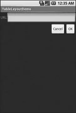
Figure 7-7. The TableLayoutDemo sample application
Scrollwork
Phone screens tend to be small, which requires developers to use some tricks to present a lot of information in the limited available space. One trick for doing this is to use scrolling, so only part of the information is visible at one time, and the rest is available via scrolling up or down.
ScrollViewis a container that provides scrolling for its contents. You can take a layout that might be too big for some screens, wrap it in a ScrollView, and still use your existing layout logic. It just so happens that the user can see only part of your layout at one time; the rest is available via scrolling.
For example, here is a ScrollViewused in an XML layout file (from the Containers/Scrolldemo in the Source Code area of http://apress.com):
xmlns:android="http://schemas.android.com/apk/res/android"
android:layout_width="fill_parent"
android:layout_height="wrap_content">
android:layout_width="fill_parent"
android:layout_height="fill_parent"
android:stretchColumns="0">
android:layout_height="80px"
android:background="#000000"/>
android:paddingLeft="4px"
android:layout_gravity="center_vertical" />
android:layout_height="80px"
android:background="#440000" />
Интервал:
Закладка:
Похожие книги на «Beginning Android»
Представляем Вашему вниманию похожие книги на «Beginning Android» списком для выбора. Мы отобрали схожую по названию и смыслу литературу в надежде предоставить читателям больше вариантов отыскать новые, интересные, ещё непрочитанные произведения.


Обсуждение, отзывы о книге «Beginning Android» и просто собственные мнения читателей. Оставьте ваши комментарии, напишите, что Вы думаете о произведении, его смысле или главных героях. Укажите что конкретно понравилось, а что нет, и почему Вы так считаете.