Mark Murphy - Beginning Android
Здесь есть возможность читать онлайн «Mark Murphy - Beginning Android» весь текст электронной книги совершенно бесплатно (целиком полную версию без сокращений). В некоторых случаях можно слушать аудио, скачать через торрент в формате fb2 и присутствует краткое содержание. Город: New York, Год выпуска: 2009, ISBN: 2009, Издательство: Apress, Жанр: Программирование, на английском языке. Описание произведения, (предисловие) а так же отзывы посетителей доступны на портале библиотеки ЛибКат.
- Название:Beginning Android
- Автор:
- Издательство:Apress
- Жанр:
- Год:2009
- Город:New York
- ISBN:978-1-4302-2420-4
- Рейтинг книги:3 / 5. Голосов: 1
-
Избранное:Добавить в избранное
- Отзывы:
-
Ваша оценка:
Beginning Android: краткое содержание, описание и аннотация
Предлагаем к чтению аннотацию, описание, краткое содержание или предисловие (зависит от того, что написал сам автор книги «Beginning Android»). Если вы не нашли необходимую информацию о книге — напишите в комментариях, мы постараемся отыскать её.
Dear Reader,
First, welcome to the world of Android! We’re entering a new era of mobile application development, one marked by open platforms and open source, to take ‘walled gardens’ and make them green houses for any and all to participate in. Android is relatively easy for developers, and I believe that this innovation will help generate a large ecosystem of developers and consumers within a very short time. This means that budding developers such as yourself will have many opportunities to design and build your own applications and you’ll have a huge and hungry customer base.
Second, welcome to the book! Its purpose is to start you on your way with building Android applications, and to help you master the learning curve. Android is already a rich framework, comparable in many ways to the richness Android of desktop Java environments. This means that there is a lot of cool stuff for you to pick up along your journey in order to create the slickest, most useful apps Android you can imagine.
The source code for the code samples in this book is all available from the Apress site, so you can stay as hands-on and practical as you like while I introduce you to the core of Android, and invite you to experiment with the various classes and APIs we’ll be looking at. By the time you’ve finished this book, you’ll be creating your own Android applications and asking yourself what your next great application will be…!
Enjoy! Mark Murphy
Beginning Android — читать онлайн бесплатно полную книгу (весь текст) целиком
Ниже представлен текст книги, разбитый по страницам. Система сохранения места последней прочитанной страницы, позволяет с удобством читать онлайн бесплатно книгу «Beginning Android», без необходимости каждый раз заново искать на чём Вы остановились. Поставьте закладку, и сможете в любой момент перейти на страницу, на которой закончили чтение.
Интервал:
Закладка:
The bottom RadioGroupis a column ( android:orientation="vertical") of three RadioButtonwidgets. Again, we have 5pxof padding on all sides and a “natural” height ( android:layout_height="wrap_content"). However, we have set android:layout_widthto be fill_parent, meaning the column of radio buttons “claims” the entire width of the screen.
To adjust these settings at runtime based on user input, we need some Java code:
packagecom.commonsware.android.containers;
importandroid.app.Activity;
importandroid.os.Bundle;
importandroid.view.Gravity;
importandroid.text.TextWatcher;
importandroid.widget.LinearLayout;
importandroid.widget.RadioGroup;
importandroid.widget.EditText;
public classLinearLayoutDemo extendsActivity
implementsRadioGroup.OnCheckedChangeListener {
RadioGroup orientation;
RadioGroup gravity;
@Override
publicvoid onCreate(Bundle icicle) {
super. onCreate(icicle);
setContentView(R.layout.main);
orientation=(RadioGroup) findViewById(R.id.orientation);
orientation. setOnCheckedChangeListener( this);
gravity=(RadioGroup) findViewById(R.id.gravity);
gravity. setOnCheckedChangeListener( this);
}
publicvoid onCheckedChanged(RadioGroup group, int checkedId) {
if(group==orientation) {
if(checkedId==R.id.horizontal) {
orientation. setOrientation(LinearLayout.HORIZONTAL);
} else{
orientation. setOrientation(LinearLayout.VERTICAL);
}
} else if(group==gravity) {
if(checkedId==R.id.left) {
gravity. setGravity(Gravity.LEFT);
} else if(checkedId==R.id.center) {
gravity. setGravity(Gravity.CENTER_HORIZONTAL);
} else if(checkedId==R.id.right) {
gravity. setGravity(Gravity.RIGHT);
}
}
}
}
In onCreate(), we look up our two RadioGroupcontainers and register a listener on each, so we are notified when the radio buttons change state ( setOnCheckedChangeListener(this)). Since the activity implements OnCheckedChangeListener, the activity itself is the listener.
In onCheckedChanged()(the callback for the listener), we see which RadioGrouphad a state change. If it was the orientation group, we adjust the orientation based on the user’s selection. If it was the gravity group, we adjust the gravity based on the user’s selection.
Figure 7-2 shows the result when the sample application is first launched inside the emulator.
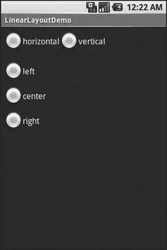
Figure 7-2. The LinearLayoutDemo sample application, as initially launched
If we toggle on the Vertical radio button, the top RadioGroupadjusts to match (see Figure 7-3).
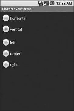
Figure 7-3. The same application, with the Vertical radio button selected
If we toggle the Center or Right radio button, the bottom RadioGroupadjusts to match (see Figures 7-4 and 7-5).
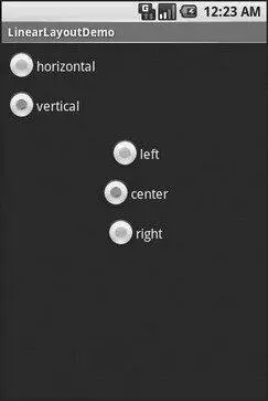
Figure 7-4. The same application, with the Vertical and Center radio buttons selected
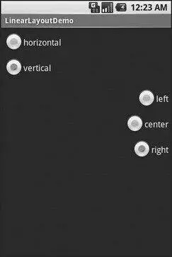
Figure 7-5. The same application, with the Vertical and Right radio buttons selected
All Things Are Relative
RelativeLayout, as the name suggests, lays out widgets based upon their relationship to other widgets in the container and in the parent container. You can place Widget X below and to the left of Widget Y, or have Widget Z’s bottom edge align with the bottom of the container, and so on.
This is reminiscent of James Elliott’s RelativeLayout [13] http://www.onjava.com/pub/a/onjava/2002/09/18/relativelayout.html
for use with Java Swing.
Concepts and Properties
To make all this work, we need ways to reference other widgets within an XML layout file, plus ways to indicate the relative positions of those widgets.
The easiest relations to set up tie a widget’s position to that of its container:
• android:layout_alignParentTopsays the widget’s top should align with the top of the container.
• android:layout_alignParentBottomsays the widget’s bottom should align with the bottom of the container.
• android:layout_alignParentLeftsays the widget’s left side should align with the left side of the container.
• android:layout_alignParentRightsays the widget’s right side should align with the right side of the container.
• android:layout_centerHorizontalsays the widget should be positioned horizontally at the center of the container.
• android:layout_centerVerticalsays the widget should be positioned vertically at the center of the container.
• android:layout_centerInParentsays the widget should be positioned both horizontally and vertically at the center of the container.
All of these properties take a simple Boolean value ( trueor false).
Note that the padding of the widget is taken into account when performing these various alignments. The alignments are based on the widget’s overall cell (a combination of its natural space plus the padding).
The remaining properties of relevance to RelativeLayouttake as a value the identity of a widget in the container. To identify and reference widgets this way, follow these steps:
1. Put identifiers ( android:idattributes) on all elements that you will need to address, of the form @+id/....
2. Reference other widgets using the same identifier value without the plus sign (@id/...).
For example, if Widget A is identified as @+id/widget_a, Widget B can refer to Widget A in one of its own properties via the identifier @id/widget_a.
Интервал:
Закладка:
Похожие книги на «Beginning Android»
Представляем Вашему вниманию похожие книги на «Beginning Android» списком для выбора. Мы отобрали схожую по названию и смыслу литературу в надежде предоставить читателям больше вариантов отыскать новые, интересные, ещё непрочитанные произведения.


Обсуждение, отзывы о книге «Beginning Android» и просто собственные мнения читателей. Оставьте ваши комментарии, напишите, что Вы думаете о произведении, его смысле или главных героях. Укажите что конкретно понравилось, а что нет, и почему Вы так считаете.