Mark Murphy - Beginning Android
Здесь есть возможность читать онлайн «Mark Murphy - Beginning Android» весь текст электронной книги совершенно бесплатно (целиком полную версию без сокращений). В некоторых случаях можно слушать аудио, скачать через торрент в формате fb2 и присутствует краткое содержание. Город: New York, Год выпуска: 2009, ISBN: 2009, Издательство: Apress, Жанр: Программирование, на английском языке. Описание произведения, (предисловие) а так же отзывы посетителей доступны на портале библиотеки ЛибКат.
- Название:Beginning Android
- Автор:
- Издательство:Apress
- Жанр:
- Год:2009
- Город:New York
- ISBN:978-1-4302-2420-4
- Рейтинг книги:3 / 5. Голосов: 1
-
Избранное:Добавить в избранное
- Отзывы:
-
Ваша оценка:
Beginning Android: краткое содержание, описание и аннотация
Предлагаем к чтению аннотацию, описание, краткое содержание или предисловие (зависит от того, что написал сам автор книги «Beginning Android»). Если вы не нашли необходимую информацию о книге — напишите в комментариях, мы постараемся отыскать её.
Dear Reader,
First, welcome to the world of Android! We’re entering a new era of mobile application development, one marked by open platforms and open source, to take ‘walled gardens’ and make them green houses for any and all to participate in. Android is relatively easy for developers, and I believe that this innovation will help generate a large ecosystem of developers and consumers within a very short time. This means that budding developers such as yourself will have many opportunities to design and build your own applications and you’ll have a huge and hungry customer base.
Second, welcome to the book! Its purpose is to start you on your way with building Android applications, and to help you master the learning curve. Android is already a rich framework, comparable in many ways to the richness Android of desktop Java environments. This means that there is a lot of cool stuff for you to pick up along your journey in order to create the slickest, most useful apps Android you can imagine.
The source code for the code samples in this book is all available from the Apress site, so you can stay as hands-on and practical as you like while I introduce you to the core of Android, and invite you to experiment with the various classes and APIs we’ll be looking at. By the time you’ve finished this book, you’ll be creating your own Android applications and asking yourself what your next great application will be…!
Enjoy! Mark Murphy
Beginning Android — читать онлайн бесплатно полную книгу (весь текст) целиком
Ниже представлен текст книги, разбитый по страницам. Система сохранения места последней прочитанной страницы, позволяет с удобством читать онлайн бесплатно книгу «Beginning Android», без необходимости каждый раз заново искать на чём Вы остановились. Поставьте закладку, и сможете в любой момент перейти на страницу, на которой закончили чтение.
Интервал:
Закладка:
publicvoid onCheckedChanged(CompoundButton buttonView,
boolean isChecked) {
if(isChecked) {
cb. setText("This checkbox is: checked");
} else{
cb. setText("This checkbox is: unchecked");
}
}
}
Note that the activity serves as its own listener for checkbox state changes since it implements the OnCheckedChangeListenerinterface (via cb.setOnCheckedChangeListener(this)). The callback for the listener is onCheckedChanged(), which receives the checkbox whose state has changed and what the new state is. In this case, we update the text of the checkbox to reflect what the actual box contains.
The result? Clicking the checkbox immediately updates its text, as you can see in Figures 6-4 and 6-5.

Figure 6-4. The CheckBoxDemo sample application, with the checkbox unchecked
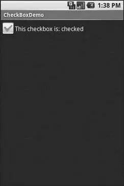
Figure 6-5. The same application, now with the checkbox checked
Turn the Radio Up
As with other implementations of radio buttons in other toolkits, Android’s radio buttons are two-state, like checkboxes, but can be grouped such that only one radio button in the group can be checked at any time.
Like CheckBox, RadioButtoninherits from CompoundButton, which in turn inherits from TextView. Hence, all the standard TextViewproperties for font face, style, color, etc., are available for controlling the look of radio buttons. Similarly, you can call isChecked()on a RadioButtonto see if it is selected, toggle()to select it, and so on, like you can with a CheckBox.
Most times, you will want to put your RadioButtonwidgets inside of a RadioGroup. The RadioGroupindicates a set of radio buttons whose state is tied, meaning only one button out of the group can be selected at any time. If you assign an android:idto your RadioGroupin your XML layout, you can access the group from your Java code and invoke:
• check()to check a specific radio button via its ID (e.g., group.check(R.id.radio1))
• clearCheck()to clear all radio buttons, so none in the group are checked
• getCheckedRadioButtonId()to get the ID of the currently-checked radio button (or -1 if none are checked)
For example, from the Basic/RadioButtonsample application, here is an XML layout showing a RadioGroupwrapping a set of RadioButtonwidgets:
xmlns:android="http://schemas.android.com/apk/res/android"
android:orientation="vertical"
android:layout_width="fill_parent"
android:layout_height="fill_parent">
android:layout_width="wrap_content"
android:layout_height="wrap_content"
android:text="Rock" />
android:layout_width="wrap_content"
android:layout_height="wrap_content"
android:text="Scissors" />
android:layout_width="wrap_content"
android:layout_height="wrap_content"
android:text="Paper" />
Figure 6-6 shows the result using the stock Android-generated Java for the project and this layout.
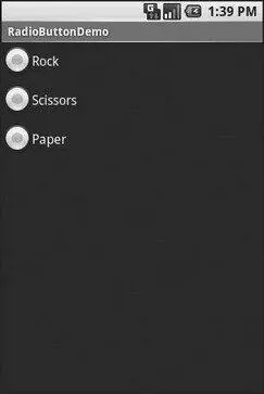
Figure 6-6. The RadioButtonDemo sample application
Note that the radio button group is initially set to be completely unchecked at the outset. To pre-set one of the radio buttons to be checked, use either setChecked()on the RadioButtonor check()on the RadioGroupfrom within your onCreate()callback in your activity.
It’s Quite a View
All widgets, including the ones previously shown, extend View, and as such give all widgets an array of useful properties and methods beyond those already described.
Useful Properties
Some of the properties on View most likely to be used include:
• Controls the focus sequence:
• android:nextFocusDown
• android:nextFocusLeft
• android:nextFocusRight
• android:nextFocusUp
• android:visibility, which controls whether the widget is initially visible
• android:background, which typically provides an RGB color value (e.g., #00FF00for green) to serve as the background for the widget
Useful Methods
You can toggle whether or not a widget is enabled via setEnabled()and see if it is enabled via isEnabled(). One common use pattern for this is to disable some widgets based on a CheckBoxor RadioButtonselection.
You can give a widget focus via requestFocus()and see if it is focused via isFocused(). You might use this in concert with disabling widgets as previously mentioned, to ensure the proper widget has the focus once your disabling operation is complete.
To help navigate the tree of widgets and containers that make up an activity’s overall view, you can use:
• getParent()to find the parent widget or container
• findViewById()to find a child widget with a certain ID
• getRootView()to get the root of the tree (e.g., what you provided to the activity via setContentView())
CHAPTER 7
Working with Containers
Containers pour a collection of widgets (and possibly child containers) into specific layouts you like. If you want a form with labels on the left and fields on the right, you will need a container. If you want OK and Cancel buttons to be beneath the rest of the form, next to one another, and flush to the right side of the screen, you will need a container. From a pure XML perspective, if you have multiple widgets (beyond RadioButtonwidgets in a RadioGroup), you will need a container just to have a root element to place the widgets inside.
Most GUI toolkits have some notion of layout management, frequently organized into containers. In Java Swing, for example, you have layout managers like BoxLayoutand containers that use them (e.g., Box). Some toolkits, such as XUL and Flex, stick strictly to the box model, figuring that any desired layout can be achieved through the right combination of nested boxes.
Android, through LinearLayout, also offers a box model, but in addition it supports a range of containers providing different layout rules. In this chapter we will look at three commonly used containers: LinearLayout(the box model), RelativeLayout(a rule-based model), and TableLayout(the grid model), along with ScrollView, a container designed to assist with implementing scrolling containers. In the next chapter we will examine some more-esoteric containers.
Интервал:
Закладка:
Похожие книги на «Beginning Android»
Представляем Вашему вниманию похожие книги на «Beginning Android» списком для выбора. Мы отобрали схожую по названию и смыслу литературу в надежде предоставить читателям больше вариантов отыскать новые, интересные, ещё непрочитанные произведения.


Обсуждение, отзывы о книге «Beginning Android» и просто собственные мнения читателей. Оставьте ваши комментарии, напишите, что Вы думаете о произведении, его смысле или главных героях. Укажите что конкретно понравилось, а что нет, и почему Вы так считаете.