Mark Murphy - Beginning Android
Здесь есть возможность читать онлайн «Mark Murphy - Beginning Android» весь текст электронной книги совершенно бесплатно (целиком полную версию без сокращений). В некоторых случаях можно слушать аудио, скачать через торрент в формате fb2 и присутствует краткое содержание. Город: New York, Год выпуска: 2009, ISBN: 2009, Издательство: Apress, Жанр: Программирование, на английском языке. Описание произведения, (предисловие) а так же отзывы посетителей доступны на портале библиотеки ЛибКат.
- Название:Beginning Android
- Автор:
- Издательство:Apress
- Жанр:
- Год:2009
- Город:New York
- ISBN:978-1-4302-2420-4
- Рейтинг книги:3 / 5. Голосов: 1
-
Избранное:Добавить в избранное
- Отзывы:
-
Ваша оценка:
Beginning Android: краткое содержание, описание и аннотация
Предлагаем к чтению аннотацию, описание, краткое содержание или предисловие (зависит от того, что написал сам автор книги «Beginning Android»). Если вы не нашли необходимую информацию о книге — напишите в комментариях, мы постараемся отыскать её.
Dear Reader,
First, welcome to the world of Android! We’re entering a new era of mobile application development, one marked by open platforms and open source, to take ‘walled gardens’ and make them green houses for any and all to participate in. Android is relatively easy for developers, and I believe that this innovation will help generate a large ecosystem of developers and consumers within a very short time. This means that budding developers such as yourself will have many opportunities to design and build your own applications and you’ll have a huge and hungry customer base.
Second, welcome to the book! Its purpose is to start you on your way with building Android applications, and to help you master the learning curve. Android is already a rich framework, comparable in many ways to the richness Android of desktop Java environments. This means that there is a lot of cool stuff for you to pick up along your journey in order to create the slickest, most useful apps Android you can imagine.
The source code for the code samples in this book is all available from the Apress site, so you can stay as hands-on and practical as you like while I introduce you to the core of Android, and invite you to experiment with the various classes and APIs we’ll be looking at. By the time you’ve finished this book, you’ll be creating your own Android applications and asking yourself what your next great application will be…!
Enjoy! Mark Murphy
Beginning Android — читать онлайн бесплатно полную книгу (весь текст) целиком
Ниже представлен текст книги, разбитый по страницам. Система сохранения места последней прочитанной страницы, позволяет с удобством читать онлайн бесплатно книгу «Beginning Android», без необходимости каждый раз заново искать на чём Вы остановились. Поставьте закладку, и сможете в любой момент перейти на страницу, на которой закончили чтение.
Интервал:
Закладка:
Button, Button, Who’s Got the Button?
We’ve already seen the use of the Button widget in Chapters 4 and 5. As it turns out, Buttonis a subclass of TextView, so everything discussed in the preceding section in terms of formatting the face of the button still holds.
Fleeting Images
Android has two widgets to help you embed images in your activities: ImageViewand ImageButton. As the names suggest, they are image-based analogues to TextViewand Button, respectively.
Each widget takes an android:srcattribute (in an XML layout) to specify what picture to use. These usually reference a drawable resource, described in greater detail in the chapter on resources. You can also set the image content based on a Urifrom a content provider via setImageURI().
ImageButton, a subclass of ImageView, mixes in the standardButton behaviors, for responding to clicks and whatnot.
For example, take a peek at the main.xmllayout from the Basic/ImageViewsample project which is found along with all other code samples at http://apress.com:
android:id="@+id/icon"
android:layout_width="fill_parent"
android:layout_height="fill_parent"
android:adjustViewBounds="true"
android:src="@drawable/molecule"
/>
The result, just using the code-generated activity, is shown in Figure 6-2.
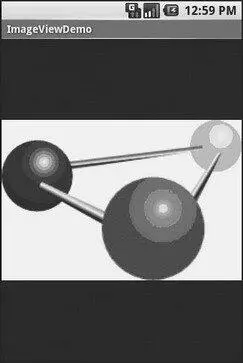
Figure 6-2. The ImageViewDemo sample application
Fields of Green. Or Other Colors.
Along with buttons and labels, fields are the third “anchor” of most GUI toolkits. In Android, they are implemented via the EditTextwidget, which is a subclass of the TextViewused for labels.
Along with the standard TextViewproperties (e.g., android:textStyle), EditTexthas many others that will be useful for you in constructing fields, including:
• android:autoText, to control if the field should provide automatic spelling assistance
• android:capitalize, to control if the field should automatically capitalize the first letter of entered text (e.g., first name, city)
• android:digits, to configure the field to accept only certain digits
• android:singleLine, to control if the field is for single-line input or multiple-line input (e.g., does Enter move you to the next widget or add a newline?)
Beyond those, you can configure fields to use specialized input methods, such as android:numericfor numeric-only input, android:passwordfor shrouded password input, and android:phoneNumberfor entering in phone numbers. If you want to create your own input method scheme (e.g., postal codes, Social Security numbers), you need to create your own implementation of the InputMethodinterface, then configure the field to use it via android:inputMethod.
For example, from the Basic/Fieldproject, here is an XML layout file showing an EditText:
android:id="@+id/field"
android:layout_width="fill_parent"
android:layout_height="fill_parent"
android:singleLine="false"
/>
Note that android:singleLineis false, so users will be able to enter in several lines of text.
For this project, the FieldDemo.javafile populates the input field with some prose:
packagecom.commonsware.android.basic;
importandroid.app.Activity;
importandroid.os.Bundle;
importandroid.widget.EditText;
public classFieldDemo extendsActivity {
@Override
publicvoid onCreate(Bundle icicle) {
super. onCreate(icicle);
setContentView(R.layout.main);
EditText fld=(EditText) findViewById(R.id.field);
fld. setText("Licensed under the Apache License, Version 2.0 " +
"(the \"License\"); you may not use this file " +
"except in compliance with the License. You may " +
"obtain a copy of the License at " +
"http://www.apache.org/licenses/LICENSE-2.0");
}
}
The result, once built and installed into the emulator, is shown in Figure 6-3.
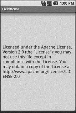
Figure 6-3. The FieldDemo sample application
Android’s emulator only allows one application in the launcher per unique Java package. Since all the demos in this chapter share the com.commonsware.android.basicpackage, you will only see one of these demos in your emulator’s launcher at any one time.
Another flavor of field is one that offers auto-completion, to help users supply a value without typing in the whole text. That is provided in Android as the AutoCompleteTextViewwidget and is discussed in Chapter 8.
Just Another Box to Check
The classic checkbox has two states: checked and unchecked. Clicking the checkbox toggles between those states to indicate a choice (e.g., “Add rush delivery to my order”).
In Android, there is a CheckBoxwidget to meet this need. It has TextViewas an ancestor, so you can use TextViewproperties like android:textColorto format the widget.
Within Java, you can invoke:
• isChecked()to determine if the checkbox has been checked
• setChecked()to force the checkbox into a checked or unchecked state
• toggle()to toggle the checkbox as if the user checked it
Also, you can register a listener object (in this case, an instance of OnCheckedChangeListener) to be notified when the state of the checkbox changes.
For example, from the Basic/CheckBoxproject, here is a simple checkbox layout:
android:id="@+id/check"
android:layout_width="wrap_content"
android:layout_height="wrap_content"
android:text="This checkbox is: unchecked" />
The corresponding CheckBoxDemo.javaretrieves and configures the behavior of the checkbox:
public classCheckBoxDemo extendsActivity
implementsCompoundButton.OnCheckedChangeListener {
CheckBox cb;
@Override
publicvoid onCreate(Bundle icicle) {
super. onCreate(icicle);
setContentView(R.layout.main);
cb=(CheckBox) findViewById(R.id.check);
cb. setOnCheckedChangeListener( this);
}
Интервал:
Закладка:
Похожие книги на «Beginning Android»
Представляем Вашему вниманию похожие книги на «Beginning Android» списком для выбора. Мы отобрали схожую по названию и смыслу литературу в надежде предоставить читателям больше вариантов отыскать новые, интересные, ещё непрочитанные произведения.


Обсуждение, отзывы о книге «Beginning Android» и просто собственные мнения читателей. Оставьте ваши комментарии, напишите, что Вы думаете о произведении, его смысле или главных героях. Укажите что конкретно понравилось, а что нет, и почему Вы так считаете.