Bruce Barnbaum - The Art of Photography - An Approach to Personal Expression
Здесь есть возможность читать онлайн «Bruce Barnbaum - The Art of Photography - An Approach to Personal Expression» весь текст электронной книги совершенно бесплатно (целиком полную версию без сокращений). В некоторых случаях можно слушать аудио, скачать через торрент в формате fb2 и присутствует краткое содержание. Жанр: Старинная литература, на английском языке. Описание произведения, (предисловие) а так же отзывы посетителей доступны на портале библиотеки ЛибКат.

- Название:The Art of Photography: An Approach to Personal Expression
- Автор:
- Жанр:
- Год:неизвестен
- ISBN:нет данных
- Рейтинг книги:5 / 5. Голосов: 1
-
Избранное:Добавить в избранное
- Отзывы:
-
Ваша оценка:
The Art of Photography: An Approach to Personal Expression: краткое содержание, описание и аннотация
Предлагаем к чтению аннотацию, описание, краткое содержание или предисловие (зависит от того, что написал сам автор книги «The Art of Photography: An Approach to Personal Expression»). Если вы не нашли необходимую информацию о книге — напишите в комментариях, мы постараемся отыскать её.
The Art of Photography: An Approach to Personal Expression — читать онлайн бесплатно полную книгу (весь текст) целиком
Ниже представлен текст книги, разбитый по страницам. Система сохранения места последней прочитанной страницы, позволяет с удобством читать онлайн бесплатно книгу «The Art of Photography: An Approach to Personal Expression», без необходимости каждый раз заново искать на чём Вы остановились. Поставьте закладку, и сможете в любой момент перейти на страницу, на которой закончили чтение.
Интервал:
Закладка:
In addition to the commonly used negative materials and developers discussed above, there is an abundance of materials for specialized purposes. Orthochromatic film is sensitive to a narrow segment of the visible spectrum (the blue wavelengths) and can be used to great advantage. Blue objects, such as the sky, are rendered very light, while red objects are very dark. The uncommon tonal renditions created by this film can be very intriguing.
Infrared film can yield truly bizarre images, and with care and subtlety on the photographer’s part they can go beyond the superficial realm of stark, almost shocking impact to become quite creative and insightful. As with so many other tools, most people use this film sporadically for special effects and immediate impact rather than delving into its expressive possibilities. If you are interested in these or other specialized films, I suggest you work with them over long periods of time, as if you were nurturing plants in your garden. Cultivate them and gradually get to know them, and what they can do for you.
Not only are there specialized films, but also specialized developers for them. They can be used with panchromatic, orthochromatic, or infrared films, yielding some very exciting and unusual results. This is purely in the realm of creative experimentation, and you will have to discover the possibilities yourself. I suggest obtaining data books and brochures from Kodak, Ilford, and the other manufacturers to get basic information before charging ahead blindly. Such books will offer information concerning the characteristics of the various materials and give you a starting point for your experiments. The rest is up to you!
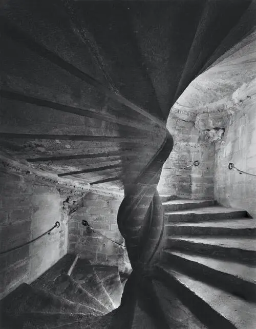
The four story spiral stairway at Chateau Lourmarin, in Provence, France, is a true work of art in masonry, much like an Escher drawing, looking almost the same upside-down. Its contrast is excessive, with window light at various levels providing the only illumination. I used my widest angle lens to adequately encompass and convey its magnificence, and a two-solution compensating development for the exposed negative .
Figure 9-14. Eclairé
Chapter 10. The Print
ASIDE FROM YOUR CHOICE OF SUBJECT MATTER, printing a negative in the darkroom is possibly the most personal aspect of photography. Every photographer has his or her own special way of approaching darkroom work, and few photographers avail themselves of the opportunity to watch others work in the darkroom. For this reason, I shall approach this chapter in a very personal manner, detailing the materials and methods I use in making a print. I don’t suggest that my approach is the only way to go about darkroom work, nor is it necessarily the best way—but it is surely my way, and it has proven successful for me. I suggest that you consider each of my methods for possible inclusion in your own approach, with your own personal modifications.
Many of the techniques that I regularly employ in the field and in the darkroom started as suggestions from other photographers. I often modified their procedures to suit me. I’ve even invented new techniques. I try to maintain an open, flexible approach, trying new procedures or materials whenever they seem to have merit for my purposes. If you can adopt an open approach, this chapter will prove more meaningful to you, whether you’re at the beginner or advanced level.
The chapter will begin with an overview of materials, because their characteristics are so integrally tied to my methods. From there, it will proceed to methods of printing—using both standard and advanced techniques—then to completion of the process through archival processing (i.e., the production of a permanent image). The discussion will first focus on black-and-white procedures, then on color. I wish to make clear that some of the methods explained in black-and-white are fully applicable to color, and vice versa. So I urge readers with an interest in only one or the other to read the entire chapter.
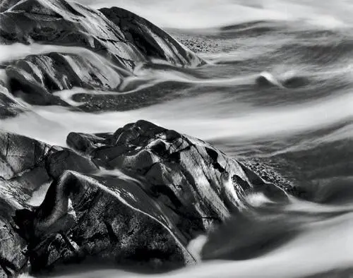
I exposed this negative in 1978 and unsuccessfully tried cropping and printing it a few times before giving up. In 2006, I rediscovered the negative and realized that the upper right, which appeared blank white on the contact proof, simply needed burning to bring out necessary detail. So, after nearly 30 years, I finally printed it. The glowing, flowing, abstract forms that I encountered three decades ago have finally come to light. With easy access to any negative I’ve ever exposed, I can print at any time. This is a great advantage of negatives, which stay the same forever, as opposed to digital files which may not be easily accessible as technology changes .
Figure 10-1. Rocks and Receding Wave
Note
I find that images possessing substantial areas of white printed on neutral or slightly warm-toned papers appear more brilliant than those printed on cold-toned, bluer papers .
Black-and-White Enlarging Papers
What is the best enlarging paper? Today there are fewer options due to the rapid emergence of digital photography, but there are still excellent products available. I’ve used many papers over the years, and today’s products are as good or better than ever. As I write this book, my favorite papers are Adox MCC110 and Ilford Multicontrast Warmtone. Both are variable contrast papers. They both have great brilliance, wide latitude in contrast range, and rich glossy surfaces (not high gloss like drugstore prints, but semigloss with a slight texture). They can be processed to full archival longevity and can be bleached and toned easily. There are other papers available as well, including several by Oriental Seagull, Kentmere, Ilford, and others. So there are plenty from which to choose.
Products are constantly being introduced, removed, and altered by all manufacturers, so any discussion of products becomes dated rather quickly. However, new products may possess many of the characteristics of older, discontinued products. Let’s look at several important paper characteristics more carefully.
There is a subtlety concerning paper color that deserves real scrutiny. Papers with cold, bluish whites always seem to have less brilliance in broad highlight areas than papers with warmer, yellower whites. It’s an interesting and unusual phenomenon that has intrigued me for some time. I believe I have identified the reason. Let’s investigate a concrete example to understand it.
Suppose you look at an image made in winter of a sunlit snowfield. It would seem that the colder (blue) white paper would convey the feeling more appropriately than a warmer (yellower) white. Surprisingly, it’s the other way around. My explanation is that the human eye responds more strongly to the yellow-white than to the blue-white. This is due to the well-known fact that the human eye responds more strongly to the yellow portion of the spectrum than to the blue portion. After all, we can see light blue, medium blue, and dark blue, but we cannot even comprehend dark yellow. Yellow always appears bright to our eyes, and that carries over to the subtle print coloration. I find that images possessing substantial areas of white printed on neutral or slightly warm papers appear more brilliant than those printed on cold-toned, bluer papers. But when a highlight is isolated and surrounded by mid-gray or darker tones, the color seems immaterial; any paper appears equally brilliant.
Developing characteristics are also important, for there are subtle differences between the image quality of a fully developed print and one that has been pulled from the developer a bit too soon. Most fiber base papers develop slowly over long periods of time, with increasingly rich blacks and more subtle mid-tones resulting from extended development times. Variable contrast papers appear to develop more quickly, but gain subtle highlight gradations with extended development. The reason for this characteristic in variable contrast papers is that their two emulsions—one low contrast and one high contrast—don’t always develop at the same rate of speed. The high contrast emulsion often develops more quickly, giving the appearance that complete development occurs rapidly; but as the low contrast emulsion develops, the subtle highlight and mid-tone gradations become more apparent. Of course, the low contrast emulsion adds to the richness and the subtleties within the mid-tone and darkest areas of the print as well. So if you rush your development, or pull the paper out of the developer early, you’ll lose much of the richness of the image.
Читать дальшеИнтервал:
Закладка:
Похожие книги на «The Art of Photography: An Approach to Personal Expression»
Представляем Вашему вниманию похожие книги на «The Art of Photography: An Approach to Personal Expression» списком для выбора. Мы отобрали схожую по названию и смыслу литературу в надежде предоставить читателям больше вариантов отыскать новые, интересные, ещё непрочитанные произведения.


Обсуждение, отзывы о книге «The Art of Photography: An Approach to Personal Expression» и просто собственные мнения читателей. Оставьте ваши комментарии, напишите, что Вы думаете о произведении, его смысле или главных героях. Укажите что конкретно понравилось, а что нет, и почему Вы так считаете.