Bruce Barnbaum - The Art of Photography - An Approach to Personal Expression
Здесь есть возможность читать онлайн «Bruce Barnbaum - The Art of Photography - An Approach to Personal Expression» весь текст электронной книги совершенно бесплатно (целиком полную версию без сокращений). В некоторых случаях можно слушать аудио, скачать через торрент в формате fb2 и присутствует краткое содержание. Жанр: Старинная литература, на английском языке. Описание произведения, (предисловие) а так же отзывы посетителей доступны на портале библиотеки ЛибКат.

- Название:The Art of Photography: An Approach to Personal Expression
- Автор:
- Жанр:
- Год:неизвестен
- ISBN:нет данных
- Рейтинг книги:5 / 5. Голосов: 1
-
Избранное:Добавить в избранное
- Отзывы:
-
Ваша оценка:
The Art of Photography: An Approach to Personal Expression: краткое содержание, описание и аннотация
Предлагаем к чтению аннотацию, описание, краткое содержание или предисловие (зависит от того, что написал сам автор книги «The Art of Photography: An Approach to Personal Expression»). Если вы не нашли необходимую информацию о книге — напишите в комментариях, мы постараемся отыскать её.
The Art of Photography: An Approach to Personal Expression — читать онлайн бесплатно полную книгу (весь текст) целиком
Ниже представлен текст книги, разбитый по страницам. Система сохранения места последней прочитанной страницы, позволяет с удобством читать онлайн бесплатно книгу «The Art of Photography: An Approach to Personal Expression», без необходимости каждый раз заново искать на чём Вы остановились. Поставьте закладку, и сможете в любой момент перейти на страницу, на которой закончили чтение.
Интервал:
Закладка:
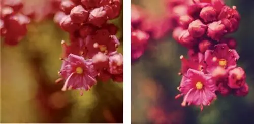
Figure 6-13 was made under sunlit conditions, Figure 6-13 under cloudy conditions. These two photographs show the same sun vs. shade color shifts that we see on the snow cups (Figure 6-12). Which is more appropriate? To me, it’s a toss-up. I see no clear winner despite their obvious differences.
Figure 6-13. Red Mountain Heather, Sierra Nevada Mountains
Subjectivity and Mood of Color
Color renditions of every film and digital sensor are different. Papers vary as well. Which combination is best is a matter of purely subjective judgment. My favorites may prove to be those you dislike most. By working with these variables over long periods of time, you become familiar with their characteristics—their strengths and weaknesses—and learn to exploit their advantages while minimizing their shortcomings.
As an example, I have always disliked Polaroid color print film. In my opinion, the colors are erratic and muted. Yet Marie Cosindas has produced a large body of outstanding color Polaroid portraits and still lifes. By working with the inherent characteristics of the film, she has produced images that can be likened to paintings of the Baroque and Romantic periods. She often dresses her subjects in lavish costumes, uses flowers or ornate objects for embellishment, and tends toward darker tones to create a lush and intense mood. Often one brilliant color stands out against the prevailing deeper tones. In the hands of many photographers the results could prove outlandish or absurd, but in hers they are magical. Much of the credit must be given to her painstaking patience in learning the characteristics of the material.
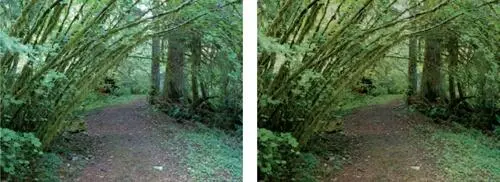
Figure 6-14, digitally captured, was made in the early evening under cloudy skies, giving it an overall blue cast. Using basic global Photoshop adjustments—hue, saturation, and contrast curves—Figure 6-14 shows how I brought in the colors that my eyes saw at the scene (note the path). I made no attempt to aggrandize the colors or saturate them needlessly, but rather to show the scene realistically.
Figure 6-14. Forest Trail, North Cascade Mountains
Cosindas’ prints eloquently point out an aspect of color work that often escapes color photographers: it is not necessary to have the entire color spectrum in each photograph. In fact, it can often be destructive. Color harmonies—colors of a single family—can help create unity in a color composition, and color contrast can help create high drama.
Intensity of hue is also of major importance in creating a color photograph. Just as in black-and-white, lighter colors tend to impart a brighter mood while darker colors tend to impart a richer, more serious, or even somber mood. A slight exposure decrease can intensify colors and mood simultaneously; a slight exposure increase can do the opposite. Needless to say, large exposure changes can ruin an image by washing it out at the upper end of the scale or muddying it at the lower end. Subtle changes, however, can have a remarkable effect on overall mood.
Control of color balance, intensity of hue, and contrast levels are major means of creating expressive color photographs. Not all photographs require garish or overly saturated colors, though the fad today is to saturate all colors. Sometimes monochrome or near-monochrome renditions can be extremely effective. At other times, a subdued color palette with one contrasting color can have tremendous strength. Use of subtle coloration, when appropriate, or saturated coloration, when appropriate, conveys a command of the medium and a personal insight that the discerning viewer will appreciate.
In Summary
Color photography requires at least as much thought as black-and-white photography; perhaps more. Color is an element of composition, and a dominating one, at that. It is also a potent determinant of mood. Color balance, color placement, color harmony or contrast, color intensity, and appropriateness of color must all be carefully considered along with lighting, balance, lines, forms, textures, and all of the other elements of composition when making a color photograph. When printing color, compatibility of the original film with the print material must be considered in order to obtain the proper look of the final image. If photography is to be used as an expressive extension of your own thoughts, each of these elements must be chosen with care.
I have long felt that it may be easier to make an acceptable color photograph than a black-and-white photograph, but it may be even more difficult to make an outstanding one. Because color is instantly recognizable and is therefore more accessible to the average person, it’s easy to make pleasant images. But because color is so accessible, it’s hard to break away from a documentary image to one that is personally expressive: too often the scene dominates over the mood, the feeling, or the interpretation. To create an image in color that is truly expressive—one that breaks away from the scene—requires a great deal of thought and dedication, as well as rapport with and deep understanding of the subject. None of this comes easily, but when it is achieved, the results can be breathtaking.
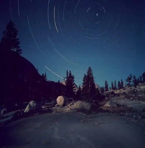
On a backpacking trip in 1976 to Sequoia National Park, I made an exposure of over three hours starting well after dark, but with a quarter moon setting during the first half hour. At this 11,000-foot elevation, the moon provided sufficient light for the immediate foreground. With the camera aimed toward Polaris (the North Star), the remainder of the exposure simply captured star trails without any subsequent exposure on the land. I could have left the shutter open longer to get even longer star trails, but I was afraid of oversleeping and ruining the exposure with too much dawn light.
Figure 6-15. Star Tracks, Sierra Nevada Mountains
Chapter 7. Filters
THE TWO PREVIOUS CHAPTERS ON LIGHT AND COLOR lay the groundwork for this chapter. More must be added before a complete understanding of filters can be achieved.
First, let’s look at light from a technical point of view without getting overly technical or mathematical about it. Visible light is a small portion of the electromagnetic spectrum (EM for short). The entire EM spectrum includes other forms of invisible radiation, such as infrared light, ultraviolet light, X-rays, gamma rays, and radio waves. Within the small portion of the EM spectrum that is visible to our eyes, there is also a spectrum (or range) of radiation levels, and we see that spectrum as colors of the visible spectrum—the colors of the rainbow, if you will. Most people are aware of Newton’s experiment of refracting light through a prism and breaking white light into its component parts, the visible spectrum.
All visible objects are visible only because they radiate light from their surfaces. The reflected or emitted light is made up of some, or all, parts of the visible spectrum. Few natural or manmade objects emit or reflect light from only one portion of the spectrum to the exclusion of other portions. The spectrum of light from a red rose, for example, includes small contributions from blue, orange, violet, and even green and yellow, as well as the dominant contribution of red. Yet the rose appears to be pure red. The blue sky is not highly saturated with blue; the percentage of blue in its spectrum is lower than the percentage of red in the rose. Though the sky’s dominant contribution is from the blue portion of the spectrum, other colors are present in surprisingly high amounts.
Читать дальшеИнтервал:
Закладка:
Похожие книги на «The Art of Photography: An Approach to Personal Expression»
Представляем Вашему вниманию похожие книги на «The Art of Photography: An Approach to Personal Expression» списком для выбора. Мы отобрали схожую по названию и смыслу литературу в надежде предоставить читателям больше вариантов отыскать новые, интересные, ещё непрочитанные произведения.


Обсуждение, отзывы о книге «The Art of Photography: An Approach to Personal Expression» и просто собственные мнения читателей. Оставьте ваши комментарии, напишите, что Вы думаете о произведении, его смысле или главных героях. Укажите что конкретно понравилось, а что нет, и почему Вы так считаете.