Bhisham C. Gupta - Statistics and Probability with Applications for Engineers and Scientists Using MINITAB, R and JMP
Здесь есть возможность читать онлайн «Bhisham C. Gupta - Statistics and Probability with Applications for Engineers and Scientists Using MINITAB, R and JMP» — ознакомительный отрывок электронной книги совершенно бесплатно, а после прочтения отрывка купить полную версию. В некоторых случаях можно слушать аудио, скачать через торрент в формате fb2 и присутствует краткое содержание. Жанр: unrecognised, на английском языке. Описание произведения, (предисловие) а так же отзывы посетителей доступны на портале библиотеки ЛибКат.

- Название:Statistics and Probability with Applications for Engineers and Scientists Using MINITAB, R and JMP
- Автор:
- Жанр:
- Год:неизвестен
- ISBN:нет данных
- Рейтинг книги:4 / 5. Голосов: 1
-
Избранное:Добавить в избранное
- Отзывы:
-
Ваша оценка:
Statistics and Probability with Applications for Engineers and Scientists Using MINITAB, R and JMP: краткое содержание, описание и аннотация
Предлагаем к чтению аннотацию, описание, краткое содержание или предисловие (зависит от того, что написал сам автор книги «Statistics and Probability with Applications for Engineers and Scientists Using MINITAB, R and JMP»). Если вы не нашли необходимую информацию о книге — напишите в комментариях, мы постараемся отыскать её.
Statistics and Probability with Applications for Engineers and Scientists using MINITAB, R and JMP, Second Edition Features two new chapters—one on Data Mining and another on Cluster Analysis Now contains R exhibits including code, graphical display, and some results MINITAB and JMP have been updated to their latest versions Emphasizes the p-value approach and includes related practical interpretations Offers a more applied statistical focus, and features modified examples to better exhibit statistical concepts Supplemented with an Instructor's-only solutions manual on a book’s companion website
is an excellent text for graduate level data science students, and engineers and scientists. It is also an ideal introduction to applied statistics and probability for undergraduate students in engineering and the natural sciences.
Statistics and Probability with Applications for Engineers and Scientists Using MINITAB, R and JMP — читать онлайн ознакомительный отрывок
Ниже представлен текст книги, разбитый по страницам. Система сохранения места последней прочитанной страницы, позволяет с удобством читать онлайн бесплатно книгу «Statistics and Probability with Applications for Engineers and Scientists Using MINITAB, R and JMP», без необходимости каждый раз заново искать на чём Вы остановились. Поставьте закладку, и сможете в любой момент перейти на страницу, на которой закончили чтение.
Интервал:
Закладка:
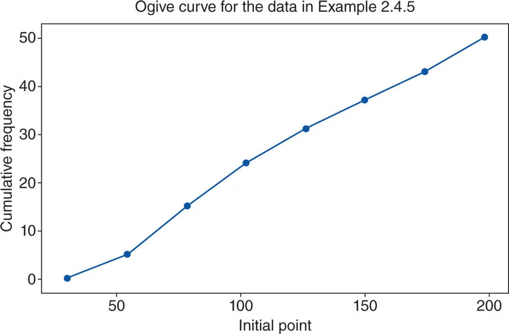
Figure 2.4.11Ogive curve using MINITAB for the data in Example 2.4.5.
2.4.5 Line Graph
A line graph, also known as a time‐series graph, is commonly used to study any trends in the variable of interest that might occur over time. In a line graph, time is marked on the horizontal axis (the  ‐axis) and the variable on the vertical axis (the
  ‐axis). For illustration, we use the data of Table 2.4.4given below in Example 2.4.6.
Example 2.4.6(Lawn mowers) The data in Table 2.4.4 give the number of lawn mowers sold by a garden shop over a period of 12 months of a given year. Prepare a line graph for these data.
Table 2.4.4Lawn mowers sold by a garden shop over a period of 12 months of a given year.
| Months | January | February | March | April | May | June | July | August | September | October | November | December |
| LM sold | 2 | 1 | 4 | 10 | 57 | 62 | 64 | 68 | 40 | 15 | 10 | 5 |
Solution:To prepare the line graph, plot the data in Table 2.4.4using the  ‐axis for the months and the
  ‐axis for the lawn mowers sold, and then join the plotted points with a freehand curve. The line graph for the data in this example is as shown in Figure 2.4.12, which was created using MINITAB ( Graph
  Time Series Plot).
From the line graph in Figure 2.4.12, we can see that the sale of lawn mowers is seasonal, since more mowers were sold in the summer months. Another point worth noting is that a good number of lawn mowers were sold in September when summer is winding down. This may be explained by the fact that many stores want to clear out such items as the mowing season is about to end, and many customers take advantage of clearance sales. Any mower sales during winter months may result because of a discounted price, or perhaps the store may be located where winters are very mild, and there is still a need for mowers, but at a much lower rate.
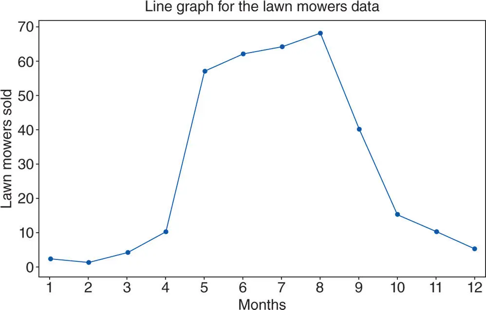
Figure 2.4.12Line graph for the data on lawn mowers in Example 2.4.6.
2.4.6 Stem‐and‐Leaf Plot
Before discussing this plot, we need the concept of the median of a set of data. The median is the value, say  , that divides the data into two equal parts when the data are arranged in ascending order. A working definition is the following (a more detailed examination and discussion of the median is given in Section 2.5.1).
Definition 2.4.2
Suppose that we have a set of values, obtained by measuring a certain variable, say  times. Then, the median of these data, say
  , is the value of the variable that satisfies the following two conditions:
1 at most 50% of the values in the set are less than , and
2 at most 50% of the values in the set are greater than .
We now turn our attention to the stem‐and‐leaf plot invented by John Tukey. This plot is a graphical tool used to display quantitative data. Each data value is split into two parts, the part with leading digits is called the stem , and the rest is called the leaf . Thus, for example, the data value 5.15 is divided in two parts with 5 for a stem and 15 for a leaf.
A stem‐and‐leaf plot is a powerful tool used to summarize quantitative data. The stem‐and‐leaf plot has numerous advantages over both the frequency distribution table and the frequency histogram. One major advantage of the stem‐and‐leaf plot over the frequency distribution table is that from a frequency distribution table, we cannot retrieve the original data, whereas from a stem‐and‐leaf plot, we can easily retrieve the data in its original form. In other words, if we use the information from a stem‐and‐leaf plot, there is no loss of information, but this is not true of the frequency distribution table. We illustrate the construction of the stem‐and‐leaf plot with the following example.
Example 2.4.7(Spare parts supply) A manufacturing company has been awarded a huge contract by the Defense Department to supply spare parts. In order to provide these parts on schedule, the company needs to hire a large number of new workers. To estimate how many workers to hire, representatives of the Human Resources Department decided to take a random sample of 80 workers and find the number of parts each worker produces per week. The data collected is given in Table 2.4.5. Prepare a stem‐and‐leaf diagram for these data.
Table 2.4.5 Number of parts produced per week by each worker.
| 73 | 70 | 68 | 79 | 84 | 85 | 77 | 75 | 61 | 69 | 74 | 80 | 83 | 82 | 86 | 87 | 78 | 81 | 68 | 71 |
| 74 | 73 | 69 | 68 | 87 | 85 | 86 | 87 | 89 | 90 | 92 | 71 | 93 | 67 | 66 | 65 | 68 | 73 | 72 | 83 |
| 76 | 74 | 89 | 86 | 91 | 92 | 65 | 64 | 62 | 67 | 63 | 69 | 73 | 69 | 71 | 76 | 77 | 84 | 83 | 85 |
| 81 | 87 | 93 | 92 | 81 | 80 | 70 | 63 | 65 | 62 | 69 | 74 | 76 | 83 | 85 | 91 | 89 | 90 | 85 | 82 |
Solution:The stem‐and‐leaf plot for the data in Table 2.4.5is as shown in Figure 2.4.13.
The first column in Figure 2.4.13gives the cumulative frequency starting from the top and from the bottom of the column but ending at the stem that lies before the stem containing the median. The number in parentheses indicates the stem that contains the median value of the data, and the frequency of that stem.
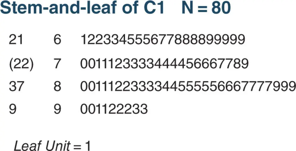
Figure 2.4.13Stem‐and‐leaf plot for the data in Example 2.4.7with increment 10.
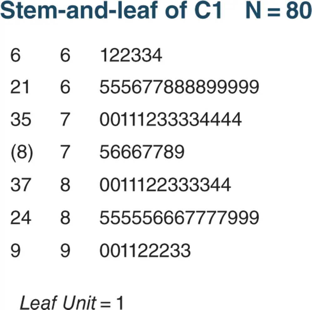
Figure 2.4.14Stem‐and‐leaf plot for the data in Example 2.4.7with increment 5.
Читать дальшеИнтервал:
Закладка:
Похожие книги на «Statistics and Probability with Applications for Engineers and Scientists Using MINITAB, R and JMP»
Представляем Вашему вниманию похожие книги на «Statistics and Probability with Applications for Engineers and Scientists Using MINITAB, R and JMP» списком для выбора. Мы отобрали схожую по названию и смыслу литературу в надежде предоставить читателям больше вариантов отыскать новые, интересные, ещё непрочитанные произведения.


Обсуждение, отзывы о книге «Statistics and Probability with Applications for Engineers and Scientists Using MINITAB, R and JMP» и просто собственные мнения читателей. Оставьте ваши комментарии, напишите, что Вы думаете о произведении, его смысле или главных героях. Укажите что конкретно понравилось, а что нет, и почему Вы так считаете.