Bhisham C. Gupta - Statistics and Probability with Applications for Engineers and Scientists Using MINITAB, R and JMP
Здесь есть возможность читать онлайн «Bhisham C. Gupta - Statistics and Probability with Applications for Engineers and Scientists Using MINITAB, R and JMP» — ознакомительный отрывок электронной книги совершенно бесплатно, а после прочтения отрывка купить полную версию. В некоторых случаях можно слушать аудио, скачать через торрент в формате fb2 и присутствует краткое содержание. Жанр: unrecognised, на английском языке. Описание произведения, (предисловие) а так же отзывы посетителей доступны на портале библиотеки ЛибКат.

- Название:Statistics and Probability with Applications for Engineers and Scientists Using MINITAB, R and JMP
- Автор:
- Жанр:
- Год:неизвестен
- ISBN:нет данных
- Рейтинг книги:4 / 5. Голосов: 1
-
Избранное:Добавить в избранное
- Отзывы:
-
Ваша оценка:
Statistics and Probability with Applications for Engineers and Scientists Using MINITAB, R and JMP: краткое содержание, описание и аннотация
Предлагаем к чтению аннотацию, описание, краткое содержание или предисловие (зависит от того, что написал сам автор книги «Statistics and Probability with Applications for Engineers and Scientists Using MINITAB, R and JMP»). Если вы не нашли необходимую информацию о книге — напишите в комментариях, мы постараемся отыскать её.
Statistics and Probability with Applications for Engineers and Scientists using MINITAB, R and JMP, Second Edition Features two new chapters—one on Data Mining and another on Cluster Analysis Now contains R exhibits including code, graphical display, and some results MINITAB and JMP have been updated to their latest versions Emphasizes the p-value approach and includes related practical interpretations Offers a more applied statistical focus, and features modified examples to better exhibit statistical concepts Supplemented with an Instructor's-only solutions manual on a book’s companion website
is an excellent text for graduate level data science students, and engineers and scientists. It is also an ideal introduction to applied statistics and probability for undergraduate students in engineering and the natural sciences.
Statistics and Probability with Applications for Engineers and Scientists Using MINITAB, R and JMP — читать онлайн ознакомительный отрывок
Ниже представлен текст книги, разбитый по страницам. Система сохранения места последней прочитанной страницы, позволяет с удобством читать онлайн бесплатно книгу «Statistics and Probability with Applications for Engineers and Scientists Using MINITAB, R and JMP», без необходимости каждый раз заново искать на чём Вы остановились. Поставьте закладку, и сможете в любой момент перейти на страницу, на которой закончили чтение.
Интервал:
Закладка:
(2.4.1) 
We illustrate the construction of a pie chart with the following example:
Example 2.4.2(Manufacturing defect types) In a manufacturing operation, we are interested in understanding defect rates as a function of various process steps. The inspection points (categories) in the process are initial cutoff, turning, drilling, and assembly. The frequency distribution table for these data is shown in Table 2.4.1. Construct a pie chart for these data.
Table 2.4.1 Understanding defect rates as a function of various process steps.
| Process steps | Frequency | Relative frequency | Angle size |
| Initial cutoff | 86 | 86/361 = 23.8% | 85.76 |
| Turning | 182 | 182/361 = 50.4% | 181.50 |
| Drilling | 83 | 83/361 = 23.0% | 82.77 |
| Assembly | 10 | 10/361 = 2.8% | 9.97 |
| Total | 361 | 100% | 360.00 |
Solution:The pie chart for these data is constructed by dividing the circle into four slices. The angle of each slice is given in the last column of Table 2.4.1. Then, the pie chart for the data of Table 2.4.1is as shown in the MINITAB printout in Figure 2.4.2. Clearly, the pie chart gives us a better understanding at a glance about the rate of defects occurring at different steps of the process.
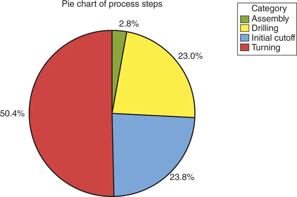
Figure 2.4.2Pie chart for the data in Table 2.4.1using MINITAB.
MINITAB
Using MINITAB, the pie chart is constructed by taking the following steps:
1 Enter the category in column C1.
2 Enter frequencies of the categories in column C2.
3 From the Menu bar, select Graph Pie Chart. Then, check the circle next to Chart values from a table on the pie chart dialog box that appears on the screen.
4 Enter C1 under Categorical values and C2 under Summary variables.
5 Note that if we have the raw data without having the frequencies for different categories, then check the circle next to Chart counts of unique values. In that case, the preceding dialog box would not contain a box for Summary variables.
6 Click Pie Options and in the new dialog box that appears select any option you like and click OK. Click Lables and in the new dialog box that appears select the Slice Labels from the box menu and select Percent option and click OK. The pie chart will appear as shown in Figure 2.4.2.
USING R
We can use the built in ‘pie()’ function in R to generate pie charts. If a pie chart with percentages desired, then the percentages of the categories should be calculated manually. Then, these percentages should be used to label the categories. The task can be completed by running the following R code in the R Console window.
Freq = c(86, 182, 83, 10) #To label categories Process = c(‘Initial cutoff’, ‘Turning’, ‘Drilling’, ‘Assembly’) #To calculate percentages Percents = round(Freq/sum(Freq)*100,1) label = paste(Percents, ‘%’, sep=‘ ’) # add % to labels #Pie Chart with percentages pie(Freq, labels = label, col=c(2,3,4,5), main=‘Pie Chart of Process Steps’) #To add a legend. Note: “pch” specifies various point shapes. legend(‘topleft’, Process, col=c(2,3,4,5), pch=15)
2.4.3 Bar Chart
Bar charts are commonly used to describe qualitative data classified into various categories based on sector, region, different time periods, or other such factors. Different sectors, different regions, or different time periods are then labeled as specific categories. A bar chart is constructed by creating categories that are represented by labeling each category and which are represented by intervals of equal length on a horizontal axis. The count or frequency within the corresponding category is represented by a bar of height proportional to the frequency. We illustrate the construction of a bar chart in the examples that follow.
Example 2.4.3(Companies' revenue) The following data give the annual revenues (in millions of dollars) of five companies A, B, C, D, and E for the year 2011:
78, 92, 95, 94, 102
Construct a bar chart for these data.
Solution:Following the previous discussion, we construct the bar chart as shown in Figure 2.4.3.
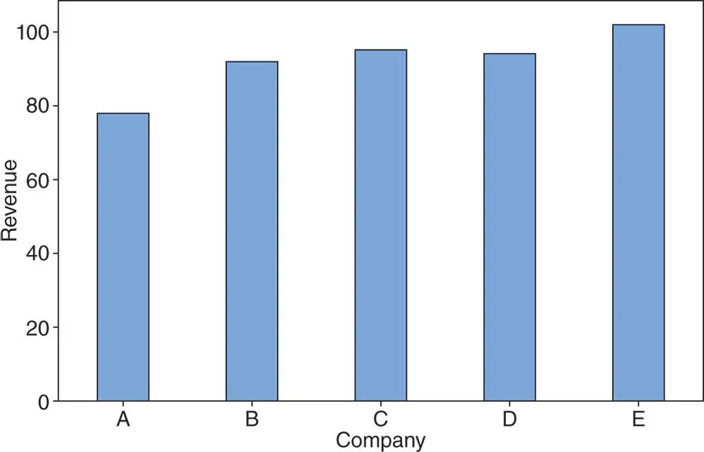
Figure 2.4.3Bar chart for annual revenues of five companies for the year 2011.
Example 2.4.4(Auto part defect types) A company that manufactures auto parts is interested in studying the types of defects in parts produced at a particular plant. The following data shows the types of defects that occurred over a certain period:
| 2 | 1 | 3 | 1 | 2 | 1 | 5 | 4 | 3 | 1 | 2 | 3 | 4 | 3 | 1 | 5 | 2 | 3 | 1 | 2 | 3 | 5 | 4 | 3 | 1 |
| 5 | 1 | 4 | 2 | 3 | 2 | 1 | 2 | 5 | 4 | 2 | 4 | 2 | 5 | 1 | 2 | 1 | 2 | 1 | 5 | 2 | 1 | 3 | 1 | 4 |
Construct a bar chart for the types of defects found in the auto parts.
Solution:In order to construct a bar chart for the data in this example, we first need to prepare a frequency distribution table. The data in this example are the defect types, namely 1, 2, 3, 4, and 5. The frequency distribution table is shown in Table 2.4.2. Note that the frequency distribution table also includes a column of cumulative frequency.
Now, to construct the bar chart, we label the intervals of equal length on the horizontal line with the category types of defects and then indicate the frequency of observations associated with each defect by a bar of height proportional to the corresponding frequency. Thus, the desired bar graph, as given in Figure 2.4.4, shows that the defects of type 1 occur the most frequently, type 2 occur the second most frequently, and so on.
Table 2.4.2Frequency distribution table for the data in Example 2.4.4.
| Frequency | Relative | Cumulative | ||
| Categories | Tally | or count | frequency | frequency |
| 1 | ///// ///// //// | 14 | 14/50 | 14 |
| 2 | ///// ///// /// | 13 | 13/50 | 27 |
| 3 | ///// //// | 9 | 9/50 | 36 |
| 4 | ///// // | 7 | 7/50 | 43 |
| 5 | ///// // | 7 | 7/50 | 50 |
| Total | 50 | 1.00 |
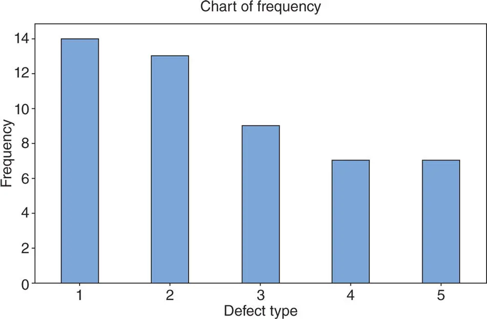
Figure 2.4.4Bar graph for the data in Example 2.4.4.
MINITAB
Using MINITAB, the bar chart is constructed by taking the following steps.
1 Enter the category in column C1.
Читать дальшеИнтервал:
Закладка:
Похожие книги на «Statistics and Probability with Applications for Engineers and Scientists Using MINITAB, R and JMP»
Представляем Вашему вниманию похожие книги на «Statistics and Probability with Applications for Engineers and Scientists Using MINITAB, R and JMP» списком для выбора. Мы отобрали схожую по названию и смыслу литературу в надежде предоставить читателям больше вариантов отыскать новые, интересные, ещё непрочитанные произведения.


Обсуждение, отзывы о книге «Statistics and Probability with Applications for Engineers and Scientists Using MINITAB, R and JMP» и просто собственные мнения читателей. Оставьте ваши комментарии, напишите, что Вы думаете о произведении, его смысле или главных героях. Укажите что конкретно понравилось, а что нет, и почему Вы так считаете.