Bhisham C. Gupta - Statistics and Probability with Applications for Engineers and Scientists Using MINITAB, R and JMP
Здесь есть возможность читать онлайн «Bhisham C. Gupta - Statistics and Probability with Applications for Engineers and Scientists Using MINITAB, R and JMP» — ознакомительный отрывок электронной книги совершенно бесплатно, а после прочтения отрывка купить полную версию. В некоторых случаях можно слушать аудио, скачать через торрент в формате fb2 и присутствует краткое содержание. Жанр: unrecognised, на английском языке. Описание произведения, (предисловие) а так же отзывы посетителей доступны на портале библиотеки ЛибКат.
- Название:Statistics and Probability with Applications for Engineers and Scientists Using MINITAB, R and JMP
- Автор:
- Жанр:
- Год:неизвестен
- ISBN:нет данных
- Рейтинг книги:4 / 5. Голосов: 1
-
Избранное:Добавить в избранное
- Отзывы:
-
Ваша оценка:
Statistics and Probability with Applications for Engineers and Scientists Using MINITAB, R and JMP: краткое содержание, описание и аннотация
Предлагаем к чтению аннотацию, описание, краткое содержание или предисловие (зависит от того, что написал сам автор книги «Statistics and Probability with Applications for Engineers and Scientists Using MINITAB, R and JMP»). Если вы не нашли необходимую информацию о книге — напишите в комментариях, мы постараемся отыскать её.
Statistics and Probability with Applications for Engineers and Scientists using MINITAB, R and JMP, Second Edition Features two new chapters—one on Data Mining and another on Cluster Analysis Now contains R exhibits including code, graphical display, and some results MINITAB and JMP have been updated to their latest versions Emphasizes the p-value approach and includes related practical interpretations Offers a more applied statistical focus, and features modified examples to better exhibit statistical concepts Supplemented with an Instructor's-only solutions manual on a book’s companion website
is an excellent text for graduate level data science students, and engineers and scientists. It is also an ideal introduction to applied statistics and probability for undergraduate students in engineering and the natural sciences.
Statistics and Probability with Applications for Engineers and Scientists Using MINITAB, R and JMP — читать онлайн ознакомительный отрывок
Ниже представлен текст книги, разбитый по страницам. Система сохранения места последней прочитанной страницы, позволяет с удобством читать онлайн бесплатно книгу «Statistics and Probability with Applications for Engineers and Scientists Using MINITAB, R and JMP», без необходимости каждый раз заново искать на чём Вы остановились. Поставьте закладку, и сможете в любой момент перейти на страницу, на которой закончили чтение.
Интервал:
Закладка:
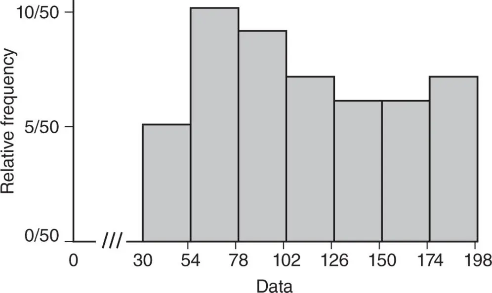
Figure 2.4.6Relative frequency histogram for survival time of parts under extraneous operating conditions.
Another graph that becomes the basis of probability distributions, which we will study in later chapters, is called the frequency polygon or relative frequency polygon depending on which histogram is used to construct this graph. To construct the frequency or relative frequency polygon, first mark the midpoints on the top ends of the rectangles of the corresponding histogram and then simply join these midpoints. Note that classes with zero frequencies at the lower as well as at the upper end of the histogram are included so that we can connect the polygon with the  ‐axis. The lines obtained by joining the midpoints are called the frequency or relative frequency polygons , as the case may be. The frequency polygon for the data in Example 2.4.5is shown in Figure 2.4.7. As the frequency and the relative frequency histograms are identical in shape, the frequency and relative frequency polygons are also identical, except for the labeling of the
  ‐axis.
Quite often a data set consists of a large number of observations that result in a large number of classes of very small widths. In such cases, frequency polygons or relative frequency polygons become smooth curves. Figure 2.4.8shows one such smooth curve. Such smooth curves, usually called frequency distribution curves, represent the probability distributions of continuous random variables that we study in Chapter c05. Thus, the histograms eventually become the basis for information about the probability distributions from which the sample was obtained.
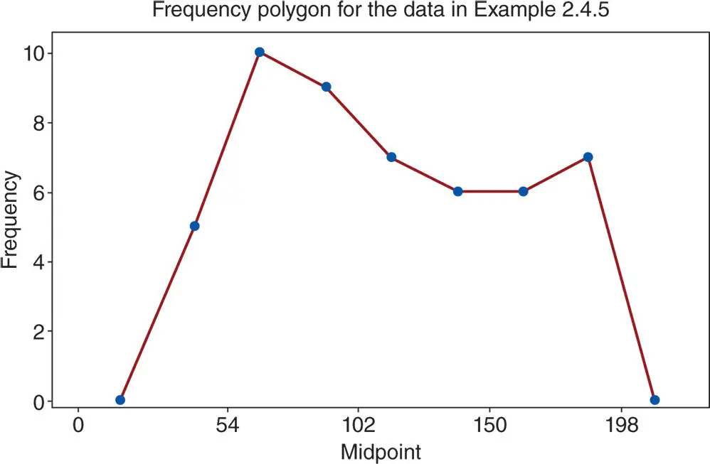
Figure 2.4.7Frequency polygon for survival time of parts under extraneous operating conditions.
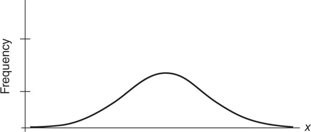
Figure 2.4.8Typical frequency distribution curve.
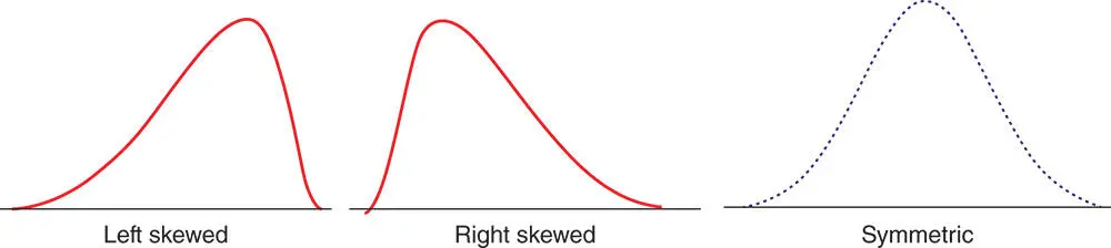
Figure 2.4.9Three typical types of frequency distribution curves.
The shape of the frequency distribution curve of a data set depends on the shape of its histogram and choice of class or bin size. The shape of a frequency distribution curve can in fact be of any type, but in general, we encounter the three typical types of frequency distribution curves shown in Figure 2.4.9.
We now turn to outlining the various steps needed when using MINITAB and R.
MINITAB
1 Enter the data in column C1.
2 From the Menu bar, select Graph Histogram. This prompts the following dialog box to appear on the screen.
3 From this dialog box, select an appropriate histogram and click OK. This will prompt another dialog box to appear.
4 In this dialog box, enter C1 in the box under the Graph variables and click OK. Then, a histogram graph will appear in the Session window.
5 After creating the histogram, if you want to customize the number of classes (cells or bins), click twice on any bar of the histogram. This prompts another dialog box Edit Bars to appear. In the new dialog box, select Binning. This allows the user to select the desired number of classes, their midpoints or cutpoints.To create a cumulative frequency histogram, take all the steps as previously described. Follow this in the dialog box at Histogram‐Simple, and select Scale Y‐Scale Type. Then, check a circle next to Frequency and a square next to Accumulate values across bins. Click OK. A customized Cumulative Frequency Histogram using MINITAB is as obtained as shown in Figure 2.4.10. Note: To get the exact sample cumulative distribution, we used the manual cutpoints shown in the first column of Table 2.4.3when Binning.
6 To obtain the frequency polygon in the dialog box Histogram‐Simple, select Data view Data Display, remove the check mark from Bars, and placing a check mark on Symbols. Under the Smoother tab, select Lowess for smoother and change Degree of smoothing to be 0 and Number of steps to be 1. Then, click OK twice. At this juncture, the polygon needs be modified to get the necessary cutpoints. We produced by right clicking on the X‐axis, and selecting the edit X scale. Under the Binning tab for Interval Type, select Cutpoint, and under the Interval Definition, select Midpoint/Cutpoint positions. Now type manually calculated interval cutpoints. Note that one extra lower and one extra upper cutpoint should be included so that we can connect the polygon with the ‐axis as shown in Figure 2.4.7.
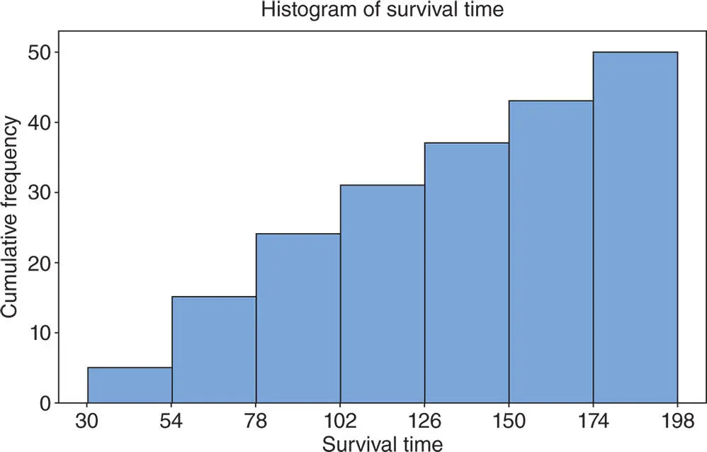
Figure 2.4.10The cumulative frequency histogram for the data in Example 2.4.5.
USING R
We can use the built in ‘hist()’ function in R to generate histograms. Extra arguments such as ‘breaks’, ‘main’, ‘xlab’, ‘ylab’, ‘col’ can be used to define the break points, graph heading,  ‐axis label,
  ‐axis label, and filling color, respectively. The specific argument ‘right = FALSE’ should be used to specify that the upper limit does not belong to the class. To obtain the cumulative histogram, we apply the ‘cumsum()’ function to frequencies obtained from the histogram function. The task can be completed by running the following R code in the R Console window.
SurvTime = c(60,100,130,100,115,30,60,145,75,80,89,57,64,92,87,110, 180,195,175,179,159,155, 146,157,167,174,87,67,73,109,123,135,129, 141,154,166,179,37,49,68,74,89,87,109,119,125,56,39,49,190) #To plot the histogram hist(SurvTime, breaks=seq(30,198, by=24), main=‘Histogram of Survival Time’, xlab=‘Survival Time’, ylab=‘Frequency’, col=‘grey’, right = FALSE) #To obtain the cumulative histogram, we replace cell frequencies by their cumulative frequencies h = hist(SurvTime, breaks=seq(30,198, by=24), right = FALSE) h$counts = cumsum(h$counts) #To plot the cumulative histogram plot(h, main=‘Cumulative Histogram’, xlab=‘Survival Time’, ylab=‘Cumulative Frequency’, col=‘grey’) Below, we show the histograms obtained by using the above R code. 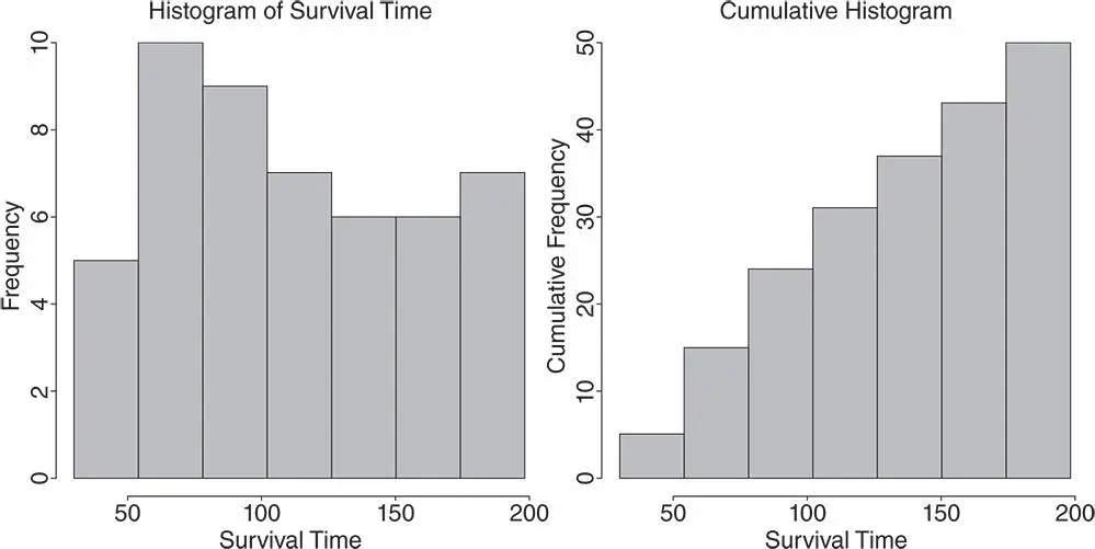
Another graph called the ogive curve , which represents the cumulative frequency distribution (c.d.f.), is obtained by joining the lower limit of the first bin to the upper limits of all the bins, including the last bin. Thus, the ogive curve for the data in Example 2.4.5is as shown in Figure 2.4.11.
Читать дальшеИнтервал:
Закладка:
Похожие книги на «Statistics and Probability with Applications for Engineers and Scientists Using MINITAB, R and JMP»
Представляем Вашему вниманию похожие книги на «Statistics and Probability with Applications for Engineers and Scientists Using MINITAB, R and JMP» списком для выбора. Мы отобрали схожую по названию и смыслу литературу в надежде предоставить читателям больше вариантов отыскать новые, интересные, ещё непрочитанные произведения.


Обсуждение, отзывы о книге «Statistics and Probability with Applications for Engineers and Scientists Using MINITAB, R and JMP» и просто собственные мнения читателей. Оставьте ваши комментарии, напишите, что Вы думаете о произведении, его смысле или главных героях. Укажите что конкретно понравилось, а что нет, и почему Вы так считаете.