However, Tukey introduced a power transformation ladder to re‐express a variable  :
:

see Problem 3 for an explanation of why  is used in place of
  when
when  .
.
In the right frame of Figure 1.4, we use the log function to dramatic effect. There clearly is a strong relationship that allows highly accurate prediction of the log(brain weight) of a land mammal knowing its log(body weight). (The body weight is easily measured for a living specimen, but not its brain weight.) Moreover, the relationship appears to be linear. In this re‐expressed scatter diagram, the two or three outliers identified in the first plot are no longer outliers.
1.2.2 Space Shuttle Flight 25
The 25th launch in the Space Shuttle program was scheduled for 22 January 1986, but postponed for various reasons each day until 28 January. The temperature had dropped to 28  overnight, and it was 36
  when the launch was attempted at 11:38 a.m. During the first 90 s, several O‐rings on the solid rocket boosters failed, leading to a catastrophic explosion and loss of all seven crew members. Scientists knew previous shuttle flights had occasionally experienced one or two O‐ring failures, but a launch had never been attempted at freezing temperatures. Varying opinions of the safety were provided to the launch director, who eventually decided to proceed. One of the data analyses is reproduced in the first row of Figure 1.5.
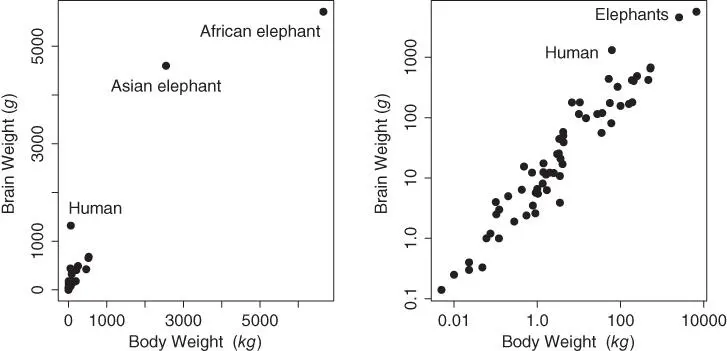
Figure 1.4 Scatter diagrams of the raw and  ‐transformed body and brain weights of 62 land mammals.
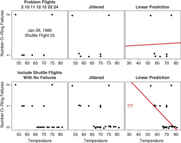
Figure 1.5 Analysis of the number of O‐ring failures for the first 24 Space Shuttle launches; see text.
In the heading of the scatter diagram in first frame, we see a list of the 7 (of the first 24) shuttle flights that experienced 1 or 2 O‐ring failures. Two failures were observed at the lowest temperature of 53  , which was well above the temperature range of 28–36
  on the day of the disaster. Strangely, two failures had also been observed at the highest temperature of 75
  .
.
In the second frame, we have jitteredthe data by adding a little uniform noise. This reveals that there were two data points superimposed at  ; jittering broke that tie. In the third frame, the data are replotted, but with an expanded
  ‐axis to include 28
  . Would you have supported the decision to launch? A least‐squares line (discussed in Chapter 8.5) is superimposed. This line suggests that, if anything, lower temperatures might result in fewer O‐ring failures. Thus the launch was attempted.
However, in a re‐analysis of these data, we have included the shuttle flights that experienced no O‐ring failures. Now the final frame suggests that two or more O‐ring failures are quite likely at 28–36  . The question of including or excluding data is a difficult problem in practice. In other settings, including non‐event data can bias the analysis in the wrong direction. As we saw in the brain‐body weight data, excluding the two or three outliers was not necessary. However, in Rayleigh's nitrogen data, excluding an entire cluster of outliers as bad data would have postponed the discovery of argon.
1.2.3 Pearson's Father–Son Height Data Revisited
We have explored the two variables in this dataset individually, but there is an obvious question of how accurately a son's height can be predicted knowing his father's height. In the first frame of Figure 1.6, we display a scatter diagram of the  pairs. This diagram clearly shows a positive tilt, consistent with the expectation that the sons of tall fathers are tall, and vice versa; however, the strength of the relationship does not seem as strong as in the brain–body weight dataset.
In the top right frame, we have placed a red dot at the location of the average heights of the fathers and sons. We have also drawn a straight line fit using the intuitive equation  . However, the equation
  is an improvement, since we observed earlier that sons were 1 inch taller than their fathers on average. As a reference, we have also included a horizontal line at the average heights of the sons. This line would be appropriate if there were no information about a son's height to be gleaned from his father's height; but a positive relationship (correlation) is clear.
Galton (1886) was one of the first to observe that many scatter diagrams observed in nature have an appearance similar to that in Figure 1.6. He noted that the shape appeared elliptical, so he superimposed elliptical contours over the scatter diagram. The bottom left frame in Figure 1.6shows three (nested) ellipses for these data. Recall that a general ellipse has five parameters: two for the center of the ellipse; two for the horizontal and vertical scales; and a fifth called the eccentricity . Galton focused on this fifth parameter, and the correlation coefficientwas the result. Ironically, this parameter is often referred to today as Pearson's correlation coefficient.
Читать дальше

 :
:
 is used in place of
  when
when  .
. overnight, and it was 36
  when the launch was attempted at 11:38 a.m. During the first 90 s, several O‐rings on the solid rocket boosters failed, leading to a catastrophic explosion and loss of all seven crew members. Scientists knew previous shuttle flights had occasionally experienced one or two O‐ring failures, but a launch had never been attempted at freezing temperatures. Varying opinions of the safety were provided to the launch director, who eventually decided to proceed. One of the data analyses is reproduced in the first row of Figure 1.5.
 ‐transformed body and brain weights of 62 land mammals.
 , which was well above the temperature range of 28–36
  on the day of the disaster. Strangely, two failures had also been observed at the highest temperature of 75
  .
. ; jittering broke that tie. In the third frame, the data are replotted, but with an expanded
  ‐axis to include 28
  . Would you have supported the decision to launch? A least‐squares line (discussed in Chapter 8.5) is superimposed. This line suggests that, if anything, lower temperatures might result in fewer O‐ring failures. Thus the launch was attempted.
 . The question of including or excluding data is a difficult problem in practice. In other settings, including non‐event data can bias the analysis in the wrong direction. As we saw in the brain‐body weight data, excluding the two or three outliers was not necessary. However, in Rayleigh's nitrogen data, excluding an entire cluster of outliers as bad data would have postponed the discovery of argon.
 pairs. This diagram clearly shows a positive tilt, consistent with the expectation that the sons of tall fathers are tall, and vice versa; however, the strength of the relationship does not seem as strong as in the brain–body weight dataset.
 . However, the equation
  is an improvement, since we observed earlier that sons were 1 inch taller than their fathers on average. As a reference, we have also included a horizontal line at the average heights of the sons. This line would be appropriate if there were no information about a son's height to be gleaned from his father's height; but a positive relationship (correlation) is clear.


