Michael Begon - Ecology
Здесь есть возможность читать онлайн «Michael Begon - Ecology» — ознакомительный отрывок электронной книги совершенно бесплатно, а после прочтения отрывка купить полную версию. В некоторых случаях можно слушать аудио, скачать через торрент в формате fb2 и присутствует краткое содержание. Жанр: unrecognised, на английском языке. Описание произведения, (предисловие) а так же отзывы посетителей доступны на портале библиотеки ЛибКат.
- Название:Ecology
- Автор:
- Жанр:
- Год:неизвестен
- ISBN:нет данных
- Рейтинг книги:5 / 5. Голосов: 1
-
Избранное:Добавить в избранное
- Отзывы:
-
Ваша оценка:
Ecology: краткое содержание, описание и аннотация
Предлагаем к чтению аннотацию, описание, краткое содержание или предисловие (зависит от того, что написал сам автор книги «Ecology»). Если вы не нашли необходимую информацию о книге — напишите в комментариях, мы постараемся отыскать её.
– now in full colour – offers students and practitioners a review of the ecological sciences.
The previous editions of this book earned the authors the prestigious ‘Exceptional Life-time Achievement Award’ of the British Ecological Society – the aim for the fifth edition is not only to maintain standards but indeed to enhance its coverage of Ecology.
In the first edition, 34 years ago, it seemed acceptable for ecologists to hold a comfortable, objective, not to say aloof position, from which the ecological communities around us were simply material for which we sought a scientific understanding. Now, we must accept the immediacy of the many environmental problems that threaten us and the responsibility of ecologists to play their full part in addressing these problems. This fifth edition addresses this challenge, with several chapters devoted entirely to applied topics, and examples of how ecological principles have been applied to problems facing us highlighted throughout the remaining nineteen chapters.
Nonetheless, the authors remain wedded to the belief that environmental action can only ever be as sound as the ecological principles on which it is based. Hence, while trying harder than ever to help improve preparedness for addressing the environmental problems of the years ahead, the book remains, in its essence, an exposition of the
of ecology. This new edition incorporates the results from more than a thousand recent studies into a fully up-to-date text.
Written for students of ecology, researchers and practitioners, the fifth edition of
is anessential reference to all aspects of ecology and addresses environmental problems of the future.
Ecology — читать онлайн ознакомительный отрывок
Ниже представлен текст книги, разбитый по страницам. Система сохранения места последней прочитанной страницы, позволяет с удобством читать онлайн бесплатно книгу «Ecology», без необходимости каждый раз заново искать на чём Вы остановились. Поставьте закладку, и сможете в любой момент перейти на страницу, на которой закончили чтение.
Интервал:
Закладка:
4.8.1 Population projection matrices
A more general, more powerful, and therefore more useful method of analysing and interpreting the fecundity and survival schedules of a population with overlapping generations makes use of the population projection matrix (see Caswell, 2001 , for a full exposition). The word ‘projection’ in its title is important. Just like the simpler methods above, the idea is not to take the current state of a population and forecast what will happen to the population in the future, but to project forward to what would happen if the schedules remained the same. Caswell uses the analogy of the speedometer in a car: it provides us with an invaluable piece of information about the car’s current state, but a reading of, say, 80 km h −1is simply a projection, not a serious forecast that we will actually have travelled 80 km in one hour’s time.
life cycle graphs
The population projection matrix acknowledges that most life cycles comprise a sequence of distinct classes with different rates of fecundity and survival: life cycle stages, perhaps, or size classes, rather than simply different ages. The resultant patterns can be summarised in a ‘life cycle graph’, though this is not a graph in the everyday sense but a flow diagram depicting the transitions from class to class over each step in time. Two examples are shown in Figure 4.15(see also Caswell, 2001). The first ( Figure 4.15a) indicates a straightforward sequence of classes where, over each time step, individuals in class i may: (i) survive and remain in that class (with probability p i); (ii) survive and grow and/or develop into the next class (with probability g i); and (iii) give birth to m inewborn individuals into the youngest/smallest class. Figure 4.15b then goes on to show that a life cycle graph can also depict a more complex life cycle, for example with both sexual reproduction (here, from reproductive class 4 into ‘seed’ class 1) and vegetative growth of new modules (here, from ‘mature module’ class 3 to ‘new module’ class 2). Note that the notation here is slightly different from that in life tables like Table 4.2. There the focus was on age classes, and the passage of time inevitably meant the passing of individuals from one age class to the next: p values therefore referred to survival from one age class to the next. Here, by contrast (as in Table 4.1), an individual need not pass from one class to the next over a time step, and it is therefore necessary to distinguish survival within a class ( p values here) from passage and survival into the next class ( g values).
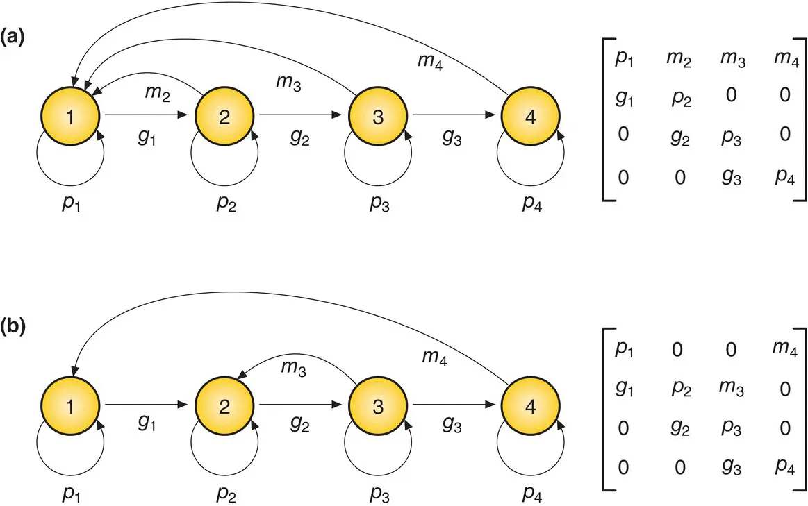
Figure 4.15 Life cycle graphs and population projection matrices for two different life cycles.The connection between the graphs and the matrices is explained in the text. (a) A life cycle with four successive classes. Over one time step, individuals may survive within the same class (with probability p 1), survive and pass to the next class (with probability g 1) or die, and individuals in classes 2, 3 and 4 may give birth to individuals in class 1 (with per capita fecundity m 1). (b) Another life cycle with four classes, but in this case only reproductive class 4 individuals can give birth to class 1 individuals, but class 3 individuals can ‘give birth’ (perhaps by vegetative growth) to further class 2 individuals.
the elements of the matrix
The information in a life cycle graph can be summarised in a population projection matrix. Such matrices are shown alongside the graphs in Figure 4.15. The convention is to contain the elements of a matrix within square brackets. In fact, a projection matrix is itself always ‘square’: it has the same number of columns as rows. The rows refer to the class number at the endpoint of a transition: the columns refer to the class number at the start. Thus, for instance, the matrix element in the third row of the second column describes the flow of individuals from the second class into the third class. More specifically, then, and using the life cycle in Figure 4.15a as an example, the elements in the main diagonal from top left to bottom right represent the probabilities of surviving and remaining in the same class (the p s), the elements in the remainder of the first row represent the fecundities of each subsequent class into the youngest class (the m s), while the g s, the probabilities of surviving and moving to the next class, appear in the subdiagonal below the main diagonal (from 1 to 2, from 2 to 3, etc.).
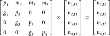
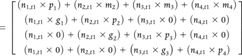
Summarising the information in this way is useful because, using standard rules of matrix manipulation, we can take the numbers in the different classes ( n 1, n 2, etc.) at one point in time ( t 1), expressed as a ‘column vector’ (simply a matrix comprising just one column), pre ‐multiply this vector by the projection matrix, and generate the numbers in the different classes one time step later ( t 2). The mechanics of this – that is, where each element of the new column vector comes from – are as follows:
determining R from a matrix
Thus, the numbers in the first class, n 1, are the survivors from that class one time step previously plus those born into it from the other classes, and so on. Figure 4.16shows this process repeated 20 times (i.e. for 20 time steps) with some hypothetical values in the projection matrix shown as an inset in the figure. It is apparent that there is an initial (transient) period in which the proportions in the different classes alter, some increasing and others decreasing, but that after about nine time steps, all classes grow at the same exponential rate (a straight line on a logarithmic scale, see Section 5.6), and so therefore does the whole population. The R value in this case is 1.25. Also, the proportions in the different classes are constant: the population has achieved a stable class structure with numbers in the ratios 51.5 : 14.7 : 3.8 : 1.
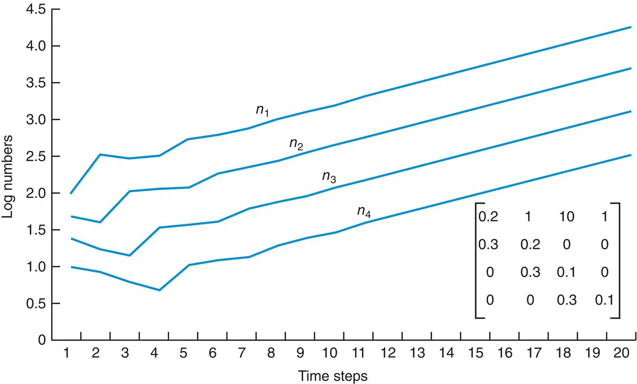
Figure 4.16 Populations with constant rates of survival and fecundity eventually reach a constant rate of growth and a stable age structure.A population growing according to the life cycle graph shown in Figure 4.15a, with parameter values as shown in the insert here. The starting conditions were 100 individuals in class 1 ( n 1= 100), 50 in class 2, 25 in class 4 and 10 in class 4. On a logarithmic (vertical) scale, exponential growth appears as a straight line. Thus, after about 10 time steps, the parallel lines show that all classes were growing at the same rate ( R = 1.25) and that a stable class structure had been achieved.
Hence, a population projection matrix allows us to summarise a potentially complex array of survival, growth and reproductive processes, and characterise that population succinctly by determining the per capita rate of increase, R , implied by the matrix. But crucially, this ‘asymptotic’ R can be determined directly, without the need for a simulation, by application of the methods of matrix algebra (these are beyond our scope here, but see Caswell (2001)). Moreover, such algebraic analysis can also indicate whether a simple, stable class structure will indeed be achieved, and what that structure will be. It can also determine the importance of each of the different components of the matrix in generating the overall outcome, R – a topic to which we turn shortly. By convention, R in population projection matrices and related approaches (see below) is often referred to as λ. Here, for continuity with previous sections, we will continue to refer to the net reproductive rate as R .
Читать дальшеИнтервал:
Закладка:
Похожие книги на «Ecology»
Представляем Вашему вниманию похожие книги на «Ecology» списком для выбора. Мы отобрали схожую по названию и смыслу литературу в надежде предоставить читателям больше вариантов отыскать новые, интересные, ещё непрочитанные произведения.


Обсуждение, отзывы о книге «Ecology» и просто собственные мнения читателей. Оставьте ваши комментарии, напишите, что Вы думаете о произведении, его смысле или главных героях. Укажите что конкретно понравилось, а что нет, и почему Вы так считаете.