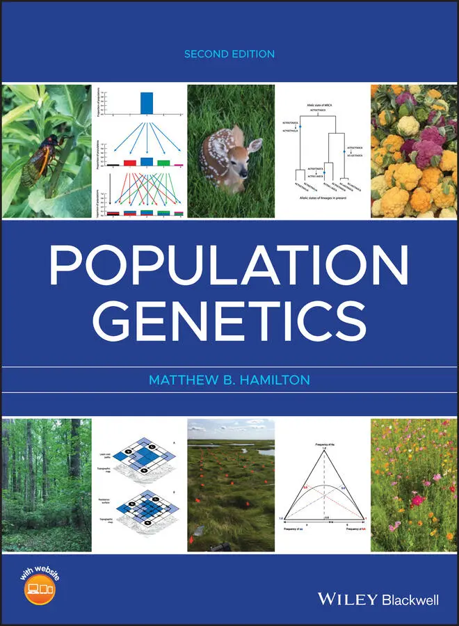
Matthew B. Hamilton - Population Genetics
Здесь есть возможность читать онлайн «Matthew B. Hamilton - Population Genetics» — ознакомительный отрывок электронной книги совершенно бесплатно, а после прочтения отрывка купить полную версию. В некоторых случаях можно слушать аудио, скачать через торрент в формате fb2 и присутствует краткое содержание. Жанр: unrecognised, на английском языке. Описание произведения, (предисловие) а так же отзывы посетителей доступны на портале библиотеки ЛибКат.
- Название:Population Genetics
- Автор:
- Жанр:
- Год:неизвестен
- ISBN:нет данных
- Рейтинг книги:4 / 5. Голосов: 1
-
Избранное:Добавить в избранное
- Отзывы:
-
Ваша оценка:
Population Genetics: краткое содержание, описание и аннотация
Предлагаем к чтению аннотацию, описание, краткое содержание или предисловие (зависит от того, что написал сам автор книги «Population Genetics»). Если вы не нашли необходимую информацию о книге — напишите в комментариях, мы постараемся отыскать её.
is the classic, accessible introduction to the concepts of population genetics. Combining traditional conceptual approaches with classical hypotheses and debates, the book equips students to understand a wide array of empirical studies that are based on the first principles of population genetics.
Featuring a highly accessible introduction to coalescent theory, as well as covering the major conceptual advances in population genetics of the last two decades, the second edition now also includes end of chapter problem sets and revised coverage of recombination in the coalescent model, metapopulation extinction and recolonization, and the fixation index.
Population Genetics — читать онлайн ознакомительный отрывок
Ниже представлен текст книги, разбитый по страницам. Система сохранения места последней прочитанной страницы, позволяет с удобством читать онлайн бесплатно книгу «Population Genetics», без необходимости каждый раз заново искать на чём Вы остановились. Поставьте закладку, и сможете в любой момент перейти на страницу, на которой закончили чтение.
Интервал:
Закладка:
8 Chapter 9Table 9.1 Symbols commonly used to refer to categories or causes of variation...Table 9.2 The eight uncorrelated (or orthogonal) types of genetic effects tha...Table 9.3 Examples of parental and progeny mean phenotypes that illustrate th...Table 9.4 Examples of response to selection for two phenotypes with the possi...Table 9.5 Derivation of the expected phenotypic value for the three marker‐lo...Table 9.6 Derivation of the expected phenotypic value for two genetic marker ...Table 9.7 Examples of QTL identified by mapping with genetic marker loci.Table 9.8 Derivation of the expected phenotypic values for marker genotypes u...
9 Chapter 10Table 10.1 The population mean phenotype ( M ) obtained from genotype frequenci...Table 10.2 The mean value of all genotypes that contain either an A 1(  ) or a...Table 10.3 Examples of the average effect for the IFG 1 locus in dogs. All case...Table 10.4 The mean phenotypic value of progeny that result when an individua...Table 10.5 Examples of breeding values for the three IFG 1 locus genotypes in d...Table 10.6 Expressions for genotypic values relative to the population mean, ...Table 10.7 Genotypic values, breeding values, and dominance deviations for th...Table 10.8 Expected covariance in genotypic values between groups of relative...Table 10.9 Frequencies and mean values for parents and progeny used to derive...
List of Illustrations
1 Chapter 2 Figure 2.1 The model of blending inheritance predicts that progeny have phen... Figure 2.2 Mendel's crosses to examine the segregation ratio in the seed coa... Figure 2.3 Mendel self‐pollinated (indicated by curved arrows) the F2 progen... Figure 2.4 Mendel's crosses to examine the segregation ratios of two phenoty... Figure 2.5 Hardy–Weinberg expected genotype frequencies for AA, Aa, and aa g... Figure 2.6 A de Finetti diagram for one locus with two alleles. The triangul... Figure 2.7 A schematic representation of random mating as a cloud of gas whe... Figure 2.8 The original data for the DNA profile given in Table 2.2 and Prob... Figure 2.9 A χ 2distribution with one degree of freedom. The χ 2value for th... Figure 2.10 Corn cobs demonstrating yellow and purple seeds that are either ... Figure 2.11 An allozyme gel stained to show alleles at the phosphoglucomutas... Figure 2.12 The impact of complete positive genotypic assortative mating (li... Figure 2.13 The impact of various systems of mating on heterozygosity ( H ) an... Figure 2.14 Average relatedness and autozygosity as the probability that two... Figure 2.15 The possible patterns of transmission from one parent to two pro... Figure 2.16 A pedigree showing first (A and C are parent and offspring, C an... Figure 2.17 A graphical depiction of the predictions of the dominance and ov... Figure 2.18 A schematic diagram of the process of recombination between two ... Figure 2.19 The decay of gametic disequilibrium ( D ) over time for four recom... Figure 2.20 A hypothetical partitioning of the contributions to the total po... Figure 2.21 The decay of gametic disequilibrium ( D ) over time when both stro... Figure 2.22 The decay of gametic disequilibrium ( D ) over time with random ma... Figure 2.23 Expected levels of the squared gametic disequilibrium correlatio...
2 Chapter 3 Figure 3.1 Beakers filled with microfuge tubes can be used to simulate the p... Figure 3.2 The Wright–Fisher model of genetic drift uses a simplified view o... Figure 3.3 The results of genetic drift continued every generation in popula... Figure 3.4 The results of genetic drift with different initial allele freque... Figure 3.5 Probability distributions for binomial random variables based on ... Figure 3.6 The standard error of the allele frequency (  ) for a binomial ran... Figure 3.7 Probability distributions for binomial random variables based on ... Figure 3.8 A schematic illustration of how the effects of genetic drift due ... Figure 3.9 The expected frequencies of populations with zero, one or two A a... Figure 3.10 Genetic drift modeled by a Markov chain. In this case, the sampl... Figure 3.11 Allelic states (or allele frequencies) for 107 Drosophila melano ... Figure 3.12 An imaginary Petri dish that confines ink particles such that th... Figure 3.13 Probability densities of allele frequency for many replicate pop... Figure 3.14 Average time that an allele segregates, takes to reach fixation,... Figure 3.15 Sewall Wright (1889–1988) with a guinea pig in an undated photog... Figure 3.16 A schematic representation of a genetic bottleneck where census ... Figure 3.17 Distributions of family size. The variance equals the mean as ex... Figure 3.18 Autozygosity and allozygosity in a finite population where ident... Figure 3.19 The decline in heterozygosity as a consequence of genetic drift ... Figure 3.20 Simulated allele frequencies of 10 independent, replicate loci i...Figure 3.21 Isolation by distance is characterized by the declining probabil...Figure 3.22 An ideal two‐dimensional normal distribution used to model the s...Figure 3.23 An example of sampling of lineages over time in a Wright–Fisher ...Figure 3.24 Haploid (top, A) and diploid (bottom, B) reproduction in the con...Figure 3.25 The distribution of the probabilities of coalescence over time p...Figure 3.26 Six independent realizations of the coalescent tree for six line...Figure 3.27 A schematic coalescent tree for six lineages shows one realizati...Figure 3.28 The distribution of times to a MRCA (or genealogy heights) for 1...Figure 3.29 The effects of a population bottleneck on gene genealogies. Duri...Figure 3.30 The effects of exponential population growth or shrinkage on coa...Figure 3.31 Additional models of finite sampling approximate different life ...
3 Chapter 4Figure 4.1 An example of population structure and allele frequency divergenc...Figure 4.2 The plant Linanthus parryae or “desert snow” is found in the Moja...Figure 4.3 Isolation by distance causes spatial structuring of allele and ge...Figure 4.4 Moran's I for simulated populations like those in Figure 4.3. To ...Figure 4.5 Models of population structure make different assumptions about t...Figure 4.6 Allele frequency in the island population for a diallelic locus u...Figure 4.7 Allele frequency in the two‐island model of gene flow for a diall...Figure 4.8 Dispersal kernel probability distributions that show how dispersa...Figure 4.9 An individual Corythophora alta tree found at the Biological Dyna...Figure 4.10 Illustration of the hierarchical nature of heterozygosity in a s...Figure 4.11 Allele frequencies at a diallelic locus for populations that con...Figure 4.12 Genetic differentiation in a finite island model simulation that...Figure 4.13 A graphical demonstration of the Wahlund effect for a diallelic ...Figure 4.14 A hypothetical example of how the Wahlund effect relates variati...Figure 4.15 Expected levels of fixation among subpopulations depend on the p...Figure 4.16 Allele frequencies, hierarchal heterozygosities, and fixation in...Figure 4.17 The distribution of F STvalues for 1000 replicate neutral loci i...Figure 4.18 Subpopulations in a stepping‐stone model exhibit an increase in ...Figure 4.19 Landscapes (represented by the topographical map in the lower pl...Figure 4.20 An example circuit with resistors representing the genetic conne...Figure 4.21 Clustering of individuals into four populations based on Bayesia...Figure 4.22 Principle components analysis of genotype data exhibits populati...Figure 4.23 A hypothetical genealogy for two demes. Initially, there are thr...Figure 4.24 Genealogies for six lineages initially divided evenly between tw...Figure 4.25 Sample configurations for two lineages and two demes (A) and thr...Figure 4.26 The possible events that can occur when two lineages are in the ...
Читать дальшеИнтервал:
Закладка:
Похожие книги на «Population Genetics»
Представляем Вашему вниманию похожие книги на «Population Genetics» списком для выбора. Мы отобрали схожую по названию и смыслу литературу в надежде предоставить читателям больше вариантов отыскать новые, интересные, ещё непрочитанные произведения.


Обсуждение, отзывы о книге «Population Genetics» и просто собственные мнения читателей. Оставьте ваши комментарии, напишите, что Вы думаете о произведении, его смысле или главных героях. Укажите что конкретно понравилось, а что нет, и почему Вы так считаете.