B. McCullough - Business Experiments with R
Здесь есть возможность читать онлайн «B. McCullough - Business Experiments with R» — ознакомительный отрывок электронной книги совершенно бесплатно, а после прочтения отрывка купить полную версию. В некоторых случаях можно слушать аудио, скачать через торрент в формате fb2 и присутствует краткое содержание. Жанр: unrecognised, на английском языке. Описание произведения, (предисловие) а так же отзывы посетителей доступны на портале библиотеки ЛибКат.
- Название:Business Experiments with R
- Автор:
- Жанр:
- Год:неизвестен
- ISBN:нет данных
- Рейтинг книги:4 / 5. Голосов: 1
-
Избранное:Добавить в избранное
- Отзывы:
-
Ваша оценка:
Business Experiments with R: краткое содержание, описание и аннотация
Предлагаем к чтению аннотацию, описание, краткое содержание или предисловие (зависит от того, что написал сам автор книги «Business Experiments with R»). Если вы не нашли необходимую информацию о книге — напишите в комментариях, мы постараемся отыскать её.
is an essential resource for any business student. This important text:
Presents the key ideas that business students need to know about experiments Offers a series of examples, focusing on specific business questions Helps develop the ability to frame ill-defined problems and determine what data and types of analysis provide information about each problem Contains supplementary material, such as data sets available to everyone and an instructor-only companion site featuring lecture slides and an answer key Written for students of general business, marketing, and business analytics,
is an important text that helps to answer business questions by highlighting the strategic and technical issues involved in designing experiments that will truly affect organizations.
Business Experiments with R — читать онлайн ознакомительный отрывок
Ниже представлен текст книги, разбитый по страницам. Система сохранения места последней прочитанной страницы, позволяет с удобством читать онлайн бесплатно книгу «Business Experiments with R», без необходимости каждый раз заново искать на чём Вы остановились. Поставьте закладку, и сможете в любой момент перейти на страницу, на которой закончили чтение.
Интервал:
Закладка:

Figure 1.5 Skirt images test.
Source: photograph by Victoria Borodinova.
As mobile websites and apps have become more popular, website owners have also conducted tests on mobile devices. Figure 1.6shows two different versions of a mobile webpage where users can find information about storage locations near them. The version on the left in Figure 1.6directs the user to enter his zip code and then press a button to search for nearby locations. The version on the right lets the user employ his current GPS location to look up locations nearby. The test measured how many customers signed up to visit a location and how many customers actually rented a storage unit. Which version do you think would get more customers to visit a physical location and to rent?
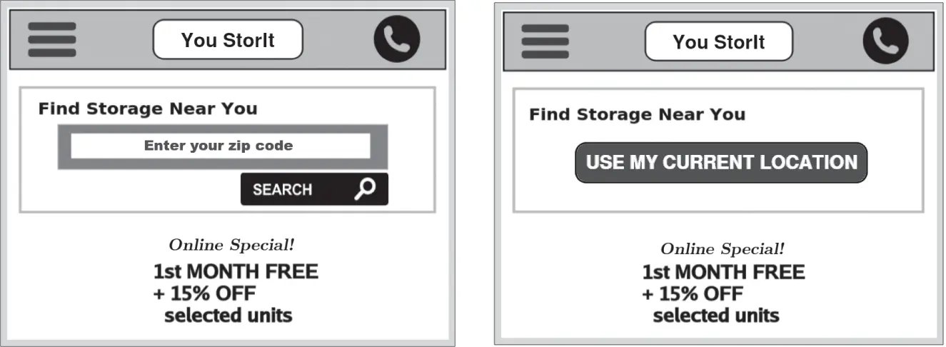
Figure 1.6 Mobile landing page test for storage company.
Our last example shows a test to determine whether it is beneficial to include a video icon on the product listing to indicate that there is a video available for the product. The images in Figure 1.7show a product listing without the icon (left) and with the icon (right). These images appear on the product listing page that shows all the products in a particular category (e.g. dresses, tops, shoes). In this test, users were assigned to either never see the video icons or to see the video icons for every product that had a video available. The two groups were compared based on the percentage of sessions that viewed a product detail page, which is the page the user sees when she clicks on one of the product listing images. The hypothesis was that the icons would encourage more people to click to see the product details where they can view the video. They also measured the total sales ($) per session. Do you think the icons will encourage users to click through to the product page?

Figure 1.7 Video icon test.
Source: Elias de Carvalho/Pexel.
Here we have shown four examples of website tests, but the options for testing websites and other digital platforms like apps or kiosks are nearly limitless. The growth in website testing has been driven largely by software that manages the randomization of users into test conditions. Popular software options include Optimizely, Maxymiser, Adobe Test&Target, Visual Website Optimizer, and Google Experiments. These tools integrate with digital analytics software like Google Analytics or Adobe Analytics that track user behavior on websites, which provides the data to compare the two versions. Most major websites will have testing software installed and often have a testing manager whose job is to plan, conduct, analyze, and report the results of tests. Newer software tools also make it possible to run tests on email, mobile apps, and other digital interfaces like touch‐screen kiosks or smart TV user interfaces. These website tests represent the ideal business experiment: we typically have a large sample of actual users, users are randomly assigned to alternative treatments, the user behavior is automatically measured by the web analytics solution, and the comparison between the two groups is a good estimate of the causal difference between the treatments. It is also relatively easy to implement the better version as soon as you get the results, and so these types of tests have a major impact on how websites are managed.
So, how good are you at guessing which version is better? Table 1.6shows the winning treatment for each of the tests (in bold) along with the lift in performance. If you were able to guess the results to all four examples, then you are gifted web designer. Even experienced website managers frequently guess incorrectly and user behavior changes over time and from one website to another, which means that the only way to figure out which version is better is to run a test.
Table 1.6 Summary of web test results.
| Test | A treatment | B treatment | Response measures | Result |
|---|---|---|---|---|
| Email sign‐up | No incentive | $10 incentive | # of sign‐ups | 300% lift |
| Skirt images | Head‐to‐toe | Cropped | Skirt sales ($/session) | 7% lift |
| Location search | Zip search | GPS search | Sign‐ups | 40% lift |
| Rentals | 23% lift | |||
| Video icon | No icon | Icon | % to product detail | No significant |
| Sales ($/session) | Difference |
Note: Winning treatment shown in boldface.
Notice that Table 1.6shows a different response measure for each test. The response measure (KPI) in an experiment is simply the measure that is used to compare the performance of two treatments. This measure is usually directly related to the business goal of the treatment. For instance, the purpose of the Dell Landing Page is to get people to sign up to talk to a Dell representative, so the percentage of users who submit a request is a natural response measure. Dell could have selected a different response measure, such as the % of users who actually speak with a Dell representative or who sign up and pay for services. In some cases, the test will include several response measures; the video icon test used both the % of users that viewed a product detail page, which is closely related to the goal of the video icon, and the sales per session, which reflects the ultimate business goal of any retail website. We will discuss the selection of response measures later, but for now it is sufficient to recognize that choosing a response measure that relates to business goals is a critical (and sometimes overlooked) part of test design.
Table 1.6reports the test results in terms of a percentage lift . For example, in the Dell Landing Page test, the lift was 36%, which means that the hero image produced 36% more submissions. Table 1.6only reports the lift numbers for test results that were found to be significant . Significance tests are used to determine whether there is enough data to say that there really is a difference between the two treatments. Imagine, for example, that we had test data on only five users: two who saw version A and looked at product details and three who saw version B and did not look at product details. Is this enough data to say that A is better than B? Your intuition probably tells you that it isn't, which is true, but when samples are a bit bigger, we can't rely on intuition to determine whether there is enough data to draw a conclusion. Testing for significance is one of the tools we use in analyzing A/B tests, and Chapter 2will show you how to do it. As we will explain in the next few sections, we need more than just the lift numbers to perform the significance test.
Most website testing managers will tell you that more than half of the website tests that they run are not significant, meaning that they cannot conclude that one version is better than the other. For example, in the video icon test in Figure 1.7, there were no significant differences in the % of users who viewed the product detail pages or the average sales per session. If we looked at the raw data, there were probably some small differences, but that difference was not great enough to rise to the level of significance. The analyst has wisely chosen not to report the lift numbers, and instead simply said, “there was no significant difference.” While the manager who came up with this video icon idea might not be too happy to find that it doesn't work, it is important to know that it doesn't work so that attention can be shifted to more promising improvements to the website. Smart testing managers realize that it is important to run many tests to find the features of the website that really do change user behavior.
Читать дальшеИнтервал:
Закладка:
Похожие книги на «Business Experiments with R»
Представляем Вашему вниманию похожие книги на «Business Experiments with R» списком для выбора. Мы отобрали схожую по названию и смыслу литературу в надежде предоставить читателям больше вариантов отыскать новые, интересные, ещё непрочитанные произведения.


Обсуждение, отзывы о книге «Business Experiments with R» и просто собственные мнения читателей. Оставьте ваши комментарии, напишите, что Вы думаете о произведении, его смысле или главных героях. Укажите что конкретно понравилось, а что нет, и почему Вы так считаете.