Thomas N. Bulkowski - Encyclopedia of Chart Patterns
Здесь есть возможность читать онлайн «Thomas N. Bulkowski - Encyclopedia of Chart Patterns» — ознакомительный отрывок электронной книги совершенно бесплатно, а после прочтения отрывка купить полную версию. В некоторых случаях можно слушать аудио, скачать через торрент в формате fb2 и присутствует краткое содержание. Жанр: unrecognised, на английском языке. Описание произведения, (предисловие) а так же отзывы посетителей доступны на портале библиотеки ЛибКат.

- Название:Encyclopedia of Chart Patterns
- Автор:
- Жанр:
- Год:неизвестен
- ISBN:нет данных
- Рейтинг книги:3 / 5. Голосов: 1
-
Избранное:Добавить в избранное
- Отзывы:
-
Ваша оценка:
Encyclopedia of Chart Patterns: краткое содержание, описание и аннотация
Предлагаем к чтению аннотацию, описание, краткое содержание или предисловие (зависит от того, что написал сам автор книги «Encyclopedia of Chart Patterns»). Если вы не нашли необходимую информацию о книге — напишите в комментариях, мы постараемся отыскать её.
, Third Edition expands upon Bulkowski's immensely popular Second Edition with fully revised and updated material on chart patterns. Whether you’re new to the stock market or an experienced professional trader, use this book as a reference guide to give you an edge.
Within the pages of this book, you’ll learn how to identify chart patterns, supported by easy-to-understand performance statistics describing how well a pattern works, what the failure rate is, and what special quirks suggest better future performance. You’ll discover how often a stop loss order will trigger at various locations within a chart pattern, how the chart pattern’s performance has evolved over the past three decades, and how to profit from failure by trading busted patterns.
This broadened and revised
offers investors the most comprehensive, up-to-date guide to this popular method of market analysis. Written by a leading expert on chart patterns, Tom Bulkowski, this edition includes revised statistics on 75 chart patterns including 23 new ones, with pictures and performance statistics, packaged within easy-to-read text.
Gain essential knowledge of chart patterns and how they are used to predict price movements in bull and bear markets New tables include how often stops are hit, busted pattern performance, performance over the decades, and special pattern features Joining Tour, Identification Guidelines, Focus on Failures, Statistics, Trading Tactics and Sample Trade is Experience. It puts you in the passenger’s seat so you can share lessons learned from Bulkowski's trades This edition reports on statistics from nearly four times the number of samples used in the Second Edition and ten times the number in the , Third Edition further solidifies the reputation of this book as the leading reference on chart patterns, setting it far above the competition.
Encyclopedia of Chart Patterns — читать онлайн ознакомительный отрывок
Ниже представлен текст книги, разбитый по страницам. Система сохранения места последней прочитанной страницы, позволяет с удобством читать онлайн бесплатно книгу «Encyclopedia of Chart Patterns», без необходимости каждый раз заново искать на чём Вы остановились. Поставьте закладку, и сможете в любой момент перейти на страницу, на которой закончили чтение.
Интервал:
Закладка:
How many rise to…?Gauging performance using another method, I checked how often price climbed to the various turns in the pattern.
For example, the closest turn to D is B. I found that price climbed to B 86% of the time. At the top of the pattern is point A. How many climbed to A? Answer: 58%.
Even though just over half of bats saw price reach A, with an average rise of 44%, it's clear many bats see price rise substantially to overcome the stinkers trying to pull the results down.
Hopefully, you can use these numbers as guidance to help you trade this pattern better by estimating how far price might rise.
Sample Trade
Figure 5.4shows a sample trade that Scott made. Scott has been a longtime admirer of Apple products, so when his software flagged a bullish bat, he took an interest in the stock. I show the bat as turns XABCD.
“I measured the height of the pattern,” he said and pointed to the chart. From the peak at A (60.96) to the low at X (50.61), the height was 10.35.
His statistics on bullish bats showed there was a 60% probability that the stock would climb to 71.31, which is the height added to peak A. (The 60% number comes from the traditional way of gauging chart pattern performance using the measure rule. Price reaches the target 60% of the time when you add the height of the pattern to the top of it.)
“You might not believe this, but I really didn't care about the answer. I wanted to hold the stock for the long term, but having that background info is reassuring.”
Scott is also a fan of trendlines. For entry, he drew a trendline skirting the peaks going down to turn D. The day after D, the stock closed above the line, signaling a buy (with the belief that the bearish bat had found a bottom at D).
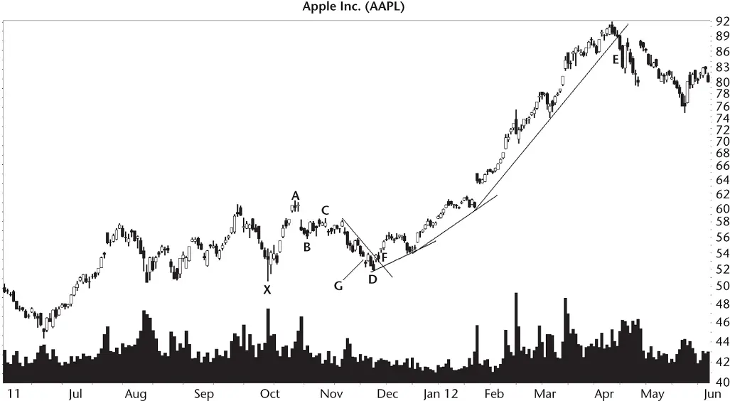
Figure 5.4 This is a sample trade using a bullish bat.
“Here's where I got creative. I used the bullish AB=CD chart pattern to find that turn D was overdue.” It predicted a bottom priced at 53.34, located in the area gap at G, so that gave Scott more confidence that the stock had put in a bottom at D. Regardless, he bought the stock at the open the next day and received a fill at 53.66.
“I placed a stop below the low at D, and below 52.00. Know why?” Before I could answer, he said, “Because at 51.83 it's seven cents below D and it avoids the round number 52. That's where others might place their trades.”
The stock cooperated and moved higher, forming a slightly upward curving trend. I show that on the chart (log scale) as a series of three lines rising toward E.
When the stock closed below the trendline near E, he placed an order to sell the stock at the open the next day. He received a fill at 87.14 for a gain of 33.48 a share, or 62% (not including commissions).
“I got lucky on this trade,” he told me.
“Why?”
“Two reasons. First, because the stock might not have turned upward at D. And second, I forgot to raise my stop.”
That's not always a bad thing, especially for long‐term holds. If you're swing trading or short‐term trading, then consider using a trailing stop, one that price stalks as it moves upward.
Another lucky factor was how the stock behaved with price rising in a near straight‐line run up to E. Although the stock retraced after E to 74.60, it went on to a new high at just over 100 in September 2012. The stock need not have dropped far at E before moving higher, too. Still, for a relatively short‐term trade, the exit was timely and the entry was delicious, too. Isn't there a red delicious brand of apple? Get it? He traded apple stock…
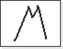
6 Big M
RESULTS SNAPSHOT
Appearance: Two peaks near the same price form a pattern that resembles an M.
Downward Breakouts
| Bull Market | Bear Market | |
| Reversal or continuation | Short‐term bearish reversal | Short‐term bearish reversal |
| Performance rank | 8 out of 36 | 10 out of 19 |
| Breakeven failure rate | 14% | 8% |
| Average decline | 17% | 22% |
| Volume trend | Downward | Downward |
| Pullbacks | 67% | 63% |
| Percentage meeting price target | 55% | 58% |
| See also | Bullish bat, double tops |
The big M chart pattern is a variation of a double top, a twin peak pattern with a tall left side. In well‐behaved patterns, the right side will also be tall so that the pattern resembles a tall M. The pattern confirms when price closes below the valley between the two peaks. We'll see a picture of the pattern in a moment.
Big Ms only break out downward, but they appear in both bull and bear markets. The average decline is about what you would expect from a bearish chart pattern, higher in bear markets than in bull markets. Volume trends downward from the first peak to the second, but plays no role in performance. Volume devotees may find that odd.
The performance rank for big Ms is good in bull markets but slips in bearish ones as the above statistics show. Let's look at some examples to see if we should include them in our trading toolbox.
Tour
Figure 6.1shows a good example of a big M chart pattern. Price begins climbing to the first peak in the pattern from the launch price at A. Think of point A as the launch pad with the hope that price will return to the pad after the pattern completes.
In perfectly shaped big Ms, the price trend to the first peak is a straight line affair, often quite fast and steep, like you see here on the way to peak B.
The big M is a twin peak pattern, BC. It's similar in shape to a double top except for the tall sides, as I mentioned. Between the peaks is a recession, D, a valley where price bottoms. The stock recovers and forms a second peak, C.
After the second peak, price drops and breaks out when price closes below the valley between the two peaks. That happens at E in this example. The stock continues lower but then gets sucked back up to G. It's a pullback, which often returns the stock back to, or near to, the breakout price in 12 days on average.
A pullback is not part of the big M. Rather it's just something that occurs about two‐thirds of the time. Traders need to be aware of it so that they don't close out a position prematurely.
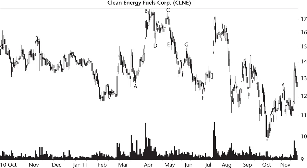
Figure 6.1 This big M sees price rise up to peak B and drop from peak C, bottoming at F just below the launch price, A.
In well‐behaved big Ms, price drops after the second peak in a straight‐line run down to the launch price, mirroring the rise to the first peak. That behavior represents the ideal situation, so don't depend on that happening in real life. In this example, the stock drops farther than the launch price, bottoming at F. Many times, however, price will bottom just above the launch price.
Identification Guidelines
Table 6.1shows the identification guidelines for the big M.
Figure 6.2provides another example of a big M at BD. Price begins the rise at A, the launch price (which is the second bottom of a nicely shaped Adam & Adam double bottom). Along the way, price gaps (an exhaustion gap because price consolidates after the gap) just past midway to the first peak and forms a pennant before resuming the climb to B.
Читать дальшеИнтервал:
Закладка:
Похожие книги на «Encyclopedia of Chart Patterns»
Представляем Вашему вниманию похожие книги на «Encyclopedia of Chart Patterns» списком для выбора. Мы отобрали схожую по названию и смыслу литературу в надежде предоставить читателям больше вариантов отыскать новые, интересные, ещё непрочитанные произведения.


Обсуждение, отзывы о книге «Encyclopedia of Chart Patterns» и просто собственные мнения читателей. Оставьте ваши комментарии, напишите, что Вы думаете о произведении, его смысле или главных героях. Укажите что конкретно понравилось, а что нет, и почему Вы так считаете.