Paul McFedries - Excel Data Analysis For Dummies
Здесь есть возможность читать онлайн «Paul McFedries - Excel Data Analysis For Dummies» — ознакомительный отрывок электронной книги совершенно бесплатно, а после прочтения отрывка купить полную версию. В некоторых случаях можно слушать аудио, скачать через торрент в формате fb2 и присутствует краткое содержание. Жанр: unrecognised, на английском языке. Описание произведения, (предисловие) а так же отзывы посетителей доступны на портале библиотеки ЛибКат.
- Название:Excel Data Analysis For Dummies
- Автор:
- Жанр:
- Год:неизвестен
- ISBN:нет данных
- Рейтинг книги:5 / 5. Голосов: 1
-
Избранное:Добавить в избранное
- Отзывы:
-
Ваша оценка:
Excel Data Analysis For Dummies: краткое содержание, описание и аннотация
Предлагаем к чтению аннотацию, описание, краткое содержание или предисловие (зависит от того, что написал сам автор книги «Excel Data Analysis For Dummies»). Если вы не нашли необходимую информацию о книге — напишите в комментариях, мы постараемся отыскать её.
Excel Data Analysis For Dummies
Excel Data Analysis For Dummies
Excel Data Analysis For Dummies — читать онлайн ознакомительный отрывок
Ниже представлен текст книги, разбитый по страницам. Система сохранения места последней прочитанной страницы, позволяет с удобством читать онлайн бесплатно книгу «Excel Data Analysis For Dummies», без необходимости каждый раз заново искать на чём Вы остановились. Поставьте закладку, и сможете в любой момент перейти на страницу, на которой закончили чтение.
Интервал:
Закладка:
6 Click OK.Excel applies the formatting to cells that meet the condition you specified.
Analyzing cell values with data bars
In some data-analysis scenarios, you might be interested more in the relative values within a range than the absolute values. For example, if you have a table of products that includes a column showing unit sales, you might want to compare the relative sales of all products.
Comparing relative values is often easiest if you visualize the values, and one of the easiest ways to visualize data in Excel is to use data bars, a data visualization feature that applies colored horizontal bars to each cell in a range of values; these bars appear “behind” (that is, in the background of) the values in the range. The length of the data bar in each cell depends on the value in that cell: the larger the value, the longer the data bar.
Follow these steps to apply data bars to a range:
1 Select the range you want to work with.
2 Choose Home ⇒ Conditional Formatting.
3 Choose Data Bars and then select the fill type of data bars you want to create.You can apply two type of data bars:Gradient fill: The data bars begin with a solid color and then gradually fade to a lighter color.Solid fill: The data bars are a solid color.Excel applies the data bars to each cell in the range. Figure 1-4 shows an example in the Units column.
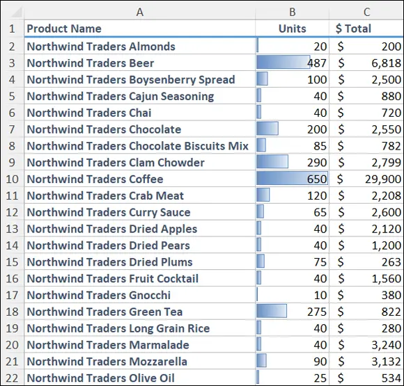
FIGURE 1-4:The higher the value, the longer the data bar.
 If your range includes right-aligned values, gradient-fill data bars are a better choice than solid-fill data bars. Why? Because even the longest gradient-fill bars fade to white toward the right edge of the cell, so your range values will mostly appear on a white background, making them easier to read.
Analyzing cell values with color scales
Getting some idea about the overall distribution of values in a range is often useful. For example, you might want to know whether a range has many low values and just a few high values. Color scales can help you analyze your data in this way. A color scale compares the relative values in a range by applying shading to each cell, where the color reflects each cell’s value.
Color scales can also tell you whether your data includes outliers: values that are much higher or lower than the others. Similarly, color scales can help you make value judgments about your data. For example, high sales and low numbers of product defects are good, whereas low margins and high employee turnover rates are bad.
To apply a color scale to a range of values, do the following:
1 Select the range you want to format.
2 Choose Home ⇒ Conditional Formatting.
3 Choose Color Scales and then select the color scale that has the color scheme you want to apply.Color scales come in two varieties: three-color scales and two-color scales. If your goal is to look for outliers, go with a three-color scale because it helps the outliers stand out more. A three-color scale is also useful if you want to make value judgments about your data, because you can assign your own values to the colors (such as positive, neutral, and negative). Use a two-color scale when you want to look for patterns in the data, because a two-color scale offers less contrast.Excel applies the color scale to each cell in your selected range.
Analyzing cell values with icon sets
Symbols that have common or well-known associations are often useful for analyzing large amounts of data. For example, a check mark usually means that something is good or finished or acceptable, whereas an X means that something is bad or unfinished or unacceptable. Similarly, a green circle is positive, whereas a red circle is negative (think traffic lights). Excel puts these and other symbolic associations to good use with the icon sets feature. You use icon sets to visualize the relative values of cells in a range.
 With icon sets, Excel adds a particular icon to each cell in the range, and that icon tells you something about the cell’s value relative to the rest of the range. For example, the highest values might be assigned an upward-pointing arrow, the lowest values a downward-pointing arrow, and the values in between a horizontal arrow.
Here’s how you apply an icon set to a range:
1 Select the range you want to format with an icon set.
2 Choose Home ⇒ Conditional Formatting.
3 Choose Icon Sets and then select the type of icon set you want to apply.Icon sets come in four categories:Directional: Indicates trends and data movementShapes: Points out the high (green) and low (red) values in the rangeIndicators: Adds value judgmentsRatings: Shows where each cell resides in the overall range of data valuesExcel applies the icons to each cell in the range, as shown in Figure 1-5.
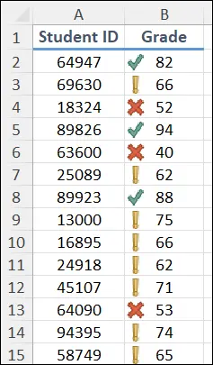
FIGURE 1-5:Excel applies an icon based on each cell’s value.
Creating a custom conditional-formatting rule
The conditional-formatting rules in Excel — highlight cells rules, top/bottom rules, data bars, color scales, and icon sets — offer an easy way to analyze data through visualization. However, you can tailor your formatting-based data analysis also by creating a custom conditional-formatting rule that suits how you want to analyze and present the data.
Custom conditional-formatting rules are ideal for situations in which normal value judgments — that is, that higher values are good and lower values are bad — don’t apply. In a database of product defects, for example, lower values are better than higher ones. Similarly, data bars are based on the relative numeric values in a range, but you might prefer to base them on the relative percentages or on percentile rankings.
To get the type of data analysis you prefer, follow these steps to create a custom conditional-formatting rule and apply it to your range:
1 Select the range you want to analyze with a custom conditional-formatting rule.
2 Choose Home ⇒ Conditional Formatting ⇒ New Rule.The New Formatting Rule dialog box appears.
3 In the Select a Rule Type box, select the type of rule you want to create.
4 Use the controls in the Edit the Rule Description box to edit the rule’s style and formatting.The controls you see depend on the rule type you selected in Step 3. For example, if you select Icon Sets, you see the controls shown in Figure 1-6. With Icon Sets, select Reverse Icon Order (as shown in the figure) if you want to reverse the normal icon assignments.
5 Click OK.Excel applies the conditional formatting to each cell in the range.
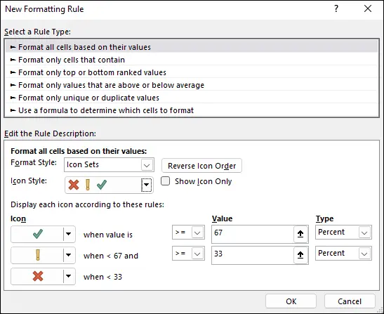
FIGURE 1-6:Use the New Formatting Rule dialog box to create a custom rule.
 HIGHLIGHT CELLS BASED ON A FORMULA
Интервал:
Закладка:
Похожие книги на «Excel Data Analysis For Dummies»
Представляем Вашему вниманию похожие книги на «Excel Data Analysis For Dummies» списком для выбора. Мы отобрали схожую по названию и смыслу литературу в надежде предоставить читателям больше вариантов отыскать новые, интересные, ещё непрочитанные произведения.


Обсуждение, отзывы о книге «Excel Data Analysis For Dummies» и просто собственные мнения читателей. Оставьте ваши комментарии, напишите, что Вы думаете о произведении, его смысле или главных героях. Укажите что конкретно понравилось, а что нет, и почему Вы так считаете.