Maintenance, Reliability and Troubleshooting in Rotating Machinery
Здесь есть возможность читать онлайн «Maintenance, Reliability and Troubleshooting in Rotating Machinery» — ознакомительный отрывок электронной книги совершенно бесплатно, а после прочтения отрывка купить полную версию. В некоторых случаях можно слушать аудио, скачать через торрент в формате fb2 и присутствует краткое содержание. Жанр: unrecognised, на английском языке. Описание произведения, (предисловие) а так же отзывы посетителей доступны на портале библиотеки ЛибКат.
- Название:Maintenance, Reliability and Troubleshooting in Rotating Machinery
- Автор:
- Жанр:
- Год:неизвестен
- ISBN:нет данных
- Рейтинг книги:4 / 5. Голосов: 1
-
Избранное:Добавить в избранное
- Отзывы:
-
Ваша оценка:
Maintenance, Reliability and Troubleshooting in Rotating Machinery: краткое содержание, описание и аннотация
Предлагаем к чтению аннотацию, описание, краткое содержание или предисловие (зависит от того, что написал сам автор книги «Maintenance, Reliability and Troubleshooting in Rotating Machinery»). Если вы не нашли необходимую информацию о книге — напишите в комментариях, мы постараемся отыскать её.
This broad collection of current rotating machinery topics, written by industry experts, is a must-have for rotating equipment engineers, maintenance personnel, students, and anyone else wanting to stay abreast with current rotating machinery concepts and technology.
Maintenance, Reliability and Troubleshooting in Rotating Machinery
Maintenance, Reliability and Troubleshooting in Rotating Machinery — читать онлайн ознакомительный отрывок
Ниже представлен текст книги, разбитый по страницам. Система сохранения места последней прочитанной страницы, позволяет с удобством читать онлайн бесплатно книгу «Maintenance, Reliability and Troubleshooting in Rotating Machinery», без необходимости каждый раз заново искать на чём Вы остановились. Поставьте закладку, и сможете в любой момент перейти на страницу, на которой закончили чтение.
Интервал:
Закладка:
Pareto failure plots (for more information, see Pareto Charts & 80-20 Rule insert below).
Bad actor forced rankings
Reliability growth plots
MTBF trends
Let’s start by reviewing a simple tool that looks at failures on a sitewide basis. Table 2.1contains a forced ranking of pump failures for various processing units across a site. By listing the mean time between repairs (MTBF) over the last 12 months, we can quickly identify the potential areas that may need addressing. In the case shown here, the Cat Cracking area seems to be the most problematic of all.
The pump failure data from Table 2.1can also be converted into a Pareto chart to provide a summary of pump reliability at a glance ( Figure 2.4). (A Pareto chart, seen in Figure 2.4, is a bar graph display of the frequency that events or measurements appear in a data group of interest.) In our Pareto chart example, pump failure frequencies over the last 12 months for various processing areas are plotted in order of decreasing failure frequency from left to right. Pareto charts are extremely useful for identifying issues that should be addressed first. The reader can quickly see that the Catalytic Cracking area had the most pump repairs over the last 12 months, and that the South Terminal area had the fewest repairs over the same time period. The visual results from this Pareto chart suggest that more study of the catalytic cracker pump failures is warranted.
Table 2.1 A hypothetical table of pump failures across a processing facility.
| Number of pump trains | Number of repairs last year | Total repair cost, $ | MTBF (Months) | |
| Catalytic Cracker | 50 | 34 | 272000 | 17.65 |
| Coker Unit | 42 | 21 | 168000 | 24 |
| Crude Unit | 40 | 15 | 120000 | 32 |
| Alky Unit | 35 | 15 | 120000 | 28 |
| Fractionation Unit | 40 | 15 | 120000 | 32 |
| Sulfur Unit | 25 | 15 | 120000 | 20 |
| Utilities | 42 | 12 | 96000 | 42 |
| Hydrotreating | 32 | 12 | 96000 | 32 |
| North Terminal | 30 | 8 | 64000 | 45 |
| South Terminal | 32 | 8 | 64000 | 48 |
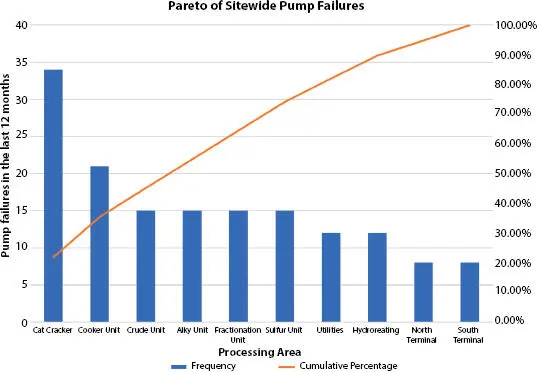
Figure 2.4 Pareto chart of total pump failures over the last 12 months for various processing units. The “cumulative percentage” line helps in determining how various groups add to the total failure population. For example, the Cat Cracker and Coker Unit failures represent about 35% of total plantwide pump failures.
Table 2.2 A forced ranking of pump failures in a hypothetical cat cracking unit.
| Pump | Failures in last 12 months | Total repair costs for the last 12 months |
| 31-P-09 A&B | 5 | $ 50,000 |
| 31-P-05 A&B | 4 | $ 40,000 |
| 31-P-04 A&B | 3 | $ 30,000 |
| 31-P-08 A&B | 3 | $ 30,000 |
| 31-P-17 A&B | 3 | $ 30,000 |
| 31-P-25 A&B | 3 | $ 30,000 |
| 31-P-02 A&B | 2 | $ 20,000 |
| 31-P-06 A&B | 2 | $ 20,000 |
| 31-P-10 A&B | 2 | $ 20,000 |
| 31-P-11 A&B | 2 | $ 20,000 |
| 31-P-12 A&B | 2 | $ 20,000 |
| 31-P-14 A&B | 2 | $ 20,000 |
| 31-P-16 A&B | 2 | $ 20,000 |
| 31-P-18 A&B | 2 | $ 20,000 |
| 31-P-19 A&B | 2 | $ 20,000 |
| 31-P-22 A&B | 2 | $ 20,000 |
| 31-P-23 A&B | 2 | $ 20,000 |
| 31-P-01 A&B | 1 | $ 10,000 |
| 31-P-03 A&B | 1 | $ 10,000 |
| 31-P-07 A&B | 1 | $ 10,000 |
| 31-P-13 A&B | 1 | $ 10,000 |
| 31-P-20 A&B | 1 | $ 10,000 |
| 31-P-21 A&B | 1 | $ 10,000 |
| 31-P-24 A&B | 1 | $ 10,000 |
| 31-P-15 A&B | 0 | $ - |
Now that we know most of the pump failures occurred in the Cat Cracking unit, we can narrow our focus to those pumps. Table 2.2shows a forced ranking of the pumps with the most failures. In our hypothetical case, Pumps 31-P-09 A&B failed five times in the last 12 months. Assuming that each repair costs about $10,000, we now see that the worst actor cost us about $50,000 in the last 12 months.
You may choose to label the least reliable pumps at your site as “bad actors.” Bad actors typically make up 7% to 10% of the pumps at your site that cost the most to maintain and cause you the most headaches. It makes sense to aggressively address bad actors first.
Pareto Charts & 80-20 Rule
The Pareto Chart is a very powerful data analysis tool that can be used to show the relative importance of problem areas and their root causes. They are composed of both bars and lines, where individual values are represented in descending order by bars, and the cumulative total of the sample is represented by the curved line. The 80/20 rule (also known as the Pareto principle or the law of the vital few and trivial many) states that, for many events, roughly 80% of the effects come from 20% of the causes. Joseph Juran, a well-regarded Quality Management consultant, suggested the principle and named it after the Italian economist, Vilfredo Pareto, who noted the 80/20 connection in 1896. Pareto showed that approximately 80% of the land in Italy was owned by 20% of the population. Pareto also observed that 20% of the peapods in his garden contained 80% of the peas. According to the Pareto Principle, in any group of things that contribute to a common effect, a relatively few contributors account for the majority of the effect.
Cumulative Failure Trends
Management is usually interested in knowing if their pump reliability is getting better or worse. A simple means of visualizing historical failure data is by contructing, then analyzing, a special trend called a reliability growth plot, which is a plot of cumulative failures versus time (see Figure 2.5). This type of graph is constructed by first creating a table of cumulative (total) failures in a population for consecuative time intervals, then plotting cumulative failures over the time period of interest. For example, let us say that in the first month 20 failures occur in a population, in the second month 25 failures occur, and in the third month 30 failures occur. This would mean the first three points in your reliability growth plot would be: Month 1, 20 failures; Month 2, 20+25=45 failures; Month 3, 20 + 25 + 30 = 75 failures, or (1,20), (2,45), and (3,75).
Reliability growth plots allow you to easily see tendencies in the failure data. Figure 2.5shows three idealized reliability growth plots:
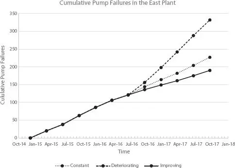
Figure 2.5 Reliability growth plot of pump failures in an operating area.
1 A trend where the slope of the cumulative failures is essentially straight, indicating a constant rate of failure (shown as “Constant” in Figure 2.5).
Читать дальшеИнтервал:
Закладка:
Похожие книги на «Maintenance, Reliability and Troubleshooting in Rotating Machinery»
Представляем Вашему вниманию похожие книги на «Maintenance, Reliability and Troubleshooting in Rotating Machinery» списком для выбора. Мы отобрали схожую по названию и смыслу литературу в надежде предоставить читателям больше вариантов отыскать новые, интересные, ещё непрочитанные произведения.


Обсуждение, отзывы о книге «Maintenance, Reliability and Troubleshooting in Rotating Machinery» и просто собственные мнения читателей. Оставьте ваши комментарии, напишите, что Вы думаете о произведении, его смысле или главных героях. Укажите что конкретно понравилось, а что нет, и почему Вы так считаете.