Wei-Meng Lee - C# 2008 Programmer's Reference
Здесь есть возможность читать онлайн «Wei-Meng Lee - C# 2008 Programmer's Reference» весь текст электронной книги совершенно бесплатно (целиком полную версию без сокращений). В некоторых случаях можно слушать аудио, скачать через торрент в формате fb2 и присутствует краткое содержание. Город: Indianapolis, Год выпуска: 2009, ISBN: 2009, Издательство: Wiley Publishing, Inc., Жанр: Программирование, на английском языке. Описание произведения, (предисловие) а так же отзывы посетителей доступны на портале библиотеки ЛибКат.
- Название:C# 2008 Programmer's Reference
- Автор:
- Издательство:Wiley Publishing, Inc.
- Жанр:
- Год:2009
- Город:Indianapolis
- ISBN:978-0-470-28581-7
- Рейтинг книги:4 / 5. Голосов: 1
-
Избранное:Добавить в избранное
- Отзывы:
-
Ваша оценка:
C# 2008 Programmer's Reference: краткое содержание, описание и аннотация
Предлагаем к чтению аннотацию, описание, краткое содержание или предисловие (зависит от того, что написал сам автор книги «C# 2008 Programmer's Reference»). Если вы не нашли необходимую информацию о книге — напишите в комментариях, мы постараемся отыскать её.
C# 2008 Programmer's Reference — читать онлайн бесплатно полную книгу (весь текст) целиком
Ниже представлен текст книги, разбитый по страницам. Система сохранения места последней прочитанной страницы, позволяет с удобством читать онлайн бесплатно книгу «C# 2008 Programmer's Reference», без необходимости каждый раз заново искать на чём Вы остановились. Поставьте закладку, и сможете в любой момент перейти на страницу, на которой закончили чтение.
Интервал:
Закладка:
One of the key capabilities of Silverlight is the support for drawing objects of different shapes and sizes. Silverlight provides the following basic shape elements:
□ Rectangle
□ Ellipse
□ Line
□ Polygon
□ Polyline
A element draws a rectangle (or square) with optional rounded corners. To specify rounded corners, use the RadiusXand RadiusYattributes. Edit the UI.xamlfile created in the previous section and replace its content with the following:
xmlns="http://schemas.microsoft.com/client/2007"
xmlns:x="http://schemas.microsoft.com/winfx/2006/xaml">
Canvas.Left="10" Canvas.Top="10"
Height="100" Width="200"
Stroke="Black"
StrokeThickness="10"
Fill="Yellow"
RadiusX="10"
RadiusY="10"/>
Canvas.Left="60" Canvas.Top="60"
Height="200" Width="180"
Stroke="Black"
StrokeThickness="10"
Fill="LightBlue"
RadiusX="30"
RadiusY="30"/>
Reload Default.htmlin the web browser. Figure 19-7 shows the output.

Figure 19-7
A element draws a line on the Canvas control. Edit the UI.xamlfile created in the previous section and replace its content with the following:
xmlns="http://schemas.microsoft.com/client/2007"
xmlns:x="http://schemas.microsoft.com/winfx/2006/xaml">
Stroke="black" StrokeThickness="5"/>
Stroke="red" StrokeThickness="10"/>
Reload the Default.htmlfile in the web browser, and observe the output (see Figure 19-8).

Figure 19-8
An element draws a circle (or oval) on the Canvascontrol. Edit the UI.xamlfile created in the previous section, and replace its content with the following:
xmlns="http://schemas.microsoft.com/client/2007"
xmlns:x="http://schemas.microsoft.com/winfx/2006/xaml">
Canvas.Left="30" Canvas.Top="30" Height="60" Width="60"
Stroke="Black" StrokeThickness="10" Fill="Pink"/>
Canvas.Left="200" Canvas.Top="30" Height="60" Width="60"
Stroke="Black" StrokeThickness="10" Fill="LightBlue"/>
Canvas.Left="20" Canvas.Top="100" Height="70" Width="250"
Stroke="Black" StrokeThickness="10" Fill="LightGreen"/>
Reload Default.htmlin the web browser. Figure 19-9 shows the output.
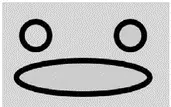
Figure 19-9
A element draws a shape with arbitrary number of sides. Edit UI.xamlagain, replacing its content with the following:
xmlns="http://schemas.microsoft.com/client/2007"
xmlns:x="http://schemas.microsoft.com/winfx/2006/xaml">
Stroke="Yellow" StrokeThickness="5" Fill="Red"/>
Reload Default.htmlin the web browser to see the result (see Figure 19-10).

Figure 19-10
A element draws a series of connected lines. Edit the UI.xamlfile and replace its content with the following:
xmlns="http://schemas.microsoft.com/client/2007"
xmlns:x="http://schemas.microsoft.com/winfx/2006/xaml">
Stroke="Black" StrokeThickness="8"/>
Reload Default.htmlin the web browser, and observe the output (see Figure 19-11).
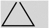
Figure 19-11
The Fillattribute that you have seen in many of the previous examples fills (paints) a shape with a solid color. However, the fill is not restricted to solid colors. Silverlight supports various ways to paint a shape:
□ SolidColorBrush
□ LinearGradientBrush
□ RadialGradientBrush
□ ImageBrush
The element paints an area with a solid color. Edit the UI.xamlfile created in the previous section, and replace its content with the following:
xmlns="http://schemas.microsoft.com/client/2007"
xmlns:x="http://schemas.microsoft.com/winfx/2006/xaml">
Canvas.Left="10" Canvas.Top="10"
Height="100" Width="100"
Stroke="Black" StrokeThickness="10" Fill="Yellow"/>
Canvas.Left="120" Canvas.Top="10"
Height="100" Width="100"
Stroke="Black" StrokeThickness="10"
Fill="#A3FC96"/>
Canvas.Left="10" Canvas.Top="120"
Height="100" Width="100"
Stroke="Black" StrokeThickness="10"
Fill="#A3FC96FF"/>
Canvas.Left="120" Canvas.Top="120"
Height="100" Width="100"
Stroke="Black" StrokeThickness="10">
In this example, the Fillattribute specifies the solid color to use to fill up the particular element. Reload the Default.htmlfile in the web browser, and observe the output in your browser (see Figure 19-12).
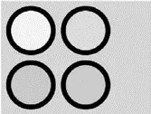
Figure 19-12
The LinearGradientBrushelement paints an area with a linear gradient. Edit the UI.xamlfile again, replacing its content with the following:
xmlns=http://schemas.microsoft.com/client/2007
xmlns:x="http://schemas.microsoft.com/winfx/2006/xaml">
Canvas.Left="10" Canvas.Top="10"
Height="100" Width="100"
Stroke="Black" StrokeThickness="10">
Canvas.Left="120" Canvas.Top="10"
Интервал:
Закладка:
Похожие книги на «C# 2008 Programmer's Reference»
Представляем Вашему вниманию похожие книги на «C# 2008 Programmer's Reference» списком для выбора. Мы отобрали схожую по названию и смыслу литературу в надежде предоставить читателям больше вариантов отыскать новые, интересные, ещё непрочитанные произведения.


Обсуждение, отзывы о книге «C# 2008 Programmer's Reference» и просто собственные мнения читателей. Оставьте ваши комментарии, напишите, что Вы думаете о произведении, его смысле или главных героях. Укажите что конкретно понравилось, а что нет, и почему Вы так считаете.