Bruce Barnbaum - The Art of Photography - An Approach to Personal Expression
Здесь есть возможность читать онлайн «Bruce Barnbaum - The Art of Photography - An Approach to Personal Expression» весь текст электронной книги совершенно бесплатно (целиком полную версию без сокращений). В некоторых случаях можно слушать аудио, скачать через торрент в формате fb2 и присутствует краткое содержание. Жанр: Старинная литература, на английском языке. Описание произведения, (предисловие) а так же отзывы посетителей доступны на портале библиотеки ЛибКат.

- Название:The Art of Photography: An Approach to Personal Expression
- Автор:
- Жанр:
- Год:неизвестен
- ISBN:нет данных
- Рейтинг книги:5 / 5. Голосов: 1
-
Избранное:Добавить в избранное
- Отзывы:
-
Ваша оценка:
The Art of Photography: An Approach to Personal Expression: краткое содержание, описание и аннотация
Предлагаем к чтению аннотацию, описание, краткое содержание или предисловие (зависит от того, что написал сам автор книги «The Art of Photography: An Approach to Personal Expression»). Если вы не нашли необходимую информацию о книге — напишите в комментариях, мы постараемся отыскать её.
The Art of Photography: An Approach to Personal Expression — читать онлайн бесплатно полную книгу (весь текст) целиком
Ниже представлен текст книги, разбитый по страницам. Система сохранения места последней прочитанной страницы, позволяет с удобством читать онлайн бесплатно книгу «The Art of Photography: An Approach to Personal Expression», без необходимости каждый раз заново искать на чём Вы остановились. Поставьте закладку, и сможете в любой момент перейти на страницу, на которой закончили чтение.
Интервал:
Закладка:
This is an unusual, but very pertinent, example. In general, the ability to burn highlights at low contrast levels (without the need to remove the negative, as flashing requires) can more easily accomplish the same effect as flashing on graded paper. In fact, burning at a low contrast level is often superior because even the lowest contrast level (i.e., a #0 or #00 filter below the lens or in the enlarger, or maximum yellow or green filtration in the enlarger) still yields some tonal separations, whereas the flash exposure with no negative has no separations. It simply boosts the separations made through the negative closer to threshold, or above threshold.
Flashing, either with graded or variable contrast papers, extends your reach into even higher negative densities. This should further free you from any fear of higher zones (those well above Zone 9), and also relax you about getting exposures above the toe of the curve and onto the straight-line portion of the curve. I regularly expose highlights at Zone 9, 10, 11, or higher, then develop the negative as needed (with full consideration of all printing options) for optimum results. Remember that you can expose negatives into the fully usable mid-teen zones, but you don’t want to develop them to such high densities. However, for portions of the negative developed to Zone 9, 10, or 11, you can use burning, low contrast burning, or flashing to bring them into visibility. In the next section on masking, you’ll learn yet another technique to allow use of the higher zones.
Masking
Masking involves the creation of a second negative (the “mask”) from the original negative. When re-registered with the original negative, the sandwich of the two can accomplish some extraordinary tasks. Good masking may involve the use of exposure registration equipment, which is easy to use and very much worth the cost.
There are two types of masks: the first, and more widely known, is contrast reduction masking or “unsharp masking”. This mask decreases overall contrast while increasing local contrast and apparent sharpness. The second type is highlight masking, which blocks out all shadow and mid-tone areas of the negative, allowing you to print highlights without darkening the other tonalities. Let’s discuss them one at a time.
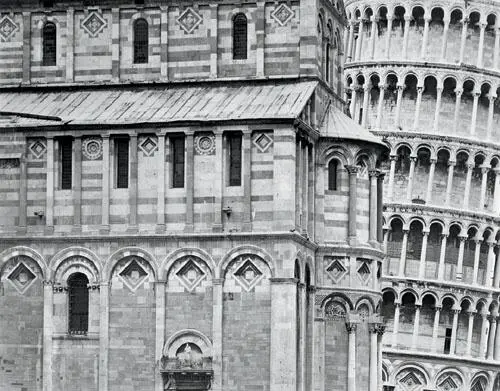
I found it exciting to create a composition of the Leaning Tower of Pisa that is different from the millions made annually. However, the area under each arch and window would have been unpleasantly dark without the use of a mask in printing. By adding small amounts of density to each of those areas, I was able, in essence, to dodge them all simultaneously .
Figure 10-9. Pisa, 2000
#1 – Contrast Reduction Masking (Unsharp Masking)
The contrast reduction mask is useful when the overall contrast of your negative is simply too much to handle, indicating that you developed it at too high a contrast level. Here, the mask is used to correct a mistake. Another use of a contrast reduction mask is when an image has multiple areas that need to be dodged simultaneously. Since we’re not built like octopuses and have only two arms, multiple dodging is impossible. In this case, a mask makes the print far superior (Figure 10-9).
This mask is made on low contrast negative material. Any fine grain negative material developed to low contrast (Kodak T-Max 100, Ilford Pan F, Fuji Acros Neopan, etc.) can serve the purpose. To make the mask, place the material below the original negative in a contact printing frame or under a sheet of heavy glass atop a foam rubber base, just as you’d make a contact proof. It’s best to separate the two with several sheets of clear negative material (I recommend T-Max 100 because its base is so clear when fixed). This assures that the mask will have soft, unsharp edges when exposed under the enlarger. (See Figure 10-10 for the setup.)
Expose and develop the mask so that the highlight areas of the original negative (the densest areas) yield little or no density in the mask. The densest areas of the mask (exposed through the thin portions of the negative) should have low density compared to the densest areas of the original negative. The mask is a low contrast, unsharp positive of the negative (making it look like a fuzzy, out-of-focus, low contrast contact proof).
When you re-register the two, you add little or no density to the highlight densities of the negative but significant density to the shadow areas. In printing the sandwich of the negative and the mask (without the intermediate spacers used in making the mask) you normally increase the contrast you would have used for the negative alone.
Because the mask is unsharp, it tends to be smooth-toned in areas that have fine, small-scale local contrasts in the negative (hair on someone’s head or beard, leaves on forest trees, etc.). It doesn’t lower the local contrast but simply adds density to those areas, necessitating longer exposures. But it significantly lowers overall contrast by broadly adding density to shadow areas without adding much (if any) to highlight areas. So this explains a third use of a contrast reduction mask: reducing overall contrast while increasing local contrast, a commonly encountered problem.
If you increase the contrast level at which you print the negative (using a higher paper grade or higher contrast filtration), you can slightly increase local contrast while reducing overall contrast, or greatly increase local contrast while maintaining overall contrast.
In some cases, the alteration of local vs. overall contrast can be exceedingly valuable. In other cases, it can be destructive to the mood you wish to create. Be careful with it and use it wisely. It is a terrific tool when used selectively and intelligently.
If you are printing a negative at the highest contrast level available, contrast reduction masking is unlikely to be a benefit. Since it reduces contrast, generally necessitating higher contrast levels, it has nowhere to go. Of course you can make a mask and try it. You have nothing to lose but time and effort because the original negative is unaltered. It may turn out that all you needed was increased local contrast. It works best for negatives printed at low or moderate contrast levels without the mask.
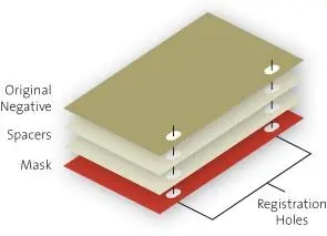
Figure 10-10. Set-up for making contrast reducing mask
It’s ironic that a technique called “unsharp masking” actually increases the apparent sharpness of an image. When a negative has a sharp contrast edge, it changes abruptly from one density to another. The mask’s lower densities are opposite those of the negative, and they change softly from one density to another because the mask is intentionally unsharp (Figure 10-11 and Figure 10-12).
When the original negative is sandwiched with the mask, the two density curves are added together (Figure 10-13). The original negative is the dominant curve because the mask is intentionally lower in contrast and density. Notice the odd thing happening adjacent to the abrupt density edge. Just before the density of the original negative makes the quantum drop at the edge, the mask begins to increase the overall density. At the edge it suddenly drops, then slowly increases density again before leveling off. Thus, the sandwich creates imperceptibly thin light and dark lines around every contrast break, yielding an appearance of increased sharpness. Every object is outlined because of the mask.
Читать дальшеИнтервал:
Закладка:
Похожие книги на «The Art of Photography: An Approach to Personal Expression»
Представляем Вашему вниманию похожие книги на «The Art of Photography: An Approach to Personal Expression» списком для выбора. Мы отобрали схожую по названию и смыслу литературу в надежде предоставить читателям больше вариантов отыскать новые, интересные, ещё непрочитанные произведения.


Обсуждение, отзывы о книге «The Art of Photography: An Approach to Personal Expression» и просто собственные мнения читателей. Оставьте ваши комментарии, напишите, что Вы думаете о произведении, его смысле или главных героях. Укажите что конкретно понравилось, а что нет, и почему Вы так считаете.