Bruce Barnbaum - The Art of Photography - An Approach to Personal Expression
Здесь есть возможность читать онлайн «Bruce Barnbaum - The Art of Photography - An Approach to Personal Expression» весь текст электронной книги совершенно бесплатно (целиком полную версию без сокращений). В некоторых случаях можно слушать аудио, скачать через торрент в формате fb2 и присутствует краткое содержание. Жанр: Старинная литература, на английском языке. Описание произведения, (предисловие) а так же отзывы посетителей доступны на портале библиотеки ЛибКат.

- Название:The Art of Photography: An Approach to Personal Expression
- Автор:
- Жанр:
- Год:неизвестен
- ISBN:нет данных
- Рейтинг книги:5 / 5. Голосов: 1
-
Избранное:Добавить в избранное
- Отзывы:
-
Ваша оценка:
The Art of Photography: An Approach to Personal Expression: краткое содержание, описание и аннотация
Предлагаем к чтению аннотацию, описание, краткое содержание или предисловие (зависит от того, что написал сам автор книги «The Art of Photography: An Approach to Personal Expression»). Если вы не нашли необходимую информацию о книге — напишите в комментариях, мы постараемся отыскать её.
The Art of Photography: An Approach to Personal Expression — читать онлайн бесплатно полную книгу (весь текст) целиком
Ниже представлен текст книги, разбитый по страницам. Система сохранения места последней прочитанной страницы, позволяет с удобством читать онлайн бесплатно книгу «The Art of Photography: An Approach to Personal Expression», без необходимости каждый раз заново искать на чём Вы остановились. Поставьте закладку, и сможете в любой момент перейти на страницу, на которой закончили чтение.
Интервал:
Закладка:
So keep this in mind: The message is the important thing. The mood is the important thing. The technique is merely support for communication between the photographer and the viewer. If your photographs are technical tour-de-forces that say nothing, then you’ve produced little of value. Ansel Adams, forcefully supporting this idea, said, “There’s nothing as useless as a sharp photograph of a fuzzy concept.” A good lens can produce a sharp image but nothing more. It’s the photographer with something to say—not the sharp lens—that produces important photographs. Ignore this myth; make good photographs.
Myth #8: Two More Persistent Myths
There is an inexhaustible supply of petty myths—many under the title “rules of composition”—that make absolutely no sense. This section could go on ad infinitum and ad nauseum. I’ll confine it to two of the most common myths.
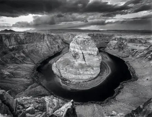
The unimaginable symmetry of nature on a grand scale drew me to make this photograph. To accentuate that symmetry, I photographed directly toward the cliffs across the 180-degree turn. To reveal the triangular rock below, which serves as a fulcrum balancing the photograph, I placed the two front tripod legs within an inch of the 700-foot cliff edge. The sun had just set to the left of the frame. The central cliff appears brightened, but it was not touched in the printing; instead, all the cliffs and lower slopes around the bend were dodged continuously during the basic exposure, then selectively bleached to balance the extreme brightness of the central rock, which seemed to be lit from within. The unexplainable lighting makes the scene even more astounding to behold .
Figure 13-14. Horseshoe Bend of the Colorado River
#8-A: The center of interest should be one-third of the way up and one-third of the way into the photograph
The so-called “rule of thirds” stems from a flawed study in the 1850s by a statistics professor who decided to learn what makes great paintings great. He worked with several art critics and art historians who chose the finest 250 paintings. (Consider this: A statistician with no real art background was working with people involved in the arts who had no understanding of statistics. There was a communication disconnect from the start.)
One question was where the center of interest should lie. Realizing that the center of interest could be placed in any one of four quadrants, and that it would end up at the exact center on average, the statistician rotated the center of interest from wherever it was found around the center of the painting to the lower right quadrant. Then he applied his statistical analysis, apparently thinking he had produced a valid analysis. He hadn’t.
Consider the imaginary line that goes from the extreme corner to the center. Obviously there would be as many points above the line as below the line, in roughly equal distances from the line. So the statistical average was certain to be on that line. No center of interest is found in the exact corner of a painting, so there is no contribution from the corner, but there could be contributions from the exact center. In other words, the answer would be along the line and would be weighted toward the center.
Not surprisingly, the statistician found that the average center of interest was two-thirds of the way along the line. His analysis forced that conclusion. In other words, it was a predetermined result! Without his quadrant rotation, the analysis would have yielded the exact center as the best place to locate a center of interest.
Of course, two-thirds of the way up that line is—ta da!—exactly one-third of the way up and one-third of the way into the painting from the corner. The result goes beyond useless because it was a stupid question to begin with. Amazingly, that flawed analysis of a meaningless question is the basis of this baseless compositional rule.
Sometimes you may want to place an object directly in the center of a photograph for stability, strength, balance, symmetry, or any number of other reasons (Figure 13-14). Sometimes you may want a center of interest (if there is one) near the edge or corner, perhaps to create an intentional imbalance or to balance a greater mass nearer the center on the other side (the old teeter-totter balancing act).
The rule of thirds is a cornerstone for much teaching about composition—sinking to its lowest ebb in camera club and professional photographic competitions, where it’s considered the epitome of fine composition. It’s an idea that best belongs in the trashcan.
#8-B: The horizon line should never divide a photograph in half
Why not? There is simply no logical or visual reason for such a silly compositional rule. It may be that dividing the image space in half horizontally (or vertically) creates the strongest possible composition for a specific image. Every image must be approached on its own merits. It makes no sense to rule out a valid compositional approach before you begin composing. Rules, assuming there are any, have to be bent and often broken to help make a point.
Yet there are photographers who purposely move the horizon line above or below center for no apparent reason other than to get away from dividing the space in half. That’s just pure foolishness. Don’t ever be swayed by this senseless rule. Figure 10-17 breaks this silly rule twice: first dividing the top and bottom in half with a horizontal line, then dividing the bottom in half with a vertical line.
These are two absurd rules of composition that are regularly bandied about as meaningful. There are other rules based on things like the “Golden Mean”, made by people who have no idea about the purely mathematical basis of that ratio as the answer to a question posed by Euclid 2,300 years ago. The Golden Mean has no artistic ramifications whatsoever. In fact, none of these purely mathematical considerations have compositional validity.
Every image must be dealt with on its own merits. Each one requires its own set of rules, which rarely apply to the next image. Some people think it’s useful to know the rules so they know when to break them. I disagree. Since rules are inherently useless, knowing them simply constrains you to follow them or consciously break them. Why put something in your mind to worry about if it’s inherently useless from the start? It’s like putting an obstacle in your path for no reason whatsoever.
My approach can best be summed up as, “There are no rules!”
Chapter 14. Photographic Techniques and Artistic Integrity
BECAUSE THE CAMERA, DARKROOM, OR COMPUTER can be used to achieve such remarkable transformations of the scene that was in front of the camera, a real philosophical question is raised: When do you step over the line from legitimacy to illegitimacy in the use of photographic manipulation? How far can you go before you’ve gone too far?
Up to now, the question has been raised in this book only as it applies to the extent of darkroom and computer manipulations that become apparent, such as too much burning, dodging, flashing, bleaching, sharpening, cloning, etc. But are there legal, moral, ethical, or philosophical boundaries limiting the degree or extent of manipulation?
Surely there are. An obvious example would be the manipulation of photographs for blackmail or nefarious political ends. Time magazine once published an article showing how simple it would be to produce a realistic print of a fictional meeting between the U.S. Secretary of State and a terrorist leader. Such a photograph could be accompanied by a story about the alleged meeting and secret deals made with known enemies. In a similar way, it would be equally simple (and equally immoral) to produce a photograph of a political candidate engaging in sex with a call girl when no such encounter ever occurred, and to distribute the phony image just before an election. These would surely be gross abuses of the photographic process. Short of such obvious examples of intentional fraud and deception, there is a gray area of possibilities that warrants some serious discussion.
Читать дальшеИнтервал:
Закладка:
Похожие книги на «The Art of Photography: An Approach to Personal Expression»
Представляем Вашему вниманию похожие книги на «The Art of Photography: An Approach to Personal Expression» списком для выбора. Мы отобрали схожую по названию и смыслу литературу в надежде предоставить читателям больше вариантов отыскать новые, интересные, ещё непрочитанные произведения.


Обсуждение, отзывы о книге «The Art of Photography: An Approach to Personal Expression» и просто собственные мнения читателей. Оставьте ваши комментарии, напишите, что Вы думаете о произведении, его смысле или главных героях. Укажите что конкретно понравилось, а что нет, и почему Вы так считаете.