The Magazine - The Artist’s Problem Solver
Здесь есть возможность читать онлайн «The Magazine - The Artist’s Problem Solver» — ознакомительный отрывок электронной книги совершенно бесплатно, а после прочтения отрывка купить полную версию. В некоторых случаях можно слушать аудио, скачать через торрент в формате fb2 и присутствует краткое содержание. Жанр: unrecognised, на английском языке. Описание произведения, (предисловие) а так же отзывы посетителей доступны на портале библиотеки ЛибКат.
- Название:The Artist’s Problem Solver
- Автор:
- Жанр:
- Год:неизвестен
- ISBN:нет данных
- Рейтинг книги:4 / 5. Голосов: 1
-
Избранное:Добавить в избранное
- Отзывы:
-
Ваша оценка:
The Artist’s Problem Solver: краткое содержание, описание и аннотация
Предлагаем к чтению аннотацию, описание, краткое содержание или предисловие (зависит от того, что написал сам автор книги «The Artist’s Problem Solver»). Если вы не нашли необходимую информацию о книге — напишите в комментариях, мы постараемся отыскать её.
The Artist’s Problem Solver — читать онлайн ознакомительный отрывок
Ниже представлен текст книги, разбитый по страницам. Система сохранения места последней прочитанной страницы, позволяет с удобством читать онлайн бесплатно книгу «The Artist’s Problem Solver», без необходимости каждый раз заново искать на чём Вы остановились. Поставьте закладку, и сможете в любой момент перейти на страницу, на которой закончили чтение.
Интервал:
Закладка:
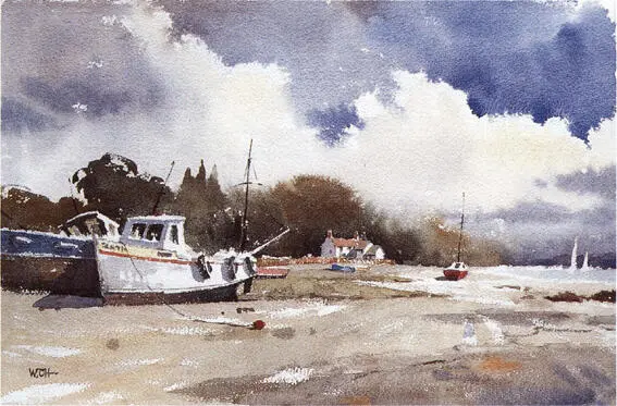
LOW TIDE AT PIN MILL, SUFFOLK
watercolour, 30 × 46 cm (12 × 18 in)
A sharp white cloud edge was obtained by keeping the upper cloud border dry while wetting the rest of the sky area. The contour was further shaped while working in a stiff wash of French Ultramarine. Light Red was mixed in for more interest in the sky.
When the sky is dry, you will notice that the colours are about 10 or 25 per cent lighter. This may disappoint initially, but when the whole picture is completed, you will appreciate that the lighter sky contrasts well with the landscape below, and it recedes into the distance where it belongs. Practise and experiment with different colours and tones, and you will develop your own version of the seven-minute (more or less) sky!
5
THE LONGER VIEW
I always have problems with my foregrounds. Can you offer some help on how to tackle them successfully?
Answered by: Jackie Simmonds
Foregrounds can cause all sorts of problems. Too much detail, and the viewer’s eye is held firmly in the foreground and fails to explore the rest of the picture. Too little attention to the foreground, however, may result in a boring, unconsidered area at the base of the picture. Often the main problem is that the student has not taken on board the idea that the foreground area of a painting has a purpose, and that purpose is usually – although there are no hard and fast rules in painting – to lead the viewer’s eye into the scene. Even in the shallow space of a still life, or an intimate corner of a landscape, the foreground of the picture needs to be carefully considered.
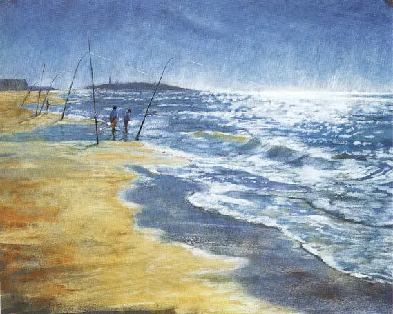
CAPE TRAFALGAR FISHERMEN
pastel on pastelcard, 46 × 66 cm (18 × 26 in)
I placed the horizon high in the rectangle to leave plenty of space for the foreground. In this way I was able to use the wave tops and edges, and the edge of wet sand, to draw the eye firmly towards the fishermen. A large foreground emphasized the emptiness of the beach, bar a few fishermen, and gave me the opportunity to paint the wonderful light on the sea, which was as important an element as any other in the picture.
ORGANIZING THE DIVISION OF SPACE
Before launching hell for leather into a painting, one of the best ways to prevent the foreground causing problems is to do a thumbnail sketch or two. I have lost count of the number of times I must have mentioned this, so forgive me if you are one of those who hates thumbnail sketches, and is fed up with being told that they are important. However, a small thumbnail sketch, executed in a few minutes, will quickly show you if your divisions of the rectangle are uncomfortable. You will be able to decide, before committing yourself to colour (and in watercolour painting, this is an extremely useful plus point), whether you have left too much or too little space for the foreground. You can change elements of the scene, in order to direct the eye more positively to the main centre of interest. You can decide whether you want foreground elements to dominate your picture – or whether they need to be drastically subdued. Making fundamental changes of this sort once a picture is well under way is not conducive to good temper!
SISTERS IN THE SANDS
pastel on paper, 46 × 66 cm (18 × 26 in)
This painting is composed of horizontal bands of colour, and the foreground area between the base of the picture and the focal point of the three children was quite deep and so potentially tricky – it could have been rather bland and boring. However, I emphasized the undulations in the sand, and the areas of blue, to break up the foreground in a lively and interesting way. Marks in the foreground are much larger than those in the distance, too, helping the sense of depth.
A thumbnail sketch will sharpen your perception; you begin to see the subject through a painter’s eyes and in pictorial terms. Clarifying your mind, and attempting to create a well-balanced design, does not mean that the image is set in stone – it simply means that you will be able to work more freely with your chosen medium, concentrating on the creation of an image that is a combination of good design and painterly approach.
KEEP IT SIMPLE
A very useful way to think about how to tackle areas of foreground is to consider the way we ‘see’ a scene at first glance. When we look at an area of landscape our attention usually focuses on a main point of interest – that which attracts us most. We are aware of the foreground – the area between our feet, and this point of interest – but only peripherally. So, somehow, we have to find a subtle way of painting the foreground so that it leads us to the point of interest, but does not detract from it.
A particularly useful aide-mémoire, therefore, is KIS – Keep It Simple. The danger, when sitting in front of a subject, is that we look too hard, and long, at the foreground, because of its proximity.
THE OLD MILL HOUSE, MAJORCA
pastel on board, 46 × 66 cm (18 × 26 in)
The foreground in this instance was an area of fairly colourless gravel – but once again, the sunlight came to my aid, and presented me with some wonderful shadows to use. Cover the shadows with a finger to see how important they are. Without them, the foreground would have been a large, featureless, uninteresting shape at the base of the picture.
Areas of foliage, for instance, can be very complex indeed, and if they are portrayed very precisely they will hold the eye firmly in the foreground, preventing any movement ‘back’ into the scene. It is generally a good idea to keep most foregrounds fairly simple – which may mean forcing yourself to find a way of simplifying what you see. Squinting at the scene often helps. Having said this, there is another trap waiting for the unwary painter. If you make the foreground too simple it might look empty and monotonous. A painter’s life is not easy!
A FEW DOS AND DON’TS
If your area of foreground is a large expanse of ground – for instance a field, or an area of grass, or sandy beach – while Keeping It Simple, DO see if you can vary the colours, and perhaps the tones, for variety and interest.
In order to encourage a feeling of recession in the image DO see whether you can use larger brush or pastel marks in the foreground, and allow your marks to become smaller and finer as the scene recedes. This will create a good illusion of moving from foreground, to middle ground, to distance.
DON’T block the viewer’s ‘path’ back into the picture with a monotonous horizontal foreground feature, such as a fence, a wall, or a line of tall grasses across the bottom of the picture like a fringe.
Obvious ‘linear’ landscape features such as paths, rivers or furrows can be used to lead the viewer’s eye to the main point of interest, but DON’T FORGET that you can deliberately use shadows on the ground, subtle modulations of colour and tone, and suggestions of texture, for the same purpose.
DON’T simplify the foreground to such an extent that it becomes a featureless bland shape at the base of the picture.
Where possible, DO see if you can create subtle ‘zig-zags’ back into the distance – diagonal movements towards the background move the viewer gently backwards, encouraging a look around along the way!
Читать дальшеИнтервал:
Закладка:
Похожие книги на «The Artist’s Problem Solver»
Представляем Вашему вниманию похожие книги на «The Artist’s Problem Solver» списком для выбора. Мы отобрали схожую по названию и смыслу литературу в надежде предоставить читателям больше вариантов отыскать новые, интересные, ещё непрочитанные произведения.


Обсуждение, отзывы о книге «The Artist’s Problem Solver» и просто собственные мнения читателей. Оставьте ваши комментарии, напишите, что Вы думаете о произведении, его смысле или главных героях. Укажите что конкретно понравилось, а что нет, и почему Вы так считаете.